SPX Year-End 2025 Targets by AnalystsJust year end analyst targets for SPX as of 02 October 2025, as answered by Grok
Cerca negli script per "spx"

SPX trend breakdownThis indicator is not granted for buying and selling confirmation, it is only for analysis. Entering or existing buy or sell is your decision and under your responsibility.
Please note that currently this indicator works only on ( spx s&p 500 index cfd sp )
explanation:
1- The purple line (candle high) is estimating the trend movement for short term.
2- The blue line (candle average) is moving average based on the candle highest close.
3- The black line (variable) is the actual movement of the trend.
- If black line above blue line with green background color, the candle is green and moving up.
- If black line above blue line with red background color, the candle is red but still above blue line.
- If the black line below blue line with red background color, the candle is red and moving down.
- If the black line below the blue line with green background color, the candle is green but still below blue line.
4- The green arrow up symbol above candle indicates that the top of current candle is higher than previous candle.
5- The green arrow up symbol below candle indicates that the bottom of current candle is higher than previous candle.
6- The red arrow down symbol above candle indicates that the top of current candle is lower than previous candle.
7- The red arrow down symbol below candle indicates that the bottom of current candle is lower than previous candle.

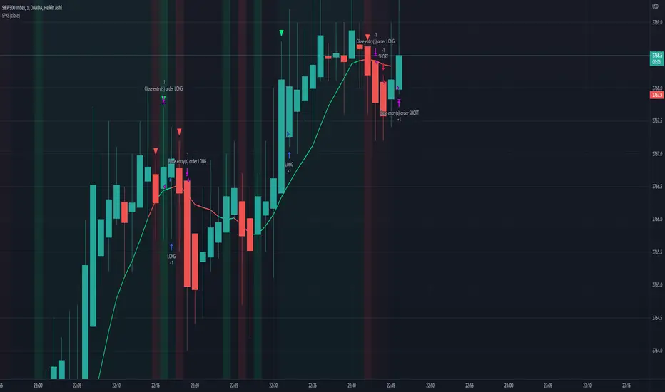
SPX EMA 9/21 + VWAP Strategy1. Temporality: 2 minutes.
2. EMA 9 and EMA 21:
• Purchase Call: when EMA 9 crosses up EMA 21 and the price is > VWAP.
• Put : when EMA 9 crosses down EMA 21 and the price is < VWAP.
3. Stop and Take Profit:
• Stop: candle closure on the other side of the VWAP.
• TP: configurable in points (e.g. +10 pts, +20 pts) or up to the opposite crossing of EMAs.
• Long enters when EMA 9 crosses up 21 and the price is above VWAP.
• Short enters when the EMA 9 crosses down the 21 and the price is below VWAP.
• TP and SL in SPX points (configurable in inputs).
• You can run in 2 minutes on SPX.

SPX Fair Value BandsThese are based on Darius Dale and Max Anderson's Net Liquidity model.
This is intended for use with the $SPX chart.
SPX Scalping StrategyThis strategy points out good entries and exits to go with the direction of SPY
Used with:
Ticker: SPX 500 USD
Heiken Ashi Candles
1, 3, 5 min timeframe
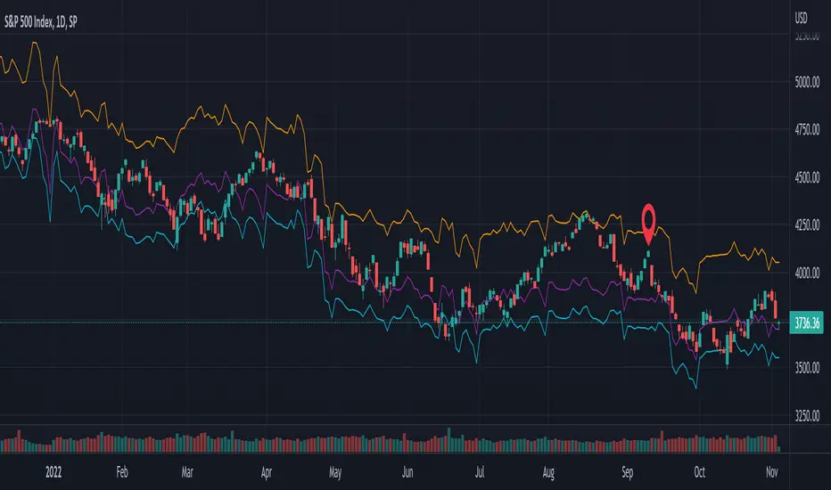
SPX DivergenceScript plots divergence of SPX sectors and world markets based on 3 months return of various ETF's.
Excessive divergence in returns typically preceeds strong market downturns 1-2 weeks ahead of time.

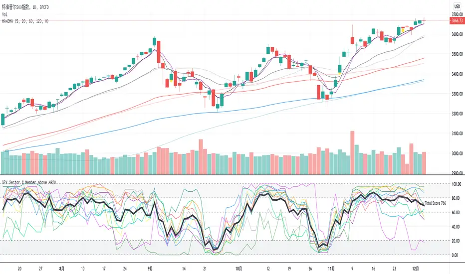
SPX Sector % Member above MA20This indicator shows the SPX sector members which are above ma20. And bold black line is the total, if it is above 1000 which means market so hot and you should sell, or if it is below 200 means you should buy.
SPX DIXThis is the SPX DIX from Squeezemetrics. The code was generated with Python-Pandas. I cannot get the full DIX because I hit the variable limit and have not found a workaround. Publishing this to see if others know of a workaround.

SPX ATR14 indicator This indicator works well on SPX 500
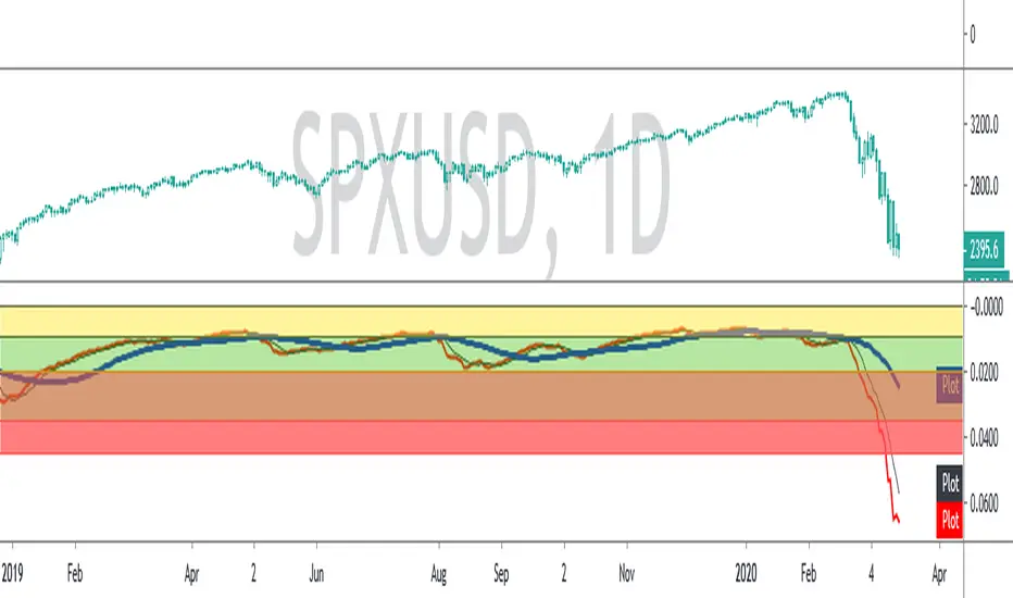
Needs to be inverted so Red is at the bottom
Levels of pullbacks are used to determine trend .
Pullback to the Green zone normal Bull Market
Pullback to the Brown Zone are warning of potential Bear Market , but if it holds , just a deeper correction within a Bull Market
Pullbacks into the Red , Bear Market .
In Bear , wait until indicator is forming a reversal trend up and price should make a divergence by either making a new low or retesting previous low.
The Blue MA is the 33 MA and can be used as a form of stop trend indicator on the cross below the MA

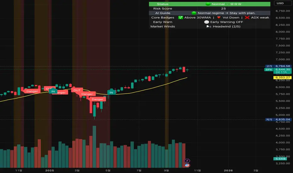
Crash Survival Indicator (SPX, Weekly/Daily)Short description
SPX-focused risk context tool using 30WMA/ATR/ADX and distance to 30WMA, with optional Hindenburg-Omen breadth and macro add-ons. Weekly is primary; Daily provides early-warning. Educational only.
Full description (English first)
What it is
Crash Survival Indicator (CSI) is a rules-based risk context indicator for the S&P 500 index (SPX). It helps keep decisions data-driven during stress by combining four weekly conditions into a weighted risk score and presenting them in a readable dashboard. Optional breadth (Hindenburg Omen cluster proxy) and macro add-ons give additional context. This is not a buy/sell system.
Why it’s original and useful
Weekly core with confirmation: Four classic conditions (30WMA regime, ATR(14) trend, ADX(14) > 20 & rising, and % distance from 30WMA) feed a 0–100 score. A 2-of-3 gate (WMA down / ATR up / ADX>20↑) must confirm before “Danger,” reducing false spikes.
Daily Early-Warning: A separate daily preview flags conditions approaching the Danger threshold (with a streak filter). It’s a heads-up only, not a timeframe switch.
Scope control to avoid confusion: Signals (labels/alerts) are restricted to SPX on Weekly/Daily by design. The dashboard can be shown SPX-only or on all symbols (configurable).
Clarity for all users: Beginner card view (plain badges) and Pro table view (detailed chips) improve readability without hiding logic.
How it works (mechanics)
Weekly core (primary frame)
30WMA regime: price vs 30-week WMA; IN/OUT labels on crosses.
ATR(14): rising ATR counts as volatility stress.
ADX(14): risk weight when ADX > 20 and rising.
Distance to 30WMA: % deviation flags potential overheat.
Scoring & thresholds: Weighted sum → Caution ≥ 40, Danger ≥ 60 (defaults). Danger also requires the 2-of-3 gate above.
Daily Early-Warning: Uses daily versions of the same ideas to detect near-Danger conditions with a streak requirement (heads-up only).
Optional breadth (Hindenburg Omen proxy): Elevated new highs and new lows while the NYSE Composite is above its 50DMA, with deteriorating breadth momentum; requires cluster confirmation to reduce noise.
Optional macro add-ons: VIX regime, DXY strength, credit stress (HYG/LQD vs MA), and TNX trend each add adjustable weights.
Inputs (overview)
Scope & Mode: SPX primary/alt tickers; signal restriction to SPX + Weekly/Daily; dashboard visibility (SPX-only vs all symbols); Beginner or Pro display.
Label Policy: Weekly-only / Weekly-core + Daily-early (default) / All (W/D); lookback windows and minimum bar gaps to prevent clutter.
Scoring: Weights for 30WMA down, ATR up, ADX>20↑, Overheat; Caution/Danger thresholds; Overheat % (distance).
Hindenburg Omen (optional): NYSE Composite and High/Low/AD series; cluster requirement.
Macro add-ons (optional): Symbols + weights for VIX, DXY, HYG, LQD, TNX.
Early Warning (Daily): Near-Danger buffer and streak length.
Visuals & Alerts: Background shading, labels on/off, font size, dashboard position, runtime
alerts.
Alerts (contextual; not trade signals)
OUT — 30WMA Down Break (Weekly)
IN — 30WMA Reclaim (Weekly)
Risk ≥ Danger + 2-of-3 Gate
Hindenburg Omen Cluster detected
Early Warning (Daily near Danger, streak)
Alerts provide context only. They are not buy/sell instructions.
Intended use and limitations
Use the Weekly panel for decisions; treat Daily Early-Warning as a heads-up.
Best used as risk framing alongside your own process (position sizing, liquidity, event risk).
Breadth/macro inputs depend on your data source; if unavailable, keep add-ons off.
No forward-looking data or lookahead; designed to avoid repainting.
Disclaimer
For educational purposes only. Not financial advice, not an investment recommendation, and not a solicitation to buy or sell any security. Past performance does not guarantee future results. Users are solely responsible for their decisions and regulatory compliance.
Optional Korean addendum (append after English)
한국어 안내 요약: 본 지표는 위기 상황에서 감정보다 데이터를 우선할 수 있도록 리스크 맥락을 제공합니다. 주봉이 핵심, 일봉은 조기경보(Heads-up)이며, 매수/매도 신호가 아닙니다. 심프님의 프로토타입 철학을 살리되 SPX 한정 신호, 라벨/알림 정책, 선택형 오멘/매크로 기능, 초보/프로 대시보드 등 가독성을 개선했습니다. 투자 판단과 책임은 전적으로 사용자에게 있습니다.
Privacy & format
Visibility: Public
Source: Protected (no source disclosure), compliant with Publishing Rules
Language: English title & description first; Korean addendum optional
Screenshot guidance (for your gallery)
Weekly SPX showing dashboard at “Danger” with an OUT label.
Weekly SPX with Hindenburg Omen Cluster label and shaded background.
Daily SPX with Early-Warning label as weekly approaches Danger.
Beginner vs Pro dashboard comparison on SPX.
Author certification (paste if needed)
I certify this publication contains no promotions, links, or solicitations, complies with TradingView House Rules and Script Publishing Rules, uses Pine v5, and is intended solely for educational purposes with no performance claims.
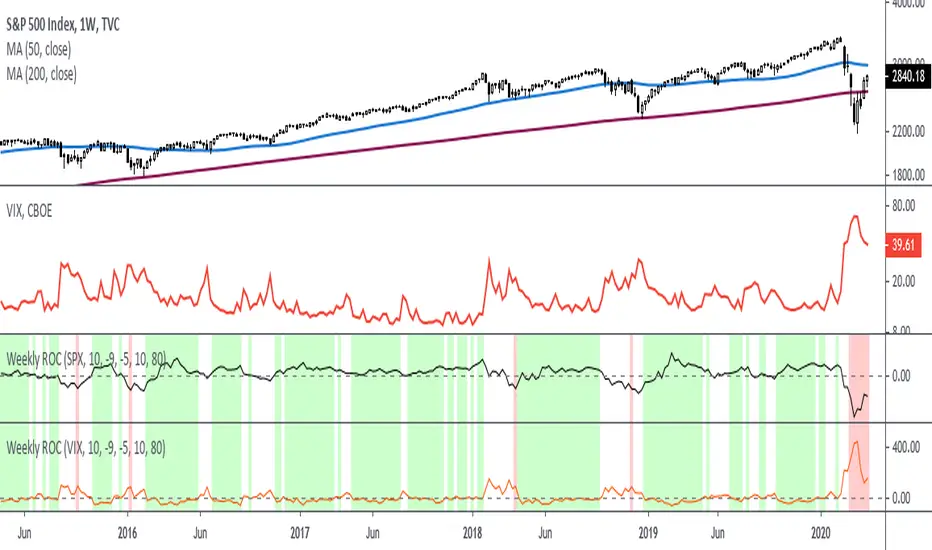
Rate Of Change - Weekly SignalsRate of Change - Weekly Signals
This indicator gives a potential "buy signal" using Rate of Change of SPX and VIX together,
using the following criteria:
SPX Weekly ROC(10) has been BELOW -9 and now rises ABOVE -5
*PLUS*
VIX Weekly ROC(10) has been ABOVE +80 and now falls BELOW +10
The background will turn RED when ROC(SPX) is below -9 and ROC(VIX) is above +80.
The background will turn GREEN when ROC(SPX) is above -5 and ROC(VIX) is below +10.
So the potential "buy signal" is when you start to get GREEN BARS AFTER RED - usually with
some white/empty bars in between...but wait for the green. This indicates that the volatility
has settled down, and the market is starting to turn up.
This indicator gives excellent entry points, but be careful of the occasional false signals.
See Nov. 2001 and Nov. 2008, in both cases the market dropped another 25-30% before the final
bottom was formed. Always have an exit strategy, especially when buying in after a downtrend.
How I use this indicator, pretty much as shown in the preview. Weekly SPX as the main chart with
some medium/long moving averages to identify the trend, VIX added as a "Compare Symbol" in red,
and then the Weekly ROC signals below.
For the ROC graphs, you can show SPX+VIX together, SPX alone, or VIX alone. I prefer to display
them separately because they don't scale well together (VIX crowds out the SPX when it spikes).
Background color is still based on both SPX/VIX together, regardless of which graph is shown.
Note that there is no VIX data available on Trading View prior to 1990, so for those dates the
formula is using only ROC(SPX) and the assigned thresholds (-9 and -5, or whatever you choose).
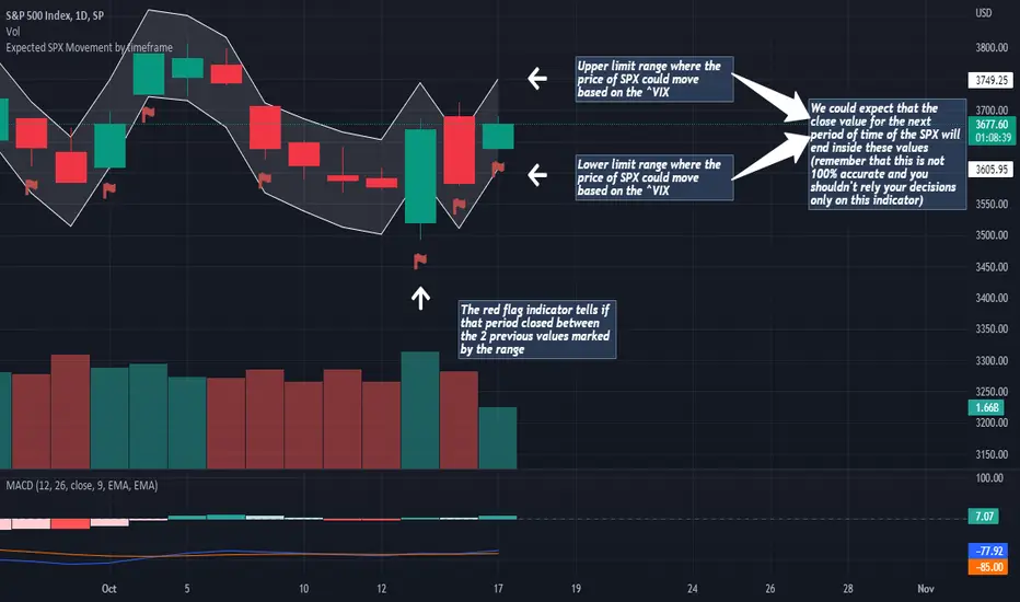
Expected SPX Movement by timeframeTHIS INDICATOR ONLY WORKS FOR SP:SPX CHART
This code will help you to measure the expected movement of SP:SPX in a previously selected timeframe based on the current value of VIX index
E.g. if the current value of VIX is 30 we calculate first the expected move of the next 12 months.
If you selected the Daily timeframe it will calculate the expected move of SPX in the next Day by dividing the current VIX Value by the squared root of 252
(The 252 value corresponds to the approximate amount of trading sessions of the year)
If you selected the Weekly timeframe it will calculate the expected move of SPX in the next Week by dividing the current VIX Value by the squared root of 52
(The 52 value corresponds to the amount of weeks of the year)
If you selected the Monthly timeframe it will calculate the expected move of SPX in the next Week by dividing the current VIX Value by the squared root of 12
(The 12 value corresponds to the amount of months of the year)
For lower timeframes you have to calculate the amount of ticks in each trading session of the year in order to get that specific range
Once you have that calculation it it'll provide the range expressed as percentage of the expected move for the following period.
This script will plot that information in a range of 2 lines which represents the expected move of the SPX for the next period
The red flag indicator tells if that period closed between the 2 previous values marked by the range
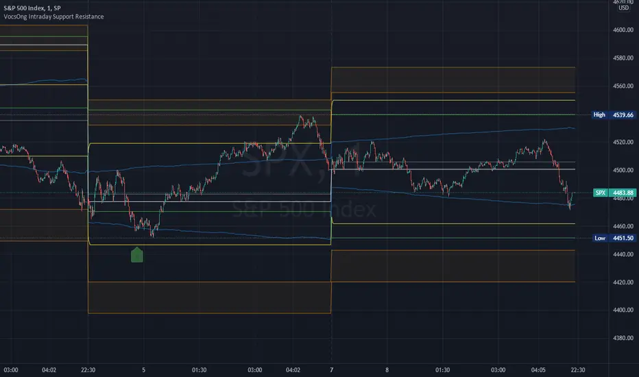
VocsOng Intraday Support ResistanceOverview
This indicator is meant for intraday trading, mainly designed for SPX . The main purpose of this indicator is to mark out the key levels of support and resistance for intraday.
There are 9 main support and resistance that forms this intraday support resistance indicator.
1. Today's Open
Today's open is often a neglected area because by default change percentage is always based on yesterday close. So having a line drawn for today's open is the very starting point.
2. Yesterday Close
3. Yesterday High
4. Yesterday Low
Yesterday Close, High, Low are important intraday trading areas, it is very common that price action resist at this area.
5. Past 4 Days Calculated Estimated High (YesterdayClose + (EstimatedRange/2) :: EstimatedRange = Nearest day x0.4, followed by 0.3, 0.2, 0.1)
6. Past 4 Days Calculated Estimated Low (YesterdayClose - (EstimatedRange/2) :: EstimatedRange = Nearest day x0.4, followed by 0.3, 0.2, 0.1)
This is a calculated estimated high/low range based on past 4 days range. Weighing the nearest day heaviest of 40%, followed by 30%, 20%, 10%.
This calculated high/low area apparently also act as good support and resistance area sometimes.
7. Expected Move High (YesterdayClose + VIX/100 * SquareRoot(1/365))
8. Expected Move Low (YesterdayClose - VIX/100 * SquareRoot(1/365))
This is the formula used to calculate expected move LIVE based on current VIX. This is based from today's open.
9. 1.5% to 2% from SPX Open today
This marks out a zone where SPX is 1.5% to 2% away from today's open. This gives a general guide on a fix percentage change based on today's open.
Statistically, SPX close within 1.5% change from today's open 93.18% of the time in the past 10 years.
How I use them?
First to note, this indicator works best on 1 minute chart. Other timeframe might not be that accurate.
All these are intraday support and resistance. They can be simply use as support and resistance by default.
In addition to that, 7,8,9 are also used as overbought/oversold indicator because they are centered to today's open.
As SPX move towards 7,8,9, it shows how overbought or oversold it is.
I use this indicator with SPX 0 dte options trading.
So as SPX approaches the oversold area, and near any of the support, I will sell a 30 wide put credit spread at 5 delta away or $1 target credit.
This trade entry goes together with a bracket take profit (80%) and stop loss (200%) OCO order.
NTX CAPITAL SPX V.1الوصف بالعربي
مؤشر NTX SPX Options مصمم خصيصًا لتداول عقود الأوبشن على SPX، ويعمل حصريًا على إطار زمني 15 دقيقة.
📌 مهم: يجب استخدام المؤشر على شارت S&P 500 (SP500) وليس شارت SPX.
يوفر المؤشر إشارات CALL و PUT عالية الدقة، مع عرض أهداف الربح مباشرة على الشارت، مما يساعد المتداول على الدخول بثقة وإدارة الصفقة باحترافية.
تم تطويره ليجمع بين الدقة والوضوح وسهولة الاستخدام، ليناسب جميع أنماط التداول على الـ SPX.
المميزات:
• يعمل على فريم الربع ساعة فقط.
• إشارات دخول مباشرة (CALL / PUT).
• تحديد الأهداف بدقة على الشارت.
• مثالي لتداول عقود الأوبشن على SPX.
⸻
Description in English
The NTX SPX Options indicator is specifically designed for trading SPX options, optimized for the 15-minute timeframe.
📌 Important: This indicator must be used on the S&P 500 (SP500) chart, not the SPX chart.
It provides highly accurate CALL and PUT signals, along with clearly defined profit targets plotted directly on the chart, helping traders enter with confidence and manage trades professionally.
Developed for precision, clarity, and ease of use, making it ideal for all SPX trading styles.
Features:
• Works exclusively on the 15-minute chart.
• Instant entry signals (CALL / PUT).
• Precise profit targets displayed on the chart.
• Perfect for trading SPX options contracts.
⸻
SectorsThis script attempts to show the relative strength of the 11 sectors in the SPX, which can be accomplished in three ways:
1. Sectors - displays all sector indices as they appear normally
2. Sector Relativity - displays each sector divided by the sum of the other 10 sectors
3. Sector Alpha - displays the alpha of each sector as compared to the sum of the other 10 sectors
I have seen some other iterations of this script that compare each sector to the SPX as a whole, a couple problems with that:
1. SPX sector weightings are unequal and change quarterly, meaning you will get an inaccurate depiction of relative sector strength across time.
2. Even if using an equal-weight SPX, you would be comparing a sector to itself as all 11 sectors are included in the SPX, not just the complementary 10 you are looking to compare one sector to.
For more information on the sectors in the SPX or the calculation of Alpha, visit the links at the top of the script.
*Includes an option for repainting -- default value is true, meaning the script will repaint the current bar.
False = Not Repainting = Value for the current bar is not repainted, but all past values are offset by 1 bar.
True = Repainting = Value for the current bar is repainted, but all past values are correct and not offset by 1 bar.
In both cases, all of the historical values are correct, it is just a matter of whether you prefer the current bar to be realistically painted and the historical bars offset by 1, or the current bar to be repainted and the historical data to match their respective price bars.
As explained by TradingView,`f_security()` is for coders who want to offer their users a repainting/no-repainting version of the HTF data.

VIX Term Structure Pro [v7.0 Enhanced]# VIX Term Structure Pro v7.0
[! (img.shields.io)](www.tradingview.com)
[! (img.shields.io)](www.tradingview.com)
[! (img.shields.io)](LICENSE)
**Professional VIX-based Market Sentiment & Timing Indicator**
专业的 VIX 市场情绪与择时指标
---
## 🌟 Overview / 概述
VIX Term Structure Pro is an advanced multi-factor market timing indicator that analyzes the VIX futures term structure, volatility regime, and market breadth to generate actionable buy/sell signals.
VIX Term Structure Pro 是一款高级多因子市场择时指标,通过分析 VIX 期货期限结构、波动率区间及市场广度,生成可操作的买卖信号。
---
## 🚀 Key Features / 核心功能
### 📊 Multi-Factor Scoring System / 多因子评分系统
- **Term Structure Z-Score**: Measures deviation from historical mean / 期限结构 Z 分数:衡量与历史均值的偏离
- **VIX/VX1 Basis**: Spot premium detection for panic signals / VIX 现货溢价:恐慌信号检测
- **Contango Analysis**: Futures curve shape insights / 期货升水分析
- **SKEW Integration**: Options skew for tail risk / SKEW 整合:尾部风险监测
- **Put/Call Ratio**: Sentiment extremes / 看跌/看涨比率:情绪极端
- **VVIX Support**: Volatility of volatility (optional) / VVIX 支持:波动率的波动率
### 🎯 Three-Tier Signal System / 三级信号系统
| Signal | Score | Description |
|--------|-------|-------------|
| 🚨 **CRASH BUY** | ≥ 6 | Extreme panic, rare opportunity / 极端恐慌,罕见机会 |
| 🟢 **STRONG BUY** | ≥ 5 | Multi-factor confluence / 多因子共振 |
| 🟡 **BUY DIP** | ≥ 4 | Accumulate on weakness / 逢低吸纳 |
| 🟠 **SELL/HEDGE** | ≤ -2 | Consider reducing risk / 考虑减仓对冲 |
| 🔴 **STRONG SELL** | ≤ -5 | Strong bearish signals / 强烈看跌信号 |
| 🔥 **EUPHORIA SELL** | ≤ -6 | Extreme greed, sell signal / 极度贪婪,卖出信号 |
### 📈 Dashboard Indicators / 仪表盘指标解读
| Indicator | Bullish 🟢 | Bearish 🔴 |
|-----------|------------|------------|
| Overall Bias | STRONG BUY / BUY DIP | STRONG SELL / SELL/HEDGE |
| AI Score | ≥ 5 (Extreme Fear) | ≤ -5 (Extreme Greed) |
| Market Trend | 🟢SPX 🟢NDX (Above MA200) | 🔴SPX 🔴NDX (Below MA200) |
| VIX Regime | LOW VOL (<15) | HIGH VOL (>25) |
| Term Struct Z | < -2.0 (Panic) | > 2.0 (Complacency) |
---
## ⚙️ Configuration / 配置选项
### 📡 Data Sources / 数据源
- **VIX Symbol**: Default `CBOE:VIX` (Alternative: `TVC:VIX`)
- **Put/Call Ratio**: Default `INDEX:CPCI` (Index P/C)
- **Timeframe**: Daily (stable) or Chart (real-time)
### ⚠️ Strategy Mode / 策略模式
- **High (Scalping)**: Sensitive, for short-term trades / 高敏感,短线
- **Normal (Swing)**: Balanced approach / 平衡模式
- **Low (Trend/Safe)**: Conservative, trend-following / 保守,趋势跟踪
### 🔬 Backtest Mode / 回测模式
- **OFF (Real-time)**: Shows current day data, suitable for live monitoring / 显示当日数据,适合实盘监控
- **ON (Historical)**: Uses only confirmed data, avoids look-ahead bias / 仅使用已确认数据,避免未来函数
---
## 📖 Usage Guide / 使用指南
### Best Practices / 最佳实践
1. **Apply to SPX/SPY/QQQ daily charts** for optimal signal accuracy
在 SPX/SPY/QQQ 日线图上使用,信号准确度最佳
2. **Wait for next trading day** to execute signals (signals trigger on daily close)
信号触发后在下一交易日执行(信号基于日线收盘)
3. **Use in conjunction with price action** for confirmation
结合价格走势确认信号
4. **Enable Market Trend Filter** (MA200) for safer entries in uncertain markets
开启趋势过滤(MA200)以在不确定市场中更安全入场
### Signal Interpretation / 信号解读
```
🚨 CRASH BUY (Score ≥ 6)
→ Rare extreme panic event
→ Historical average return: significant positive over 2 months
→ Consider aggressive positioning
🟢 STRONG BUY (Score ≥ 5)
→ Multiple indicators align
→ Historical average return: positive over 1 month
→ Consider building positions
🟡 BUY DIP (Score ≥ 4)
→ Moderate fear detected
→ Suitable for adding to existing positions
→ Filtered out in bear markets if Trend Filter is ON
```
---
## 📊 Historical Statistics / 历史统计
The indicator tracks signal frequency and average subsequent returns:
- **CRASH BUY**: 40-day return period (~2 months)
- **STRONG BUY**: 20-day return period (~1 month)
- **BUY DIP**: 10-day return period (~2 weeks)
指标追踪信号频率和后续平均收益,可在仪表盘中查看历史统计。
---
## 🔔 Alerts / 警报
Built-in alert conditions with cooldown mechanism to prevent spam:
| Alert | Condition |
|-------|-----------|
| Crash Buy Alert | Score ≥ 6, extreme panic |
| Strong Buy Alert | Score ≥ 5, multi-factor confluence |
| Buy Dip Alert | Score ≥ threshold |
| Euphoria Sell Alert | Score ≤ -6, extreme greed |
| Strong Sell Alert | Score ≤ -5 |
| VIX Basis Panic | VIX spot premium spike |
---
## 📋 Changelog / 更新日志
### v7.0 (Current)
- ✨ Three-tier buy/sell signal system
- 📊 Signal statistics with average return tracking
- 🔬 Backtest Mode toggle for historical testing
- 🎨 Configurable ±1 Z-Score reference lines
- ⚡ Modular scoring functions
- 🛡️ Dual index trend display (SPX + NDX)
- 📱 Compact & Full dashboard modes
---
## ⚠️ Disclaimer / 免责声明
**English:**
This indicator is for educational and informational purposes only. It does not constitute financial advice. Past performance does not guarantee future results. Always do your own research and consider your risk tolerance before trading.
**中文:**
本指标仅供教育和信息参考,不构成投资建议。过往表现不代表未来收益。交易前请自行研究并评估风险承受能力。
---
## 📄 License / 许可证
MIT License - Feel free to use, modify, and share.
---
## 🤝 Contributing / 贡献
Issues and pull requests are welcome!
欢迎提交问题和贡献代码!
---
**Made with ❤️ for the trading community**
**为交易社区用心打造**

GEX / Gamma - SPX Indicator Description – GEX / Gamma (SPX)
This indicator allows you to manually plot your daily +GEX, TRANS-GEX, and –GEX levels on SPX and visualize how price reacts around key gamma zones.
You enter the three levels each morning, and the script automatically draws:
+GEX / TRANS / –GEX zones with an adjustable buffer
Clean labels (e.g., “+GEX: 6850”) pinned to the right side of the chart
Today-only candle coloring (green above TRANS-GEX, red below)
Zones extend from yesterday’s session through the current session, helping highlight areas where dealer hedging flows may influence volatility, compression, or acceleration.
How to Use
Add the indicator to any intraday SPX chart.
Open settings and enter your +GEX, TRANS-GEX, and –GEX levels for the day.
Adjust the buffer, colors, and label style as needed.
Watch how price behaves as it moves above or below TRANS-GEX and interacts with +/- GEX zones.
Best For
Intraday SPX / ES / SPY
Options traders
Volatility and gamma-aware strategies
Strategy Behind It (Tight Version)
GEX levels help identify where dealer hedging flows can influence SPX price behavior.
+GEX (Positive Gamma)
Market tends to stabilize here. Dealers hedge against price moves, creating mean-reversion and lower volatility.
TRANS-GEX (Transition Level)
Key pivot where gamma flips. Price crossing this level often signals a shift in volatility or intraday direction.
–GEX (Negative Gamma)
Market becomes more reactive. Dealers hedge with price, increasing volatility, momentum, and trend potential.
How traders use it:
Expect resistance or slowdown into +GEX
Watch for potential bottoming or increased volatility –GEX
Use TRANS-GEX as a bias line or trigger for intraday shifts
A move outside of either the +GEX or -GEX will likely result in some type of high volume move.

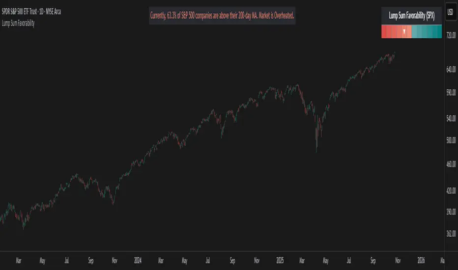
Lump Sum Favorability (SPX & NDX)This indicator provides a visual dashboard to gauge the statistical favorability of deploying a "Lump Sum" investment into the SPX (S&P 500) or NDX (Nasdaq 100).
The primary goal is not to time the exact market bottom, but to identify zones of significant pessimism or euphoria. Historically, periods of indiscriminate selling have represented high-probability entry points for long-term investors.
The dashboard consists of two parts:
1. The Favorability Gauge: A 12-segment gauge that moves from Red (Unfavorable) to Teal (Favorable).
2. The Summary Text: An optional text box (enabled in settings) that provides a plain-English summary of the current market breadth.
---
The Method: Market Breadth
This indicator is not based on the price of the index itself. Price-based indicators (like an RSI on the SPX) can be misleading. In a market-cap-weighted index, a few mega-cap stocks can hold the index price up while the vast majority of "average" stocks are already in a deep bear market.
This tool uses Market Breadth to measure the true, underlying health and participation of the entire market.
How It Works
1. Data Source: The indicator pulls the daily percentage of companies within the selected index (SPX or NDX) that are trading above their 200-day moving average. (Data tickers: S5TH for SPX, NDTH for NDX).
2. Smoothing: This raw data is volatile. To filter out daily noise and confirm a persistent trend, the indicator calculates a 5-day Simple Moving Average (SMA) of this percentage. This is the value used by the indicator.
3. Interpretation:
High Value (>= 50%): More than half of the stocks are above their long-term average. This signifies the market is "Overheated" or in a risk-on phase. The favorability for a new lump sum investment is considered Low.
Low Value (< 50%): Less than half of the stocks are above their long-term average. This signifies "Oversold" conditions or capitulation. These moments historically offer the best favorability for starting a new long-term investment.
---
How to Use the Indicator
1. The Favorability Gauge
The gauge is designed to be intuitive: Red means "Stop/Caution," and Teal means "Go/Opportunity."
Note: The gauge's logic is inverted from the data value to achieve this simplicity.
Red Zone (Left): UNFAVORABLE
This corresponds to a high percentage of stocks being above their 200d MA (>= 50%). The market is considered Overheated, and the favorability for a new lump sum investment is low.
Teal Zone (Right): FAVORABLE
This corresponds to a low percentage of stocks being above their 200d MA (< 50%). The market is considered Oversold, and the favorability for a new lump sum investment is high.
2. The Summary Text
When "Show Summary Text" is enabled in the settings, a box will appear at the top-center of your chart. This box provides a clear, data-driven summary, such as:
"Currently, only 22% of S&P 500 companies are above their 200-day MA. Market is Oversold."
The color of this text will automatically change to match the market state (Red for Overheated, Teal for Oversold), providing instant confirmation of the gauge's reading.
---
Settings
Market: Choose the index to analyze: SPX (S&P 500) or NDX (Nasdaq 100).
Gauge Position: Select where the gauge dashboard should appear on your chart (default is Bottom Right).
Show Summary Text: Toggle the descriptive text box on or off (default is On).
---
This indicator is a statistical and historical guide, not a financial advice or timing signal. It is designed to measure favorability based on past market behavior, not to provide certainty.
Extreme oversold conditions can persist, and markets can always go lower. This tool should be used as one component of a broader investment and risk-management framework. Past performance is not a guarantee of future results.
Plotting SPX LineIntroduction
This is our second script on TradingView. The script plots SP500 Index as a line on your Trading View Platform. Plotting the SPX line on your charts is a good visual to see how a stock is acting relative to the markets.
Instructions on How To Add this Script to Your TradingView Charting Platform
Step 0: Head over to www.tradingview.com
Step 1: Add “Plotting SPX Line” to your Favorites by clicking “Add to Favorite Scripts” near the bottom of the page.
Step 2: Click “Indicators” at the very top on TradingView. Under Favorites click “Plotting SPX Line”
Step 3: Hover on the Indicator name (Plotting SPX Line) on your plot under legend and click the three dots (see screenshot). Under the “Move To” choose “New Pane Above”.
Step 4: Done. You have now plotted the SPX Line on your Trading View Platform.

XAUUSD/SPX with SMA(48)📊 Gold vs S&P 500 | XAUUSD/SPX Ratio with SMA (48) – Full Pine Script Breakdown
In this video, we build and explain a custom Pine Script that plots the Gold to S&P 500 ratio (XAUUSD/SPX) along with a 48-period Simple Moving Average (SMA).
This ratio helps us analyze how Gold is performing against equities and whether smart money is shifting from risk assets (stocks) to safe haven (gold).
🔧 What’s Included in the Script:
✅ Live ratio of XAUUSD (Gold) / SPX (S&P 500)
✅ 48-period SMA for trend analysis
✅ Clean visual chart in a separate pane
✅ Pine Script v5 compatible
🧠 Why This Matters:
Tracking the XAUUSD/SPX ratio gives deeper insight into macro trends, inflation hedge behavior, and market sentiment.
A rising ratio can signal weakness in equities and strength in precious metals — a key trend for long-term investors and macro traders.

BTC & SPX vs Yield Curve: Recession Risk ZonesBTC & SPX vs Yield Curve – Recession Risk Zones
This tool helps you track Bitcoin (BTC) and the S&P 500 (SPX) against key macro signals from the U.S. yield curve to spot potential recession risks.
🟪 Color Legend:
🔴 Red = Yield curve is inverted (warning starts)
🟡 Yellow = Projected 6–18 month recession risk (if inversion still active)
🟠 Orange = Active 6–18 month risk window (after inversion ends)
💜 Fuchsia = Real historical U.S. recessions
📈 What’s Plotted:
🔵 BTCUSD (blue line) – Normalized price
🟢 S&P 500 (green line) – Normalized price
🟠 10Y–2Y Yield Spread – Macro signal for risk
✅ Use it to:
Spot macro pressure zones
See how BTC and SPX behave around economic stress
Stay cautious when red/orange/yellow areas appear
Let me know if you'd like to enable toggles to hide/show BTC or SPX independently!

ES/SPX/SPY conversion indicatorOverview:
This indicator helps with giving a conversion from ES, SPX and SPY to each other. Will help with setting levels on the chart based on the one of the 3 securities. For example, if you have a level from ES (futures) and want to correlate that level in the SPY, then you can put the ES option and the level you want to watch and will put the line in the corresponding level of the SPY.
How it works/Calculations:
It will use a mathematical equation to calculate the ratio between ES/SPY/SPX. Using this ratio equation, if ES price point A is wanted, then it will be correlated to the SPY and will help with knowing what levels correspond to the futures and vice versa. One thing to be aware is that Tradingview has a 15 min delayed on futures so you will not have updated pricing unless you pay for it, but for this indicator main purpose is for the people that want to correlate certain levels from futures to SPY based on technical analysis. On the settings you can choses the ticker that you want to put the levels, whether is ES, SPX or SPY and then you have multiple areas to put those levels as active or inactive. If the line is below the price point it will color red and if the line is above the price, then will be green.
Potential Pitfalls:
No potential pitfalls except as mentioned above, the delay in futures unless you pay for it.
How to use:
You should not be using this indicator for entries or stop. This indicator will help correlate levels from ES, SPX and SPY among themselves.
Who will benefit from this indicator? Whoever likes to do technical analysis on the futures and want to watch those levels into the spy and correlate them.
Settings:
-Very simple settings, first you chose the one that you want to compare with. You will have 3 choices, ES, SPX, SPY. If you have the SPY chart and want to compare with ES, then chose ES and then put the levels from ES that you want to mark on the SPY.
Disclaimer:
This is still an indicator that is being tested and in no way should be used alone. Currently will be in closed beta to find bugs and to work on accuracy.
The information contained in this script does not constitute financial advice or a solicitation to buy or sell any securities of any type. I will not accept liability for any loss or damage, including without limitation any loss of profit, which may arise directly or indirectly from the use of or reliance on such information.
All investments involve risk, and the past performance of a security, industry, sector, market, financial product, trading strategy, backtest, or individual's trading does not guarantee future results or returns. Investors are fully responsible for any investment decisions they make. Such decisions should be based solely on an evaluation of their financial circumstances, investment objectives, risk tolerance, and liquidity needs.
My Scripts are only for educational purposes!
