Money Flow DivergenceThe Money Flow Divergence indicator is designed to help traders identify periods when there is a significant divergence between the growth of the U.S. M2 money supply and the S&P 500 index (SPX).
This divergence can provide insights into potential market turning points, making it a valuable tool for long-term investors and traders looking to capitalize on macroeconomic trends.
How It Works:
Data Sources:
S&P 500 Index (SPX) and U.S. M2 Money Supply.
Calculating Growth Rates:
SPX Growth: The script calculates the percentage growth of the S&P 500 index by comparing the current closing price with the previous period's closing price.
M2 Growth: Similarly, it calculates the percentage growth of the U.S. M2 money supply by comparing the current value with the previous period's value.
Growth Gap/Delta:
Growth Gap: The core of the indicator is the "growth gap" or "delta," which is the difference between the M2 money supply growth and the SPX growth. This gap indicates whether liquidity in the economy (represented by M2) is outpacing or lagging behind the performance of the stock market.
Interpretation:
Positive Gap (Green Bars): When the M2 growth outpaces SPX growth, the gap is positive, indicating that there is more liquidity in the system than what is being reflected in the stock market. This scenario often signals potential upward momentum in the market, making it a good time to consider buying.
Negative Gap (Red Bars): When the SPX growth outpaces M2 growth, the gap is negative, suggesting that the market may be overextended relative to the available liquidity. This can be a warning sign of potential market corrections or downturns.
Visualization:
The indicator plots the growth gap as a histogram with bars colored based on the gap value:
Green Bars: Indicate a positive gap where M2 growth is higher than SPX growth.
Red Bars: Indicate a negative gap where SPX growth is higher than M2 growth.
The bars are thickened for better visibility, and a horizontal line at zero is plotted to help users easily distinguish between positive and negative gaps.
How To Use It:
Time Frame Selection: Users can select the desired time frame (e.g., monthly, weekly) for the data. This flexibility allows traders to analyze the indicator over different periods, depending on their investment horizon.
Monthly time frames seem to work best.
Interpreting the Indicator:
Bullish Signals: Look for sustained periods of positive growth gaps (green bars), which may indicate a favorable environment for buying or holding long positions.
Bearish Signals: Be cautious during periods of negative growth gaps (red bars), which could signal overvaluation in the market or potential pullbacks.
Enjoy and let me know if you have any questions.
Cerca negli script per "spx"

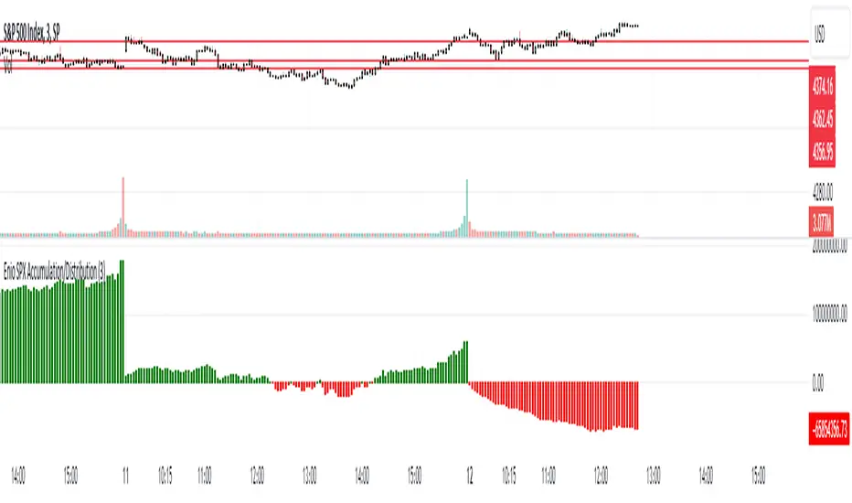
Enio_SPX_Accumulation/DistributionThis indicator handles the same inputs used for classic Accumulation and Distribution indicators, but performs the calculations in a different way.
This indicator is used to compare the positive volume (up volume) and the number of advancing stocks against the negative volume (down volume) and the number of declining stocks.
This indicator only measures SPX market breadth (Advancing issues, Declining issues) and SPX volume (Up and down volume)so it is for use only with SPX, SPY or MES. It can also be used with ES, but data outside of regular trading hours is not provided, the indicator in those cases will print a block of the same height and same color as the last RTH bar.
When the histogram is positive or green, the bars change to a lighter color if the current bar is less than the average of the last 3 bars. A continued set of bars with a lighter color could mean that the trend is about to change.
When the histogram is negative or red, the bars change to a lighter color if the current bar is greater than the average of the last 3 bars. A continued set of bars with a lighter color could mean that the trend is about to change.
When the histogram height is low, could signal a choppy market (SPX).
The histogram can help indicate a trending market when the opening trend is maintained and the color of the bars does not change, for example, a solid green increasing histogram can indicate a bullish trending market, while a solid red decreasing histogram will indicate a strong bearish trend.
In intraday trading the indicator can signal if the SPX price changes are supported by volume and market breadth and also allows you to see when these changes or trend are weakening.
The change from green (positive) to red (negative) and vice versa should not be taken alone as a buy/sell signal but as a confirmation of signals from other indicators you trust.
Due to the great specific weight that some stocks have within the SPX price calculation, the divergences of this indicator with SPX, can be taken as warning signals, but should not become an element of trading decisions. . You could see a negative histogram while SPX is positive and vice versa.
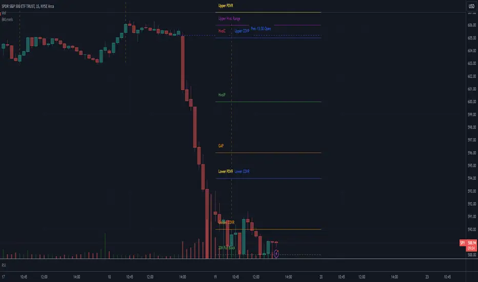
Max Value Gap [MOT]📊 Max Value Gap — Intraday Fill Zones + Stats Dashboard
Max Value Gap is a real-time gap fill detection system that visualizes institutional-style intraday price inefficiencies on major indices like SPX and NDX. Built for scalpers and short-term traders, it helps identify prime reversal areas where price is likely to return — often within the same session.
This script tracks U.S. regular market hour gaps only (9:30 AM to 4:00 PM ET) and is designed for high-precision execution on the 1-minute chart.
🧠 What Is an SPX Intraday Gap?
An SPX intraday gap occurs when the market creates a void between candles due to rapid price movement — often following volatility spikes, liquidation breaks, or aggressive buyer/seller imbalances. These unfilled zones act like magnetic targets, drawing price back into them as liquidity rebalances.
Unlike overnight gaps, these are formed and resolved within the same session, making them ideal for intraday strategies.
🔍 Key Features
✅ 1. Automatic Gap Detection
Scans only during official U.S. equity market hours (9:30 AM – 4:00 PM EST)
Gap Up: A green candle opens above the previous high
Gap Down: A red candle opens below the previous low
Each valid gap is outlined using colored boxes:
🟩 Green Box = Gap Up
🟥 Red Box = Gap Down
📸 Image : Chart with both green and red boxes marking gaps on SPX.
✅ 2. Dynamic Gap Zone Tracking
Once a gap is identified, the box extends forward until price fills the zone
A gap is considered filled when:
Price trades back into the gap zone
For gap ups: price crosses below the bottom of the gap
For gap downs: price crosses above the top of the gap
Users have the option to auto-delete filled boxes for clarity
📸 Image: Chart with price re-entering and completing a gap fill with box extending only until that point.
✅ 3. Real-Time Statistics Table
Located in the bottom-right of your chart, the built-in dashboard shows:
Total gaps formed
Gaps filled intraday
Gaps filled same day
Percentages of successful fills
📸 Image: Picture of statistics table
This live table helps assess whether the current day’s gaps are behaving in line with historical probabilities — no guesswork required.
🔄 Futures Execution Strategy
While the gaps are plotted on the SPX (or index) chart, the actual trades are taken on MNQ, NQ, or ES, using the gap levels as entry targets.
Sample Trading Flow:
A gap down forms on SPX at 1:45 PM (EST)
Price starts showing reversal signs back toward the gap
Enter long MNQ or NQ targeting a move into the gap zone
Take profit once price fully fills the zone
Repeat throughout the session — trend or chop, gaps are a magnet
This method mirrors institutional mean reversion techniques, capitalizing on market inefficiencies without chasing momentum.
📸 SPX Gap Being Filled with Corresponding MNQ Move Overlay
✅ Best Practices
Works best during morning session volatility (9:30–11:30 AM ET)
Combine with reversal candles or momentum tools for high-quality entries
Avoid during low-volume lunch chop unless tracking larger gap zones
Use on SPX while executing trades on MNQ/NQ/ES
⚠️ Disclaimer
This script is provided for educational and informational purposes only. It does not offer investment advice or trade signals. Past performance does not guarantee future results. Use appropriate risk management. Redistribution or resale is strictly prohibited.

Combined EMA Technical AnalysisThis script is written in Pine Script (version 5) for TradingView and creates a comprehensive technical analysis indicator called "Combined EMA Technical Analysis." It overlays multiple technical indicators on a price chart, including Exponential Moving Averages (EMAs), VWAP, MACD, PSAR, RSI, Bollinger Bands, ADX, and external data from the S&P 500 (SPX) and VIX indices. The script also provides visual cues through colors, shapes, and a customizable table to help traders interpret market conditions.
Here’s a breakdown of the script:
---
### **1. Purpose**
- The script combines several popular technical indicators to analyze price trends, momentum, volatility, and market sentiment.
- It uses color coding (green for bullish, red for bearish, gray/white for neutral) and a table to display key information.
---
### **2. Custom Colors**
- Defines custom RGB colors for bullish (`customGreen`), bearish (`customRed`), and neutral (`neutralGray`) signals to enhance visual clarity.
---
### **3. User Inputs**
- **EMA Colors**: Users can customize the colors of five EMAs (8, 20, 9, 21, 50 periods).
- **MACD Settings**: Adjustable short length (12), long length (26), and signal length (9).
- **RSI Settings**: Adjustable length (14).
- **Bollinger Bands Settings**: Length (20), multiplier (2), and proximity threshold (0.1% of band width).
- **ADX Settings**: Adjustable length (14).
- **Table Settings**: Position (e.g., "Bottom Right") and text size (e.g., "Small").
---
### **4. Indicator Calculations**
#### **Exponential Moving Averages (EMAs)**
- Calculates five EMAs: 8, 20, 9, 21, and 50 periods based on the closing price.
- Used to identify short-term and long-term trends.
#### **Volume Weighted Average Price (VWAP)**
- Resets daily and calculates the average price weighted by volume.
- Color-coded: green if price > VWAP (bullish), red if price < VWAP (bearish), white if neutral.
#### **MACD (Moving Average Convergence Divergence)**
- Uses short (12) and long (26) EMAs to compute the MACD line, with a 9-period signal line.
- Displays "Bullish" (green) if MACD > signal, "Bearish" (red) if MACD < signal.
#### **Parabolic SAR (PSAR)**
- Calculated with acceleration factors (start: 0.02, increment: 0.02, max: 0.2).
- Indicates trend direction: green if price > PSAR (bullish), red if price < PSAR (bearish).
#### **Relative Strength Index (RSI)**
- Measures momentum over 14 periods.
- Highlighted in green if > 70 (overbought), red if < 30 (oversold), white otherwise.
#### **Bollinger Bands (BB)**
- Uses a 20-period SMA with a 2-standard-deviation multiplier.
- Color-coded based on price position:
- Green: Above upper band or close to it.
- Red: Below lower band or close to it.
- Gray: Neutral (within bands).
#### **Average Directional Index (ADX)**
- Manually calculates ADX to measure trend strength:
- Strong trend: ADX > 25.
- Very strong trend: ADX > 50.
- Direction: Bullish if +DI > -DI, bearish if -DI > +DI.
#### **EMA Crosses**
- Detects bullish (crossover) and bearish (crossunder) events for:
- EMA 9 vs. EMA 21.
- EMA 8 vs. EMA 20.
- Visualized with green (bullish) or red (bearish) circles.
#### **SPX and VIX Data**
- Fetches daily closing prices for the S&P 500 (SPX) and VIX (volatility index).
- SPX trend: Bullish if EMA 9 > EMA 21, bearish if EMA 9 < EMA 21.
- VIX levels: High (> 25, fear), Low (< 15, stability).
- VIX color: Green if SPX bullish and VIX low, red if SPX bearish and VIX high, white otherwise.
---
### **5. Visual Outputs**
#### **Plots**
- EMAs, VWAP, and PSAR are plotted on the chart with their respective colors.
- EMA crosses are marked with circles (green for bullish, red for bearish).
#### **Table**
- Displays a summary of indicators in a customizable position and size.
- Indicators shown (if enabled):
- EMA 8/20, 9/21, 50: Green dot if bullish, red if bearish.
- VWAP: Green if price > VWAP, red if price < VWAP.
- MACD: Green if bullish, red if bearish.
- MACD Zero: Green if MACD > 0, red if MACD < 0.
- PSAR: Green if price > PSAR, red if price < PSAR.
- ADX: Arrows for very strong trends (↑/↓), dots for weaker trends, colored by direction.
- Bollinger Bands: Arrows (↑/↓) or dots based on price position.
- RSI: Numeric value, colored by overbought/oversold levels.
- VIX: Numeric value, colored based on SPX trend and VIX level.
---
### **6. Alerts**
- Triggers alerts for EMA 8/20 crosses:
- Bullish: "EMA 8/20 Bullish Cross on Candle Close!"
- Bearish: "EMA 8/20 Bearish Cross on Candle Close!"
---
### **7. Key Features**
- **Flexibility**: Users can toggle indicators on/off in the table and adjust parameters.
- **Visual Clarity**: Consistent use of green (bullish), red (bearish), and neutral colors.
- **Comprehensive**: Combines trend, momentum, volatility, and market sentiment indicators.
---
### **How to Use**
1. Add the script to TradingView.
2. Customize inputs (colors, lengths, table position) as needed.
3. Interpret the chart and table:
- Green signals suggest bullish conditions.
- Red signals suggest bearish conditions.
- Neutral signals indicate indecision or consolidation.
4. Set up alerts for EMA crosses to catch trend changes.
This script is ideal for traders who want a multi-indicator dashboard to monitor price action and market conditions efficiently.

CNN Fear and Greed Index JD modified from minusminusCNN Fear and Greed Index - www.cnn.com
Modified from minusminus -
See Documentation from CNN's website
CNN's Fear and Greed index is an attempt to quantitatively score the Fear and Greed in the SPX using 7 factors:
Market Momentum- S&P 500 (SPX) and its 125-day moving average
Stock Price Strength -Net new 52-week highs and lows on the NYSE
Stock Price Breadth - McClellan Volume Summation Index
Put and Call options - 5-day average put/call ratio
Market Volatility - VIX and its 50-day moving average
Safe Haven Demand - Difference in 20-day stock and bond returns
Junk Bond Demand - Yield spread: junk bonds vs. investment grade
Each Factor has a weight input for the final calculation initially set to a weight of 1. The final calculation of the index is a weighted average of each factor.
3 Factors have separate functions for calculation : See Code for Clarity
SPX Momentum : difference between the Daily CBOE:SPX index value and it's 125 Day Simple moving average.
Stock Price Strength : Net New 52-week highs and lows on the NYSE.
Function calculates a measure of Net New 52-week highs by:
NYSE 52-week highs (INDEX:MAHN) - all new NYSE Highs (INDEX:HIGH)
measure of Net New 52-week lows by:
NYSE 52-week lows (INDEX:MALN) - all new NYSE Lows (INDEX:LOWN)
Then calculate a ratio of Net New 52-week Highs and Lows over Total Highs and Lows then takes a 5-day moving average of that ratio-See Code
Stock Price Breadth is the McClellan Volume Summation Index :
First Calculate the McClellan Oscillator
Second Calculate the Summation Index
4 Factors are Straight data requests
5 Day Simple Moving Average of the Put-Call Ratio on SPY
50 Day Simple Moving Average of the SPX VIX
Difference between 20 Day Simple Moving Average of SPX Daily Close and 20 Day Simple Moving Average of 10Y Constant Maturity US Treasury Note
Yield Spread between ICE BofA US High Yield Index and ICE BofA US Investment Grade Corporate Yield Index
The Fear and Greed Index is a weighted average of these factors - which is then normalized to scale from 0 to 100 using the past 25 values - length parameter.
3 Zones are Shaded: Red for Extreme Fear, Grey for normal jitters, Green for Extreme Greed.
Disclaimer: This is not financial advice. These are just my ideas, and I am not an investment advisor or investment professional. This code is for informational purposes only and do your own analysis before making any investment decisions. This is an attempt to replicate in spirt an index CNN publishes on their website and in no way shape or form infringes on their content, calculations or proprietary information.
From CNN: www.cnn.com
FEAR & GREED INDEX FAQs
What is the CNN Business Fear & Greed Index?
The Fear & Greed Index is a way to gauge stock market movements and whether stocks are fairly priced. The theory is based on the logic that excessive fear tends to drive down share prices, and too much greed tends to have the opposite effect.
How is Fear & Greed Calculated?
The Fear & Greed Index is a compilation of seven different indicators that measure some aspect of stock market behavior. They are market momentum, stock price strength, stock price breadth, put and call options, junk bond demand, market volatility, and safe haven demand. The index tracks how much these individual indicators deviate from their averages compared to how much they normally diverge. The index gives each indicator equal weighting in calculating a score from 0 to 100, with 100 representing maximum greediness and 0 signaling maximum fear.
How often is the Fear & Greed Index calculated?
Every component and the Index are calculated as soon as new data becomes available.
How to use Fear & Greed Index?
The Fear & Greed Index is used to gauge the mood of the market. Many investors are emotional and reactionary, and fear and greed sentiment indicators can alert investors to their own emotions and biases that can influence their decisions. When combined with fundamentals and other analytical tools, the Index can be a helpful way to assess market sentiment.

Global Market Pulse + [Combined]The Global Market Pulse + is a multi-functional analytical tool designed for traders and investors working with cryptocurrencies, stocks, and macroeconomic assets. It integrates 7 independent analytical modules into a single script, providing a comprehensive market assessment.
Operating Modes
1️⃣ Crypto Mode
Function: Monitors the crypto market health by analyzing:
Altcoin market capitalization (excluding BTC)
Bitcoin and Ethereum dominance shifts
Trading volume dynamics
Output: Pulse line (0-100 scale) with:
Accumulation Zone (Bullish)
Distribution Zone (Bearish)
2️⃣ Equity Mode
Function: Tracks traditional markets via:
S&P 500 (SPX) momentum
US Dollar Index (DXY) trends
Gold/Silver ratio
Use Case: Identifies "risk-on/risk-off" periods affecting crypto.
3️⃣ Correlation Mode
Function: Calculates BTC's correlation with:
SPX | Gold | Oil | Custom assets (user-defined)
Thresholds:
+0.7+ Strong positive correlation
-0.7- Inverse correlation
4️⃣ Altseason Mode
Function: Detects altcoin investment opportunities using:
Altcoin Dominance Oscillator
Custom OB/OS levels
Signals:
Buy: Oversold + Volume spike
Sell: Overbought + Volume drop
5️⃣ Cycle Mode
Function:
Auto-detects market cycle lengths
Predicts future turning points
Features:
Adaptive timeframe-based settings
Anomaly detection (deviations from mean)
6️⃣ RSX-MACD Mode
Function: Hybrid momentum indicator combining:
RSX (smoothed RSI)
Classic MACD logic
Advantage: Reduced false signals vs traditional MACD.
7️⃣ Dual-RSX Mode
Function: Dual-speed RSX indicator with:
Fast line (short-term)
Slow line (long-term)
Key Features
Adaptive Logic: Auto-adjusts parameters based on:
Selected timeframe (M1 - Weekly)
Market type (Crypto/Stocks)
Multi-Timeframe Analysis: Processes higher timeframe data on any chart.
Custom Assets: Add any ticker for correlation studies.
Visual Alerts: Color-coded signals for quick interpretation.
Usage Recommendations
For Crypto Traders:
Combine Crypto + Altseason modes for altcoin timing.
Use Correlation to filter macro risks.
Stock Investors:
Equity + Cycle modes for SPX/gold entry points.
Algorithmic Trading:
RSX-MACD/Dual-RSX provide ready-made conditions for bots.
⚠ Disclaimer: Educational tool only. Always confirm signals with additional analysis.
Global Market Pulse + — это многофункциональный инструмент для анализа крипторынка, акций и макроактивов. Он объединяет 7 независимых модулей в одном скрипте.
Режимы работы
1️⃣ Crypto (Крипторынок)
Анализ:
Капитализация альткоинов (без BTC)
Доминирование BTC/ETH
Объемы торгов
Сигналы:
Аккумуляция (бычья зона)
Дистрибуция (медвежья зона)
2️⃣ Equity (Фондовый рынок)
Анализ:
Динамика S&P 500 (SPX)
Индекс доллара (DXY)
Соотношение золото/серебро
Применение: Определение "risk-on/risk-off" периодов.
3️⃣ Correlation (Корреляции)
Анализ: Корреляция BTC с:
SPX | Золото | Нефть | Пользовательскими активами
Пороги:
+0.7+ Сильная прямая связь
-0.7- Обратная корреляция
4️⃣ Altseason (Альтсезон)
Анализ:
Осциллятор доминирования альткоинов
Уровни перекупленности/перепроданности
Сигналы:
Покупка: Перепроданность + рост объемов
Продажа: Перекупленность + падение объемов
5️⃣ Cycle (Циклы)
Функции:
Автовыявление длительности циклов
Прогноз точек разворота
Особенности:
Автоподстройка под таймфрейм
Детекция аномалий
6️⃣ RSX-MACD
Особенности: Гибрид RSX (сглаженный RSI) и MACD.
Преимущество: Меньше ложных сигналов.
7️⃣ Dual-RSX
Функция: Двойной RSX с:
Быстрой линией (краткосрок)
Медленной линией (долгосрок)
Уровни: 20 (перепрод.) / 50 (центр) / 80 (перекуп.)
Ключевые особенности
Автоподстройка под таймфрейм и тип рынка.
Мультитаймфрейм-анализ на любом графике.
Кастомизация: Добавление любых активов для корреляций.
Визуальные сигналы: Цветовая индикация состояний.
Рекомендации по использованию
Криптотрейдерам:
Комбинация Crypto + Altseason для торговли альткоинами.
Correlation для учета макрорисков.
Инвесторам:
Equity + Cycle для точек входа в SPX/золото.
Алготрейдинг:
RSX-MACD/Dual-RSX как условия для торговых роботов.
⚠ Важно: Инструмент для анализа. Не является торговой рекомендацией.
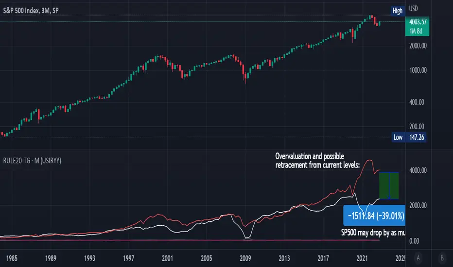
Rule Of 20 - Fair Value Estimation by Inflation & Earnings (TG)The Rule Of 20 is a heuristic calculation to find the fair value of an asset or market given its earnings and current inflation.
Its calculation is straightforward: the fair multiple of the price or price-to-earnings ratio of a stock should be 20 minus the rate of inflation.
In math terms: fair_price-to-earnings_ratio = (20 - inflation) ; fair_value = current_price * fair_price-to-earnings_ratio / real_price-to-earnings_ratio
For example, if a stock or index was trading on 11 times earnings and inflation was 2%, then the theory would be that the fair price-to-earnings ratio would be 20-2 = 18, which is much higher than the real price-to-earnings ratio of 11, and hence the asset would be undervalued.
Conversely, a market or company that was trading on 18 times price-to-earnings ration when inflation was 8% was seen as overvalued, because of the fair price-to-earnings ratio being 20-8=12, hence much lower than the real price-to-earnings ratio of 18.
We can then project the delta between the fair PE and real PE onto the asset's value to obtain the projected fair value, which may be a target of future value the asset may reach or hover around.
For example, as of 1st November 2022, SPX stood at 3871.97, with a PE ratio of 20.14 and an inflation in the US of 7.70. Using the Rule Of 20, we find that the fair PE ratio is 20-7.7=12.3, which is much lower than the current PE ratio of 20.14 by 39%! This may indicate a future possibility of a further downside risk by 39% from current valuation levels.
The origins of this rule are unknown, although the legendary US fund manager Peter Lynch is said to have been an active proponent when he was directing the Fidelity’s Magellan fund from 1977 to 1990.
For more infos about the Rule Of 20, reading this article is recommended: www.sharesmagazine.co.uk
This indicator implements the Rule Of 20 on any asset where the Financials are availble to TradingView, and also for the entire SP:SPX index as a way to assess the wider US stock market. Technically, the calculation is a bit different for the latter, as we cannot access earnings of SPX through Financials on TradingView, so we access it using the QUANDL:MULTPL/SP500_PE_RATIO_MONTH ticker instead.
By default are displayed:
current asset value in red
fair asset value according to the Rule Of 20 in white for SPX, or different shades of purple/maroon for other assets. Note that for SPX there is only one calculation, whereas for other assets there are multiple different ways to calculate earnings, so different fair values can be computed.
fair price-to-earnings ratio (PE ratio) in light grey.
real price-to-earnings ratio in darker grey.
This indicator can be used on SP:SPX ticker, and on most NASDAQ:* tickers, since they have Financials integrated in TradingView. Stocks tickers from other exchanges may not provide Financials data, so this indicator won't work then. If this happens, try to find the same ticker on NASDAQ instead.
Note that by default, only the US stock market is considered. If you want to consider stocks or assets in other regions of the world, please change the inflation ticker to a ticker that reflect the target region's inflation.
Also adding a table to ease interpretation was considered, but then the Timeframe MTF parameter would not work, and since the big advantage of this indicator is to allow for historical comparisons, the table was dropped.
Enjoy, and keep in mind that all models are wrong, but some are useful.
Trade safely!
TG
Price Correction to fix data manipulation and mispricingPrice Correction corrects for index and security mispricing to the extent possible in TradingView on both daily and intraday charts. Price correction addresses mispricing issues for specific securities with known issues, or the user can build daily candles from intraday data instead of relying on exchange reported daily OHLC prices, which can include both legitimate special auction and off-exchange trades or illegitimate mispricing. The user can also detect daily OHLC prices that don’t reflect the intraday price action within a specified percent deviation. Price Correction functions as normal candles or bars for any time frame when correction is not needed.
On the 4th of October 2022, the AMEX exchange, owned by the New York Stock Exchange, decided to misprice the daily OHLC data for the SPY, the world’s largest ETF fund. The exchange eliminated the overnight gap that should have occurred in the daily chart that represents regular trading hours by showing a wick connecting near the close of the previous day. Neither the SPX, the SP500 cash index that the SPY ETF tracks, nor other SPX ETFs such as VOO or IVV show such a wick because significant price action at that level never occurred. The intraday SPY chart never shows the price drop below 372.31 that day, but there is a wick that extends to 366.57. On the 6th of October, they continued this practice of using a wick that connects with the close of the previous day to eliminate gaps in daily price action. The objective of this indicator is to fix such inconsistent mispricing practices in the SPY, NYA, and other indices or securities.
Price Correction corrects for the daily mispricing in the SPY to agree with the price action that actually occurred in the SPX index it tracks, as well as the other SPX ETFs, by using intraday data. The chart below compares the Price Correction of the SPY (top) to the SPX (middle) and the original mispriced SPY (bottom) with incorrect wicks. Price correction (top) removes those incorrect wicks (bottom) to match the SPX (middle).
The daily mispricing of the SPY follows after the successful deployment of the NYSE Composite Index mispricing, NYA, an index that represents all common stocks within the New York Stock Exchange, the largest exchange in the world. The importance of the NYA should not be understated. It is the price counterpart to NYSE’s market internals or statistics. Beginning in 2021, the New York Stock Exchange eliminated gaps in daily OHLC data for the NYA by using the close of the previous day as the open for the following day, in violation of their own NYSE Index Series Methodology. The Methodology states for the opening price that “The first index level is calculated and published around 09:30 ET, when the U.S. equity markets open for their regular trading session. The calculation of that level utilizes the most updated prices available at that moment.” You can verify for yourself that this is simply not the case. The first update of the NYA price for each day matches the close of the previous day, not the “most updated prices available at that moment”, causing data providers to often represent the first intraday bar with a huge sudden price change when an overnight price change occurred instead. For example, on 13 Jun 2022, TradingView shows a one-minute bar drop 2.3%. With a market capitalization of roughly 23 trillion dollars, the NYSE composite capitalization did not suddenly drop a half-trillion dollars in just one minute as the intraday chart data would have you believe. All major US indices, index ETFs, and even foreign indices like the Toronto TAX, the Australian ASXAL, the Bombay SENSEX, and German DAX had down gaps that day, except for the mispriced NYSE index. Price Correction corrects for this mispricing in daily OHLC data, as shown in the main chart at the top of this page comparing the original NYA (top) to the Price Corrected NYA (bottom).
Price Correction also corrects for the intraday mispricing in the NYA. The chart below shows how the Price Correction (top) replaces the incorrect first one-minute candles with gaps (bottom) from 22 Sep 2022 to 29 Sep 2022. TradingView is inconsistent in how intraday data is reported for overnight gaps by sometimes connecting the first intraday bar of the day to the close of the previous day, and other times not. This inconsistency may be due to manually changing the intraday data based on user support tickets. For example, after reporting the lack of a major gap in the NYA daily OHLC prices that existed intraday for 13 Jun 2022, TradingView opted to remove the true gap in intraday prices by creating a 2.3% half-a-trillion-dollar one-minute bar that connected the close of the previous day to show a sudden drop in price that didn’t occur, instead of adding the gap in the daily OHLC data that actually took place from overnight price action.
Price Correction allows users to detect daily OHLC data that does not reflect the intraday price action within a certain percent difference by changing the color of those candles or bars that deviate. The chart below clearly shows the start of the NYSE disinformation campaign for NYA that started in 2021 by painting blue those candles with daily OHLC values that deviated from the intraday values by 0.1%. Before 2021, the number of deviating candles is relatively sparse, but beginning in 2021, the chart is littered with deviating candles.
If there are other index or security mispricing or data issues you are aware of that can be incorporated into Price Correction, please let me know. Accurate financial data is indispensable in making accurate financial decisions. Assert your right to accurate financial data by reporting incorrect data and mispricing issues.
How to use the Price Correction
Simply add this “indicator” to your chart and remove the mispriced default candles or bars by right clicking on the chart, selecting Settings, and de-selecting Body, Wick, and Border under the Symbol tab. The Presets settings automatically takes care of mispricing in the NYA and SPY to the extent possible in TradingView. The user can also build their own daily candles based off of intraday data to address other securities that may have mispricing issues.

MenthorQ Levels ConversionLevels Conversion helps traders accurately overlay price levels from spot/index ETFs and indices (like SPX, SPY, QQQ, NDX) onto futures charts (like ES, NQ, etc.).
Because futures and spot/index prices don’t trade at the same price, your levels will be misaligned if you plot them directly. Futures typically trade at a spread or ratio versus their related index/ETF. This indicator solves that by calculating the conversion ratio automatically, so your levels stay aligned on the futures chart.
How it works
This script calculates the ratio between Asset A and Asset B and applies it to convert levels from one instrument to the other (for example, SPX → ES, QQQ → NQ).
Ratio options (3 modes)
You can choose one of three ratio sources:
✅ T1 Ratio (Morning Snapshot)
Select a specific time to “lock” the ratio.
Default: 10:00 AM ET (morning session snapshot)
✅ T2 Ratio (Afternoon Snapshot)
Select a second time to “lock” the ratio.
Default: 3:30 PM ET (afternoon snapshot)
✅ Last Price Ratio (Live)
Uses the last traded price of both assets to compute the ratio.
Note: To refresh the “Last Price” baseline, simply remove and re-add the indicator.
Learn more about Levels Conversions: menthorq.com
Common levels conversions
Some popular use-cases include:
- SPX Gamma Levels → ES
- SPY Gamma Levels → ES
- QQQ Gamma Levels → NQ
- NDX Gamma Levels → NQ
- SPX Intraday Gamma Levels → ES
- QQQ Intraday Gamma Levels → NQ
- SPX Swing Trading Levels → ES
- QQQ Swing Trading Levels → NQ
- GLD Levels → GC
- DIA Levels → YM
- USO Levels → CL
- NVDA / MAG7 Levels → QQQ
Fabian Z-ScoreFabian Z-Score — % Distance & Z-Scores for SPX / DJI / XLU
What it does
This indicator measures how far three market proxies are from a moving average and standardizes those distances into z-scores so you can spot stretch/mean-reversion and relative out/under-performance.
Universe: S&P 500 (SPX), Dow Jones (DJI) and Utilities (XLU). You can change any of these in Inputs.
Anchor MA: user-selectable MA type (SMA/EMA/RMA/WMA/VWMA/HMA/LSMA/ALMA) and length (default 39; a popular weekly anchor).
Outputs
% from MA: 100 × (𝐶𝑙𝑜𝑠𝑒 − 𝑀𝐴) / 𝑀𝐴
Time-series Z: z-score of the last N % distances (default 39) → “how stretched vs its own history?”
Cross-sectional Z: z-score of each % distance within the trio on this bar → “who’s strongest vs the others right now?”
A compact mini table (top-right) shows the latest values for each symbol: % from MA, Z(ts) and Z(xsec).
Panels & Visualization
Toggle what you want to see in View:
Plot % distance — raw % above/below the MA (0% line shown).
Plot time-series Z — standardized stretch with ±Threshold guides (default ±2σ).
Plot cross-sectional Z — relative z across SPX, DJI, XLU (0 = at the trio’s mean).
Smoothing — optional light MA on the plotted series (set to 1 for none).
A price-panel Moving Average is drawn with your chosen type/length for visual context.
Colors: SPX = teal, DJI = orange, XLU = purple.
Alerts
Two built-in alert conditions (time-series Z only):
“Z(ts) crosses up +Thr” — any of the three crosses above +Threshold.
“Z(ts) crosses down -Thr” — any crosses below −Threshold.
When enabled, the chart background tints faint green (up cross) or red (down cross) on those bars.
How to use (ideas, not advice)
On weekly charts, a 39-length MA/Z lookback often captures major risk-on/off swings. (Fabian Timing)
Deep negative Z(ts) (e.g., ≤ −2σ or −3σ) frequently accompanies panic and mean-reversion setups.
High positive Z(ts) suggests over-extension; watch for momentum fades.
Cross-sectional Z helps rank leadership today:
Z(xsec) > 0 → stronger than the trio’s mean this bar; Z(xsec) < 0 → weaker.
Utilities (XLU) turning positive x-sec while the others are negative can hint at defensive rotation.
If all 3 are above 0, go long, if below 0 go cash.
Combine: look for extreme Z(ts) aligning with lead/lag Z(xsec) to time entries/exits or hedges.
Inputs (quick reference)
Symbols: SPX / DJI / XLU (editable).
MA type & length: SMA, EMA, RMA, WMA, VWMA, HMA, LSMA, ALMA; default EMA(39).
Z-score lookback (ts): default 39.
Smoothing on plots: default 1 (off).
Z threshold (±): default 2.0 (guide lines & alerts).

Money Flow Divergence IndicatorOverview
The Money Flow Divergence Indicator is designed to help traders and investors identify key macroeconomic turning points by analyzing the relationship between U.S. M2 money supply growth and the S&P 500 Index (SPX). By comparing these two crucial economic indicators, the script highlights periods where market liquidity is outpacing or lagging behind stock market growth, offering potential buy and sell signals based on macroeconomic trends.
How It Works
1. Data Sources
S&P 500 Index (SPX500USD): Tracks the stock market performance.
U.S. M2 Money Supply (M2SL - Federal Reserve Economic Data): Represents available liquidity in the economy.
2. Growth Rate Calculation
SPX Growth: Percentage change in the S&P 500 index over time.
M2 Growth: Percentage change in M2 money supply over time.
Growth Gap (Delta): The difference between M2 growth and SPX growth, showing whether liquidity is fueling or lagging behind market performance.
3. Visualization
A histogram displays the growth gap over time:
Green Bars: M2 growth exceeds SPX growth (potential bullish signal).
Red Bars: SPX growth exceeds M2 growth (potential bearish signal).
A zero line helps distinguish between positive and negative growth gaps.
How to Use It
✅ Bullish Signal: When green bars appear consistently, indicating that liquidity is outpacing stock market growth. This suggests a favorable environment for buying or holding positions.
❌ Bearish Signal: When red bars appear consistently, meaning stock market growth outpaces liquidity expansion, signaling potential overvaluation or a market correction.
Best Timeframes for Analysis
This indicator works best on monthly timeframes (M) since it is designed for long-term investors and macro traders who focus on broad economic cycles.
Who Should Use This Indicator?
📈 Long-term investors looking for macroeconomic trends.
📊 Swing traders who incorporate liquidity analysis in their strategies.
💰 Portfolio managers assessing market liquidity conditions.
🚀 Use this indicator to stay ahead of market trends and make informed investment decisions based on macroeconomic liquidity shifts! 🚀

GEX Profile [PRO] Real Auto-Updated Gamma Exposure Levels𝗥𝗲𝗮𝗹 𝗚𝗘𝗫 𝗟𝗲𝘃𝗲𝗹𝘀 𝘄𝗶𝘁𝗵 𝗦𝗲𝗮𝗺𝗹𝗲𝘀𝘀 𝗔𝘂𝘁𝗼-𝗨𝗽𝗱𝗮𝘁𝗲𝘀 𝗳𝗼𝗿 𝗼𝘃𝗲𝗿 𝟭𝟲𝟱+ 𝗼𝗳 𝘁𝗵𝗲 𝗠𝗼𝘀𝘁 𝗟𝗶𝗾𝘂𝗶𝗱 𝗨.𝗦. 𝗠𝗮𝗿𝗸𝗲𝘁 𝗦𝘆𝗺𝗯𝗼𝗹𝘀 (including 𝟬𝗗𝗧𝗘 𝗳𝗼𝗿 𝗦𝗣𝗫, SPY, QQQ, TLT, IWM, etc...)
🔃 Dynamic Updates : Receive precise GEX levels with auto-updating metrics up to 5 times a day throughout the trading session—no manual refresh needed!
🍒 Strategically Developed : Built by experienced options traders to meet the needs of serious options market participants.
🕒 0DTE? No Problem! : Designed with 0DTE traders in mind, our indicator keeps you updated with GEX levels and seamless auto-refresh to capture every crucial market shift.
📈 Optimized for Option Traders : See accurate GEX and NETGEX profiles for multiple expirations to maximize strategic potential.
🔶 Comprehensive GEX Levels
This indicator provides unparalleled insight into market dynamics with levels like Call/Put Support, Resistance, HVL (High Volatility Level), and Call/Put Walls. These levels are auto-updated based on live market movements and reflect gamma shifts and volatility signals essential for options traders.
🔶 Ideal for 0DTE and Multi-Leg Strategies
Track essential GEX levels across expirations with our unique Cumulative (⅀) and Selected Alone (⊙) calculation models. Customize your view to reveal high-impact levels across multiple expirations or focus on a specific expiration for a targeted strategy.
🔶 Coverage of 165+ Highly Liquid U.S. Symbols
Compatible with over 165 U.S. market symbols, including SP:SPX , AMEX:SPY , NASDAQ:QQQ , NASDAQ:TLT , AMEX:GLD , NASDAQ:NVDA , and more. The watchlist is expanding continuously to meet the needs of active traders. List of Compatible Symbols Available Here: www.tradingview.com
🔶How does the indicator work and why is it unique?
This is not just another GEX indicator. It incorporates 15min delayed option chain data from ORATS as data provider, processes and refines the delayed data package using pineseed, and sends it to TradingView, visualizing the key GEX levels using specific formulas (see detailed below). This method of incorporating options data into a visualization framework is unique and entirely innovative on TradingView.
Unlike other providers that only set GEX levels at market open, this indicator adjusts dynamically throughout the day, providing updated insights across the trading day and capturing gamma shifts as the market moves.
_________________________________
-----------------------------------------------
🌑 𝗗 𝗢 𝗖 𝗨 𝗠 𝗘 𝗡 𝗧 𝗔 𝗧 𝗜 𝗢 𝗡 🌑
-----------------------------------------------
_________________________________
🔶 Understanding GEX (Gamma Exposure) and Gamma Profiling
Gamma Exposure (GEX) is a crucial concept in options trading because it reveals how options market positions can influence the dynamics of asset prices. In essence, GEX measures the collective gamma exposure of options market participants, impacting overall market stability and price movements.
🔹 What is GEX?
At its core, GEX captures the aggregate impact of gamma, a key options Greek, which tells us how an option's delta changes in response to price movements in the underlying asset. Positive or negative GEX levels can reflect the collective bullish or bearish stance of the market:
Positive GEX (far above HVL) : Indicates a net bullish positioning by options holders. When GEX is strongly positive, it suggests that as the asset price increases, market participants might need to buy more of the asset to maintain their hedges. This behavior can fuel further upward momentum.
Negative GEX (far below HVL) : Implies a net bearish positioning. In a strongly negative GEX environment, declines in the asset's price might prompt participants to sell, potentially exacerbating the downward movement.
🔹 The Influence of GEX on Strike Prices and Expiration
A unique feature of GEX is its impact near expiration dates. As options approach expiration, GEX levels can “pin” the price to specific strike levels, where options positions are concentrated. This pinning effect arises as market makers adjust their hedging strategies, often causing the asset price to gravitate towards certain strike prices, where a large volume of options contracts sits.
🟨 Overview of our GEX Calculation Models for Options Traders 🟨
Our GEX indicator models were developed with serious options traders in mind, providing flexibility beyond typical GEX providers. We know that using GEX levels for multi-leg strategies, where the underlying doesn't need a strong trend to be profitable , calls for a nuanced approach that aligns with different trading horizons. Here’s a detailed breakdown of our GEX calculation models and how they support strategic trading across varying timeframes.
Thus, the HVL an orher CALL/PUT WALLS depends on the indicator's selected calculation mode and expiration. The NETGEX profile of the chosen expiration appears on the HVL line , which automatically updates five times during trading hours , except for 0DTE, which reflects the value set at market open.
🔶 Cumulative Expiration (⅀) Calculation Method
This method aggregates GEX data for all expirations up to the selected date , giving you a more comprehensive view of market dynamics. We recommend using this method, as it allows you to see how combined expirations impact GEX levels, which can be critical when setting up trades with a longer time horizon.
🔶 Selected Alone (⊙) Calculation Method
This option displays the GEX profile specific to only the chosen expiration , providing a unique, time-bound view. This approach is ideal for those seeking precise insight into how an individual expiration is performing without the broader context of other expirations.
🔶 Example of using calculation methods:
With options trading, especially for multi-leg strategies, choosing the right expiration and calculation model is crucial. Let’s break down an example:
Suppose you’re considering a Friday (4DTE) front-leg diagonal on the SPX at the start of the week. In this case, the focus isn’t strictly on any single expiration (like 0DTE or 4DTE individually), but rather on what might happen cumulatively by Friday across all expirations . Here, the Cumulative Expiration (⅀) model comes into play, as it shows you an aggregated view of the GEX profile, factoring in all strikes and legs for all expirations leading up to the selected date.
For most use cases, we recommend setting your indicator to the Cumulative (⅀) model , which provides a broad and insightful look at GEX levels across multiple expirations. However, you can always switch to Selected Alone (⊙) for targeted analysis of an individual expiration. Remember, 0DTE defaults to “Selected Alone”, and Every Expiry always shows a cumulative value by default.
_________________________________
-----------------------------------------------
🟦 HVL (High Volatility Level) 🟦
Also known as the Gamma FLIP level or Zero Gamma , it represents the price level at which the gamma environment transitions from positive to negative or vice versa. The High Volatility Level (HVL) is a critical point for understanding gamma shifts and anticipating volatility. This shift influences how market makers hedge their positions, potentially increasing or dampening market volatility.
🔷 Understanding the Gamma Flip and HVL
At its core, the gamma flip represents the point where market makers may transition from a net positive to a net negative gamma position, or the reverse. When prices move above HVL, gamma is positive, often leading to lower volatility due to the stabilizing effects of market makers’ hedging. Conversely, when prices drop below HVL, gamma flips negative, and hedging by market makers can amplify volatility as they trade with the direction of price movements.
The HVL (High Volatility Level) is particularly important as it signals a shift in the impact of price movements on the GEX profile. Using the cumulative calculation mode, GEX values are aggregated across all strikes and expirations up to the selected expiration, helping to pinpoint the point where the GEX curve's slope changes from negative to positive.
🔷 Implications for Traders and Market Makers
For market makers, crossing below HVL into a negative gamma zone means that they hedge in the same direction as price movements, potentially amplifying volatility. For traders, understanding HVL's role is essential to choosing strategies that align with the prevailing volatility regime:
Positive GEX 🟢:
Above HVL, where GEX is positive, market makers hedge by buying stocks as prices fall and selling as prices rise. This has a stabilizing effect, creating a lower-volatility environment.
Negative GEX 🔴:
Below HVL, where GEX is negative, market makers' hedging aligns with price movements, increasing volatility. Here, they buy as prices rise and sell as they fall, reinforcing price direction.
🔷 HVL as a Momentum and Volatility Indicator
The HVL offers traders insight into potential shifts in market momentum. For example, above HVL, if the price increases, Net GEX also rises, which stabilizes prices as market makers hedge in opposition to price direction. Below HVL, however, a price rise decreases Net GEX, creating conditions where market makers’ hedging amplifies price movements, resulting in a more volatile environment.
HVL also acts as a significant support level, often preceding put supports. If the price falls below this level, traders may expect heightened volatility and increased bearish sentiment.
Knowing the location of HVL is vital for positioning yourself on the right side of volatility. By monitoring the HVL, traders can better anticipate shifts in sentiment and align strategies with prevailing market dynamics.
_________________________________
-----------------------------------------------
🟩 Call Resistance and Call Wall Levels 🟩
In options trading, understanding GEX levels like Call Resistance and Call Wall levels is crucial for navigating potential price inflection points. Our indicator provides these levels directly on your chart, allowing you to customize and optimize your trading approach. Here’s a detailed guide to help you understand and use Call Resistance and additional Call Wall levels effectively.
🟢 Call Resistance Level
The Call Resistance Level is a key point where our model indicates heightened Call GEX concentration. This level serves as a potential resistance area where price movement may face a barrier, slowing or even reversing before a breakout. Here’s how the Call Resistance Level can influence market behavior:
Resistance and Price Reversal ⬇️ : Similar to the Put Support level, the Call Resistance acts as a "sticky" price level, where upward movement encounters resistance. When the price approaches this level, it’s common for market makers to begin shorting to maintain delta neutrality. This shorting activity, combined with the potential monetization of calls, introduces a technical bearish force in the short term, often causing the price to bounce downward.
Upside Acceleration Point ⬆️ : If investors reposition calls to higher strikes as the price reaches Call Resistance, this level can roll up, allowing the price to push upward and potentially accelerating the rally. This effect can drive the market to higher levels as market makers adjust their positions accordingly.
🟢 Additional Call Wall Levels
Our model identifies the second and third-highest Call GEX levels, known as additional Call Walls. These levels are often secondary resistance points but hold significance as they add layers of possible resistance or breakout points. They offer similar potential as the primary Call Resistance level, acting as either:
Resistance Zones: Slowing the price momentum as it approaches these levels.
Inflection Points for Upside Momentum: Allowing for a possible continuation of upward movement if prices break through.
🟢 How to Trade the Call Resistance Level
To use the Call Resistance level effectively, look for possible price rejections or consolidations as the price approaches this zone. Here are the main scenarios:
Bounce to Downside: As the price nears the Call Resistance level, market makers’ delta-hedging activity (through shorting) can turn this level into a short-term bearish force, leading to price pullbacks.
Rolling the Position: For bulls, a key objective at the Call Resistance level is to see investors roll their call positions higher, effectively moving the resistance up. This repositioning may lead to incremental price gains as the Call Resistance level rises with each roll.
_________________________________
-----------------------------------------------
🟥 Put Support and Put Wall Levels 🟥
In options trading, understanding GEX levels like Put Support and secondary Put Wall levels is essential for managing potential price support points and gauging downside risk. Our indicator places these levels directly on your chart, allowing for customization to enhance your trading strategy. Here’s a detailed guide to help you leverage the Put Support and additional Put Wall levels effectively.
🔴 Put Support Level
The Put Support Level is a key zone where our model shows the highest concentration of negative GEX, representing an area with substantial put option interest. This level functions as a potential support zone, where price may stabilize or bounce upward, or as an inflection point, signaling increased downside momentum. Here’s how the Put Support Level can affect market behavior:
Support and Price Reversal🔺 : Similar to how Call Resistance operates on the upside, the Put Support Level often acts as a "sticky" level on the downside, where price finds support. As the asset price moves closer to this level, market makers begin adjusting their positions, frequently buying to maintain delta neutrality. This activity can create a temporary short squeeze, pushing prices back up.
Downside Acceleration Point 🔻 : If the asset continues moving lower, triggering more hedging activity, this level can become a tipping point for accelerated downside momentum.
🔴 Additional Put Wall Levels
Our model also identifies the second and third-highest negative GEX levels, known as secondary Put Walls. These levels are often seen as secondary support points and hold significance by adding layers of support or potential downside inflection points. Like the primary Put Support Level, they can act in two ways:
Support Zones: Helping slow price declines as they approach these levels.
Downside Inflection Points: Allowing further price decline if the support fails.
🔴 How Investors Hedge with Put Options
Investors commonly use put options to hedge long positions and protect portfolios, especially during times of market stress when implied volatility rises. This demand for puts increases the Put Skew, as market makers short to remain delta hedged.
As prices approach the Put Support Level, the hedging activity often intensifies because more puts become At the Money (ATM) or In the Money (ITM). To realize the value of their hedges, investors typically monetize these puts at this level, triggering the closing of short positions by market makers and resulting in a price bounce.
🔴 The Role of Implied Volatility
Implied Volatility (IV) is also a critical factor since it directly influences market flows. If IV driving put flows decreases, market makers may buy back shorts, which contributes to the bounce at the Put Support Level. Additionally, another Greek, Vanna—representing changes in delta due to IV shifts—plays a vital role here. As IV changes, Vanna affects delta-hedging adjustments, adding a layer of complexity to understanding market makers' actions around these support levels.
🔴 Possible Price Scenarios at the Put Support Level
When the price reaches the Put Support Level, there are generally two scenarios:
Bounce to Upside🔺 : The Put Support Level is where substantial put hedging activity happens. As prices approach, market makers adjust their delta by buying, which can push prices back up.
Roll Positions🔻 : After monetizing puts, investors have two options: roll hedges to higher strikes if they expect a bullish move, or open new out-of-the-money puts at lower strikes. If new hedges are set at lower levels, the Put Support level may also shift lower, creating a new bearish force as market makers begin hedging these new positions.
🟨 Customizing Put Support/Call Resistance and Put/Call Wall Levels on Your Chart
Our indicator settings provide extensive customization options for displaying Put Support, Call Resistance, and Put/Call Wall levels.
You can:
adjust the depth to highlight the highest positive or negative NETGEX levels
choose to display relative data, show only the colored strike line
adjust the offset for enhanced visibility.
This flexibility helps you focus on the critical details that best align with your trading strategy, ensuring a clearer and more tailored view of the GEX levels on your chart.
Currently, we examine the top three levels with the highest positive and negative NETGEX values, allowing you to view seven key GEX levels on your chart (3 Call + 1 HVL + 3 Put). However, in the near future, we plan to expand this to seven levels per side, resulting in a total of up to 15 significant GEX levels on the chart instead of the current 7. This enhancement will cater to all needs, especially benefiting 0DTE traders.
_________________________________
-----------------------------------------------
🔶 ADDITIONAL IMPORTANT COMMENTS
🔹- Why is there a slight difference between the displayed data and other GEX provider's data like MenthorQ, GammaEdge, SpotGamma, GEXBot, etc?
There are two reasons for this, and one is beyond our control:
🔹 (1) Option-data update frequency:
According to TradingView's regulations and guidelines, we can update external data a maximum of 5 times per day. We strive to use these updates in the most optimal way:
(1st update) 15 minutes after U.S. market open
(2nd, 3rd, 4th updates) 1.5–3 hours during U.S. market open hours
(5th update) 10 minutes before U.S. market close.
You don’t need to refresh your window; our latest refreshed data pack is always automatically applied to your indicator. You can see the time elapsed since the last update by hovering over the HVL.
🔹 (2) GEX Levels with Intraday Updates Based on Price Movements
The TanukiTrade Options GEX Indicator for TradingView provides open interest data with a 15-minute delay after the market opens. Using this data, we calculate and update the relevant levels throughout the trading day, reflecting almost real-time price changes and gamma values. Unlike other GEX providers, who set their GEX levels solely at market open without further updates, we dynamically adjust our levels intraday to capture significant price shifts.
🔹 Automatic & Seamless Intraday Updates and Special Cases
For our indicator, the HVL (High Volatility Level) reflects the selected calculation mode and expiration. We update these NETGEX profiles five times throughout the trading day, with one exception: 0DTE data, which is set at market open and does not update intraday due to the rapid narrowing of gamma levels . Note that similar to other GEX providers, our 0DTE remains fixed at open, while cumulative values update during the day based on almost real-time market movements.
🔹Consistent SPX 0DTE GEX Levels with Morning Open Interest Updates Only
For SPX, the 0DTE (Zero Days to Expiration) options and GEX levels are calculated based on openinterest data provided by the clearinghouse at market open. Due to the exponential narrowing of gamma levels throughout the day, we do not update these levels intraday, unlike other expirations. Therefore, if you select the expiring contract on that day, you’ll see the exact morning level, as it was calculated at market open. This status is also published the previous evening, based on the data available then, so you can already view the levels for the following day’s 1DTE (next day’s 0DTE) before market close. After market open, around 15 minutes later, this level is updated with the latest open interest data and remains unchanged for the rest of the day. Other providers take a similar approach. We do not support intraday volume-based GEX calculations, as our benchmarks show this can produce misleading results.
Disclaimer:
Our option indicator uses approximately 15min-3 hour delayed option market snapshot data to calculate the main option metrics. Exact realtime option contract prices are never displayed; only derived GEX metrics are shown to ensure accurate and consistent visualization. Due to the above, this indicator can only be used for decision support; exclusive decisions cannot be made based on this indicator. We reserve the right to make errors.This indicator is designed for options traders who understand what they are doing. It assumes that they are familiar with options and can make well-informed, independent decisions. We work with paid delayed data and we are not a data provider; therefore, we do not bear any financial or other liability.

Statistical Package for the Trading Sciences [SS]
This is SPTS.
It stands for Statistical Package for the Trading Sciences.
Its a play on SPSS (Statistical Package for the Social Sciences) by IBM (software that, prior to Pinescript, I would use on a daily basis for trading).
Let's preface this indicator first:
This isn't so much an indicator as it is a project. A passion project really.
This has been in the works for months and I still feel like its incomplete. But the plan here is to continue to add functionality to it and actually have the Pinecoding and Tradingview community contribute to it.
As a math based trader, I relied on Excel, SPSS and R constantly to plan my trades. Since learning a functional amount of Pinescript and coding a lot of what I do and what I relied on SPSS, Excel and R for, I use it perhaps maybe a few times a week.
This indicator, or package, has some of the key things I used Excel and SPSS for on a daily and weekly basis. This also adds a lot of, I would say, fairly complex math functionality to Pinescript. Because this is adding functionality not necessarily native to Pinescript, I have placed most, if not all, of the functionality into actual exportable functions. I have also set it up as a kind of library, with explanations and tips on how other coders can take these functions and implement them into other scripts.
The hope here is that other coders will take it, build upon it, improve it and hopefully share additional functionality that can be added into this package. Hence why I call it a project. Okay, let's get into an overview:
Current Functions of SPTS:
SPTS currently has the following functionality (further explanations will be offered below):
Ability to Perform a One-Tailed, Two-Tailed and Paired Sample T-Test, with corresponding P value.
Standard Pearson Correlation (with functionality to be able to calculate the Pearson Correlation between 2 arrays).
Quadratic (or Curvlinear) correlation assessments.
R squared Assessments.
Standard Linear Regression.
Multiple Regression of 2 independent variables.
Tests of Normality (with Kurtosis and Skewness) and recognition of up to 7 Different Distributions.
ARIMA Modeller (Sort of, more details below)
Okay, so let's go over each of them!
T-Tests
So traditionally, most correlation assessments on Pinescript are done with a generic Pearson Correlation using the "ta.correlation" argument. However, this is not always the best test to be used for correlations and determine effects. One approach to correlation assessments used frequently in economics is the T-Test assessment.
The t-test is a statistical hypothesis test used to determine if there is a significant difference between the means of two groups. It assesses whether the sample means are likely to have come from populations with the same mean. The test produces a t-statistic, which is then compared to a critical value from the t-distribution to determine statistical significance. Lower p-values indicate stronger evidence against the null hypothesis of equal means.
A significant t-test result, indicating the rejection of the null hypothesis, suggests that there is statistical evidence to support that there is a significant difference between the means of the two groups being compared. In practical terms, it means that the observed difference in sample means is unlikely to have occurred by random chance alone. Researchers typically interpret this as evidence that there is a real, meaningful difference between the groups being studied.
Some uses of the T-Test in finance include:
Risk Assessment: The t-test can be used to compare the risk profiles of different financial assets or portfolios. It helps investors assess whether the differences in returns or volatility are statistically significant.
Pairs Trading: Traders often apply the t-test when engaging in pairs trading, a strategy that involves trading two correlated securities. It helps determine when the price spread between the two assets is statistically significant and may revert to the mean.
Volatility Analysis: Traders and risk managers use t-tests to compare the volatility of different assets or portfolios, assessing whether one is significantly more or less volatile than another.
Market Efficiency Tests: Financial researchers use t-tests to test the Efficient Market Hypothesis by assessing whether stock price movements follow a random walk or if there are statistically significant deviations from it.
Value at Risk (VaR) Calculation: Risk managers use t-tests to calculate VaR, a measure of potential losses in a portfolio. It helps assess whether a portfolio's value is likely to fall below a certain threshold.
There are many other applications, but these are a few of the highlights. SPTS permits 3 different types of T-Test analyses, these being the One Tailed T-Test (if you want to test a single direction), two tailed T-Test (if you are unsure of which direction is significant) and a paired sample t-test.
Which T is the Right T?
Generally, a one-tailed t-test is used to determine if a sample mean is significantly greater than or less than a specified population mean, whereas a two-tailed t-test assesses if the sample mean is significantly different (either greater or less) from the population mean. In contrast, a paired sample t-test compares two sets of paired observations (e.g., before and after treatment) to assess if there's a significant difference in their means, typically used when the data points in each pair are related or dependent.
So which do you use? Well, it depends on what you want to know. As a general rule a one tailed t-test is sufficient and will help you pinpoint directionality of the relationship (that one ticker or economic indicator has a significant affect on another in a linear way).
A two tailed is more broad and looks for significance in either direction.
A paired sample t-test usually looks at identical groups to see if one group has a statistically different outcome. This is usually used in clinical trials to compare treatment interventions in identical groups. It's use in finance is somewhat limited, but it is invaluable when you want to compare equities that track the same thing (for example SPX vs SPY vs ES1!) or you want to test a hypothesis about an index and a leveraged share (for example, the relationship between FNGU and, say, MSFT or NVDA).
Statistical Significance
In general, with a t-test you would need to reference a T-Table to determine the statistical significance of the degree of Freedom and the T-Statistic.
However, because I wanted Pinescript to full fledge replace SPSS and Excel, I went ahead and threw the T-Table into an array, so that Pinescript can make the determination itself of the actual P value for a t-test, no cross referencing required :-).
Left tail (Significant):
Both tails (Significant):
Distributed throughout (insignificant):
As you can see in the images above, the t-test will also display a bell-curve analysis of where the significance falls (left tail, both tails or insignificant, distributed throughout).
That said, I have not included this function for the paired sample t-test because that is a bit more nuanced. But for the one and two tailed assessments, the indicator will provide you the P value.
Pearson Correlation Assessment
I don't think I need to go into too much detail on this one.
I have put in functionality to quickly calculate the Pearson Correlation of two array's, which is not currently possible with the "ta.correlation" function.
Quadratic (Curvlinear) Correlation
Not everything in life is linear, sometimes things are curved!
The Pearson Correlation is great for linear assessments, but tends to under-estimate the degree of the relationship in curved relationships. There currently is no native function to t-test for quadratic/curvlinear relationships, so I went ahead and created one.
You can see an example of how Quadratic and Pearson Correlations vary when you look at CME_MINI:ES1! against AMEX:DIA for the past 10 ish months:
Pearson Correlation:
Quadratic Correlation:
One or the other is not always the best, so it is important to check both!
R-Squared Assessments:
The R-squared value, or the square of the Pearson correlation coefficient (r), is used to measure the proportion of variance in one variable that can be explained by the linear relationship with another variable. It represents the goodness-of-fit of a linear regression model with a single predictor variable.
R-Squared is offered in 3 separate forms within this indicator. First, there is the generic R squared which is taking the square root of a Pearson Correlation assessment to assess the variance.
The next is the R-Squared which is calculated from an actual linear regression model done within the indicator.
The first is the R-Squared which is calculated from a multiple regression model done within the indicator.
Regardless of which R-Squared value you are using, the meaning is the same. R-Square assesses the variance between the variables under assessment and can offer an insight into the goodness of fit and the ability of the model to account for the degree of variance.
Here is the R Squared assessment of the SPX against the US Money Supply:
Standard Linear Regression
The indicator contains the ability to do a standard linear regression model. You can convert one ticker or economic indicator into a stock, ticker or other economic indicator. The indicator will provide you with all of the expected information from a linear regression model, including the coefficients, intercept, error assessments, correlation and R2 value.
Here is AAPL and MSFT as an example:
Multiple Regression
Oh man, this was something I really wanted in Pinescript, and now we have it!
I have created a function for multiple regression, which, if you export the function, will permit you to perform multiple regression on any variables available in Pinescript!
Using this functionality in the indicator, you will need to select 2, dependent variables and a single independent variable.
Here is an example of multiple regression for NASDAQ:AAPL using NASDAQ:MSFT and NASDAQ:NVDA :
And an example of SPX using the US Money Supply (M2) and AMEX:GLD :
Tests of Normality:
Many indicators perform a lot of functions on the assumption of normality, yet there are no indicators that actually test that assumption!
So, I have inputted a function to assess for normality. It uses the Kurtosis and Skewness to determine up to 7 different distribution types and it will explain the implication of the distribution. Here is an example of SP:SPX on the Monthly Perspective since 2010:
And NYSE:BA since the 60s:
And NVDA since 2015:
ARIMA Modeller
Okay, so let me disclose, this isn't a full fledge ARIMA modeller. I took some shortcuts.
True ARIMA modelling would involve decomposing the seasonality from the trend. I omitted this step for simplicity sake. Instead, you can select between using an EMA or SMA based approach, and it will perform an autogressive type analysis on the EMA or SMA.
I have tested it on lookback with results provided by SPSS and this actually works better than SPSS' ARIMA function. So I am actually kind of impressed.
You will need to input your parameters for the ARIMA model, I usually would do a 14, 21 and 50 day EMA of the close price, and it will forecast out that range over the length of the EMA.
So for example, if you select the EMA 50 on the daily, it will plot out the forecast for the next 50 days based on an autoregressive model created on the EMA 50. Here is how it looks on AMEX:SPY :
You can also elect to plot the upper and lower confidence bands:
Closing Remarks
So that is the indicator/package.
I do hope to continue expanding its functionality, but as of now, it does already have quite a lot of functionality.
I really hope you enjoy it and find it helpful. This. Has. Taken. AGES! No joke. Between referencing my old statistics textbooks, trying to remember how to calculate some of these things, and wanting to throw my computer against the wall because of errors in the code, this was a task, that's for sure. So I really hope you find some usefulness in it all and enjoy the ability to be able to do functions that previously could really only be done in external software.
As always, leave your comments, suggestions and feedback below!
Take care!
Market InternalsMarket internals can be a powerful tool for determining future moves, overall trend health and provide a means of directional confidence.
This indicator watches a handful of SPX and US stocks based internals to determine key areas of sentiment changes, the internals monitored are:
US Stocks Ticks
Call and Put SPX Volume
SPX Gamma Dispersion
US Stocks Ask and Big Volume
US Stocks Advancing and Declining Issues
Each time there's a bullish or bearish sentiment change it will be market with green/red flag and a single letter that identifies what market internal has changed.
SPX gamma dispersion events aren't to be considered directional from historical observations made but can be a sign of liquidity adjustments and when paired with any of the other aforementioned internals sentiment changes can be used as a powerful signal.
If it's observed that market internals are changing erratically then it's a clear indication of market chop and best to wait for cleaner trends.
Future updates may include non-SPX based internals analysis, change in display, alerts/alertconditions and more. Feel free to comment with any desired changes and we can discuss!
TradeChartist Drifter™𝗧𝗿𝗮𝗱𝗲𝗖𝗵𝗮𝗿𝘁𝗶𝘀𝘁 𝗗𝗿𝗶𝗳𝘁𝗲𝗿 is an adeptly designed, functional and a visual indicator that plots trend-following Support and Resistance walls by employing the concepts of Trend-based Support and Resistance, Momentum and Volatility, based on user defined lookback length, and includes three extremely useful Visualizers - Drift Bands Visualizer , Drift Strength Visualizer and Drifter AutoFibs Visualizer to help visualize the Price action in relation to the Support and Resistance Walls.
===================================================================================================================
™𝗧𝗿𝗮𝗱𝗲𝗖𝗵𝗮𝗿𝘁𝗶𝘀𝘁 𝗗𝗿𝗶𝗳𝘁𝗲𝗿 𝗨𝘀𝗲𝗿 𝗠𝗮𝗻𝘂𝗮𝗹
===================================
Concept of Drift
™TradeChartist Drifter combines concepts of Trend-based Support and Resistance, Momentum and Volatility to plot continuous Drifter Support and Resistance Walls that encloses the price action ( Drift ) within it (If the source price is price candle/bar based price like open,close,high,low,hl2,hl3 or ohlc4). In fact, these walls are generated by the price action ( Drift ) itself and helps the user see the price trend clearly as price makes higher highs/lows and lower highs/lows.
The Drifter walls are based on the user defined lookback length which can be changed in the Lᴇɴɢᴛʜ ғᴏʀ Dʀɪғᴛᴇʀ Wᴀʟʟs input box.
Drifter walls can be viewed or hidden by enabling or disabling 𝐒𝐡𝐨𝐰 𝐃𝐫𝐢𝐟𝐭𝐞𝐫 𝐖𝐚𝐥𝐥𝐬 .
Price Highs and Lows breaching the Drifter Walls can be viewed or hidden by enabling or disabling Sʜᴏᴡ Dʀɪғᴛᴇʀ Hɪɢʜs ᴀɴᴅ Lᴏᴡs .
Understanding and Visualizing ( Drift ) is important as it helps traders see the price action clearly. Price Volatility, Trend and Momentum are dependent on the period they are analysed. In order to visualize the drift, the user must enter the number of bars lookback in the Dʀɪғᴛ Lᴏᴏᴋʙᴀᴄᴋ input box.
===================================================================================================================
Three Types of Visualizers
One of the three types of Visualizers can be selected from Vɪsᴜᴀʟɪᴢᴇʀ Tʏᴘᴇ dropdown.
Drifter AutoFibs Visualizer is dependent on the Lᴇɴɢᴛʜ ғᴏʀ Dʀɪғᴛᴇʀ Wᴀʟʟs only as it fills the Drifter with Automatic Fibonacci Levels based on the distance between the Drifter Walls.
Drift Strength Visualizer is dependent on the Dʀɪғᴛ Lᴏᴏᴋʙᴀᴄᴋ only as it detects the Drift Strength based on Drift length. This Visualizer detects the Bull and the Bear zones based on the lookback. This helps visualize the Trend and Momentum clearly as the zones are filled with user selected theme based Bull and Bear colours.
Drift Bands Visualizer plots Drift Bands based on either Average True Range (ATR) or Standard Deviation along with the Bull or Bear Trend clearly shown using the color of the Mean or Basis line of the Drift Bands.
===================================================================================================================
╔═════════ 𝗗𝗿𝗶𝗳𝘁 𝗕𝗮𝗻𝗱𝘀 ══════════╗
Drift Bands are based on either ATR or Standard Deviation and consists of an Upper Band, a Lower Bands and a Mean or Basis Line. Drift Bands are extremely effective and highly useful in spotting the trend as the breakout from the upper or the lower band signals a change in the Drift based on the Dʀɪғᴛ Lᴏᴏᴋʙᴀᴄᴋ .
Note: The Mean or the Basis line of the Drift Bands depends only on the Dʀɪғᴛ Lᴏᴏᴋʙᴀᴄᴋ and Sᴏᴜʀᴄᴇ price. To plot Drift Bands based on external source, enable Usᴇ Sᴏᴜʀᴄᴇ Pʀɪᴄᴇ . The Width of the Bands is affected by ATR or Standard Deviation, based on the user preference.
ATR based Drift Bands
To plot ATR based Drift bands, enable 𝐀𝐓𝐑 𝐁𝐚𝐧𝐝𝐬 - Uɴᴄʜᴇᴄᴋ ғᴏʀ Sᴛᴀɴᴅᴀʀᴅ Dᴇᴠɪᴀᴛɪᴏɴ . ATR period is automatic. The ATR factor or the ATR multiplier can be changed in ATR Mᴜʟᴛɪᴘʟɪᴇʀ (ғᴏʀ ᴀᴛʀ ʙᴀsᴇᴅ ʙᴀɴᴅs (Default - 1, Min - 0.5, Max - 3). Higher ATR multiplier increases the width of the Drift Bands.
Note: In most cases, higher ATR multiplier of 2 or 3 increases Risk, but also results in increased Gains.
Standard Deviation based Drift Bands
To plot Standard Deviation bases Drift Bands, disable 𝐀𝐓𝐑 𝐁𝐚𝐧𝐝𝐬 - Uɴᴄʜᴇᴄᴋ ғᴏʀ Sᴛᴀɴᴅᴀʀᴅ Dᴇᴠɪᴀᴛɪᴏɴ . Both Sᴛᴀɴᴅᴀʀᴅ Dᴇᴠɪᴀᴛɪᴏɴ Lᴇɴɢᴛʜ (Default - 55, Min - 13) and Sᴛᴀɴᴅᴀʀᴅ Dᴇᴠɪᴀᴛɪᴏɴ Mᴜʟᴛɪᴘʟɪᴇʀ (Default - 1, Min - 0.236, Max - 2) affect the width of the Bands. Higher Standard Deviation Multiplier increases the Volatility of the Drift Bands.
Note: In most cases, higher Standard Deviation multiplier increases Risk, but also results in increased Gains.
Tip : To plot Bull and Bear Drift Zones, enable 𝐃𝐫𝐢𝐟𝐭 𝐙𝐨𝐧𝐞𝐬 𝐁𝐚𝐜𝐤𝐠𝐫𝐨𝐮𝐧𝐝 𝐅𝐢𝐥𝐥 and this can be used as Trade zones as this will be in sync with the trend colour of Mean line of the Drift Bands.
===================================================================================================================
╔═══════ 𝗗𝗿𝗶𝗳𝘁𝗲𝗿 𝗔𝗲𝘀𝘁𝗵𝗲𝘁𝗶𝗰𝘀 ═══════╗
There are two themes (Chilli and Flame) to choose from for the colour schemes of Drifter under 𝗗𝗿𝗶𝗳𝘁𝗲𝗿 𝗧𝗵𝗲𝗺𝗲 dropdown.
Dʀɪғᴛᴇʀ Bᴀᴄᴋɢʀᴏᴜɴᴅ Fɪʟʟ plots Bull and Bear strength based background fill between the Drifter walls. This is disabled for Drifter AutoFibs Visualizer .
There are two types of background fills namely, Mean Reversion and Trend Following and can be selected from Bᴀᴄᴋɢʀᴏᴜɴᴅ Fɪʟʟ Tʏᴘᴇ dropdown.
Enabling Dʀɪғᴛᴇʀ Cᴏʟᴏᴜʀ Bᴀʀs paints the price bars with the Drifter background fill.
Note: Trend Following fill is dependent on Dʀɪғᴛ Lᴏᴏᴋʙᴀᴄᴋ .
===================================================================================================================
Alerts
Alerts can be created for Long and Short entries by using Once Per Bar Close as Alert Frequency. Entries are generated on Real time bars based on Drift Bands Breakout conditions. It is recommended to wait for bar close before taking a position based on Drift Bands Trade Entries.
The indicator does not repaint and can be confidently used for alerts and trade entries without worrying about signals disappearing.
™TradeChartist Drifter can also be connected to ™TradeChartist Plug and Trade using 𝗗𝗿𝗶𝗳𝘁𝗲𝗿 𝗧𝗿𝗲𝗻𝗱 𝗜𝗱𝗲𝗻𝘁𝗶𝗳𝗶𝗲𝗿 as Oscillatory Signal to generate entries along with Targets, Stop Loss plots etc. Target and Stop Loss alerts can be created using Plug and Trade's Alerts system.
===================================================================================================================
There are several combinations of settings that can be tested on the security traded based on timeframe and risk/reward expectations. The indicator can be used for trade entries with various Drift Bands settings. Following are a few examples using the Drifter.
===================================================================================================================
Example Charts
1. SPX 1hr chart using Drifter AutoFibs Visualizer based on 100 period lookback for Drifter Walls.
2. SPX 1hr chart using Drift Strength Visualizer based on 100 period Drift Lookback.
3. SPX 1hr chart using 100 period ATR (Multiplier - 1) based Drift Bands Visualizer with Drift Zones Background Fill.
4. SPX 1hr chart using 50 period ATR (Multiplier - 1) based Drift Bands Visualizer with Drift Zones Background Fill.
5. SPX 1hr chart using 50 period Standard Deviation (Length - 21, Multiplier - 2) based Drift Bands Visualizer with Drift Zones Background Fill.
6. EUR-USD 1hr chart using 34 period ATR (Multiplier - 3) based Drift Bands Visualizer with Drift Zones Background Fill.
7. BTC-USD 5m chart using 34 period ATR (Multiplier - 3) based Drift Bands Visualizer connected to ™TradeChartist Intensity Equilibrium Line.
8. BTC-USD 5m chart using 34 period ATR (Multiplier - 3) based Drift Bands Visualizer connected to ™TradeChartist Intensity Equilibrium Line + Connected to ™TradeChartist Plug and Trade
===================================================================================================================
Best Practice: Test with different settings first using Paper Trades before trading with real money
===================================================================================================================
This is not a free to use indicator. Get in touch with me (PM me directly if you would like trial access to test the indicator)
Premium Scripts - Trial access and Information
Trial access offered on all Premium scripts.
PM me directly to request trial access to the scripts or for more information.
===================================================================================================================
Correlative Move IndicatorEDIT: When loading this indicator it uses a default symbol for comparison of SPX. On Tradingview SPX is a Daily price (unless you buy real time) so you will see "Loading ..." and never see data. Move out to a daily time frame -or- switch the symbol to something available intraday. /EDIT
Correlates the movement of the price you are graphing to the price of someting else that you pick (default is SPX, see EDIT above)
Comments in code explain what I did. If correlations are too tight for CC to show anything but a flat line try this.
Please comment / improve.
=====================
// A simple indicator that looks complex (impress your friends)
// Provides rate of change in the propensity of something
// to move in correlation with whatever you are graphing.
// Inputs are:
// "Compared symbol" - standard Trading View symbol input. You can input ratios & formulas if you like; Defaults to SPX
// "Invert?" - by default the indicator shows the item you have charted as numerator and the "Compared symbol"
// the denominator. So if you graphed "UVXY" and open this indicator with default compared symbol "SPX" then
// the base relationship is UVXY/SPX. Click the box if you want SPX/UVXY (for example) instead.
// "Fast EMA Period" - the period for the fast EMA (white line). default = 7
// "Slow EMA Period" - the period for the slow EMA (black line). default = 27. Important: the bakground color of the indicator
// changes based on this EMA hitting threshold values below.
// "+ threshold" - > threshold for green background. default = 1.0
// "- threshold" - < threshold for red background. default = 0.99
// "BBand Period" - number of periods back for BBand (1 std deviation) calculation. default = 15
// Does not measure correlation per se - it measures change in that correlation.
// If two things do not correlate well in the first place then you will see a lot of noise
// and I wish you much luck in interpreting it.
// However, if two things do correlate well (like VXX and VIX) then this will help you detect
// circumstances where that correlation is unstable. Such instability can signal change in direction.
// I developed it to track real time changes in contango / backwardation in various VIX futures instruments which I trade.
// Tip - always try invert - sometimes the correlation changes become clearer. That can be because the threshold bias
// towards "+" with the defaults here, so think about what the "logical" relationship is and adjust the thresholds, or invert,
// or do both. Just remember - the indicator is below the item you are charting, so the default "source"/"compared"
// relationship is intuitive as you look at the screen. Volatility traders, however, will find "invert" useful with default
// thresholds signalling "green" for contango and "red" for backwardation.
// Short and long ema trends added for smoothing and trend change indications.
// Background color changes to green when correlation changing "positively" and red when "negatively" and white when near 1.
// Think of the value "1" as representing the base "1 to 1" correlation between two things. That doesn't mean same price -
// it means same rate and direction in change in price.
// 1 std deviation is used to build a basic Bollinger Band in blue. The number of periods for calculating that is an input.
// You may find a change in correlation signal outside a Bollinger Band signals a direction change. TV alerts can be
// set for such events.
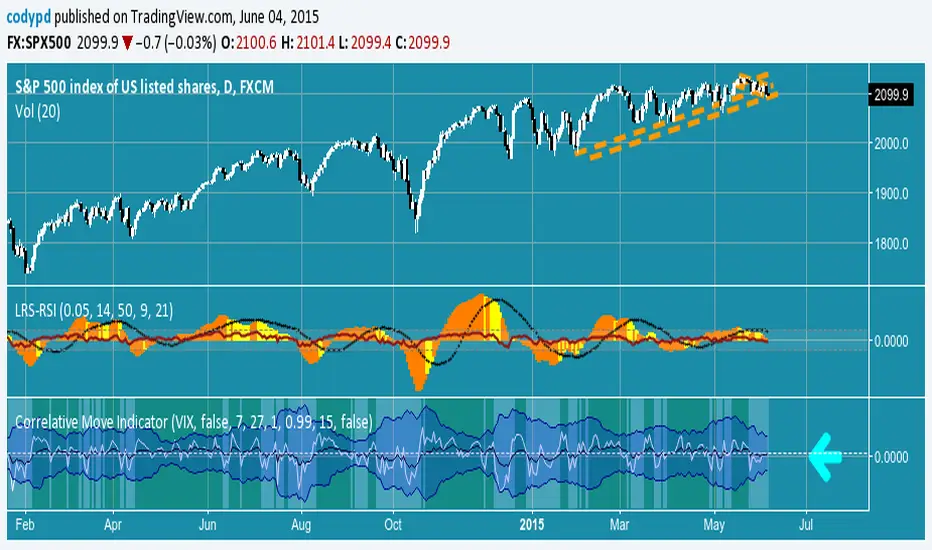
Swing Trading IndicatorThis script is a swing‑trading dashboard designed for BTC, ETH, S&P 500 (for now). It combines weekly RSI, USDT.D, VIX, moving averages and Fisher Transform into a single visual tool, with background highlights, an on‑chart info table and ready‑made alerts to help you time high‑probability swing entries and manage risk.
1. Overview
The indicator is intended to work on daily timeframe.
Signals are context‑aware: BTC and ETH get USDT.D conditions, SPX gets VIX and EMA‑100 logic, and all non‑ETH symbols can also use Fisher Transform as a mean‑reversion filter.
2. Conditions and background highlights
Each component sets a boolean condition and, when active, paints a background layer:
Weekly RSI condition
True when weekly RSI is below its symbol‑specific threshold.
USDT.D conditions
BTC: triggered when USDT.D is above the user threshold and the chart symbol is BTC.
ETH: same logic for ETH, but tracked separately..
VIX condition (SPX only)
True when VIX high is at or above the VIX threshold while the chart is SPX.
EMA condition (BTC & SPX)
BTC: daily close below EMA‑200.
SPX: daily close below EMA‑100.
Fisher Transform condition (non‑ETH)
Fisher Transform on the chart timeframe, using the configured period.
True when Fisher value is below the Fisher threshold.
3. Intended use and notes
This indicator is designed as a confluence tool for swing traders, not a standalone buy/sell system. It works best on assets that are in a clear uptrend, where the main idea is to accumulate during corrections within that broader bullish structure.
During larger market shocks, deep corrections, or black‑swan events, trend‑based and mean‑reversion filters can produce false signals, because volatility and correlations often behave abnormally in those periods. For that reason, this script should always be combined with independent risk management, higher‑timeframe trend analysis, and your own discretion.

Z-score RegimeThis indicator compares equity behaviour and credit behaviour by converting both into z-scores. It calculates the z-score of SPX and the z-score of a credit proxy based on the HYG divided by LQD ratio.
SPX z-score shows how far the S&P 500 is from its rolling average.
Credit z-score shows how risk-seeking or risk-averse credit markets are by comparing high-yield bonds to investment-grade bonds.
When both z-scores move together, the market is aligned in either risk-on or risk-off conditions.
When SPX z-score is strong but credit z-score is weak, this may signal equity strength that is not supported by credit markets.
When credit z-score is stronger than SPX z-score, credit markets may be leading risk appetite.
The indicator plots the two z-scores as simple lines for clear regime comparison.

Correlation HeatMap [TradingFinder] Sessions Data Science Stats🔵 Introduction
n financial markets, correlation describes the statistical relationship between the price movements of two assets and how they interact over time. It plays a key role in both trading and investing by helping analyze asset behavior, manage portfolio risk, and understand intermarket dynamics. The Correlation Heatmap is a visual tool that shows how the correlation between multiple assets and a central reference asset (the Main Symbol) changes over time.
It supports four market types forex, stocks, crypto, and a custom mode making it adaptable to different trading environments. The heatmap uses a color-coded grid where warmer tones represent stronger negative correlations and cooler tones indicate stronger positive ones. This intuitive color system allows traders to quickly identify when assets move together or diverge, offering real-time insights that go beyond traditional correlation tables.
🟣 How to Interpret the Heatmap Visually ?
Each cell represents the correlation between the main symbol and one compared asset at a specific time.
Warm colors (e.g. red, orange) suggest strong negative correlation as one asset rises, the other tends to fall.
Cool colors (e.g. blue, green) suggest strong positive correlation both assets tend to move in the same direction.
Lighter shades indicate weaker correlations, while darker shades indicate stronger correlations.
The heatmap updates over time, allowing users to detect changes in correlation during market events or trading sessions.
One of the standout features of this indicator is its ability to overlay global market sessions such as Tokyo, London, New York, or major equity opens directly onto the heatmap timeline. This alignment lets traders observe how correlation structures respond to real-world session changes. For example, they can spot when assets shift from being inversely correlated to moving together as a new session opens, potentially signaling new momentum or macro flow. The customizable symbol setup (including up to 20 compared assets) makes it ideal not only for forex and crypto traders but also for multi-asset and sector-based stock analysis.
🟣 Use Cases and Advantages
Analyze sector rotation in equities by tracking correlation to major indices like SPX or DJI.
Monitor altcoin behavior relative to Bitcoin to find early entry opportunities in crypto markets.
Detect changes in currency alignment with DXY across trading sessions in forex.
Identify correlation breakdowns during market volatility, signaling possible new trends.
Use correlation shifts as confirmation for trade setups or to hedge multi-asset exposure
🔵 How to Use
Correlation is one of the core concepts in financial analysis and allows traders to understand how assets behave in relation to one another. The Correlation Heatmap extends this idea by going beyond a simple number or static matrix. Instead, it presents a dynamic visual map of how correlations shift over time.
In this indicator, a Main Symbol is selected as the reference point for analysis. In standard modes such as forex, stocks, or crypto, the symbol currently shown on the main chart is automatically used as the main symbol. This allows users to begin correlation analysis right away without adjusting any settings.
The horizontal axis of the heatmap shows time, while the vertical axis lists the selected assets. Each cell on the heatmap shows the correlation between that asset and the main symbol at a given moment.
This approach is especially useful for intermarket analysis. In forex, for example, tracking how currency pairs like OANDA:EURUSD EURUSD, FX:GBPUSD GBPUSD, and PEPPERSTONE:AUDUSD AUDUSD correlate with TVC:DXY DXY can give insight into broader capital flow.
If these pairs start showing increasing positive correlation with DXY say, shifting from blue to light green it could signal the start of a new phase or reversal. Conversely, if negative correlation fades gradually, it may suggest weakening relationships and more independent or volatile movement.
In the crypto market, watching how altcoins correlate with Bitcoin can help identify ideal entry points in secondary assets. In the stock market, analyzing how companies within the same sector move in relation to a major index like SP:SPX SPX or DJ:DJI DJI is also a highly effective technique for both technical and fundamental analysts.
This indicator not only visualizes correlation but also displays major market sessions. When enabled, this feature helps traders observe how correlation behavior changes at the start of each session, whether it's Tokyo, London, New York, or the opening of stock exchanges. Many key shifts, breakouts, or reversals tend to happen around these times, and the heatmap makes them easy to spot.
Another important feature is the market selection mode. Users can switch between forex, crypto, stocks, or custom markets and see correlation behavior specific to each one. In custom mode, users can manually select any combination of symbols for more advanced or personalized analysis. This makes the heatmap valuable not only for forex traders but also for stock traders, crypto analysts, and multi-asset strategists.
Finally, the heatmap's color-coded design helps users make sense of the data quickly. Warm colors such as red and orange reflect stronger negative correlations, while cool colors like blue and green represent stronger positive relationships. This simplicity and clarity make the tool accessible to both beginners and experienced traders.
🔵 Settings
Correlation Period: Allows you to set how many historical bars are used for calculating correlation. A higher number means a smoother, slower-moving heatmap, while a lower number makes it more responsive to recent changes.
Select Market: Lets you choose between Forex, Stock, Crypto, or Custom. In the first three options, the chart’s active symbol is automatically used as the Main Symbol. In Custom mode, you can manually define the Main Symbol and up to 20 Compared Symbols.
Show Open Session: Enables the display of major trading sessions such as Tokyo, London, New York, or equity market opening hours directly on the timeline. This helps you connect correlation shifts with real-world market activity.
Market Mode: Lets you select whether the displayed sessions relate to the forex or stock market.
🔵 Conclusion
The Correlation Heatmap is a robust and flexible tool for analyzing the relationship between assets across different markets. By tracking how correlations change in real time, traders can better identify alignment or divergence between symbols and gain valuable insights into market structure.
Support for multiple asset classes, session overlays, and intuitive visual cues make this one of the most effective tools for intermarket analysis.
Whether you’re looking to manage portfolio risk, validate entry points, or simply understand capital flow across markets, this heatmap provides a clear and actionable perspective that you can rely on.

Macro Context v1 - NobruzeraaaHMacro Context v1
Advanced Multi-Asset Correlation Analysis for Professional Trading
"In institutional trading, correlation is king. This panel puts the crown on your charts."
Overview
This is a sophisticated real-time market analysis tool that monitors critical institutional correlations across traditional and cryptocurrency markets. This indicator provides traders with actionable insights based on academic research and institutional trading patterns.
Features
- **Multi-Asset Correlation Engine**
- **13 Advanced Analysis Layers** covering macro, crypto, and institutional flows
- **Real-time Correlation Detection** between BTC, equities, bonds, and commodities
- **Institutional Divergence Alerts** for early trend identification
- **Risk Sentiment Analysis** using VIX, DXY, and yield curve data
**Professional Grade Analytics**
- **NDX/SPX vs BTC Correlation** - Critical tech-crypto relationship monitoring
- **VIX Breakout Detection** - Institutional panic (>30) and dangerous complacency (<15) alerts
- **Yield Curve Inversion Monitoring** - Recession signal detection via US10Y-US2Y spread
- **Institutional Flow Tracking** - Real proxies using MSTR/COIN performance
- **DXY Critical Levels** - USD dominance (>105) and weakness (<95) thresholds
**Smart Actionable Signals**
- **Opportunity Detection** in altcoins during confirmed risk-on periods
- **Divergence Warnings** when BTC-Tech correlations break down
- **Volatility Preparation** alerts during market complacency
- **Hedge Recommendations** during institutional flight to quality
Correlation Matrix Monitored
**Traditional Markets**
| Asset | Function | Institutional Significance |
|-------|----------|---------------------------|
| **SPX** | Equity benchmark | Risk-on/off sentiment |
| **NDX** | Tech growth proxy | Innovation capital flows |
| **VIX** | Volatility index | Fear/greed institutional gauge |
| **DXY** | Dollar strength | Global liquidity flows |
| **US10Y-US2Y** | Yield curve | Recession probability |
| **Gold** | Safe haven | Inflation hedge demand |
| **Copper** | Industrial metal | Growth expectations |
**Cryptocurrency Markets**
| Asset | Function | Institutional Significance |
|-------|----------|---------------------------|
| **BTC** | Digital store of value | Institutional adoption gauge |
| **ETH** | Smart contract platform | DeFi institutional interest |
| **BTC.D** | Bitcoin dominance | Crypto capital allocation |
| **USDT.D** | Stablecoin dominance | Risk-off crypto indicator |
| **TOTAL3** | Alt market cap | Retail vs institutional flow |
**Institutional Proxies**
| Asset | Function | Why It Matters |
|-------|----------|----------------|
| **MSTR** | MicroStrategy stock | Corporate BTC holdings proxy |
| **COIN** | Coinbase stock | Crypto institutional gateway |
---
Critical Correlations Detected
**1. Tech-Led Risk-On Confirmation**
**Trigger:** NDX outperforming SPX + BTC rising + VIX declining
**Signal:** Strong institutional appetite for growth assets
**Action:** Opportunity in tech and crypto momentum
**2. BTC-Tech Divergence Warning**
**Trigger:** NDX/SPX ratio positive + BTC declining significantly
**Signal:** Potential institutional crypto exit while maintaining tech exposure
**Action:** Monitor for broader crypto weakness
**3. Institutional Panic Mode**
**Trigger:** VIX > 30 + USDT.D rising + BTC/equities declining
**Signal:** Fear-driven liquidations across all risk assets
**Action:** Wait for clarity, prepare for volatility
**4. Dangerous Complacency**
**Trigger:** VIX < 15 + low volatility across assets
**Signal:** Market complacency reaching dangerous levels
**Action:** Prepare for sudden volatility spike
**5. Yield Curve Recession Signal**
**Trigger:** US10Y-US2Y spread deeply inverted (<-0.5%)
**Signal:** Bond market pricing in economic slowdown
**Action:** Defensive positioning, reduce risk exposure
**6. USD Super-Dominance**
**Trigger:** DXY > 105 + gold declining + risk assets under pressure
**Signal:** Extreme USD strength creating global liquidity stress
**Action:** Monitor emerging market stress, dollar-denominated debt concerns
**7. Altseason Confirmation**
**Trigger:** BTC.D declining + USDT.D declining + TOTAL3 outperforming + low VIX
**Signal:** Capital rotating from BTC to altcoins in risk-on environment
**Action:** Opportunity in alternative cryptocurrencies
---
Advanced Analytics Provided
**Risk Sentiment Classification**
- 🔴 **Fear in System** - Multiple fear indicators triggered
- 🟡 **Cautious Mode** - Mixed signals, proceed carefully
- 🟢 **Risk Appetite** - Confirmed risk-on environment
- 🟢 **Strong Risk-On** - Multiple bullish confirmations
- 🟠 **Dangerous Complacency** - Excessive optimism warning
**Macro Context Analysis**
- 💪 **Dollar Dominant** - USD strength driving global flows
- 🌍 **USD Weakening** - Emerging market and commodity positive
- ⚠️ **Market Stress** - Multiple stress indicators active
- 🚀 **Solid Bull Market** - Confirmed uptrend across assets
- 🏭 **Growth Acceleration** - Copper/Gold ratio signaling expansion
- 🛡️ **Defensive Rotation** - Flight to quality assets
**Actionable Intelligence**
- ✅ **Opportunity in Alts** - Multiple confirmations for altcoin exposure
- ⚠️ **Wait for Clarity** - High uncertainty, avoid new positions
- 🏛️ **Consider Hedge** - Defensive positioning recommended
- 📈 **Ride Momentum** - Trend continuation likely
- 🔍 **Monitor Divergence** - Correlation breakdown warning
- ⚠️ **Prepare for Volatility** - Complacency extreme reached
Technical Implementation
**Data Sources**
- **Traditional Markets:** TradingView real-time feeds
- **Cryptocurrency:** Binance spot prices and market cap data
- **Macro Data:** US Treasury yields, volatility indices
- **Update Frequency:** Every minute during market hours
**Calculation Methodology**
- **24-hour percentage changes** for all assets
- **Real-time price levels** for VIX and DXY thresholds
- **Spread calculations** for yield curve analysis
- **Ratio analysis** for relative performance metrics
**Multi-Language Support**
- 🇺🇸 **English** - Full professional terminology
- 🇪🇸 **Spanish** - Complete translation for Latin American markets
- 🇧🇷 **Portuguese** - Brazilian market terminology
---
Academic Foundation
This indicator is built upon peer-reviewed research and institutional trading patterns:
**Research-Based Correlations**
- **Bitcoin-NASDAQ correlation studies** (2024 academic papers)
- **VIX threshold analysis** from institutional trading desks
- **Yield curve inversion** recession prediction models
- **Dollar index breakout** historical analysis
- **Cryptocurrency dominance** flow studies
**Institutional Insights**
- **Fear & Greed Index** methodology adaptation
- **Professional volatility** threshold implementation
- **Corporate treasury** Bitcoin adoption tracking
- **Institutional proxy** correlation validation
---
Quick Start Guide
**Configuration**
- **Language Selection:** Choose your preferred language
- **Asset Selection:** Enable/disable specific asset monitoring
- **Timezone:** Set your preferred timezone for timestamp display
**Interpretation**
- **Green indicators:** Bullish/risk-on signals
- **Red indicators:** Bearish/risk-off signals
- **Yellow indicators:** Neutral/mixed signals
- **Orange indicators:** Warning/extreme conditions
---
Use Cases
**Traders**
- **Portfolio allocation** based on institutional flows
- **Risk management** through correlation monitoring
- **Market timing** using sentiment extremes
- **Divergence trading** opportunities
**Analysts**
- **Multi-asset correlation** research
- **Macro theme** identification
- **Risk sentiment** quantification
- **Flow analysis** across asset classes
**Cryptocurrency Investors**
- **Altseason timing** through dominance analysis
- **Macro correlation** understanding
- **Institutional adoption** tracking
- **Risk-on/off** positioning
---
Important Disclaimers
- **Not Financial Advice:** This tool provides analytical insights, not investment recommendations
- **Market Risk:** All trading involves substantial risk of loss
- **Correlation Changes:** Market correlations can shift rapidly during crisis periods
- **Supplementary Tool:** Should be used alongside other analysis methods
This indicator represents cutting-edge market analysis combining traditional finance and cryptocurrency insights. Regular updates ensure continued accuracy as market structures evolve.
**Version:** 1.0
**Last Updated:** 2025
**Compatibility:** Pine Script v6
**Category:** Multi-Asset Analysis

Jinx CovarianceThis script calculates and plots the covariance between the closing price of the current trading symbol and the closing prices of several major US stock market components over a user-defined lookback period.
Here's a breakdown:
* Indicator Initialization: The script starts by defining an indicator named "My script".
* Array Declaration: Nine empty arrays (a1 to a9) are created to store historical closing prices.
* Security Data Request: The script then requests historical closing price data for the following symbols using the same timeframe as the current chart: DJI (Dow Jones Industrial Average), SPX (S&P 500), AAPL (Apple), GOOG (Alphabet Inc. Class C), GOOGL (Alphabet Inc. Class A), AMZN (Amazon), META (Meta Platforms), and MSFT (Microsoft). These are stored in variables as2 through as9.
* Data Population Loop: A for loop runs for a number of bars specified by the "Lookback" input (defaulting to the last 100 bars). In each iteration:
* The closing price of the current symbol (close ) is added to the array a1.
* The closing prices of the requested securities (as2 to as9 ) are added to their respective arrays (a2 to a9).
* Covariance Calculation: After the loop, the script calculates the covariance between the array of the current symbol's closing prices (a1) and the array of closing prices for each of the other securities (a2 to a9). The results are stored in variables a1a2 to a1a9.
* Plotting Covariance: Finally, the script plots each of the calculated covariance values on the chart:
* For DJI, the covariance is plotted with the title "DJI". The color of the plot is aqua if the current covariance is greater than the covariance 10 bars ago, and red otherwise. This plot is displayed only in the data window.
* For SPX, the covariance is plotted with the title "SPX". The color is black if the current covariance is greater than the covariance 10 bars ago, and red otherwise. This plot is also displayed only in the data window.
* For AAPL, GOOG, GOOGL, AMZN, META, and MSFT, the covariance is plotted with their respective ticker symbols as titles. The color of each plot changes between a specific color (blue, fuchsia, lime, gray, maroon, navy respectively) and red, depending on whether the current covariance is higher than it was 10 bars prior.
In essence, this script visualizes how the current symbol's price movement correlates with the price movements of these major indices and stocks over the defined historical period. The color change on the plots indicates whether the covariance has increased compared to 10 bars ago, potentially suggesting a strengthening or weakening of the correlation. The display setting for DJI and SPX means their covariance values will only be visible in the data window panel at the bottom of the TradingView chart, not as lines directly overlaid on the price action.
© jeremyandnancy8

Jay Stock Vs S&P Sector Performance
This indicator facilitates stock comparison with an S&P sector while also identifying sector trends and potential trend beginnings, continuations, and conclusions by integrating moving averages with trend lines.
Its unique trend curves also assist in pinpointing key support and resistance levels for the sector. The sector grouping and market cap are calculated within the indicator using a curated list of stocks.
Multi-timeframe plots provide valuable insights by displaying short-term and long-term trends on the same chart, making it suitable for both intraday and swing trading analysis.
Multiple sector charts and trends can be visualized at the same time by adding multiple instances of same indicator to compare different sectors for portfolio rebalancing between sectors.
Another distinctive and essential feature is performance lines, which allow for visualizing S&P sector performance relative to the SPX market and stock performance relative to the S&P sector. Using the performance lines, one can identify top-performing sectors and then pinpoint the best stocks within those sectors.
How to read multi-timeframe charts?
The first timeframe, such as daily, is represented by a red EMA8 line (labeled DE) and a corresponding thin trend line (labeled DT). The second timeframe, such as weekly, uses a green EMA8 line (labeled WE) and a medium trend line (labeled WT). The third timeframe, such as monthly, is depicted with a blue EMA8 line (labeled ME) and a thick trend line (labeled MT).
As the timeframe increases, the true range increases and hence trend curve thickness increases.
How do EMA and Trend Line Work Together?
In the Electronic Tech sector daily chart screenshot below, trend initiation is highlighted with a green circle, trend continuation is marked by arrow, and trend completion is indicated with a red circle. A total of two trends are identified on the chart.
When the EMA crosses above the corresponding trend line, it signals the start of a trend, while a cross below the trend line marks its end. The period between the trend start and end represents trend continuation.
How do Trend Lines Serve as Support or Resistance?
In the Electronics Sector daily chart screenshot below, the monthly green trend line serves as support when the price declines toward it, while the red trend line acts as resistance when the price rises from below.
Green circles on the chart highlight instances where the monthly trend provided support, while red circles indicate points where the weekly trend acted as resistance.
How Multi-Timeframe Trends Assist in Stock Analysis?
In the Transportation sector daily chart screenshot below, the monthly trend is rising, and the weekly trend is also moving upward, indicating a favorable outlook for both long-term (monthly) and medium-term (weekly) trends. While, the daily chart suggests a up trend starting.
How to use performance lines to pick outperforming sectors and stocks?
In the screenshot below, the sector candles and trendlines have been disabled in the settings for better clarity, while the performance lines remain enabled. The chart displays META's performance lines, comparing its performance against the Technology Services sector.
The upward movement of the red lines indicates that META is performing well relative to its sector, while the rising blue lines suggest that the sector itself is gaining strength. This trend signals a potential improvement in both the sector’s overall performance and META’s standing within it.
Inputs and customization:
The combination of ema and trend plots will be plotted for 4 different time frames all at once. The first three timeframes(60, 240, D, W, M, etc) can be chosen in the settings while the fourth one is for current chart timeframe.
One can manually select the sector for comparison in the settings or choose to have it automatically selected for most of S&P 500 stocks. At what price to plot the sector chart can be set in the settings.
The sector candles, trend lines, performance lines and labels, can all be shown or hidden by adjusting settings.
How is Trend Line and EMA calculated?
The Trend line is calculated using an arithmetic equation based on the last 8 data points, which are themselves a combination of weighted moving averages of varying lengths. A 14-period true range of the price is calculated and plotted as a buffer zone around the trend lines.
Trend curves appear green when the price is above the trend line and red when it is below. Trend lines are labeled using the timeframe followed by 'T' (e.g., DT, WT, MT).
The EMA represents the weighted moving average of the most recent eight candles and is labeled with the timeframe followed by 'E' (e.g., DE, WE, ME).
How is sector data(representational) Calculated ?
The representational sector data (market cap) is calculated by summing each stock's price, weighted by its market cap percentage within the selected group, and then scaling the result to display at the desired price point on the chart.
The sector plot data shown here is the representation(not actual) of total market value of a few chosen stocks (list shown on chart) in the S&P 500. Large-cap stocks are excluded from the calculation to mitigate bias. Therefore, the displayed chart offers an approximate representation of the sector movement.
How is performance Calculated ?
The stock vs. sector performance, shown in red, is calculated as the stock's market cap movement divided by the sector's market cap movement. If the stock is doing much better than the rest of its sector group, this line will go up. Similarly, sector Vs SPX performance, shown in blue, is calculated as sector movement divide by SPX movement. When a sector outperforms the broader(SPX) market, the blue line trends upward.
Pro Tip: For optimal visibility, apply this indicator to a separate pane below the stock chart.
Caution: This indicator is intended solely for educational and analytical purposes, assisting traders in studying stock movements relative to their sector group. Stocks selected for sector market cap calculations are curated and hence these plots should only be taken for comparison study purposes. Exercise caution when using it for investment decisions.
BKLevelsThis displays levels from a text input, levels from certain times on the previous day, and high/low/close from previous day. The levels are drawn for the date in the first line of the text input. Newlines are required between each level
Example text input:
2024-12-17
SPY,606,5,1,Lower Hvol Range,FIRM
SPY,611,1,1,Last 20K CBlock,FIRM
SPY,600,2,1,Last 20K PBlock,FIRM
SPX,6085,1,1,HvolC,FIRM
SPX,6080,2,1,HvolP,FIRM
SPX,6095,3,1,Upper PDVR,FIRM
SPX,6060,3,1,Lower PDVR,FIRM
For each line, the format is ,,,,,
For color, there are 9 possible user- configurable colors- so you can input numbers 1 through 9
For line style, the possible inputs are:
"FIRM" -> solid line
"SHORT_DASH" -> dotted line
"MEDIUM_DASH" -> dashed line
"LONG_DASH" -> dashed line