IBEX35 Volume Template [DM]Greetings Sirs
This Script recovers all the volume of the stocks that make up the index to generate the real volume signal with the market data.
You can see how some bars differ in color that is because the volume has been calculated individually by the forward backward stock layer.
Enjoy
Cerca negli script per "volume"

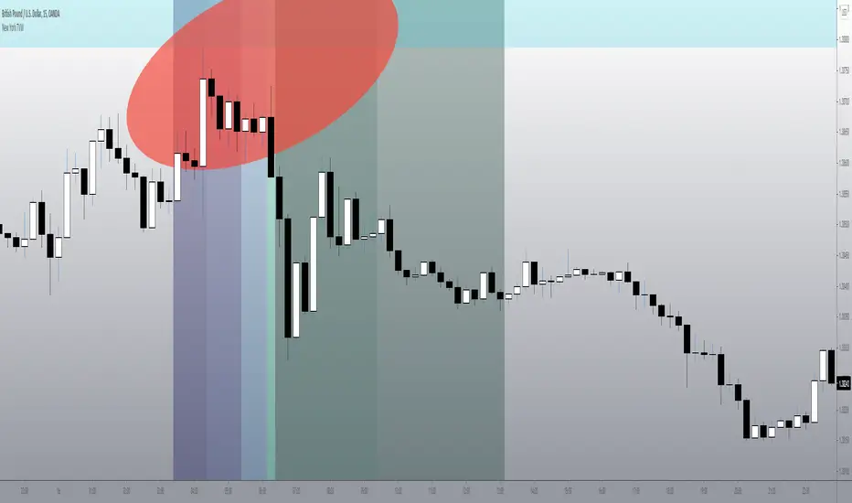
NY Theoretical Volume Windows (@MightyFine)This is the newest edition of my volume window indicator, TVW = theoretical volume window, or a time when you can commonly see a consistent injection of capital, based on north american trading hours.
This script was built in Pacific Timezone, I am not 100% sure it will automatically adjust and display the proper times.
If it does not, you can message me and I will eventually see if I can remedy.
You can change the colors on the style tab, they are simply meant to be analogous and harmonious with my chart, change as you see fit.
You can disable some or all of the windows by selecting the check box next to each section title.
This indicator works well with any chart that is logically active in the North American / NYSE times, and I find it is very helpful for US Domestic equities as well.
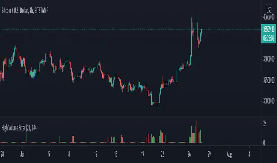
High Volume Filter - Taylor V1High Volume Filter
- Hide Small Volume Bar
- Show High Volume Bar
Able to Change the Filter Average Period

Candle Volume ProfileAn updated version of Candle Volume Profile.
Reworked to make it work with every timeframe.
All you gotta do is type in the input a value that is 1/10th of the current timeframe in minutes (example: 6 on the 1h tf, 24 on the 4h, 1 on the 10min tf etc etc)
The redder the part of the candle is, the higher the volume was in that section.
Suggested to either hide the original chart or make the candle body transparent

Cumulative Volume FTX + BINANCE SPOT VS DERVIATIVE VOLUMEShows spot volume green and red and derivative volume as blue.

Symbol VolumeUnlike the built-in Volume indicator and other custom scripts, this one allows to configure the volume symbol and preserves the known look and feel.

[ENG/PL] Sumiński's Volume | Wolumen SumińskiegoNASDAQ:DISCK ENG below.
Niniejszy wskaźnik, który jako jego twórca pozwoliłem sobie nazwać w tłumaczeniu na Polski - Wolumenem Sumińskiego :)
Od innych wskaźników wolumenu różni się tym, że mierzy "gęstość wolumenu" na danym barze. Polega to na tym, że w przypadku wystąpienia dużej świecy, np. spadkowej przy niewielkim wolumenie - oznacza to że wskazany obszar cenowy pozbawiony jest drugiej strony - w tym przypadku kupujących, nie zachodzi tu chęć odkupienia sprzedawanego instrumentu.
Jednak w przypadku wystąpienia niedużej świecy, a podwyższonego wolumenu - oznacza to, że przy danym poziomie ceny spotkał się duży kapitał kupujących i sprzedających - wskaźnik oznacza taki bar wysoką wartością. Im wyższy poziom wskaźnika tym "gęstsza" i mocniejsza wymiana pomiędzy kupującymi a sprzedającymi.
_____________________________________________
This indicator, which, as its creator, I have allowed myself to call - Sumiński's Volume :)
It differs from other volume indicators in that it measures the "volume density" on a given bar. It consists in the fact that in the event of a large candle, e.g. a downward candle with a small volume - it means that the indicated price area has no other side - in this case there are buyers, there is no desire to buy back the instrument being sold.
However, in the event of a small candle and an increased volume - this means that at a given price level, there was a large capital of buyers and sellers - the indicator means such a bar with a high value. The higher the index level, the "denser" and stronger the exchange between buyers and sellers.

Koalafied Volume Extension Bar colours based on extensions from volume Z-Score. Large volume candles can often signal exhaustion or show market strength in reversals or breakouts. Candles not supported by rising volume are coloured black while those that are retain their colouring.

Better VolumePlots perceived buy volume,sell volume, an sma of volume over the last x amount of bars, and an arrow when volume is above average.

Relative Volume LabelThe indicator shows the current day volume out of the average of the last chosen days.
The result is shown on a label below the last bar.
Users can choose the number of days to include in the average calculation and the label colors.

Plot Other Symbol VolumeThis script plots the volume of another specified symbol.
The standard TradingView 'compare' functionality already covers plotting the various price types.

wtt volume
This indicator is based on the chapter Progress in Volume Capacity of WTT. The Fundamentals and Advance of Natural Trading Theory.
Progress in volume capacity focuses on the absolute strength or relative strength of the volume capacity of bulls and bears in a single k-bar.
The book grades volume capacity as follows:
Absolute Strength:
Absolute strength of bulls: the bulls win and close, with long lower shadow or long solid body.
Absolute strength of bears: the bears win and close, with long upper shadow or long solid body.
Relative Strength
Relative strength of bulls: long lower shadow much longer than the solid K-bar, even when the bears win; or well-matched solid K-bar and upper shadow when the bulls close.
Relative strength of bears: long upper shadow much longer than the solid K-bar, even when the bulls win; or well-matched solid K-bar and lower shadow when the bears close.
Crosshairs
Frequently found in market shocks or before turning points, to be analyzed on top of the above relative and absolute strength.
This indicator colors the volume by the size of volume capacity, dark colors for the strong, light colors for the weak, and grey crosshairs. This is to make it easier for you to draw the curve of volume capacity and feel the contrast of strength between the bulls and the bears. You may therefore have better timing and position for opening and closing a position. The bull-bear strength comparison reflected by a single k-bar helps you better decide the next move within a very short period, which could be opening a position, coming into the position at low, underweighting, or closing a position.
本指标根据《WTT.自然交易理论基础与进阶》量能精进一章编写。
量能精进关注的,是单个K柱中多空双方量能的绝对强势或相对强势。
该书把量能分为以下几个等级:
绝对强势
多头绝对强势:多头获胜收线,带有长下影线或长实心柱体。
空头绝对强势:空头获胜收线,带有长上影线或长实心柱体。
相对强势
多头相对强势:长下影线相对实心K柱长很多,即使是空头获胜收线;或多头收线时实心K柱与上影线旗鼓相当。
空头相对强势:长上影线相对实心K柱长很多,即使是多头获胜收线;或空头收线时实心K柱与下影线旗鼓相当。
十字线
在震荡行情或出现拐点前出现频率较高,可结合上述相对强势和绝对强势进行综合判断。
本指标根据量能强弱对交易量进行染色,强势为深色,弱势为浅色,灰色为十字线,方便你手绘量能曲线,感受多空量能强弱。能给你提供更优的开平仓时机和点位。通过单个k柱形态反映出来的多空强弱关系,你可以更好地执行下一个极短周期内的操作,可能是开仓,也可能是补仓、减仓或平仓。
Delta Volume/Cumulative deltaThis is a slightly modified version of the Delta Volume v2.1 indicator from kernel_phi.
You can read the documentation here:

Currency Group Volume
This indicator shows the combined volume of an entire currency from the majors and crosses. So if you chose USD you get the combined volume of audusd, nzdusd, usdjpy, usdchf, eurusd, gbpusd, usdcad...
I made it to see if it would reveal where orders where flowing or perhaps where turning points were etc.
There's an example below of how I was trying to use it. I'm not sure it shows anything too far from obvious.
Its been in my archive for ages so I thought i might as well share it - if anyone sees something I've missed let me know.
(the currency that had the smallest volume spike (AUD) had the biggest push after the volume)
DAX VolumeDAX index (DEU30) hourly volume indicator, which is obtained by adding the sum of the underlying stocks volume.
The volume is displayed in millions of EUR.

SWT Volume AlertBased off the built in Volume study. Added an alert condition for when the current bar's volume surpasses that of the previous bar.

Moving Candle VolumeShows which part of the candle was executed with the highest volume.
Different from Candle Volume Profile because more useful for indicators and scripts
VERY IMPORTANT TO CHANGE THE SETTING BASED ON THE TIMEFRAME.
Does not work on any timeframe lower than 20 minutes

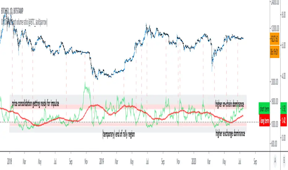
On Chain vs Spot volume ratio (@BTC_JackSparrow)Calculates and displays the ratio between on chain recorded Bitcoin transaction volume and the volume traded over multiple spot exchange pairs - includes all exchanges mentioned by Bitwise Research
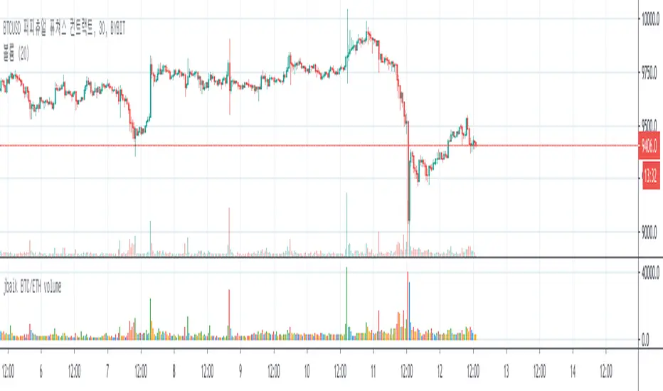
jbaik BTC/ETH volumeShows total BTC/ETH volume of different exchanges (non future)
Platform included :
COINBASE, POLONIEX, BITSTAMP , BITFLYER, KARAKEN, BINANCE, GEMINI , BITHUMB, HUOI, OKEX
Can turn on/off BTC or ETH volume on setting
Shows different colour per volume bar :
when price is higher and volume is higher than previous => green
when price is higher but volume is lower than previous => blue
when price is lower and volume is lower than previous => orange
when price is lower but volume is higher than previous => red
Price Weighted VolumeReally simple: VWAP idea applied to volume, to see how much actual value is moving around. Great for assets pegged to fiat like USD, as it then shows how many dollars moved.
It's fun to pair with a long-term VWAP.
