[SM] Bitcoin cycles bull market
An indicator to determine the seasonality / cyclicality of bitcoin for long trades.
Application
- For traders: Identification of zones with lower risk of entering long positions
- For swing traders and investors: customizable calendar of entries into long position
Indicator structure
1. Vertical zones (green and red) of time ranges. Only for historical bars. The range width is adjustable in the indicator settings.
2. Table (in the form of a calendar) for determining the time of entering a trade in the future. The table is not editable. It displays the result of the configured zones on the historical bars.
General settings
- choose the color of the Tradingview theme (light or dark)
Table settings
- Turn table display on / off
- Set the number of months to be displayed in the table
Settings of vertical zones (green and red)
Each cycle (1 month summer, 1 month autumn, ...) has four dates
- start date of the green zone (day and month)
- date of the end of the green zone
- start date of the red zone
- date of the end of the red zone
Bitcoin (Criptovaluta)

Bitcoin Halving Rainbow + S2F Model PriceOverview
The rainbow price line:
This script creates a colorful view of Bitcoin's price action, where different colors indicate the time until the next halving date. The color scale in the top right highlights what each main color group represents in terms of days until the next halving. Using historical data, the simple indication of days until the next halving has somewhat accurately predicted potential bottoms and tops of market cycles. Comparing current colors to previous cycles provides a rough view of where BTC is in its current cycle and what to expect going forward until the next halving date.
In addition to the colored price action, I have incorporated the stock-to-flow model price for Bitcoin.
The stock-to-flow (S2F) model price:
The stock-to-flow ratio is a calculation that aims to estimate how many years are required to produce the current stock of an asset, based on the current production rate. When applied to Bitcoin, we simply divide the total amount of bitcoins in circulation by the amount of bitcoins mined in a certain timeframe. Once we have this value, we can calculate a model price based on the stock-to-flow ratio. This S2F model price uses a 463-day moving average. Preston Pysh came up with this number as he believed Bitcoin cycles happen in three phases: bull run, correction, and a reversion to the mean. He estimated there are about 200,000 blocks per cycle, three phases per cycle, and ~144 blocks per day. Dividing all three gets us 463. I have removed 1,000,000 coins from this calculation to account for Satoshi's coins.
The process I took to plot this model price (credit to PlanB for originally creating this calculation):
-Declare constant variables for the halving period, starting block reward, and the number of coins Satoshi owns.
-Fetch the block index by using the request.security() function.
-Determine the number of halvings that have occurred by dividing the block index by the halving period.
-Calculate the current block reward by multiplying the initial block reward by 0.5 raised to the power of the number of halvings.
-Calculate the number of blocks mined per period (day or week) and derive the stock (total bitcoins in circulation minus Satoshi's coins) and flow (annual block rewards) from it.
-Calculate the S2F ratio by dividing the stock by the flow.
-Calculate the S2F model price by applying a mathematical formula (ModelPrice = exp(-1.84) * S2F to the power of 3.36) along with a 463-day moving average.
** Please note, due to the use of the 463-day MA, the first ~400 days of the S2F model price is not entirely accurate.
In addition to the above, I have added vertical lines on each halving date, along with labels that have a tooltip if you hover over them, which will show more information about that particular halving.
Important tips:
-This script has been designed to work on the 1-Day timeframe but can also work on the 1-Week timeframe. Any other timeframe will not accurately plot all the information due to the way I have developed the script.
-This script is best used on the ticker I have posted this on, "INDEX:BTCUSD". It can also work on "BLX" or "BITSTAMP:BTCUSD".
-Hide candles when using the script to just show the halving rainbow (hover over the symbol name in the top left and press the eye icon).
-Right-click the price scale and select "Scale price chart only" to get a better view of the plots.
-Right-click the price scale and select "Logarithmic."
-I will update the script as time goes on to show future halvings along with adjusting the next halving date as we get closer (if it changes).
Settings Menu:
Tooltips are included explaining what the settings do, but here's a quick summary:
-'Show Vertical Halving Lines?': Default is true. This allows the user to remove the vertical lines shown on each halving date.
-'Show Halving Labels?': Default is true. This allows the user to remove the info labels shown on each halving date.
-'Halving Line and Label Color': Default is white. This allows the user to change the color of the halving lines and labels to better fit their chart layout.
-'Show Stock to Flow Model Price?': Default is true. This allows the user to remove the S2F model price.
-'Stock to Flow Model Price Color': Default is white. This allows the user to change the color of the S2F model price to better fit their chart layout.
-'Draw Color Table?': Default is true. This allows the user to remove the color table in the top right of the chart.
-'Distance rainbow is away from actual price action': Default is 0 (Plots over candles). This allows the user to adjust where the halving rainbow is plotted if they would like to also see candles on the chart. (Use any value under 0.9)
Feel free to message me or comment on the post with any questions or issues!
Much more to come!
Thanks for reading, enjoy!

Short Term Bubble RiskThis risk indicator uses the extension of the closing price to the 20W SMA and displays a color-coded risk oscillator. The higher the oscillator is, the greater the short-term risk and vice-versa. This indicator has historically worked well for estimating the short-term risk of Bitcoin and Ethereum on a weekly timeframe.

BTC Performance Table / BTC Seasonality Visualization
This script visualizes Bitcoins "seasonality", in form of a colored table (based on the idea from "BigBangTheory")
The history table shows you which months do statistically perform better/worse in comparison to other months.
How to use this script:
Choose ticker "BLX" ("BraveNewCoin Liquid Index for Bitcoin").
Set the charts time frame to weekly or daily. Tables position on the screen and its colors are configurable.
Table explanation:
Cells show whether a gain or a loss occured from month to month, since BTC came out in 2010.
The price difference, between monthly open and monthly close, determines the cell color (negative -> red, positive -> green).
The year column shows total gain (green) or loss (red) for that particular year.
Each value is presented as a rounded percentage number.
How this script works:
The script calculates the price difference between each monthly and yearly open and close, storing those numbers inside arrays.
Then it populates the table, by using those numbers and doing the cell coloring (there will be a yellow cell, in case no change should occur).
German Short-Description
Prozentuale Übersicht in Tabellenform, der monatlichen, sowie jährlichen, Performance des Bitcoin (basierend auf der Idee von "BigBangTheory").
Hierdurch wird die "Saisonalität" des Bitcoin sichtbar. D.h. welche Monate des Jahres, im Vergleich zu anderen Monaten, statistisch gesehen öfter positiv/negativ schließen.
Zwecks vollständiger Darstellung muss der Ticker "BLX" ("BraveNewCoin Liquid Index for Bitcoin") im weekly oder daily time frame aktiv sein.

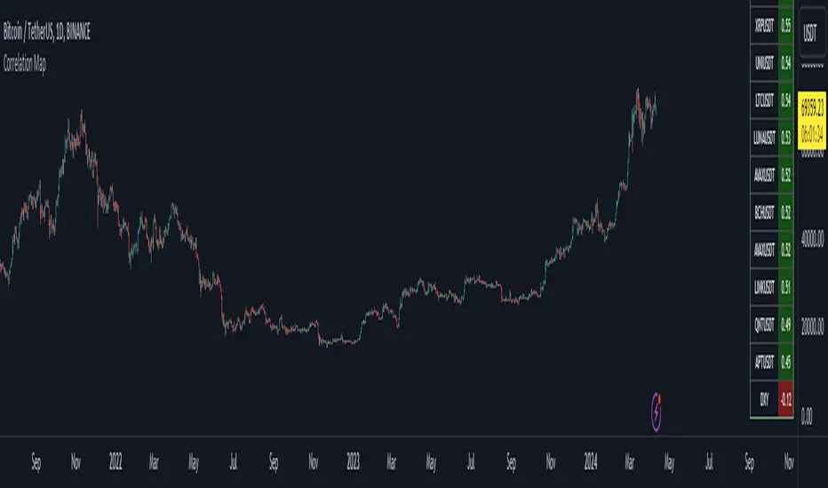
Bitcoin Correlation MapHello everyone,
This indicator shows the correlation coefficients of altcoins with bitcoin in a table.
What is the correlation coefficient?
The correlation coefficient is a value that takes a value between 0 and 1 when a parity makes similar movements with the reference parity, and takes a value between 0 and -1 when it makes opposite movements.
In order to obtain more meaningful and real-time results in this indicator, the weighted average of the correlation values of the last 200bar was used. You can change the bar length as you wish. With the correlation value, you can see the parities that have similar movements with bitcoin and integrate them into your strategy.
You can change the coin list as you wish, and you can also calculate their correlation with etherium instead of bitcoin .
The indicator shows the correlation value of 36 altcoins at the moment.
The indicator indicates the color of the correlated parities as green and the color of the inversely correlated parities as red.
Cheers
Dynamic Volume Oscillator [CryptoScripts]The Dynamic Volume Oscillator uses a combination of volume and momentum to nail whenever a reversal is likely to happen. I've also included divergences (both regular and hidden) that you can toggle on/off and adjust the settings to fit your trading style.
Colors - The green wave indicates an uptrend while the purple wave indicates a downtrend.
Overbought/Oversold - Green backgrounds indicate the DVO is oversold and a reversal to the upside is likely to happen within the next few candles. Red backgrounds indicate the DVO is overbought and a reversal to the downside is likely to happen within the next few candles. You can adjust the levels to trigger when the signal flashes. Experiment with different timeframes/altcoins to see which settings work best. Some coins are more volatile than others and lower timeframes tend to reach higher levels vs higher timeframes.
Divergences - The settings of 1 and 3 for the lookbacks are so the divergence signal appears only 1 candle before the actual divergence happens (on the replay tool) vs 4-5 candles from other indicators. This means your entry on a divergence signal is 2 candles after it prints (for backtesting purposes).
Alerts - I also added alerts for Overbought, Oversold, Regular and Hidden Bearish/Bullish Divergences.
Let me know if you have any questions! Enjoy :)

Token Metrics IndicatorThe Token Metrics Combined Indicator v2 is a comprehensive technical analysis tool designed to output Long/Short signals for crypto assets on TradingView. It combines multiple indicators, including Token Metrics Clouds, Token Metrics Trend Lines , Token Metrics Channels, and signals, to give a comprehensive outlook on the market trend and potential entry/exit points.
Users can backtest the signals to understand the strategy's historical performance, learn how to use it, identify its pros and cons, and determine the market conditions it best suits. It is important to note that the backtesting performance does not indicate future results.
The methods for calculating fixed stop-losses vary depending on the trading pattern. A fixed stop-loss is used for long-term trading, while a trading stop-loss is used for high-frequency trading. This provides flexible investment risk management, allowing you to assign different stop-loss percentages to different trading strategies.
The Length input allows users to control the indicator’s sensitivity, with a default value of 20 bars for long-term trading and 9 bars for high-frequency trading. The Adjustment Factor input has a default value of 0.1 and can be adjusted to adapt to changing levels of volatility . The Stop-loss input allows users to control their risk tolerance, with a default value of 8% for long-term trading and 2% for high-frequency trading.
Token Metrics Clouds incorporates a bullish / bearish trend indicator, which uses two adaptive moving averages that adapt to volatility , reducing false trend signals during range-bound environments and providing a more accurate representation of market trends.
The Token Metrics Trendline is a long-term indicator that uses an adaptive moving average to identify long-term trends. This can also be used for long-term resistance and support levels, providing a comprehensive overview of the current market situation for both long-term and high-frequency traders.
The Token Metrics Signals indicator provides long, short, and close signals, indicating when to enter and exit long or short positions based on the TM trend-following strategy.
The Token Metrics Channels indicator is a top/bottom indicator that adjusts to current levels of volatility . This uses adaptive Donchian channels to determine the previous short-term swing high and low, providing insight into where short-term resistance or support might be forming and where breakouts can occur. The look-back periods change according to the strategy time frame, offering a flexible and dynamic approach to market analysis.
Long-term trading is a trend-following strategy best suited for daily and weekly timeframes. This strategy works well in trending markets but may produce false signals in choppy or range-bound markets.
High-frequency trading is a mean-reverting strategy best suited for 15-minute, 30-minute, and 1-hour timeframes. This strategy performs well in choppy or range-bound markets but may not be effective in strong trending markets.

Volume ClusterVolume Cluster aggregates one-minute-based volume information over a specified arbitrary price range as a cluster. In delta mode, the accumulated volume is displayed based on the buy volume/sell volume information.

Stablecoins DominanceStablecoins Dominance
The purpose of the script is to show Stablecoin's strength in the crypto markets.
5 Largest Stablecoins divided by Total Market Cap
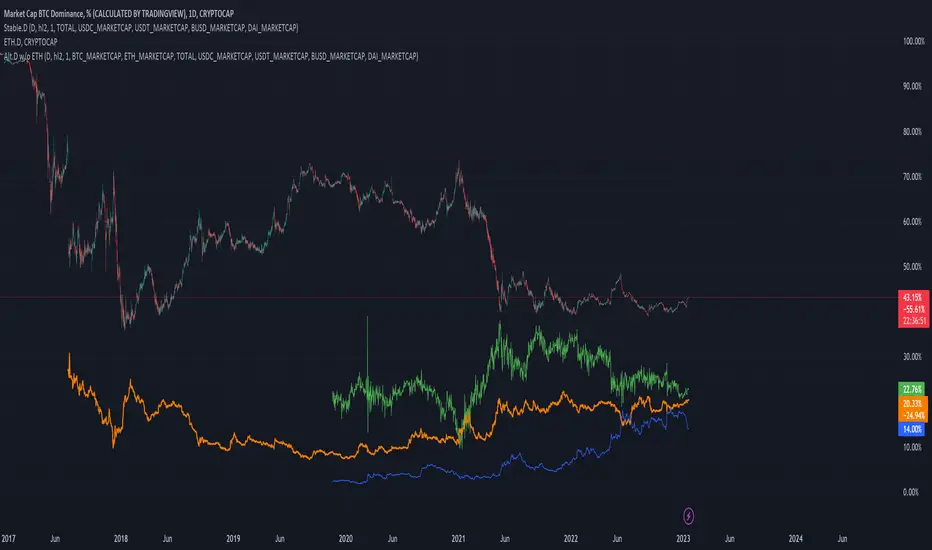
Altcoin Dominance (without ETH) Excluding Stablecoins UnsymetricAltcoin Dominance (without ETH) Excluding Stablecoins Unsymetric
The purpose of the script is to show Altcoin's strength without Ethereum once we exclude stablecoins.
So we look into all altcoins besides eth and besides stablecoins divided by a value of eth+btc
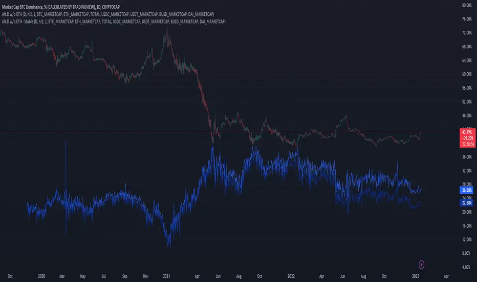
Altcoin Dominance Excluding EthereumAltcoin Dominance Excluding Ethereum
The purpose of the script is to show Altcoin's strength without Ethereum.
Pretty much shows Altcoin's Dominance in comparison to Market Cap once we exclude Ethereum.

ETH Dominance Excluding StablecoinsETH Dominance Excluding Stablecoins.
The purpose of the script is to show Ethereum's strength relative to other cryptocurrencies.
Pretty much shows ETH Dominance in comparison to Market Cap once we exclude the 5 largest stablecoins.

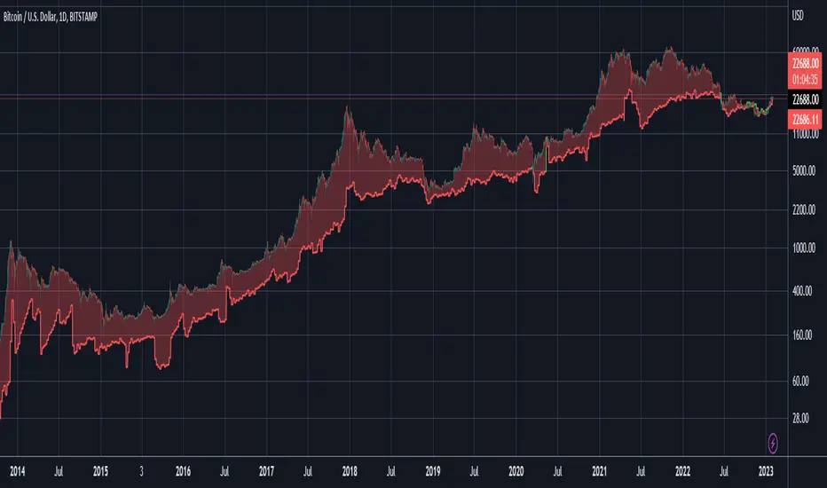
DXY Overlay CompareOverlays the DXY chart over the top of any other chart. When the dollar strength increases, asset prices can drop and vice versa. Was created personally to compare with the price of Bitcoin.

True Bitcoin Value USD - Mario MThe average mining costs of one bitcoin equals to the true intrinsic value
Globally, the Bitcoin network uses around 0.5% of the world’s electrical power supply.
The sheer amount of electrical power and complex hardware required to operate a mining farm has intrinsic value.
This gives bitcoin a fundamental cost to create, and thus intrinsic value.
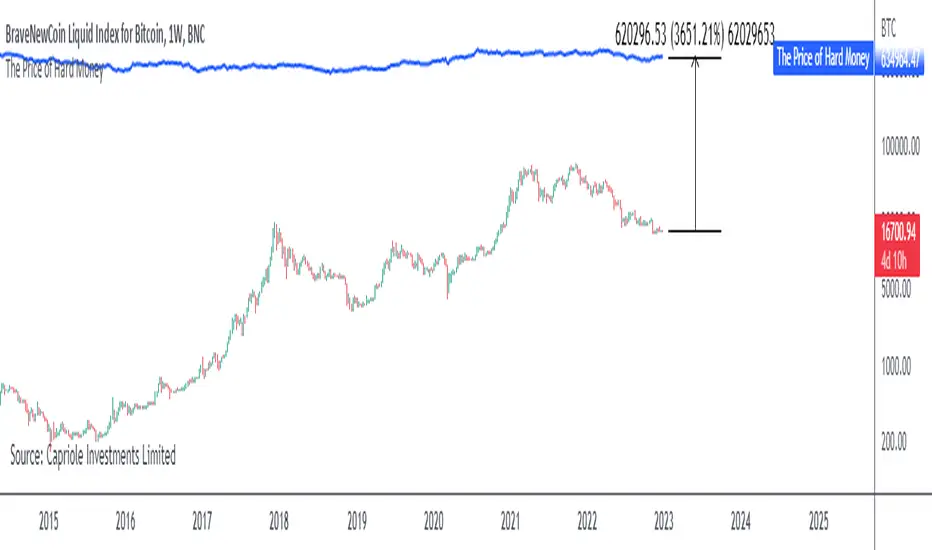
The Price of Hard MoneyIf we calculate “the price of hard money” (the market capitalization weighted price of gold plus Bitcoin); we get this chart.
Since 2017, Bitcoin’s share of hard money growth has been increasing, we can see it visibly on the gold chart by a widening delta between the price of hard money and the Gold price. We can also see some interesting technical behaviours.
In 2021, Hard Money broke out and held this breakout above the 2011 Gold high. Only later in 2022 did a correction of 20% occur – typical of Golds historic volatility in periods of inflation and high interest rates.
Hard Money is at major support and we have evidence for a fundamental shift in investor capital flows away from gold and into Bitcoin.
This Indicator is useful:
- To track the market capitalization of Gold (estimated), Bitcoin and combined market capitalization of Hard Money.
- To track the price action and respective change in investor flows from Gold to Bitcoin .
Provided Bitcoin continues to suck more value out of gold with time, this chart will be useful for tracking price action of the combined asset classes into the years to come.
RSI and MA with Trailing Stop Loss and Take Profit (by Coinrule)The relative strength index is a momentum indicator used in technical analysis. It measures the speed and magnitude of a coin's recent price changes to evaluate overvalued or undervalued conditions in the price of that coin. The RSI is displayed as an oscillator (a line graph essentially) on a scale of zero to 100. When the RSI reaches oversold levels, it can provide a signal to go long. When the RSI reaches overbought levels, it can mark a good exit point or alternatively, an entry for a short position. Traditionally, an RSI reading of 70 or above indicates an overbought situation. A reading of 30 or below indicates an oversold condition.
A moving average (MA) calculates the average of a selected range of prices, usually closing prices, by the number of periods in that range. Essentially it is used to help smooth out price data by creating a constantly updated average price.
The Strategy enters and closes trades when the following conditions are met:
Entry Conditions:
RSI is greater than 50
MA9 is greater than MA50
RSI increases by 5
Exit Conditions:
Price increases by 1% trailing
Price decreases by 2% trailing
This strategy is back-tested from 1 January 2022 to simulate how the strategy would work in a bear market. The strategy provides good returns.
The strategy assumes each order is using 30% of the available coins to make the results more realistic and to simulate you only ran this strategy on 30% of your holdings. A trading fee of 0.1% is also taken into account and is aligned to the base fee applied on Binance.

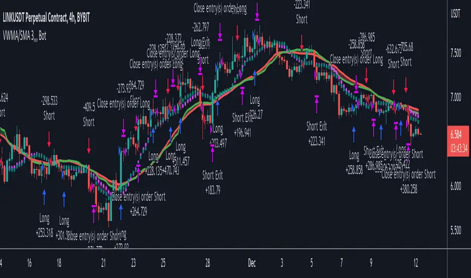
VWMA/SMA 3Commas BotThis strategy utilizes two pairs of different Moving Averages, two Volume-Weighted Moving Averages (VWMA) and two Simple Moving Averages (SMA).
There is a FAST and SLOW version of each VWMA and SMA.
The concept behind this strategy is that volume is not taken into account when calculating a Simple Moving Average.
Simple Moving Averages are often used to determine the dominant direction of price movement and to help a trader look past any short-term volatility or 'noise' from price movement, and instead determine the OVERALL direction of price movement so that one can trade in that direction (trend-following) or look for opportunities to trade AGAINST that direction (fading).
By comparing the different movements of a Volume-Weighted Moving Average against a Simple Moving Average of the same length, a trader can get a better picture of what price movements are actually significant, helping to reduce false signals that might occur from only using Simple Moving Averages.
The practical applications of this strategy are identifying dominant directional trends. These can be found when the Volume Weighted Moving Average is moving in the same direction as the Simple Moving Average, and ideally, tracking above it.
This would indicate that there is sufficient volume supporting an uptrend or downtrend, and thus gives traders additional confirmation to potentially look for a trade in that direction.
One can initially look for the Fast VWMA to track above the Fast SMA as your initial sign of bullish confirmation (reversed for downtrending markets). Then, when the Fast VWMA crosses over the Slow SMA, one can determine additional trend strength. Finally, when the Slow VWMA crosses over the Slow SMA, one can determine that the trend is truly strong.
Traders can choose to look for trade entries at either of those triggers, depending on risk tolerance and risk appetite.
Furthermore, this strategy can be used to identify divergence or weakness in trending movements. This is very helpful for identifying potential areas to exit one's trade or even look for counter-trend trades (reversals).
These moments occur when the Volume-Weighted Moving Average, either fast or slow, begins to trade in the opposite direction as their Simple Moving Average counterpart.
For instance, if price has been trending upwards for awhile, and the Fast VWMA begins to trade underneath the Fast SMA, this is an indication that volume is beginning to falter. Uptrends need appropriate volume to continue moving with momentum, so when we see volume begin to falter, it can be a potential sign of an upcoming reversal in trend.
Depending on how quickly one wants to enter into a movement, one could look for crosses of the Fast VWMA under/over the Fast SMA, crosses of the Fast VWMA over/under the Slow SMA, or crosses over/under of the Slow VWMA and the Slow SMA.
This concept was originally published here on TradingView by ProfitProgrammers.
Here is a link to his original indicator script:
I have added onto this concept by:
converting the original indicator into a strategy tester for backtesting
adding the ability to conveniently test long or short strategies, or both
adding the ability to calculate dynamic position sizes
adding the ability to calculate dynamic stop losses and take profit levels using the Average True Range
adding the ability to exit trades based on overbought/oversold crosses of the Stochastic RSI
conveniently switch between different thresholds or speeds of the Moving Average crosses to test different strategies on different asset classes
easily hook this strategy up to 3Commas for automation via their DCA bot feature
Full credit to ProfitProgrammers for the original concept and idea.
Any feedback or suggestions are greatly appreciated.
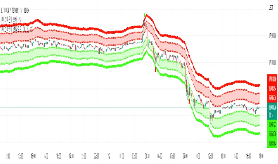
MarsMine_EnvelopThis indicator is an indicator for use in 5-minute period day trading strategies.
The indicator derives a power power based on past closing prices and substitutes the power value into a multiplier of Euler's constant to derive a range.
Bands were increased by substituting multiples into the derived range, and each band has a role.
You will enter a buy or sell between the first and second bands, and become comfortable on the opposite first band.
The third band is set as a stop loss standard.
이 지표는 5분봉 단타 매매 전략에서 사용하기 위한 보조지표입니다.
해당 지표는 과거 종가를 기반으로 멱수를 도출해내고 해당 멱수값을 오일러 상수의 승수에 대입하여 범위를 도출해냅니다.
도출해 낸 범위에 멀티플을 대입하여 밴드를 증가 시켰으며 각 밴드들은 역할이 존재합니다.
첫번째와 두번째 밴드 사이에서 매수 또는 매도 진입을 하게 되며, 반대의 첫번째 밴드에서 익절하게 됩니다.
세번째 밴드는 손절기준으로 설정합니다.
Integrated Implied Volatility C/FThe integrated version of IV CAP/FLOOR Premium and Bitcoin IV C/F.
Illustrating Cap-Floor bands based on statistical calculations using the implied volatility of Bitcoin, foreign currency pairs, commodities, bonds, and indexes.

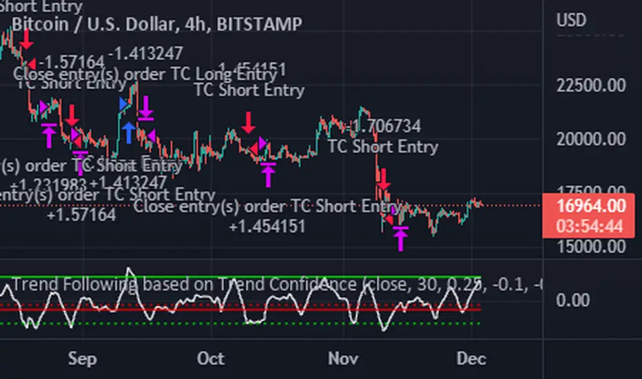
Trend Following based on Trend ConfidenceThis is a Trend Following strategy based on the Trend Confidence indicator.
The goal of this strategy is to be a simple Trend Following strategy, but also to be as precise as possible when it comes to the question 'how confident are we that a linear trend is ongoing?'. For this we calculate the 'confidence' of a linear trend in the past number of closing prices. The idea of this strategy is that past a certain confidence, the ongoing linear trend is more likely to continue than not.
Trend Confidence:
The Trend Confidence shows us how strong of a linear trend the price has made in the past number (given by Length parameter) of closing prices. The steepness of the price change makes the Trend Confidence more extreme (more positive for an uptrend or more negative for a downtrend), and the deviation from a straight line makes the Trend Confidence less extreme (brings the confidence closer to 0). This way we can filter out signals by wild/sudden price moves that don't follow a clear linear trend.
Math behind the Trend Confidence:
A linear fit is made on the past number of closing prices, using Ordinary Linear Regression. We have the steepness of the linear fit: b in y=a+bx . And we have the standard deviation of the distances from the closing prices to the linear fit: sd . The Trend Confidence is the ratio b/sd .
Entries and Exits:
For entry and exit points we look at how extreme the Trend Confidence is. The strategy is based on the assumption that past a certain confidence level, the ongoing linear trend is more likely to continue than not.
So when the Trend Confidence passes above the 'Long entry" threshold, we go Long. After that when the Trend Confidence passes under the 'Long exit' threshold, we exit. The Long entry should be a positive value so that we go Long once a linear uptrend with enough confidence has been detected.
When the Trend Confidence passes below the 'Short entry' threshold, we go Short. After that when the Trend Confidence passes above the 'Short exit' threshold, we exit. The Short entry should be a negative value so that we go Short once a linear downtrend with enough confidence has been detected.
Default Parameters:
The strategy is intended for BTC-USD market, 4 hour timeframe. The strategy also works on ETH-USD with similar parameters.
The Length is arbitrarily set at 30, this means we look at the past 30 closing prices to determine a linear trend. Note that changing the length will change the range of Trend Confidence values encountered.
The default entry and exit thresholds for Longs and Shorts do not mirror each other. This is because the BTC-USD market goes up more heavily and more often than it goes down. So the ideal parameters for Longs and Shorts are not the same.
The positive results of the strategy remain when the parameters are slightly changed (robustness check).
The strategy uses 100% equity per trade, but has a 10% stop loss so that a maximum of 10% is risked per trade.
Commission is set at 0.1% as is the highest commission for most crypto exchanges.
Slippage is set at 5 ticks, source for this is theblock.co.
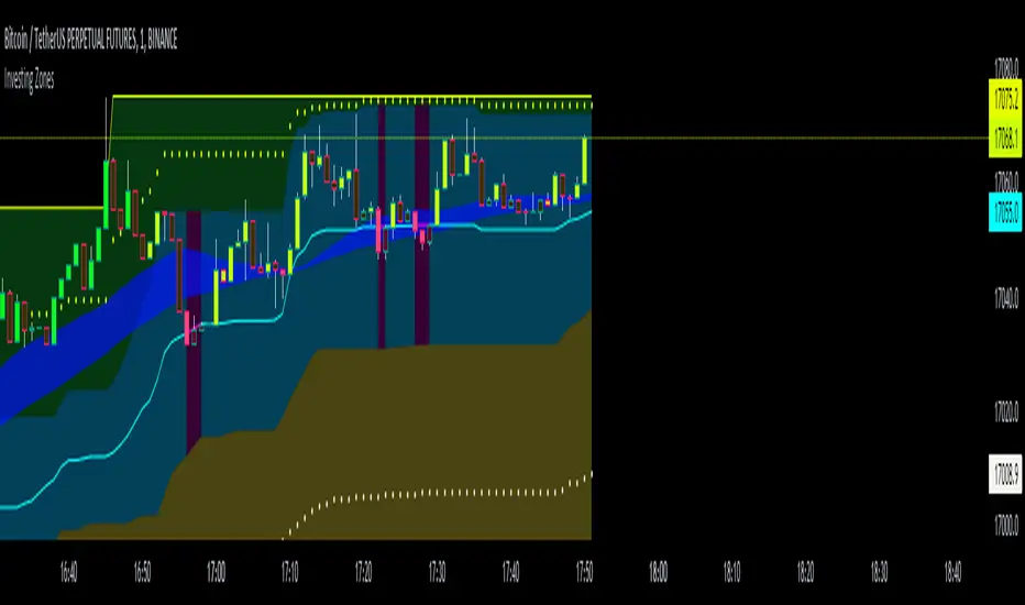
Investing ZonesInvesting Zones indicator shows the areas where LONGS or SHORTS can be made, the areas are calculated based on the mathematical averages of the high and low peaks of the price.
-There is an area called "No trading Zone" where the price is too slow, It also has a Alma Trend Ribbon (blue for uptrend, pink for downtrend) that helps to make trading decisions.
-You can make shorts when the price enters the Yellow zone called the "Sell Zone" and the price is below the Alma trend, set the TP1 in the white dotted line, and TP2 in the white lower line
-You can make longs when the price enters the Green zone called the "Buy Zone" and the price is above the Alma trend, set the TP1 in the yellow dotted line, and TP2 in the yellow upper line
-It works in all timeframes, personally I use it in 1min, 5min and 1hr.
Wave Fusion By CryptoScriptsThe Wave Fusion indicator is finally here! This indicator is a combination of the Wave Strength Oscillator and RSVP Extractor. It used a combination of momentum waves, volume, price, RSI, and statistical analysis to help nail down whenever the current price is overextended and due for a reversal. I'm currently using the 1D timeframe for BTC but feel free to experiment on different timeframes to see what works best for you. In the description below, I'll go over each signal, how it's derived, and how to use them!
Oversold (Green shaded area) - The oversold indication appears whenever all oscillators are oversold and is usually a good indicator that a reversal to the upside is around the corner (at least for a short period). Be advised these are the weakest of the three signals so I recommend using this signal with other indicators (such as my MFI Pro).
Overbought (Red shaded area) - The overbought indication appears whenever all oscillators are overbought and is usually a good indicator that a reversal to the downside is around the corner (at least for a short period). Be advised these are the weakest of the three signals so I recommend using this signal with other indicators (such as my MFI Pro).
Green Diamond - The green diamonds indicate whenever one or more oscillators are oversold AND one or more oscillators are outside of the bollinger bands, which is great for catching reversals to the upside. These may come two or three at a time so it may be best to wait until they have all printed before entering.
Red Diamond - The red diamonds indicate whenever one or more oscillators are overbought AND one or more oscillators are outside of the bollinger bands which is great for catching reversals to the downside (as seen in the chart). These may come two or three at a time so it may be best to wait until they have all printed before entering.
Rocket - The rocket symbol occurs whenever ALL oscillators are oversold and one or more oscillators are outside of the bollinger bands . This is great for catching reversals to the upside but may come two or three at a time so it may be best to wait until they have all printed before entering.
Red Alarm - The red alarm symbol occurs whenever ALL oscillators are overbought and one or more oscillators are outside of the bollinger bands . This is great for catching reversals to the downside but may come two or three at a time so it may be best to wait until they have all printed before entering.
Moon - The Moon symbol occurs whenever ALL oscillators are oversold and ALL oscillators are outside of the bollinger bands . This is great for catching reversals to the upside but may come two or three at a time so it may be best to wait until they have all printed before entering.
Blood Moon - The red alarm symbol occurs whenever ALL oscillators are overbought and ALL oscillators are outside of the bollinger bands . This is great for catching reversals to the downside but may come two or three at a time so it may be best to wait until they have all printed before entering.
Strongest to Weakest Buy Signals - Moon --> Rocket --> Green Diamond --> Green Shaded Area
Strongest to Weakest Sell Signals - Blood Moon --> Red Alarm --> Red Diamond --> Red Shaded Area
Input Options
Show Histogram - I also included a Histogram in the indicator to help gauge the level of buys/sell strength but kept it hidden for the default levels (i.e a green diamond with a red histogram bar is usually a good sign a reversal is about to happen to the upside whereas a green diamond with a green histogram bar may indicate a false reversal and there's still more room to the downside until a red bar appears. Always backtest this!)
Show Overbought/Oversold Levels - This is if you want to ignore all of the green/red shaded areas and only focus on the diamonds and rocket/alarm signals
Wave Overbought/Oversold Levels - Free free to change to value of the overbought/oversold levels to change where the green/red shades areas print
Momentum Overbought/Oversold Levels - Free free to change to value of the overbought/oversold levels to change where the green/red shades areas print
Histogram Length - This will not change anything with the signals but I included it so you can change the visuals if it helps you
Momentum Length - This will change where the signals plot
Momentum Signal - This only changes the yellow signal line and nothing else. It's not incorporated into any equation
Average Length - This will change where the signals plot
Alerts
I've set alerts on this indicator for each icon (Oversold, Overbought, Green Diamond, Red Diamond, Rocket, Red Alarm, Moon , Blood Moon). I HIGHLY recommend setting the alerts for Candle Close so that you can be sure the signal is confirmed.
You may notice that the indicator can give multiple signals back-to-back or be overbought/oversold for multiple candles. When this happens, it's best to look at other indicators such as the MFI Pro, MACD, etc to nail the best entry and have confluence with your decision. With that said, having multiple signals back-to-back can also be an indication that the move is close to happening. This indicator works with crypto and stocks as well.
If you have any questions or would like to purchase this indicator, please comment below or PM me. I also made a video tutorial for the indicator on my Youtube channel (link is next to my profile pic)
Be advised past performance is not indicative of future returns. Backtest EVERY timeframe and NEVER blindly take signals! Also, never invest more than you can afford to lose.
Enjoy :)

Bitcoin Miner Extreme SellingThis script is for identifying extreme selling. Judging by the chart, Bitcoin miners often (not always) sell hard for two reasons: to take profit into parabolic price rises, or to stay solvent when the price is very low.
Extreme selling thus often coincides with long-term tops and bottoms in Bitcoin price. This can be a useful EXTRA data point when trying to time long-term Bitcoin spot or crypto equity investment (NOT advice, you remain responsible, etc). The difference between selling measured in BTC and in USD gives a reasonable idea of whether miners are selling to make a profit or to stay solvent.
CREDITS
The idea for using the ratio of miner outflows to reserves comes from the "Bitcoin Miner Sell Pressure" script by the pioneering capriole_charles.
The two request.security calls are identical. Another similarity is that you have to sum the outflows to make it make sense. But it doesn't make much difference, it turns out from testing, to use an average of the reserves, so I didn't. All other code is different.
The script from capriole_charles uses Bollinger bands to highlight periods when sell pressure is high, uses a rolling 30-day sum, and only uses the BTC metrics.
My script uses a configurable 2-6 week rolling sum (there's nothing magical about one month), uses different calculations, and uses BTC, USD, and composite metrics.
INPUTS
Rolling Time Basis : Determines how much data is rolled up. At the lowest level, daily data is too volatile. If you choose, e.g., 1 week, then the indicator displays the relative selling on a weekly basis. Longer time periods, obviously, are smoother but delayed, while shorter time periods are more reactive. There is no "real" time period, only an explicit interpretation.
Show Data > Outflows : Displays the relative selling data, along with a long-term moving average. You might use this option if you want to compare the "real" heights of peaks across history.
Show Data > Delta (the default): Only the difference between the relative selling and the long-term moving average is displayed, along with an average of *that*. This is more signal and less noise.
Base Currency : Configure whether the calculations use BTC or USD as the metric. This setting doesn't use the BTC price at all; it switches the data requested from INTOTHEBLOCK.
If you choose Composite (the default), the script combines BTC and USD together in a relative way (you can't simply add them, as USD is a much bigger absolute value).
In Composite mode, the peaks are coloured red if BTC selling is higher than USD, which usually indicates forced selling, and green if USD is higher, which usually indicates profit-taking. This categorisation is not perfectly accurate but it is interesting insomuch as it is derived from block data and not Bitcoin price.
In BTC or USD mode, a gradient is used to give a rough visual idea of how far from the average the current value is, and to make it look pretty.
USAGE NOTES
Because of the long-term moving averages, the length of the chart does make a difference. I recommend running the script on the longest Bitcoin chart, ticker BLX.
To use it to compare selling with pivots in crypto equities, use a split chart: one BLX with the indicator applied, and one with the equity of your choice. Sync Interval, Crosshair, Time, and Date Range, but not Symbol.
