Cerca negli script per "track"
Triple eMA cross trackerTracks 3 emas, colorizing background:
Green - 1 on top of 2 on top of 3;
Blue - 1 on top of 3, but 2 below 3;
Red - 1 below 2 below 3;
Orange - 1 below 3, 2 above 3.
Nutshell: allows a quick and always apparent check for strategies like the old 8e, 13e, 21e strategy you see online, customizeable by any emas of your choosing.
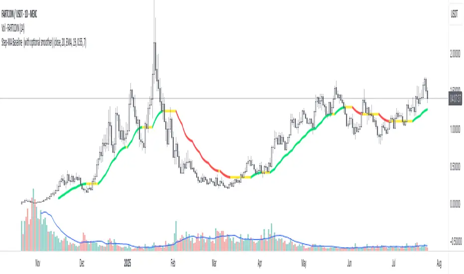
Step-MA Baseline (with optional smoother)Trackline – Trend-Following Baseline with Confirmation Zones
A clean trend-following baseline that adapts to price action while filtering noise. Built on a smoothed moving average (EMA or HMA), Trackline highlights directional bias, with optional zone coloring to indicate breakout alignment or pullback opportunities. Use it to identify trend direction, validate entries, or act as dynamic support/resistance in trending environments.
Features:
• Customizable length & smoothing method (EMA, HMA, or WMA)
• Optional signal coloring (bullish/bearish/neutral)
• Works on all timeframes and assets
• Pairs well with momentum or liquidity tools
Track Highest/Lowest last[n] CandlesThis indicator will track the last , (defval=8), Highest and Lowest and previous close price by placing LINES. I created this to make it easier to place lines in the 25%, 50%, 75% , and 100% of take profits depending if I'm going Long or Short using MTT or MMS. Part of the auto -GannBox i'm trying to finish. Anyways, this makes it easier. I hope everyone can benefit from it.

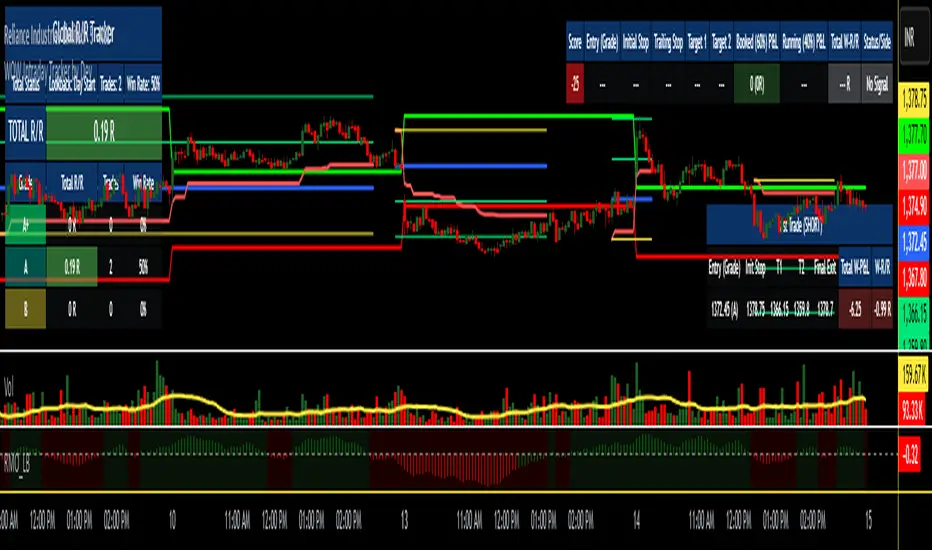
WOW Intraday Tracker by Dev🎯 WOW Intraday Tracker: Professional Trade Execution & R/R Analysis
The WOW Intraday Tracker (V1.30 Final) is an advanced, invite-only tool built for disciplined intraday trading. It transforms market signals into a fully managed trade, providing both real-time execution confidence and objective performance review.
************************************************************************************
✨ Core Execution Features
The Tracker automates the most critical aspects of trade management:
Automatic Entry Trigger: The script uses a proprietary multi-factor scoring system to identify high-probability setups. Once a trade signal is validated and its Score meets the Activation Threshold (which is visible in the Running Trade Table), the entry order (Long or Short) is automatically triggered and monitored.
Trade Grade Qualification: Crucially, every setup is assigned a Trade Grade (A+, A, or B) before entry, based on structural confluence, allowing traders to qualify the setup quality instantly.
Initial SL & Multiple Targets (TGTs): All trades are established with risk-defined parameters from the start.
Initial Stop-Loss (SL): Automatically calculated based on user-defined ATR Multiples to align risk with current volatility.
Multiple Take-Targets (TGTs): Two distinct target levels (TGT1 and TGT2) are set based on user-defined R-Multiples (Risk-to-Reward ratios) to facilitate a partial profit-taking strategy.
Dynamic Trailing & Stop Adjustment: As the trade progresses, the script automatically manages risk, adjusting the stop-loss upon TGT hits to lock in profit.
Signal Cancellation Feature: To protect capital, the script actively monitors the signal's health. If the internal trade score drops below the configurable Cancellation Threshold before entry, the pending order is automatically invalidated and cleared.
⚖️ Trade Exit and Weighted R/R Assumptions
The script's primary function is to track and calculate a Weighted Risk-to-Reward (R/R) based on a predetermined exit plan:
Target 1 (T1): 30% of the original position. Stop is adjusted to protect profits.
Target 2 (T2): Another 30% of the original position. Trailing Stop begins based on a volatility factor.
Final Exit: Rest 40% of the original position. Exited when the Trailing Stop is hit.
Important Note: The Trailing Stop is tracked on a closing basis within the script. While you can choose to exit the trade manually on a hit basis or book profits based on your personal judgment, the script's final Weighted R/R calculation is based on the assumption that the position exits as detailed above.
**************************************************************************************
📊 Global R/R Tracker Table (Performance by Grade)
This powerful feature provides objective, actionable data for trade review. It continuously tallies your performance, broken down by the quality (Grade) of the trade setup.
The table tracks performance for A+, A, and B grade setups, plus a TOTAL row, based on your chosen lookback (Full History or Day Start)
By separating performance by Grade, you gain a clear, evidence-based understanding of which setups truly deserve your capital and focus.
*************************************************************************************
🎨 Advanced Customization & Styling
The WOW Intraday Tracker offers extensive control over the look and feel of your workspace to ensure maximum clarity and minimal chart clutter.
Table Positioning: Freely select the on-chart location (Top Right, Bottom Left, etc.) for all three tables.
Theming: Customize the background and text colors for all tables, including the dynamic green/red backgrounds of the Global R/R Tracker.
Plot Lines: Full color control over all plotted trade lines: PDH/PDL, Entry Price, Initial Stop, Trailing Stop, and Targets.
*********************************************************************************
⏱️ Usage & Recommended Timeframes
The WOW Intraday Tracker is primarily designed and optimized for high-frequency, short-term intraday trading.
Recommended Timeframes: For optimal performance, we recommend using the script on lower-to-mid-range intraday timeframes: 5-minute, 15-minute, and 25 (or 30) minutes.
Intended Use: While the script can be applied to higher timeframes, its main purpose is to capture volatility and quick moves within the trading day.
Swing Trading: In rare instances, the tracker may generate signals suitable for a short-term swing trade (1-2 days), but this is secondary to its core intraday function.
********************************************************************************************
🔑 Access Note
The WOW Intraday Tracker utilizes proprietary logic within its scoring system and is published as an invite-only script. The source code is protected to maintain the integrity and value of the intellectual property.
To inquire about access, please contact the author directly via TradingView Private Message on this profile.
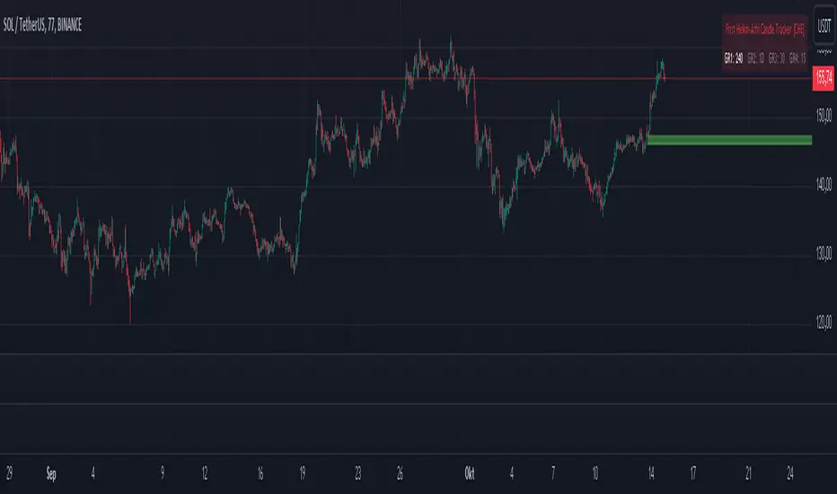
First Heikin-Ashi Candle Tracker [CHE] First Heikin-Ashi Candle Tracker
"A Heikin-Ashi Candle Rarely Comes Alone"
1. Introduction
Fundamental Observation
- "A Heikin-Ashi Candle Rarely Comes Alone"
- This principle highlights the tendency of Heikin-Ashi candles to appear in sequences, indicating sustained trends rather than isolated movements.
- Recognizing these patterns can significantly enhance trading strategies by identifying stronger and more reliable entry points.
2. Understanding Heikin-Ashi Candles
What Are Heikin-Ashi Candles?
- Heikin-Ashi is a type of candlestick chart used to identify market trends more clearly.
- Calculation Method:
- Ha_Close: (Open + High + Low + Close) / 4
- Ha_Open: (Previous Ha_Open + Previous Ha_Close) / 2
- Ha_High: Maximum of High, Ha_Open, Ha_Close
- Ha_Low: Minimum of Low, Ha_Open, Ha_Close
- Visual Differences:
- Smoother appearance compared to traditional candlesticks.
- Helps in filtering out market noise and highlighting the prevailing trend.
Benefits of Heikin-Ashi Candles
- Trend Clarity: Easier identification of uptrends and downtrends.
- Reduced Noise: Minimizes the impact of insignificant price movements.
- Visual Appeal: Cleaner charts enhance decision-making processes.
3. Introducing the First Heikin-Ashi Candle Tracker [CHE ]
Purpose of the Indicator
- Track First Heikin-Ashi Candles: Identifies the initial appearance of Heikin-Ashi candles across multiple timeframes.
- Enhance Trading Decisions: Provides visual cues for potential long and short entries based on trend confirmations.
Key Features
- Multi-Timeframe Support: Monitor Heikin-Ashi candles across different timeframes (e.g., 240, 60, 30, 15 minutes).
- Customizable Visuals: Adjustable colors and line widths for better chart integration.
- User-Friendly Interface: Easy-to-configure settings tailored to individual trading preferences.
- Max Line Management: Controls the number of displayed lines to maintain chart clarity.
4. How to Use the First Heikin-Ashi Candle Tracker
Step-by-Step Guide
1. Enable Desired Groups:
- Activate up to four groups, each representing a different timeframe.
- Customize each group's settings according to your trading strategy.
2. Configure Timeframes:
- Select timeframes that align with your trading style (e.g., short-term vs. long-term).
3. Set Candle Types to Track:
- Choose to monitor Both, Green (Bullish), or Red (Bearish) Heikin-Ashi candles.
- Focus on specific candle types to streamline entry signals.
4. Customize Visual Indicators:
- Adjust Green Line Color and Red Line Color for clear distinction.
- Modify Line Width to ensure visibility without cluttering the chart.
5. Manage Line Limits:
- Set the Max Number of Lines to prevent overcrowding.
- The indicator will automatically remove the oldest lines when the limit is exceeded.
6. Interpret Signals:
- Green Lines: Indicate potential Long entry points.
- Red Lines: Indicate potential Short entry points.
- Observe the sequence and frequency of candles to assess trend strength.
Practical Example
- Uptrend Identification:
- Consecutive green Heikin-Ashi candles with corresponding green lines signal a strong upward trend.
- Consider entering a Long position when the first green candle appears.
- Downtrend Identification:
- Consecutive red Heikin-Ashi candles with corresponding red lines signal a strong downward trend.
- Consider entering a Short position when the first red candle appears.
5. Benefits and Utility
Enhanced Trend Detection
- Early Signals: Identify the beginning of new trends promptly.
- Confirmation: Multiple timeframes provide robust confirmation of trend direction.
Improved Entry Points
- Precision: Pinpoint optimal moments to enter trades, reducing the risk of false signals.
- Flexibility: Suitable for both Long and Short strategies across various markets.
User-Friendly Operation
- Intuitive Settings: Easily configurable to match individual trading preferences.
- Visual Clarity: Clear lines and color-coding facilitate quick decision-making.
Time Efficiency
- Automated Tracking: Saves time by automatically identifying and marking relevant candles.
- Multi-Timeframe Analysis: Consolidates information from different timeframes into a single view.
6. Why Use the First Heikin-Ashi Candle Tracker ?
Strategic Advantages
- Market Insight: Gain deeper understanding of market dynamics through Heikin-Ashi analysis.
- Risk Management: Improved entry points contribute to better risk-reward ratios.
- Versatility: Applicable to various trading instruments, including stocks, forex, and cryptocurrencies.
Why Heikin-Ashi for Entries?
- Trend Reliability: Heikin-Ashi candles smooth out price data, providing more reliable trend indicators.
- Reduced Whipsaws: Fewer false signals compared to traditional candlestick charts.
- Clarity in Decision-Making: Simplifies the process of identifying and acting on market trends.
Conclusion
- The First Heikin-Ashi Candle Tracker is an essential tool for traders seeking to enhance their trend analysis and improve entry strategies.
- By leveraging the power of Heikin-Ashi candles, this indicator offers a clear, user-friendly approach to identifying profitable trading opportunities.
7. Getting Started
Installation
1. Add the Indicator:
- Open TradingView and navigate to the Pine Script editor.
- Paste the translated Pine Script code for the First Heikin-Ashi Candle Tracker .
- Save and add the indicator to your chart.
2. Configure Settings:
- Enable desired groups and set appropriate timeframes.
- Customize colors and line widths as per your preference.
- Adjust the maximum number of lines to maintain chart clarity.
3. Start Trading:
- Monitor the chart for green and red lines indicating potential Long and Short entries.
- Combine with other analysis tools for enhanced trading decisions.
Support and Resources
- Documentation: Refer to the included comments within the Pine Script for detailed explanations.
- Community Forums: Join TradingView communities for tips and shared experiences.
- Customer Support: Reach out for assistance with installation or configuration issues.
8. Disclaimer
The content provided, including all code and materials, is strictly for educational and informational purposes only. It is not intended as, and should not be interpreted as, financial advice, a recommendation to buy or sell any financial instrument, or an offer of any financial product or service. All strategies, tools, and examples discussed are provided for illustrative purposes to demonstrate coding techniques and the functionality of Pine Script within a trading context.
Any results from strategies or tools provided are hypothetical, and past performance is not indicative of future results. Trading and investing involve high risk, including the potential loss of principal, and may not be suitable for all individuals. Before making any trading decisions, please consult with a qualified financial professional to understand the risks involved.
By using this script, you acknowledge and agree that any trading decisions are made solely at your discretion and risk.
Happy Trading!
Best regards
Chervolino (Volker)
BuyPrice TrackerDescription:
This custom indicator is designed to help traders and investors track the performance of multiple stocks relative to their specified buy prices. It offers a visual representation of price changes and percentage gains or losses, making it easier to monitor your portfolio at a glance.
Key Features:
1. Multiple Stock Tracking: Monitor up to 15 different stocks simultaneously.
2. Custom Buy Prices: Set individual buy prices for each stock you're tracking.
3. Dynamic Price Line: A yellow dotted line appears on the chart to mark your buy price.
4. Real-time Updates: The indicator updates with each new price bar, providing current information.
5. Percentage Change Display: Clearly shows the percentage change from your buy price to the current price.
6. Color-Coded Labels: Green for positive changes, red for negative, allowing for quick visual assessment.
7. Customizable Label Position: Choose between top-right or top-left corner of the chart for the information label.
8. Adjustable Text Size: Customize the size of the text in the label for better visibility.
9. Buy Price Scale Label: Displays your buy price directly on the price scale for easy reference.
How It Works:
Enter your stock symbols and corresponding buy prices in the indicator settings.
The indicator will display a yellow dotted line at your buy price for the current chart.
A label will appear showing the stock symbol, your buy price, and the current percentage change.
The label updates in real-time as prices change, allowing you to monitor performance instantly.
Benefits:
Effortlessly track multiple positions in your portfolio.
Quickly identify which stocks are performing well and which might need attention.
Make informed decisions about holding, selling, or buying more based on clear visual cues.
Customize the display to suit your trading style and chart setup.
This indicator is perfect for active traders managing multiple positions, long-term investors tracking their portfolio performance, or anyone looking to keep a close eye on specific price levels in the market.
Note: This indicator works best when applied to the specific stock charts you're tracking. Make sure to input the correct stock symbols and buy prices in the indicator settings for accurate results.

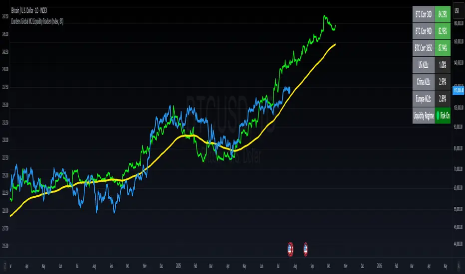
Durdens Global M2 Liquidity Tracker🧠 Durdens Global M2 Liquidity Tracker | Bitcoin vs Liquidity, Visualized
If you’re not watching global liquidity, you’re not really trading macro.
This indicator tracks FX-adjusted M2 money supply across 20+ countries, aggregated into a single global liquidity signal. It can then be used to overlay against Bitcoin for timing macro shifts with precision.
🔍 Core Features:
🌐 USD-adjusted M2 from the US, China, Eurozone, UK, Japan, and more
📊 Normalization modes: None (raw), Index (Based to 100), Z-Score
⏳ Offset input to shift liquidity data forward — aligns with Bitcoin's delayed reaction (84–107 days common)
🧠 BTC correlation matrix: 30D, 90D, 365D correlation values
🧪 Top 3 M2 delta signals: Tracks 90-day % change for US, China, EU
🧮 Fibonacci SMAs: 13 / 34 / 89 for structural macro context
🟢🔴 Liquidity regime engine: EMA 89 defines "Risk-On" vs "Risk-Off" states
🧩 How It Works:
Each country’s M2 is multiplied by its FX rate (to USD) and summed into a single global M2 line. This ensures comparability across nations. The user can choose to:
Normalize the output (raw, indexed, or z-scored)
Shift the global M2 forward in time (offset), simulating the lag effect liquidity has on Bitcoin
Visualize macro risk conditions using EMA 89 as a liquidity regime filter
Analyze BTC correlation across 3 windows and track key regions’ M2 delta
❓ FAQ:
Why does this matter?
M2 is the monetary fuel behind asset bubbles. When liquidity rises, Bitcoin follows; with a delay. This tracker helps you front-run macro flows before they hit the chart.
Why use Index or Z-Score modes?
Raw values skew long-term visual analysis. Index mode rebases data for comparative trend tracking. Z-Score shows when liquidity is overheated or suppressed (mean reversion).
What does the offset input do?
Liquidity doesn’t hit Bitcoin instantly. Many traders use an 84–107 day forward shift to align M2 changes with BTC price action. The offset helps you visualize this.
Why track top 3 M2 regions?
US, China, and Eurozone are the heavyweights in global liquidity. Tracking their offset-day % change gives immediate insight into capital expansion or contraction.
Can I use this to trade?
Absolutely; but it’s best used as a macro filter. Combine with price structure, funding, or on-chain data to optimize timing and conviction.
⚡ Use Cases:
Spot early pivots in liquidity regimes (Risk-Off to Risk-On)
Quantify macro backdrop for Bitcoin or altcoin cycles
Understand when the Fed or PBOC are tightening or easing
Ditch the hopium. Trade with context.
—
Built by: @DurdensBitcoinLedger
Follow for updates — future upgrades include:
• Regional toggles
• Custom M2 baskets
• Alert conditions
• Continued revisions & updates
Stay liquid, not wrecked.
Investment Tracker Profit/lossThe Investment Tracker is a custom-built indicator designed to help traders and investors track their performance in real time. With this tool, you can easily monitor the gains or losses from your initial investment based on the price movement of a specific token. The indicator dynamically updates to show how much you've earned or lost, providing valuable insights into your investment strategy.
Key Features:
Profit/Loss Tracking: Instantly see whether you're in profit (green) or loss (red) based on the token's price movement.
Current Value Calculation: Tracks your investment’s current value by comparing the price at which you bought the token with its current price.
Visual Representation: Displays your initial investment, current value, and profit/loss on the chart with dynamic color coding (green for profit, red for loss).
Top-Right Display: Profit/loss data is conveniently displayed in the top-right corner of the chart, providing a clean and non-intrusive way to monitor your position.
Transparency: The indicator's lines have reduced opacity, allowing you to view your position without obstructing the price action.
How to Use:
Input your initial investment amount (in USD or your desired currency).
Set the buy price of the token when you made the purchase.
Watch the indicator update as the price of the token changes, providing real-time tracking of your profit or loss.
Whether you're holding a single position or monitoring multiple investments, this tracker gives you a clear and up-to-date view of how your portfolio is performing.
Perfect For:
Crypto traders who want to monitor their positions in real time.
Long-term investors looking to track the performance of their investments.
Anyone who wants a simple, visual way to measure their gains and losses in the market.

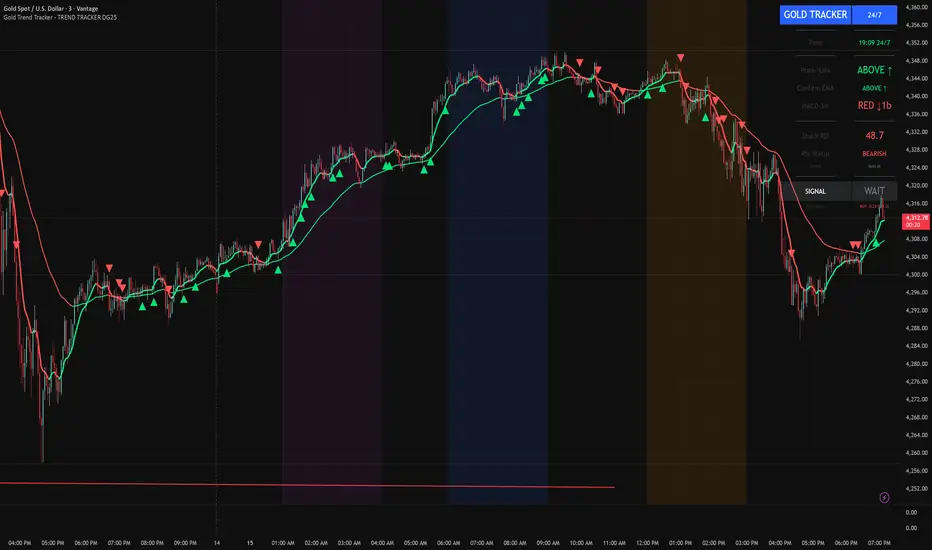
Gold Trend Tracker - TREND TRACKER DG25Gold Trend Tracker - Complete All-In-One Trading System
A professional, institutional-grade trading system specifically optimized for Gold (XAU/USD) that combines multiple technical indicators with session-based filtering and real-time performance tracking. No external indicators required - everything you need is built right in!
🎯 CORE FEATURES
Multi-Layered Confirmation System:
Dynamic EMA trend filter (default 10-period) with color-coded visualization
Optional secondary confirmation EMA (21-period) for stronger validation
3-minute MACD analysis with histogram tracking and direction monitoring
MACD bounce detection for high-probability continuation entries
Built-in Stochastic RSI (K=3, D=3, RSI Length=14, Stochastic Length=14)
Option to connect external Stochastic RSI if preferred
Intelligent Signal Generation:
Clear BUY/SELL triangles plotted directly on price chart
Minimum bars filter to eliminate signal spam and overtrading
Higher timeframe signal overlay (optional) - see 3min signals on 15min chart
Visual Stochastic RSI threshold cross markers (customizable shapes & sizes)
"Show Only First Cross" option to reduce visual clutter
Comprehensive alert system for all signal types
Advanced Session Management:
Pre-configured trading sessions: Asian (1-4am), London (6-9am), NY (12-3pm)
Timezone-aware filtering supporting major financial centers:
Europe/London
America/New_York
America/Chicago
Europe/Paris
Asia/Tokyo
Asia/Dubai
Color-coded session backgrounds (purple/blue/orange)
Individual session toggle switches
24/7 mode for continuous trading (crypto/forex)
Signals only generate during active sessions
Real-Time Performance Tracking:
Live P/L calculation since last signal entry
Customizable lot size for accurate dollar calculations
Pip movement tracking with automatic conversion
Last signal type and duration display
Performance color-coding (green profits, red losses)
Professional Dashboard:
Clean, scalable interface (Small/Medium/Large sizing)
Current time and active session display
Trading status indicator (TRADING/PAUSED/24/7)
Price position relative to Main EMA (ABOVE ↑ / BELOW ↓)
Confirmation EMA status (when enabled)
3-minute MACD color, direction arrow, and bar count
Stochastic RSI value with color-coded status
RSI status: BULLISH/BEARISH/NEUTRAL
Source type indicator (Built-in/External)
Large, clear SIGNAL display: BUY NOW / SELL NOW / WAIT
Performance summary: signal type + price change + dollar value
📊 HOW THE SYSTEM WORKS
BUY Signal Requirements:
✓ Price trading ABOVE main EMA (bullish trend confirmation)
✓ 3-minute MACD crosses above zero OR bounces higher after crossover
✓ Stochastic RSI K-line above bullish threshold (default 50)
✓ Within an active trading session (if session filter enabled)
✓ Confirmation EMA aligned (if secondary EMA enabled)
✓ Minimum bars since last signal met (prevents overtrading)
SELL Signal Requirements:
✓ Price trading BELOW main EMA (bearish trend confirmation)
✓ 3-minute MACD crosses below zero OR bounces lower after crossover
✓ Stochastic RSI K-line below bearish threshold (default 50)
✓ Within an active trading session (if session filter enabled)
✓ Confirmation EMA aligned (if secondary EMA enabled)
✓ Minimum bars since last signal met (prevents overtrading)
Multi-Confirmation Philosophy:
This system requires ALL conditions to align before generating a signal. This drastically reduces false signals and increases win rate by only trading the highest-probability setups where trend, momentum, and volume all confirm direction.
⚙️ BUILT-IN STOCHASTIC RSI
No External Dependencies:
The indicator includes a fully functional Stochastic RSI calculation based on the standard TradingView formula. No need to hunt for compatible indicators or worry about settings mismatches.
Default Settings (Optimized for Gold):
K Smoothing: 3
D Smoothing: 3
RSI Length: 14
Stochastic Length: 14
Bullish Threshold: 50
Bearish Threshold: 50
How It Works:
Calculates RSI on price data
Applies Stochastic formula to RSI values
Smooths result with K-period SMA
Uses K-line (not D-line) for cleaner, faster signals
Compares to your bullish/bearish thresholds
Generates visual cross markers when thresholds breached
Visual Markers:
Multiple shape options: Circle, Diamond, Square, Cross
Four size options: Tiny, Small, Normal, Large
Customizable colors for bullish/bearish crosses
"Show Only First Cross" prevents repetitive markers
Appears below bars (bullish) or above bars (bearish)
Flexibility:
Switch to "External" mode to connect your own Stochastic RSI indicator
Adjust all calculation parameters to match your trading style
Completely disable the filter if you prefer trend + MACD only
🎨 CUSTOMIZATION OPTIONS
Indicators:
Adjust Main EMA length (default 10)
Enable/disable Confirmation EMA (default OFF)
Set Confirmation EMA length (default 21)
Modify MACD parameters (Fast 5, Slow 14, Signal 9)
Enable/disable MACD bounces (default ON)
Set max bounces per trend (1-10, default 2)
Stochastic RSI:
Choose Built-in or External source
Adjust K/D smoothing periods
Modify RSI and Stochastic lengths
Set custom bullish/bearish thresholds
Configure cross marker appearance
Toggle dashboard display
Signals:
Show/hide signal triangles
Set minimum bars between signals (0-50, default 5)
Enable higher timeframe signal overlay
Choose HTF timeframe (e.g., 3min on 15min chart)
Sessions:
Enable/disable session filtering
Select your timezone
Toggle individual sessions (Asian/London/NY)
Customize session start/end hours
Show/hide session background colors
Display:
Choose dashboard size (Small/Medium/Large)
Adjust all visual elements
Customize colors and styling
💡 PRO TRADING TIPS
Session Optimization:
London Session (6-9am): Highest volatility, best for breakout trades
NY Session (12-3pm): Strong trends, ideal for momentum continuation
Avoid Asian Session (1-4am): Lower liquidity, choppier price action
Overlap Period (12-3pm London time): Peak volume, clearest signals
Signal Filtering:
Set 3-5 bars minimum between signals to avoid overtrading
Higher values (7-10 bars) for more conservative, swing-style entries
Lower values (1-3 bars) for aggressive scalping during high volatility
Confirmation EMA Usage:
Enable in choppy/ranging markets for extra validation
Disable during strong trending conditions (adds lag)
Set to 21 for short-term trends, 50 for medium-term
MACD Bounce Strategy:
Bounces occur when MACD histogram changes direction after crossover
Max 2 bounces = optimal (catches first continuation)
Max 1 bounce = conservative (only initial momentum shift)
Max 3-5 bounces = aggressive (catches multiple waves)
Stochastic RSI Thresholds:
50/50 = Balanced (default, works for most conditions)
30/70 = Conservative (fewer but stronger signals)
60/40 = Aggressive (more signals, requires tighter stops)
Adjust based on current market volatility
Risk Management:
Use the performance tracker to trail stops
Exit when dashboard shows opposite signal forming
Monitor MACD direction arrows for momentum shifts
Set profit targets based on average session ranges
🚀 QUICK START GUIDE
For Beginners:
Add indicator to 3-minute Gold (XAU/USD) chart
Leave all default settings (everything is pre-optimized)
Enable London session (6-9am) and NY session (12-3pm)
Set your timezone to your location
Wait for BUY/SELL triangle + "BUY NOW"/"SELL NOW" on dashboard
Enter trade when ALL conditions align
Exit on opposite signal or dashboard status change
For Advanced Traders:
Optimize EMA lengths for your preferred timeframe
Adjust Stochastic RSI thresholds based on backtesting
Fine-tune MACD bounce count for your risk tolerance
Enable Confirmation EMA for extra validation
Use HTF signal overlay for multi-timeframe confluence
Set signal filter to match your trading frequency
Customize session times for your specific market focus
📈 BEST TIMEFRAMES
Primary: 3-minute chart (system is MACD-optimized for 3min)
Alternative: 5-minute, 15-minute (adjust signal filter accordingly)
NOT Recommended: 1-minute (too noisy), 1-hour+ (signals too infrequent)
Chart Setup:
Main Chart: Your preferred timeframe (3min recommended)
MACD: Always references 3-minute data internally
Stochastic RSI: Calculates on current chart timeframe
Session Filter: Works on any timeframe
✅ WHAT MAKES THIS SYSTEM UNIQUE
All-In-One Solution:
✓ No hunting for compatible external indicators
✓ No configuration headaches or version conflicts
✓ One indicator = complete trading system
Session Intelligence:
✓ Only trades during optimal liquidity periods
✓ Automatically pauses during low-volume sessions
✓ Timezone-aware for global traders
Multi-Confirmation:
✓ Trend (EMA) + Momentum (MACD) + Volume (Stochastic RSI)
✓ Drastically reduces false signals
✓ Higher win rate through layered validation
Performance Transparency:
✓ Real-time P/L tracking on every trade
✓ Know your performance immediately
✓ Data-driven decision making
Professional Grade:
✓ Clean, institutional-style dashboard
✓ Customizable for any trading style
✓ Comprehensive alert system
⚠️ IMPORTANT NOTES
This is NOT a "Holy Grail":
No indicator is 100% accurate
Requires proper risk management
Works best during trending conditions
May produce whipsaws in choppy/ranging markets
Risk Disclosure:
Always use stop losses
Never risk more than 1-2% per trade
Past performance doesn't guarantee future results
Practice on demo account first
Optimization:
Default settings are optimized for Gold (XAU/USD)
May require adjustment for other instruments
Backtest on your specific market before live trading
Different session times may work better for your timezone
🔔 ALERTS INCLUDED
BUY Signal Alert
SELL Signal Alert
Stochastic RSI Cross Above Threshold
Stochastic RSI Cross Below Threshold
Alert Setup:
Click "Create Alert" button
Select desired alert condition
Choose notification method (popup/email/SMS/webhook)
Never miss a high-probability setup!
💬 SUPPORT & UPDATES
This indicator is actively maintained and updated based on user feedback. Future updates may include:
Additional timeframe options
More session presets
Enhanced performance analytics
Multi-asset optimization
Tags: Gold Trading, XAU/USD, Trend Following, MACD Strategy, Stochastic RSI, Session Trading, Day Trading, Scalping, London Session, New York Session, EMA System, Multi-Timeframe Analysis, Trading Dashboard, Performance Tracking
Forex Session TrackerForex Session Tracker - Professional Trading Session Indicator
The Forex Session Tracker is a comprehensive and visually intuitive indicator designed specifically for forex traders who need precise tracking of major global trading sessions. This powerful tool helps traders identify active market sessions, monitor session-specific price ranges, and capitalize on volatility patterns unique to each trading period.
Understanding when major financial centers are active is crucial for forex trading success. This indicator provides real-time visualization of the Tokyo, London, New York, and Sydney trading sessions, allowing traders to align their strategies with peak liquidity periods and avoid low-volatility trading windows.
---
Key Features
📊 Four Major Global Trading Sessions
The indicator tracks all four primary forex trading sessions with precision:
- Tokyo Session (Asian Market) - Captures the Asian trading hours, ideal for JPY, AUD, and NZD pairs
- London Session (European Market) - Monitors the most liquid trading period, perfect for EUR, GBP pairs
- New York Session (American Market) - Tracks US market hours, essential for USD-based currency pairs
- Sydney Session (Pacific Market) - Identifies the opening of the trading week and AUD/NZD activity
Each session is fully customizable with individual color schemes, making it easy to distinguish between different market periods at a glance.
🎯 Session Range Visualization
For each active trading session, the indicator automatically:
- Draws rectangular boxes that highlight the session's time period
- Tracks and displays session HIGH and LOW price levels in real-time
- Creates horizontal lines at session extremes for easy reference
- Positions session labels at the center of each trading period
- Updates dynamically as new highs or lows are formed within the session
This visual approach helps traders quickly identify:
- Session breakout opportunities
- Support and resistance zones formed during specific sessions
- Range-bound vs. trending session behavior
- Key price levels that institutional traders are watching
📱 Live Information Dashboard
A sleek, professional information panel displays:
- Real-time session status - Instantly see which sessions are currently active
- Color-coded indicators - Green dots for active sessions, gray for closed sessions
- Timezone information - Confirms your current timezone settings
- Customizable positioning - Place the dashboard anywhere on your chart (Top Left, Top Right, Bottom Left, Bottom Right)
- Adjustable size - Choose from Tiny, Small, Normal, or Large text sizes for optimal visibility
The dashboard provides at-a-glance awareness of market conditions without cluttering your chart analysis.
⚙️ Extensive Customization Options
Every aspect of the indicator can be tailored to your trading preferences:
Session-Specific Controls:
- Enable/disable individual sessions
- Customize colors for each trading period
- Adjust session times to match your broker's server time
- Toggle background highlighting on/off
- Show/hide session high/low lines independently
General Settings:
- UTC Offset Control - Adjust timezone from UTC-12 to UTC+14
- Exchange Timezone Option - Automatically use your chart's exchange timezone
- Background Transparency - Fine-tune the opacity of session highlighting (0-100%)
- Session Labels - Show or hide session name labels
- Information Panel - Toggle the live status dashboard on/off
Style Settings:
- Turn session backgrounds ON/OFF directly from the Style tab
- Maintain clean charts while keeping all analytical features active
🔔 Built-in Alert System
Stay informed about session openings with customizable alerts:
- Tokyo Session Started
- London Session Started
- New York Session Started
- Sydney Session Started
Set up notifications to never miss important market opening periods, even when you're away from your charts.
---
How to Use This Indicator
For Day Traders:
1. Identify High-Volatility Periods - Focus your trading during London and New York session overlaps for maximum liquidity
2. Monitor Session Breakouts - Watch for price breaks above/below session highs and lows
3. Avoid Low-Volume Periods - Recognize when major sessions are closed to avoid false signals
For Swing Traders:
1. Mark Key Levels - Use session highs and lows as support/resistance zones
2. Track Multi-Session Patterns - Observe how price behaves across different trading sessions
3. Plan Entry/Exit Points - Time your trades around session openings for better execution
For Currency-Specific Traders:
1. JPY Pairs - Focus on Tokyo session movements
2. EUR/GBP Pairs - Monitor London session activity
3. USD Pairs - Track New York session volatility
4. AUD/NZD Pairs - Watch Sydney and Tokyo sessions
---
Technical Specifications
- Pine Script Version: 5
- Overlay Indicator: Yes (displays directly on price chart)
- Maximum Bars Back: 500
- Drawing Objects: Up to 500 lines, boxes, and labels
- Performance: Optimized for real-time data processing
- Compatibility: Works on all timeframes (recommended: 5m to 1H for session tracking)
---
Installation & Setup
1. Add to Chart - Click "Add to Chart" after copying the script to Pine Editor
2. Configure Timezone - Set your UTC offset or enable "Use Exchange Timezone"
3. Customize Colors - Choose your preferred color scheme for each session
4. Adjust Display - Enable/disable features based on your trading style
5. Set Alerts - Create alert notifications for session starts
---
Best Practices
✅ Combine with Price Action - Use session ranges alongside candlestick patterns for confirmation
✅ Watch Session Overlaps - The London-New York overlap (1300-1600 UTC) typically shows highest volatility
✅ Respect Session Highs/Lows - These levels often act as intraday support and resistance
✅ Adjust for Your Broker - Verify session times match your broker's server clock
✅ Use Multiple Timeframes - View sessions on both lower (15m) and higher (1H) timeframes for context
---
Why Choose Forex Session Tracker Pro?
✨ Professional Grade Tool - Built with clean, efficient code following TradingView best practices
✨ Beginner Friendly - Intuitive design with clear visual cues
✨ Highly Customizable - Adapt every feature to match your trading style
✨ Performance Optimized - Lightweight code that won't slow down your charts
✨ Actively Maintained - Regular updates and improvements
✨ No Repainting - All visual elements are fixed once the session completes
---
Support & Updates
This indicator is designed to provide reliable, accurate session tracking for forex traders of all experience levels. Whether you're a scalper looking for high-volatility windows or a position trader marking key institutional levels, the Forex Session Tracker Pro delivers the insights you need to make informed trading decisions.
Happy Trading! 📈
---
Disclaimer
This indicator is a tool for technical analysis and should be used as part of a comprehensive trading strategy. Past performance does not guarantee future results. Always practice proper risk management and never risk more than you can afford to lose. Trading forex carries a high level of risk and may not be suitable for all investors.

Moon Phase & Celestial Events TrackerMoon Phase & Celestial Events Tracker
Overview
A comprehensive astronomical and celestial event indicator that tracks and projects major cosmic events from 2011 to 2040. This indicator overlays important astronomical phenomena directly on your charts, allowing traders and researchers to analyze potential correlations between celestial events and market movements.
Key Features
Eclipse Tracking 🌑
Blood Moons (Total Lunar Eclipses) including 2014-2015 tetrad
Partial Lunar Eclipses with distinctive yellow markers
Solar Eclipses: Total, Annular, Partial, and Hybrid types with unique symbols
Optional eclipse season background highlighting
Moon Cycles 🌕
Supermoons at perigee (closest Earth approach)
Regular moon phases: New, First Quarter, Full, Last Quarter
Adjustable phase marking with day-offset capability
Mercury Retrograde ☿
Start and end dates clearly marked
Optional period highlighting for entire retrograde duration
Complete cycle tracking through 2040
Seasonal Transitions ✨
Spring Equinox, Summer Solstice, Autumn Equinox, Winter Solstice
Precise astronomical season changes
Future Projections 📊
Event forecasting up to 5 years ahead
Customizable projection range (30-1825 days)
Selective projection by event type
Adjustable visual styles and transparency
Interpretation Guide
Blood Moons
Total lunar eclipses where Earth's atmosphere creates the red appearance. In financial astrology, these are often watched as potential reversal or volatility periods, though correlations vary significantly.
Eclipse Seasons
Twice-yearly windows when Sun-Earth-Moon alignment allows eclipses. Some market practitioners note increased volatility during these periods, though empirical evidence remains debated.
Mercury Retrograde
The apparent backward motion of Mercury occurs 3-4 times yearly. In trading folklore, it's associated with communication issues, technical problems, and false signals. Many practitioners suggest extra caution with new positions during these periods.
Supermoons
Full or new moons at closest Earth approach. Some traders track these for potential short-term highs/lows, particularly in commodities and currencies, though effects are subtle if present.
Seasonal Markers
Astronomical season changes have been incorporated into various market timing systems, with some analysts noting clustering of trend changes around these dates.
Use Cases
Historical pattern analysis
Event-based research
Educational astronomy tracking
Market cycle studies
Long-term planning and observation
Technical Details ⚙️
Data Coverage: 2011-2040 (30 years of precise astronomical events)
Compatibility: All timeframes with smart filtering (Weekly/Monthly show only major events)
Performance: Lightweight with efficient calculations and minimal chart impact
Data Source: Based on NASA ephemeris data for precise event timing
Customization Options 🎨
Individual colors for each event type
Transparency controls for projections
Event visibility toggles
Optional date labels on events
Alert Options 🔔
Set custom alerts for any tracked event including all eclipse types, moon phases, Mercury retrograde start/end, and seasonal transitions.
⚠️ Important Note
This indicator displays astronomical events for research and educational purposes. Any perceived correlations with market movements should be thoroughly backtested. Financial astrology interpretations are included for historical context only and should not be considered trading advice. Always use proper risk management and multiple forms of analysis in trading decisions.
Best Suited For
Market researchers and analysts
Students of market cycles
Those interested in astronomical timing
Educational and observational purposes
Long-term pattern analysis

AlphaEdge Crypto Tracker [CHE]AlphaEdge Crypto Tracker
Efficiently Identify Top Performers and Underperformers Among 40 Crypto Assets at a Glance
In the fast-paced world of cryptocurrency trading, staying ahead requires the ability to quickly assess the performance of multiple assets simultaneously. AlphaEdge Crypto Tracker is an advanced Pine Script™ indicator designed for TradingView that empowers traders to effortlessly monitor and evaluate 40 different crypto assets in real-time.
This tool is my Christmas gift to all traders. I wish you all a Merry Christmas and successful trades in the coming year!
Why It’s Important to Identify Winners and Losers Among 40 Assets at a Glance:
1. Time Efficiency: Managing a diverse portfolio can be overwhelming. With AlphaEdge Crypto Tracker, traders can swiftly identify which assets are performing exceptionally well (winners) and which are underperforming (losers) without the need to analyze each asset individually.
2. Informed Decision-Making: By having a clear overview of top gainers and losers, traders can make strategic decisions such as reallocating investments, taking profits, or cutting losses, thereby optimizing their trading strategies.
3. Risk Management: Quickly spotting underperforming assets helps in mitigating potential losses and adjusting positions to maintain a balanced and profitable portfolio.
4. Opportunity Identification: Recognizing top-performing assets allows traders to capitalize on emerging trends and maximize their returns by focusing on the most promising opportunities.
Key Features of AlphaEdge Crypto Tracker :
- Comprehensive Asset Tracking: Monitors 40 crypto assets simultaneously, providing a broad view of the market landscape.
- Max Gain and Adjusted Max Loss Calculations: Utilizes a 14-bar (configurable) period to calculate the highest gains and the adjusted maximum losses for each asset, offering insights into potential profitability and risk.
- Dynamic Ranking: Automatically sorts and ranks assets based on their performance, highlighting the top 10 gainers and top 10 losers for easy comparison.
- Customizable Display:
- Table Settings: Adjust the size, position, and colors of the performance table to fit your chart layout.
- Interactive Tooltips: Hover over asset names to view detailed tooltips, enhancing usability and information accessibility.
- Visual Alerts: Changes in asset performance are visually indicated through background color updates, allowing for immediate recognition of significant shifts.
- User-Friendly Interface: Intuitive table layout with clear headers and organized data presentation, making it easy for traders of all levels to interpret the information.
How It Works:
1. Data Calculation: For each of the 40 tracked assets, AlphaEdge Crypto Tracker calculates the maximum gain and adjusted maximum loss over the defined trading period.
2. Sorting and Ranking: The assets are sorted based on their maximum gains and adjusted maximum losses, automatically updating to reflect the latest market movements.
3. Real-Time Display: The top 10 gainers and losers are displayed in a neatly organized table directly on your TradingView chart, providing immediate visual insights.
4. Customization: Users can tailor the tracking period, select specific assets to monitor, and adjust the table’s appearance to match their trading style and preferences.
Conclusion:
AlphaEdge Crypto Tracker is an essential tool for cryptocurrency traders seeking to enhance their market analysis and decision-making processes. By providing a comprehensive and customizable overview of multiple assets, it enables traders to efficiently identify profitable opportunities and manage risks effectively. Whether you’re a seasoned trader or just starting, AlphaEdge Crypto Tracker equips you with the insights needed to navigate the dynamic crypto market with confidence.
Get Started Today:
Integrate AlphaEdge Crypto Tracker into your TradingView setup and take control of your crypto trading strategy with unparalleled clarity and precision.
Disclaimer:
The content provided, including all code and materials, is strictly for educational and informational purposes only. It is not intended as, and should not be interpreted as, financial advice, a recommendation to buy or sell any financial instrument, or an offer of any financial product or service. All strategies, tools, and examples discussed are provided for illustrative purposes to demonstrate coding techniques and the functionality of Pine Script within a trading context.
Any results from strategies or tools provided are hypothetical, and past performance is not indicative of future results. Trading and investing involve high risk, including the potential loss of principal, and may not be suitable for all individuals. Before making any trading decisions, please consult with a qualified financial professional to understand the risks involved.
By using this script, you acknowledge and agree that any trading decisions are made solely at your discretion and risk.
License Information:
This Pine Script™ code is subject to the terms of the Mozilla Public License 2.0. You can view the full license (mozilla.org).
© chervolino

ICT Multi-Timeframe Market Structure Tracker [SwissAlgo]ICT Multi-Timeframe Market Structure Tracker
Tracks the ICT market structure across three core timeframes (1-Week, 1-Day, 1-Hour) simultaneously.
----------------------------------------------------------------------
Why this Indicator?
You know market structure matters, whether you trade stocks, Forex, commodities, or crypto.
You've studied ICT concepts - " Change of Character ", " Break of Structure ", " Premium/discount zones ". You understand that multi-timeframe alignment is where the edge lives.
But here's what's probably happening while you apply the ICT concepts for your trading decisions:
You're manually drawing structural highs and lows across three timeframes
You're calculating Fibonacci retracements by hand for each timeframe
You're switching between weekly, daily, and hourly charts, trying to remember where each pivot was, trying to detect the critical events you're waiting for
By the time you've mapped it all out, the setup is gone. Or worse, you missed that the 1-hour just broke the structure while you were checking the weekly bias.
What about seeing all three timeframes at once instead? You need to know immediately when the price enters a premium or discount zone. You need alerts that fire when structure breaks or character changes - across all timeframes - without babysitting your screen.
----------------------------------------------------------------------
The Indicator, at a Glance
This indicator:
tracks ICT market structure across three core timeframes (1-Week, 1-Day, 1-Hour) simultaneously .
automatically plots Fibonacci retracement levels from your defined structural pivots
monitors price position (during retracements) in real-time
sends consolidated alerts when actionable events occur on any timeframe
The 1-Week View: Mid-Term Trend Bias for lower timeframes
The 1-Day View: Swings nested within the 1-Week Structure
The 1-Hour View: Swings nested within the 1-Day Structure
One glance tells you:
* Current trend direction per timeframe
* Exact Fib zone price is trading right now
* Whether the structure just broke or the character changed
* If you're in a potential long/short setup zone
The indicator helps you reduce chart-hopping, manual calculations, and minimize the missed structural shifts.
----------------------------------------------------------------------
Who is this for?
This tool is built for day traders who understand ICT concepts and need efficient multi-timeframe structure tracking. If you know what a Change of Character is, why 0.382-0.5 retracements matter in uptrends, and how to trade external structure, this indicator eliminates the manual structure tracking so you can focus on confirming and executing your trading tactics.
New to ICT? This indicator assumes foundational knowledge of the Inner Circle Trader methodology developed by Michael J. Huddleston. Before using this tool, familiarize yourself with concepts like market structure breaks, premium/discount arrays, and liquidity engineering. The ICT framework offers a unique perspective on institutional order flow and price action - but this indicator is designed for those already applying these concepts, not learning them for the first time.
Critical Skill Required : You must understand the difference between external structure (key swing highs/lows that define market direction) and internal structure (minor fluctuations within the range).
Selecting incorrect pivots - such as marking internal noise instead of true structural points - will generate false signals and undermine the entire analysis. This indicator tracks structure based on YOUR inputs. If those inputs are wrong, every Fibonacci level, alert, and bias signal will be wrong. Learn to identify clean structural breaks before using this tool.
Trading Experience Matters: This tool tracks structure and fires alerts, but interpreting those signals requires understanding context, confluences, and risk management. If you're early in your trading journey, consider this a professional-grade instrument that becomes powerful once you have the conceptual foundation to use it effectively.
----------------------------------------------------------------------
How It Works
Step 1: Define Your Structure
You, the ICT expert or student, define the structural high and low for each timeframe, with their exact dates. This empowers you to control the analysis.
Based on your entries, the indicator establishes trend direction by timeframe and calculates Fibonacci retracement levels automatically.
* Structural High/Low: Key swing points that define external structure per ICT methodology
* Auto-Validation: Built-in autoscan feature confirms your pivot entries match actual price extremes
* Deterministic Behavior: Date stamps ensure the indicator behaves consistently across all sessions
Step 2: Monitor The Tables
Two tables provide a structural context:
Multi-Timeframe Analysis Table (top-right):
Current close, high, low, and 0.5 Fib for all three timeframes
Trend direction (↑/↓)
Days since structure established (i.e., "age" or maturity)
Current Fibonacci zone
Real-time alerts: Trend changes, breakouts, and trade bias signals
Detailed Fibonacci Table (middle-right):
All nine Fib retracement levels (1.0 to 0.0) for the selected timeframe
Exact price at each level
Percentage distance from current price
Visual marker showing current position
Step 3: Monitor The Chart
Visual elements show structure at a glance:
Fibonacci Retracement Zones: Color-coded bands show premium (red), discount (green), and equilibrium (gray) areas based on trend direction
Structural Lines: Red (high) and green (low) horizontal lines mark your defined pivots with automatic fill showing the current range (based on higher timeframe pivots)
Pivot Dots: Optional small markers highlight potential structural turning points on your current timeframe (reference only - always validate pivots yourself)
Trend Indicator: Top-center banner displays the selected timeframe's current trend
Auto-pivot points
Step 4: Get Alerts and Decide the Way Forward
Set one alert on the 1-hour chart only (if you set the alert on other timeframes, you may get delayed feedback).
You'll receive notifications when ANY of these events occur on ANY timeframe:
* Change of Character (ChoC): Trend reversal confirmed by price breaking the opposite structural level
* Break of Structure (BoS): Continuation confirmed by price breaking the same-direction structural level
* Trade Bias Signals: Price entering key Fibonacci zones (0.382-0.5 for longs in uptrend, 0.5-0.618 for shorts in downtrend, with + and ++ variants for deeper retracements)
* Reversal Warnings: Price entering extreme zones (0.882-1.0 or 0.0-0.118), suggesting potential trend exhaustion and reversal towards the opposite direction
All alerts fire once per bar close with a consolidated message showing which timeframes triggered and what conditions were met.
----------------------------------------------------------------------
Understanding the 3 Timeframes Hierarchy
The three timeframes may be conceived as nested layers of structure:
* 1-Week (Macro Bias) : May help you determine your core directional bias (long/short) in a mid-term perspective. The 1-Week TF may operate as your highest-conviction filter and help you contextualize shorter-term market moves (which may align or misalign with the trend appearing on such a timeframe).
* 1-Day (Swing Structure) : Operates within the weekly range. The daily structure can contradict the weekly structure temporarily (due to retracements, consolidations). This is where you may identify intermediate swing opportunities.
* 1-Hour (Execution Structure) : Operates within the daily range. It may help you identify entry timing and short-term bias. Can show opposite trends during retracements, and some traders look for alignment with higher timeframes as part of their setup criteria.
Example: Weekly uptrend (bullish bias) → Daily pulls back into downtrend (retracement phase) → Hourly shows uptrend resumption (this may be interpreted as an entry signal). All three trends can differ simultaneously, but when all three align (in one direction or another), you may start evaluating your moves.
----------------------------------------------------------------------
Using the Tool effectively
When this indicator signals a potential setup (entering key Fibonacci zones, structure breaks, or bias shifts), treat it as a starting point for deeper analysis, not a direct entry signal.
Before executing, consider using additional tools to refine timing:
Fair Value Gaps (FVG) : Identify imbalances where the price moved too quickly, leaving potential fill zones
Order Blocks : Locate the last opposing candle before a strong move - often institutional entry points
Liquidity Zones : Map where stop losses likely cluster (equal highs/lows, round numbers)
Premium/Discount Confirmation: Verify you're buying at a discount or selling at a premium relative to the current range
Session Timing/Kill Zones : Align entries with high-liquidity sessions (London/New York opens)
This indicator shows you where the structure sits and when it shifts. Your job is to combine that context with precise entry models. The alerts narrow your focus to high-probability zones - then you apply your edge within those zones.
----------------------------------------------------------------------
How to Set Up Alerts
This indicator monitors all three timeframes simultaneously and fires consolidated alerts when any condition triggers. Follow these steps to configure alerts properly:
Step 1: Set Your Chart to the 1-Hour Timeframe
Alerts must be created on the 1-hour chart for optimal timing
Do not use higher timeframes (4H, 1D, 1W) or alerts may be delayed
Lower timeframes (15M, 5M) will work but may generate more frequent notifications
Step 2: Open the Alert Menu
Click the "Alert" button (clock icon) in the top toolbar
Or use keyboard shortcut: Alt+A (Windows) / Option+A (Mac)
Step 3: Configure Alert Settings
Condition: Select "ICT Multi-Timeframe Market Structure Tracker "
Alert Type: Choose "Any alert() function call"
Options: Select "Once Per Bar Close"
Expiration: Set to "Open-ended alert" (no expiration)
Alert Name: Choose a descriptive name (e.g., "BTC Market Structure Alerts")
Step 4: Configure Notifications
Notification Methods: Check your preferred channels (app notification, email, webhook, etc.)
Sound: Optional — choose alert sound if desired
Step 5: Create Alert
Click the "Create" button
Alert is now active and will monitor all three timeframes
Important Notes:
You only need ONE alert setup total — it monitors 1W, 1D, and 1H simultaneously
Alert messages show which timeframe(s) triggered and what conditions were met
Alerts fire once per bar close to avoid mid-bar noise
If you change your structural pivot inputs, the alert continues working with new parameters
Example Alert Message:
BTC Market Structure Alert:
🟢 1D Bullish BoS
📈 1H Long Setup (0.382-0.5)
This tells you the 1-Day broke structure bullishly AND the 1-Hour entered a long setup zone — both events happened on the same bar close.
----------------------------------------------------------------------
Key Features
* Tracks 1-Week, 1-Day, and 1-Hour structure simultaneously
* Automatic Fibonacci retracement calculation (9 levels + extensions up or down, depending on timeframe trend)
* Real-time Change of Character and Break of Structure detection
* Color-coded premium/discount zone visualization
* Multi-condition alerts across all timeframes (single alert setup required)
* Autoscan validation to confirm manual pivot entry accuracy
* Timezone-adjustable for global markets
----------------------------------------------------------------------
Important Notes
* Requires ICT Knowledge: This is not a plug-and-play system. Understanding market structure, liquidity concepts, and Fibonacci confluence is essential for effective use.
* Manual Structure Definition: You define the structural pivots. The indicator tracks and alerts - it doesn't make trading decisions.
* Chart Timeframe: Set alerts on the 1-hour chart for optimal timing across all three monitored timeframes.
----------------------------------------------------------------------
Disclaimer
This indicator is for educational and informational purposes only. It does not constitute financial, investment, or trading advice.
The indicator:
* Makes no guarantees about future market performance
* Cannot predict market movements with certainty
* May generate false indications
* Relies on historical patterns that may not repeat
* Should not be used as the sole basis for trading decisions
Users are responsible for:
* Conducting independent research and analysis
* Understanding the risks of trading
* Making their own investment/divestment decisions
* Managing position sizes and risk exposure appropriately
Trading involves substantial risk and may not be suitable for all investors. Past performance does not guarantee future results. Users should only invest what they can afford to lose and consult qualified professionals before making financial decisions. The indicator’s assumptions may be invalidated by changing market conditions.
By using this tool, users acknowledge these limitations and accept full responsibility for their trading decisions.

Smart Money Flow TrackerSmart Money Flow Tracker - Liquidity & Fair Value Gap Indicator
Overview
The Smart Money Flow Tracker is a comprehensive Pine Script indicator designed to identify and analyze institutional trading patterns through liquidity prints and Fair Value Gaps (FVGs). This advanced tool combines multiple analytical approaches to help traders understand where smart money is operating in the market, providing crucial insights for better trade timing and market structure analysis.
Core Functionality
1. Liquidity Prints Detection
The indicator identifies liquidity prints by analyzing pivot highs and lows that represent potential areas where institutional orders may be resting. Key features include:
Pivot-Based Analysis: Uses configurable pivot lengths (default 5) to identify significant highs and lows
Volume Confirmation: Optional volume filter ensures liquidity prints occur during periods of significant trading activity
Dynamic Labeling: Visual markers on chart showing liquidity print locations with customizable colors
Success Rate Tracking: Monitors how often liquidity prints lead to meaningful price reactions
2. Fair Value Gap (FVG) Analysis with Volume Integration
Advanced FVG detection that goes beyond basic gap identification:
Three-Bar Pattern Recognition: Identifies gaps where the high of bar 1 is below the low of bar 3 (bullish) or low of bar 1 is above high of bar 3 (bearish)
Volume-Enhanced Detection: Incorporates comprehensive volume analysis including:
Average volume calculation over configurable periods
Total volume across the 3-bar FVG pattern
Dominant volume bar identification
Volume ratio calculations for strength assessment
Volume Threshold Filtering: Optional minimum volume requirements to filter out low-conviction FVGs
Visual Enhancement: FVG boxes with volume-based coloring and detailed volume labels
3. Comprehensive Statistics Dashboard
Real-time statistics table displaying:
Total liquidity prints detected
Success rate percentage with dynamic color coding
Volume filter status
Total Fair Value Gaps identified
High-volume FVG count and percentage
All metrics update in real-time as new data becomes available
4. Advanced Alert System
Multiple alert conditions for different scenarios:
Standard liquidity print detection
Volume-confirmed liquidity prints
Bullish and bearish FVG formation
High-volume FVG alerts for institutional-grade setups
Key Input Parameters
Display Controls
Show Liquidity Prints: Toggle main functionality on/off
Show Statistics Table: Control visibility of the analytics dashboard
Show Fair Value Gaps: Enable/disable FVG detection and display
Technical Settings
Pivot Length: Adjusts sensitivity of liquidity print detection (1-20 range)
Volume Confirmation: Requires above-average volume for liquidity print validation
Volume Lookback: Period for calculating average volume (5-50 bars)
FVG Volume Settings
Show FVG Volume Info: Display detailed volume metrics on FVG labels
FVG Volume Threshold: Minimum volume multiplier for high-volume FVG classification
FVG Volume Average Period: Lookback period for FVG volume calculations
Visual Customization
Bullish/Bearish Colors: Separate color schemes for different market directions
Text Colors: Bright lime green for optimal visibility on all background types
Table Positioning: Flexible placement options for the statistics dashboard
Trading Applications & Use Cases
1. Institutional Order Flow Analysis
Liquidity Hunting: Identify areas where institutions may be targeting retail stops
Smart Money Tracking: Follow institutional footprints through volume-confirmed liquidity prints
Market Structure Understanding: Recognize key levels where large orders are likely resting
2. Fair Value Gap Trading Strategies
Gap Fill Trading: Trade the statistical tendency of FVGs to get filled
Volume-Confirmed Entries: Use high-volume FVGs as higher-probability trade setups
Institutional FVG Recognition: Focus on FVGs with dominant volume bars indicating institutional participation
3. Multi-Timeframe Analysis
Higher Timeframe Context: Use on daily/weekly charts to identify major institutional levels
Intraday Precision: Apply to lower timeframes for precise entry and exit timing
Cross-Timeframe Confirmation: Combine signals across multiple timeframes for enhanced accuracy
4. Risk Management Applications
Stop Loss Placement: Use liquidity print levels as logical stop loss areas
Position Sizing: Adjust position sizes based on volume confirmation and success rates
Trade Filtering: Use statistics dashboard to assess current market conditions
Technical Logic & Methodology
Liquidity Print Algorithm
Pivot Identification: Scans for pivot highs/lows using the specified lookback period
Volume Validation: Optionally confirms prints occur during above-average volume periods
Success Tracking: Monitors subsequent price action to calculate effectiveness rates
Dynamic Updates: Continuously updates statistics as new data becomes available
FVG Detection Process
Pattern Recognition: Identifies 3-bar patterns with qualifying gaps
Volume Analysis: Calculates comprehensive volume metrics across the pattern
Strength Assessment: Determines volume ratios and dominant bars
Classification: Categorizes FVGs based on volume thresholds and characteristics
Visual Representation: Creates boxes and labels with volume-based styling
Statistical Framework
Real-time Calculations: All metrics update with each new bar
Percentage-based Metrics: Success rates and volume confirmations shown as percentages
Color-coded Feedback: Visual indicators for quick assessment of current conditions
Historical Tracking: Maintains running totals throughout the session
Best Practices for Usage
1. Parameter Optimization
Start with default settings and adjust based on market conditions
Lower pivot lengths for more sensitive detection on volatile instruments
Higher volume thresholds for cleaner signals in high-volume markets
2. Market Context Consideration
Combine with broader market structure analysis
Consider economic events and news that may affect institutional flow
Adjust expectations based on market volatility and liquidity conditions
3. Integration with Other Analysis
Use alongside support/resistance levels for confluence
Combine with momentum indicators for timing confirmation
Integrate with volume profile analysis for additional context
Conclusion
The Smart Money Flow Tracker represents a sophisticated approach to institutional flow analysis, combining traditional liquidity concepts with modern volume analytics. By providing both visual signals and comprehensive statistics, it enables traders to make more informed decisions based on where smart money is likely operating in the market. The indicator's flexibility and customization options make it suitable for various trading styles and timeframes, from scalping to position trading.

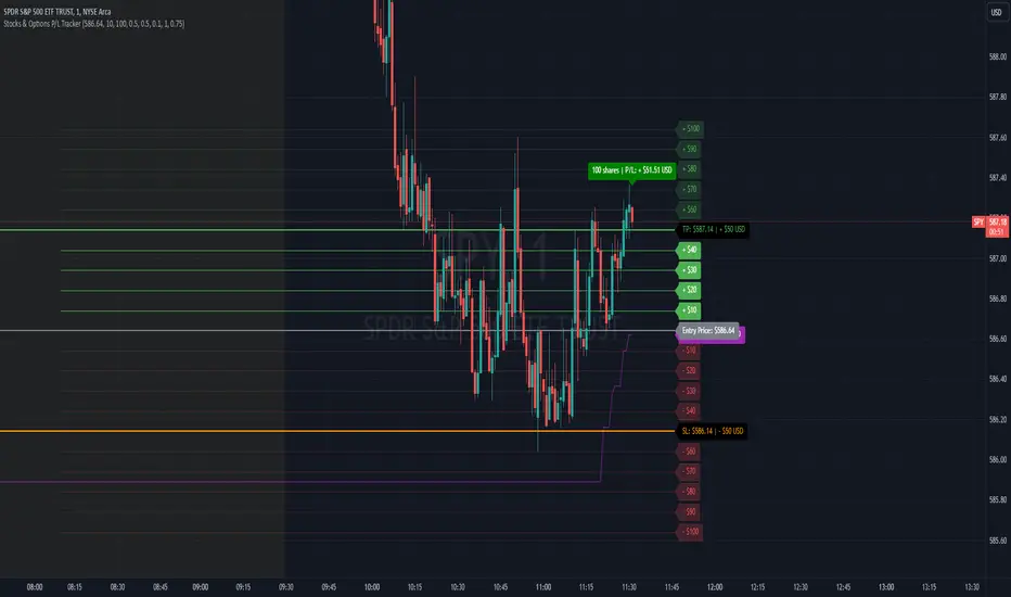
Stocks & Options P/L TrackerOverview:
The Stocks & Options P/L Tracker is a custom TradingView indicator developed to offer traders precise tracking of stocks & options trades’ profit and loss in real-time. It features a detailed display of P/L intervals, stop-loss and take-profit levels, and an adaptable trailing stop mechanism to help traders manage risk and optimize their trading strategies. This tool is particularly useful for active traders who seek immediate visual feedback on their trades’ performance.
Key Features:
Real-Time P/L Display: Computes and displays the P/L per contract/share and total P/L dynamically on the chart based on the specified entry price, relative to the current market price, and number of contracts or shares.
Configurable Take Profit and Stop Loss: Users can set take-profit and stop-loss amounts, and the indicator will visually mark these levels with corresponding dollar amounts for easy reference.
Trailing Stop Functionality: Offers an option to enable a trailing stop that automatically adjusts based on price movements.
Interval-Based P/L Tracking: Uses customizable intervals to display projected P/L levels above and below the entry price, helping users understand potential profit or loss scenarios at a glance.
Dynamic Labeling and Alerts: Visual labels are used to mark P/L, take-profit, stop-loss, trailing stop, and entry levels. These labels update dynamically on each new price bar to provide immediate insights into trade performance. NOTE: Due to TradingView's limitations with server-side alerts on fixed prices, dynamic alerts (for Take Profit, Stop Loss, and Trailing Stop) that adjust with price changes are not yet available. Alerts must be manually reset to your desired price each time.
Clean and Responsive Design: Utilizes color-coded labels and lines for P/L intervals, making it easy to distinguish profit, loss, stop, and take-profit zones. Colors adjust automatically to the current price to maintain clarity.
User Input Validation: Ensures appropriate input values for items like entry price, contract/share size, and profit/loss intervals to prevent errors and optimize performance.
Efficient Object Management: Implements object reusability for lines and labels to stay within Pine Script's object limits, ensuring smooth operation and maximum accuracy in real-time tracking.
Automatic Adjustments Based on Market Changes: Calculates and adjusts trailing stop levels dynamically based on highest price movement, which provides traders flexibility while maintaining risk controls.
Trader Benefits:
This indicator empowers traders with a robust tool to manage their trades visually and strategically on TradingView. The real-time feedback and customization options help traders make informed decisions, minimize risks, and maximize potential profits.
Happy Trading! :)
AI x Meme Impulse Tracker [QuantraSystems]AI x Meme Impulse Tracker
Quantra Systems guarantees that the information created and published within this document and on the Tradingview platform is fully compliant with applicable regulations, does not constitute investment advice, and is not exclusively intended for qualified investors.
Important Note!
The system equity curve presented here has been generated as part of the process of testing and verifying the methodology behind this script.
Crucially, it was developed after the system was conceptualized, designed, and created, which helps to mitigate the risk of overfitting to historical data. In other words, the system was built for robustness, not for simply optimizing past performance.
This ensures that the system is less likely to degrade in performance over time, compared to hyper-optimized systems that are tailored to past data. No tweaks or optimizations were made to this system post-backtest.
Even More Important Note!!
The nature of markets is that they change quickly and unpredictably. Past performance does not guarantee future results - this is a fundamental rule in trading and investing.
While this system is designed with broad, flexible conditions to adapt quickly to a range of market environments, it is essential to understand that no assumptions should be made about future returns based on historical data. Markets are inherently uncertain, and this system - like all trading systems - cannot predict future outcomes.
Introduction
The AI x Meme Impulse Tracker is a cutting-edge, fast-acting rotational algorithm designed to capitalize on the strength of assets within pre-selected categories. Using a custom function built on top of the RSI Pulsar, the system measures momentum through impulses rather than traditional trend following methods. This allows for swifter reallocations based on short bursts of strength.
This system focuses on precision and agility - making it highly adaptable in volatile markets. The strategy is built around three independent asset categories - with allocations only made to the strongest asset in each - ensuring that capital movement (in particular between blockchains) is kept to a minimum for efficiency purposes while maintaining exposure to the highest performing tokens.
Legend
Token Inputs:
The Impulse Tracker is designed with dynamic asset selection - allowing traders to customize the inputs for each category. This feature enables flexible system management, as the number of active tokens within each category can be adjusted at any time. Whether the user chooses the default of 13 tokens per category, or fewer, the system will automatically recalibrate. This ensures that all calculations, from relative strength to individual performance assessments, adjust as required. Disabled tokens are treated by the system as if they don’t exist - seamlessly updating performance metrics and the Impulse Tracker’s allocation behavior to maintain the highest level of efficiency and accuracy.
System Equity Curve:
The Impulse Tracker plots both the rotational system’s equity and the Buy-and-Hold (or ‘HODL’) benchmark of Bitcoin for comparison. While the HODL approach allocates the entire portfolio to Bitcoin and functions as an index to compare to, the Impulse Tracker dynamically allocates based on strength impulses within the chosen tokens and categories. The system equity curve is representative of adding an equal capital split between the strongest assets of each category. The relative strength system does handle ‘ties’ of strength - in this situation multiple tokens from a single category can be included in the final equity curve, with the allocated weight to that category split between the tied assets.
TABLES:
Equity Stats:
This table is held in Quantra System's typical UI design language. It offers a comprehensive snapshot of the system’s performance, with key metrics organized to help traders quickly assess both short-term and cumulative results. The left side provides details on individual asset performance, while the right side presents a comparison of the system’s risk-adjusted metrics against a simple BTC Hodl strategy.
The leftmost column of the Equity Stats table showcases performance indicators for the system’s current allocations. This provides quick identification of the current strongest tokens, based on confirmed and non-repainting data as soon as the current opens and the last bar closes.
The right-hand side compares the performance differences between the system and Hodl profits, both on a cumulative basis and analyzing only the previous bar. The total number of position changes is also tracked in this table - an important metric when calculating total slippage and should be used to determine how ‘hands-on’ the strategy will be on the current timeframe.
The lower part of the table highlights a direct comparison of the AI x Memes Impulse strategy with buy-and-hold Bitcoin. The risk adjusted performance ratios, Sharpe, Sortino and Omega, are shown side by side, as well as the maximum drawdown experienced by both strategies within the set testing window.
Screener Table:
This table provides a detailed breakdown of the performance for each asset that has been the strongest in its category at some point and thus received an allocation. The table tracks several key metrics for each asset - including returns, volatility, Sharpe ratio, Sortino ratio, Omega ratio, and maximum drawdown. It also displays the signals for both current and previous periods, as well as the assets weight in the theoretical portfolio. Assets that have never received a signal are also included, giving traders an overview of which assets have contributed to the portfolio's performance and which have not played a role so far.
The position changes cell also offers important insights, as it shows the frequency of not just total position changes, but also rebalancing events.
Detailed Slippage Table:
The Detailed Slippage Table provides a comprehensive breakdown of the calculated slippage and fees incurred throughout the strategy’s operations. It contains several key metrics that give traders a granular view of the costs associated with executing the system:
Selected Slippage - Displays the current slippage rate, as defined in the input menu.
Removal Slippage - This accounts for any slippage or fees incurred when removing an allocation from a token.
Reallocation Slippage - Tracks the slippage or fees when reallocating capital to existing positions.
Addition Slippage - Measures the slippage or fees incurred when allocating capital to new tokens.
Final Slippage - Is the sum of all the individual slippage points and provides a quick view of the total slippage accounted for by the system.
The table is also divided into two columns:
Last Transaction Slippage + Fees - Displays any slippage or fees incurred based on position changes within the current bar.
Total Slippage + Fees - Shows the cumulative slippage and fees incurred since the portfolio’s selected start date.
Visual Customization:
Several customizable features are included within the input menu to enhance user experience. These include custom color palettes, both preloaded and user-selectable. This allows traders to personalize the visual appearance of the tables, ensuring clarity and consistency with their preferred interface themes and background coloring.
Additionally, users can adjust both the position and sizes of all the tables - enabling complete tailoring to the trader’s layout and specific viewing preferences and screen configurations. This level of customization ensures a more intuitive and flexible interaction with the system’s data.
Core Features and Methodologies
Advanced Risk Management - A Unique Filtering Approach:
The Equity Curve Activation Filter introduces an innovative way to dynamically manage capital allocation, aligning with periods of market trend strength. This filter is rooted in the understanding that markets move cyclically - altering between periods trending and mean-reverting periods. This cycle is especially pronounced in the crypto markets, where strong uptrends are often followed by prolonged periods of sideways movements or corrections as participants take profits and momentum fades.
The Cyclical Nature of Markets and Trend Following:
Financial markets do not trend indefinitely. Each uptrend or downtrend, whether over high and low timeframes, tends to culminate in a phase where momentum exhausts - leading to the sideways or corrective phases. This cycle results from the natural dynamics of market participants: during extended trends, more participants jump in, riding the momentum until profit taking causes the trend to slow down or reverse. This cyclical behavior occurs across all timeframes and in all markets - making it essential to adapt trading strategies in attempt to minimize losses during less favorable conditions.
In a trend following system, profitability often mirrors this cyclical pattern. Trend following strategies thrive when markets are moving directionally, capturing gains as price moves with strength in a single direction. However in phases where the market chops sideways, trend following strategies will usually experience drawdowns and reduced returns due to the impersistent nature of any trends. This fluctuation in trend following profitability can actually serve as one of the best coincident indicators of broader market regime change - when profitability begins to fade, it often signals a transition to drawn out unfavorable trend trading conditions.
The Equity Curve as a Market Signal
Within the Impulse Tracker, a continuous equity curve is calculated based upon the system's allocation to the strongest tokens. This equity curve effectively tracks the system’s performance under all market conditions. However, instead of solely relying on the direct performance of the selected tokens, the system applies additional filters to analyze the trend strength of this equity curve itself.
In the same way you only want to purchase an asset that is moving up in price, you only want to allocate capital to a strategy whose equity curve is trending upwards!
The Equity Curve Activation Filter consistently monitors the trend of this equity curve through various filter indicators, such as the “Wave Pendulum Trend”, the “Quasar QSM” and the “MAQSM” (an aggregate of multiple types of averages). These filters help determine whether the equity curve is trending upwards, signaling a favorable period for trend following. When the equity curve is in a positive trend, capital is allocated to the system as normal - allowing it to capture gains during favorable market conditions, Conversely, when the trend weakens and the equity curves begins to stagnate or decline, the activation filter shifts the system into a “cash” positions - temporarily halting allocations in order to prevent market exposure during choppy or mean reverting phases.
Timing Allocation With Market Conditions
This unique filtering approach ensures that the system is primarily active during periods when market trends are most supportive. By aligning capital allocations with the uptrend in trend following profitability, the system is designed to enter during periods of strong momentum and move to cash when momentum with the equity curve wanes. This approach reduces the risk of overtrading in less favorable conditions and preserves capital for the next favorable trend.
In essence the Equity Curve Allocation Filter serves as a dynamic risk management layer that leverages the cyclicality of trend following profitability in order to navigate shifting market phases.
Sensitivity and Signal Responsiveness:
The Quasar Sensitivity Setting allows users to fine-tune the system’s responsiveness to asset signals. High sensitivity settings lead to quicker position changes, making the system highly reactive to short term strength impulses. This is especially useful in fast moving markets where token strength can shift rapidly. The Sensitive setting might be more applicable to higher volatility or lower market cap assets - as the increased volatility increases the necessity of faster position cutting in order to front run the crowd. Of course - a balanced approach is ideal, as if the signals are too fast there will be too many whips and false signals. (And extra fees + slippage!)
The benefit of this script is because of the advanced slippage calculations, false signals are sufficiently punished (unlike systems without fees or slippage) - so it will become immediately apparent if the false signals have a significantly detrimental impact on the system’s equity curve.
Asset specific signals within each category are re-evaluated after the close of each bar to ensure that capital is always allocated to the highest performing asset. If a token’s momentum begins to fade the system swiftly reallocates to the next strongest asset within that category.
Category Filter - Allocates only to the Strongest Asset per group
One of the core innovations of the AI x Meme Impulse Tracker is the customizable Category Filter, which ensures that only the strongest-performing asset within each predefined group receives capital allocation. This approach not only increases the precision of asset selection but also allows traders to tailor the system to specific token narratives or categories. Sectors can include trending themes such as high-attention meme tokens, AI-driven tokens, or even categorize assets by blockchain ecosystems like Ethereum, Solana, or Base chain. This flexibility enables users to align their strategies with the latest market narratives or to optimize for specific groups, focusing on high-beta tokens within well defined sectors for a more targeted exposure. By keeping the focus on category leaders, the system avoids diluting its impact across underperforming assets, thereby maximizing capital efficiency and reducing unnecessary trading costs.
Dynamic Asset Reallocation:
Dynamic reallocation ensures that the system remains nimble and adapts to changing market conditions. Unlike slower systems, the Quasar method continually monitors for changes in asset strength and reallocates capital accordingly - ensuring that the system is always positioned in the highest performing assets within each category.
Position Changes and Slippage:
The Impulse Tracker places a strong emphasis on realistic simulation, prioritizing accuracy over inflated backtest results. This approach ensures that slippage is accounted for in a more aggressive manner than what may be experienced in real-world execution.
Each position change within the system - whether it’s buying, selling, reallocating, or rebalancing between assets - incurs slippage. Slippage is applied to both ends of every transaction: when a position is entered and exited, and when reallocating capital from one token to another. This dynamic behavior is further enhanced by a customizable slippage/fees input, allowing users to simulate realistic transaction costs based on their own market conditions and execution behaviors.
The slippage model works by applying a weighted slippage to the equity curve, taking into account the actual amount of capital being moved. Slippage is not applied in a blanket manner but rather in proportion to the allocation changes. For example, if the system reallocates from a single 100% position to two 50% allocations, slippage will be applied to the 50% removed from the first asset and the 50% added to the new asset, resulting in a 1x slippage multiplier.
This process becomes more granular when multiple assets are involved. For instance, if reallocating from two 50% positions to three 33% positions, slippage will be incurred on each of the changes, but at a reduced rate (⅔ x slippage), reflecting the smaller percentage of portfolio equity being moved. The slippage model accounts for all types of allocation shifts, whether increasing or decreasing the number of tokens held, providing a realistic assessment of system costs.
Here are some detailed examples to illustrate how slippage is calculated based on different scenarios:
100% → 50% / 50%: 1x slippage applied to both position changes (2 allocation changes).
50% / 50% → 33% / 33% / 33%: ⅔ x slippage multiplier applied across 3 allocation changes.
33% / 33% / 33% → 100%: 4/3 x slippage multiplier applied across 3 allocation changes.
In practice, not every position change will be rebalanced perfectly, leading to a lower number of transactions and lower costs in practice. Additionally, with the use of limit orders, a trader can easily reduce the costs of entering a position, as well as ensuring a competitive entry price.
By simulating slippage in this granular manner, the system captures the absolute maximum level of fees and slippage, in order to ensure that backtest results lean towards an underrepresentation - opposed to inflated results compared with practical execution.
A Special Note on Slippage
In the image above, the system has been applied to four different timeframes - 20h, 15h, 10h, and 5h - using identical settings and a selected slippage amount of 2%. By isolating a recent trend leg, we can illustrate an important concept: while the 15h timeframe is more profitable than the 20h timeframe, this difference stems from a core trading principle. Lower timeframes typically provide more data points and allow for quicker entries and exits in a robust system. This often results in reduced downside and compounding of gains.
However, slippage, fees, and execution constraints are limiting factors, especially in volatile, low-cap cryptocurrencies. Although lower timeframes can improve performance by increasing trade frequency, each trade incurs heavy slippage costs that accumulate - impacting the portfolio’s capital at a compounding rate. In this example, the chosen slippage rate of 2% per trade is designed to reflect the realistic trading costs, emphasizing how lower timeframe trading comes at the cost of increased slippage and fees
Finding the optimal balance between timeframe and slippage impact requires careful consideration of factors such as portfolio size, liquidity of selected tokens, execution speed, and the fee rate of the exchange you execute trades on.
Equity Curve and Performance Calculations
To provide a benchmark, the script also generates a Buy-and-Hold (or "HODL") equity curve that represents a complete allocation to Bitcoin. This allows users to easily compare the performance of the dynamic rotation system with that more traditional benchmark strategy.
The script tracks key performance metrics for both the dynamic portfolio and the HODL strategy, including:
Sharpe Ratio
The Sharpe Ratio is a key metric that evaluates a portfolio’s risk-adjusted return by comparing its ‘excess’ return to its volatility. Traditionally, the Sharpe Ratio measures returns relative to a risk-free rate. However, in our system’s calculation, we omit the risk-free rate and instead measure returns above a benchmark of 0%. This adjustment provides a more universal comparison, especially in the context of highly volatile assets like cryptocurrencies, where a traditional risk-free benchmark, such as the usual 3-month T-bills, is often irrelevant or too distant from the realities of the crypto market.
By using 0% as the baseline, we focus purely on the strategy's ability to generate raw returns in the face of market risk, which makes it easier to compare performance across different strategies or asset classes. In an environment like cryptocurrency, where volatility can be extreme, the importance of relative return against a highly volatile backdrop outweighs comparisons to a risk-free rate that bears little resemblance to the risk profile of digital assets.
Sortino Ratio
The Sortino Ratio improves upon the Sharpe Ratio by specifically targeting downside risk and leaves the upside potential untouched. In contrast to the Sharpe Ratio (which penalizes both upside and downside volatility), the Sortino Ratio focuses only on negative return deviations. This makes it a more suitable metric for evaluating strategies like the AI x Meme Impulse Tracker - that aim to minimize drawdowns without restricting upside capture. By measuring returns relative to a 0% baseline, the Sortino ratio provides a clearer assessment of how well the system generates gains while avoiding substantial losses in highly volatile markets like crypto.
Omega Ratio
The Omega Ratio is calculated as the ratio of gains to losses across all return thresholds, providing a more complete view of how the system balances upside and downside risk even compared to the Sortino Ratio. While it achieves a similar outcome to the Sortino Ratio by emphasizing the system's ability to capture gains while limiting losses, it is technically a mathematically superior method. However, we include both the Omega and Sortino ratios in our metric table, as the Sortino Ratio remains more widely recognized and commonly understood by traders and investors of all levels.
Usage Summary:
While the backtests in this description are generated as if a trader held a portfolio of just the strongest tokens, this was mainly designed as a method of logical verification and not a recommended investment strategy. In practice, this system can be used in multiple ways.
It can be used as above, or as a factor in forming part of a broader asset selection system, or even a method of filtering tokens by strength in order to inform a day trader which tokens might be optimal to look for long-only trading setups on an intrabar timeframe.
Final Summary:
The AI x Meme Impulse Tracker is a powerful algorithm that leverages a unique strength and impulse based approach to asset allocation within high beta token categories. Built with a robust risk management framework, the system’s Equity Curve Activation Filter dynamically manages capital exposure based on the cyclical nature of market trends, minimizing exposure during weaker phases.
With highly customizable settings, the Impulse Tracker enables precise capital allocation to only the strongest assets, informed by real-time metrics and rigorous slippage modeling in order to provide the best view of historical profitability. This adaptable design, coupled with advanced performance analytics, makes it a versatile tool for traders seeking an edge in fast moving and volatile crypto markets.
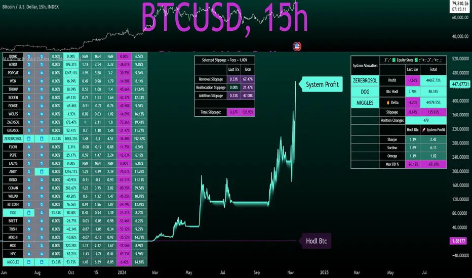
TGIF Dynamic Tracker [NINE]Overview
A professional-grade indicator for tracking weekly price ranges and identifying high-probability retracement zones based on the TGIF (Thank God It's Friday) concept from ICT (Inner Circle Trader) methodology.
What is the TGIF Concept?
The TGIF concept is based on the observation that price tends to retrace a significant portion of the weekly range toward the end of the trading week — typically on Thursday evening or Friday. This phenomenon occurs as institutional traders take profits and rebalance positions before the weekend, creating predictable retracement patterns.
By identifying the weekly high and low, traders can anticipate specific retracement levels where price is likely to find support or resistance. The most commonly referenced retracement zone is the 20-30% level, representing a shallow pullback from the week's extreme before potential continuation.
Features In Depth
Weekly High/Low Tracking
The foundation of the TGIF strategy is accurately tracking the current week's price extremes.
Automatic Detection: The indicator continuously monitors price action and updates the weekly high and low in real-time. As new extremes are made, all dependent calculations (retracement zones, percentage levels) update automatically.
Smart Session Timing: The indicator automatically detects your market type and adjusts accordingly:
Stocks/ETFs: Week begins Monday at 9:30 AM ET (market open)
Forex/Crypto/Futures: Week begins Sunday at 6:00 PM ET (18:00)
This ensures accurate weekly range calculations regardless of which market you're trading.
Visual Customization:
Enable/disable weekly high and low lines independently
Choose line color, style (solid, dashed, dotted), and thickness
Lines extend from week start to current bar
Percentage Level Lines
Individual horizontal lines mark key retracement percentages within the weekly range.
Available Levels:
20% — Shallow retracement, first potential support/resistance
30% — Edge of the primary TGIF zone
50% — Mid-range equilibrium point
60% — Beginning of deeper retracement territory
80% — Deep retracement zone
90% — Near-complete retracement
Independent Controls: Each level can be toggled on or off individually, allowing you to display only the levels relevant to your trading strategy. All levels share common styling settings for a clean, consistent appearance.
Dynamic Bias Adjustment: Levels automatically adjust based on the current weekly bias:
Bullish Bias (new weekly high made): Levels measure DOWN from the high
Bearish Bias (new weekly low made): Levels measure UP from the low
This ensures retracement zones always point toward the direction of potential pullback.
Retracement Zones
Highlighted zones visually emphasize the most significant retracement areas.
Three Configurable Zones:
20-30% Zone (Primary TGIF Zone)
This is the classic TGIF retracement area. When price makes a weekly high or low, traders anticipate a pullback to this zone before potential continuation. This shallow retracement often provides optimal risk/reward entries in the direction of the weekly trend.
50-60% Zone (Equilibrium Zone)
Represents a balanced pullback to the middle of the weekly range. Price reaching this zone suggests a more significant retracement is underway. This area often acts as a decision point — price either finds support/resistance here or continues toward deeper retracement levels.
80-90% Zone (Deep Retracement Zone)
Indicates a near-complete retracement of the weekly range. Price reaching this zone suggests the original weekly move may be fully reversing. Traders watch for reversal signals here or prepare for a potential range expansion in the opposite direction.
Zone Display Options:
Each zone can be enabled/disabled independently
Customizable background colors with transparency control
Zones only appear during the retracement period (starting Thursday/Friday)
Midlines: Optional center lines within each zone (25%, 55%, 85%) provide additional precision points. These midlines often act as the "sweet spot" within each retracement band.
Time-Based Markers
Vertical lines help you identify important session boundaries and timing.
Daily Session Lines:
Mark the start of each trading day with vertical lines extending through the weekly range.
Stocks: 9:30 AM ET (NYSE/NASDAQ open)
Forex/Crypto/Futures: 6:00 PM ET (18:00 — New York session close/new day start)
Control how many historical session lines remain visible (1-5) to avoid chart clutter while maintaining useful reference points.
Weekly Start Lines:
A distinct vertical line marks the beginning of each trading week, providing clear visual separation between weeks and helping you identify the starting point for weekly range calculations.
Retracement Start Lines:
Mark when the TGIF retracement period begins — this is when you should start watching for pullbacks to the retracement zones.
Stocks: Friday 9:30 AM ET (Friday market open)
Forex/Crypto/Futures: Thursday 6:00 PM ET (18:00)
Historical Weeks
View retracement data from previous weeks to identify recurring patterns and validate the TGIF concept on your chosen instrument.
Historical Tracking:
Display up to 20 previous weeks of data
Each historical week shows its own high/low lines, retracement zones, and time markers
Helps identify how consistently the instrument respects TGIF levels
What's Displayed:
Weekly high and low boundaries
All enabled retracement zones with midlines
Weekly start and retracement start lines
Optional labels for historical levels
Historical Labels: Toggle labels on historical weeks independently. Disable them to reduce clutter while keeping the visual reference lines.
Use Cases:
Backtest TGIF setups visually on your chart
Identify instruments that respect TGIF levels consistently
Study how deep retracements typically go on your chosen market
Labels & Display Modes
Comprehensive labeling options for quick reference.
Label Display Modes:
Levels: Shows only the level name (e.g., "HIGH", "20%", "50%")
Price: Shows only the price value
Both: Shows level name and price (e.g., "20% | 1.2345")
Label Positioning: Labels appear to the right of the current bar, staying visible as price action develops.
Tooltips: When using "Levels" display mode, hover over any label to see the exact price in the tooltip.
Label Customization:
Text size: Tiny, Small, Normal, Large, Huge
Text color selection
Labels use monospace font for clean alignment
Info Table
An optional real-time summary table showing all current levels and their distance from price.
Table Contents:
Current day indicator (MON, TUE, WED, THU, FRI)
All six percentage levels (20%, 30%, 50%, 60%, 80%, 90%)
Exact price for each level
Distance from current price to each level
Adaptive Theming: The table automatically detects your chart's background color (light or dark) and adjusts text and border colors for optimal readability.
Display Settings:
9 position options (corners, edges, and center)
Size options: Tiny, Small, Normal, Large
Practical Use: Quickly identify which level is nearest to current price without visually scanning the chart. The distance column helps assess how far price needs to travel to reach key zones.
Smart Market Detection
The indicator automatically identifies your market type and adjusts all timing calculations.
Detected Market Types:
Stocks & ETFs:
Week starts: Monday 9:30 AM ET
Daily sessions: 9:30 AM ET
Retracement period begins: Friday 9:30 AM ET
Standard equity market hours apply
Forex & Crypto:
Week starts: Sunday 6:00 PM ET (18:00)
Daily sessions: 6:00 PM ET (18:00)
Retracement period begins: Thursday 6:00 PM ET (18:00)
24-hour market timing with New York session rollover
Futures Contracts:
Automatically detected via common futures symbols (ES, NQ, YM, RTY, CL, GC, etc.)
Uses forex-style timing (18:00 ET rollover)
Handles continuous contracts and front-month symbols
This automatic detection ensures you get accurate weekly ranges without manual configuration.
Bias Tracking
The indicator dynamically tracks weekly directional bias to orient retracement calculations correctly.
How Bias is Determined:
When price makes a new weekly high, bias shifts to BULLISH
When price makes a new weekly low, bias shifts to BEARISH
Bias can change multiple times throughout the week as new extremes are made
Why Bias Matters:
Retracement levels are calculated from the appropriate extreme based on current bias:
Bullish bias: Levels measure DOWN from the weekly high (anticipating pullback from high)
Bearish bias: Levels measure UP from the weekly low (anticipating pullback from low)
This ensures the 20-30% zone always represents a shallow retracement in the context of the current weekly direction.
Tips
Best Results on Trending Weeks: TGIF works best when there's a clear weekly direction. Choppy, range-bound weeks may not produce clean retracements.
Combine with Other Confluence: TGIF levels are most powerful when they align with other technical factors — Fair Value Gaps, order blocks, previous week highs/lows, or key support/resistance levels.
Use Historical Data: Enable historical weeks to see how your instrument typically respects TGIF levels. Some instruments are more "TGIF-friendly" than others.
Midlines as Precision Points: The midlines (25%, 55%, 85%) often act as the exact reversal point within each zone. Watch for reactions specifically at these levels.
Friday Afternoon Caution: Late Friday sessions can be thin and choppy. Consider taking profits or reducing position sizes heading into the weekend.
Requirements
Intraday Timeframes Only: This indicator requires timeframes of 1 hour or less for accurate session and weekly boundary detection.
Sufficient Historical Data: When using the Historical Weeks feature, ensure your chart has enough bars loaded to display the requested number of weeks.
Session-Based Markets: Optimized for markets with distinct sessions. Continuous 24/7 markets may show different characteristics.
Disclaimer
For Educational and Informational Purposes Only
This indicator is provided as a technical analysis tool for educational and informational purposes only. It is not intended as, and should not be construed as, financial advice, investment advice, trading advice, or any other type of advice.
No Guarantees: Past performance of any trading strategy, indicator, or methodology is not indicative of future results. The TGIF concept and associated retracement levels do not guarantee that price will behave in any predicted manner. Markets are inherently
unpredictable, and no technical indicator can accurately predict future price movements.
Risk Warning: Trading financial instruments involves substantial risk of loss and is not suitable for all investors. You should carefully consider your investment objectives, level of experience, and risk appetite before trading. Never trade with money you cannot afford to lose.
Not Financial Advice: The creator of this indicator (NINE) is not a licensed financial advisor, broker, or dealer. Nothing in this indicator or its documentation should be interpreted as a recommendation to buy, sell, or hold any financial instrument.
Your Responsibility: You are solely responsible for your own trading decisions. Always conduct your own research and due diligence before making any trading or investment decisions. Consider consulting with a qualified financial professional before trading.
No Liability: The creator assumes no responsibility or liability for any errors, inaccuracies, or omissions in this indicator or its documentation. The creator shall not be held liable for any losses, damages, or costs arising from the use or inability to use this indicator.

Dynamic Portfolio TrackerDynamic Portfolio Tracker
The Dynamic Portfolio Tracker is a visual tool for actively managing and monitoring a multi-asset portfolio directly on TradingView. It allows users to input up to 15 custom assets (with a default setup for 5), define how much of each asset they hold, and assign a target allocation percentage to each. The script then calculates live market prices, total portfolio value, current vs. target weightings, and provides clear, color-coded instructions on whether to buy, sell, or hold each asset. It displays all this data in an on-chart table, showing both the dollar amount and the quantity to adjust for each asset, helping users keep their portfolio aligned with their strategy in real time.
How to Use the Inputs (What Each Field Means)
1. Portfolio Assets (Tickers)
Fields: Asset 1 Ticker, Asset 2 Ticker, …, Asset 15 Ticker
What it does: Lets you select which assets (crypto, stocks, etc.) you want to track. These are live symbols pulled from TradingView.
2. Asset Quantities
Fields: Asset 1 Amount, Asset 2 Amount, …, Asset 15 Amount
What it means: How much of each asset you currently hold. For example:
• 0.03 BTC
• 2.1 ETH
Why it’s needed: The script multiplies this by the live price to calculate the current dollar value of each asset in your portfolio.
3. Target %
Fields: Asset 1 Implied %, Asset 2 Implied %, …, Asset 15 Implied %
What it means: Your desired allocation for each asset. For example:
• 40% BTC
• 20% ETH
• 10% SOL, etc.
Important: These must total 100% or less across all assets. The script checks this and shows an error if the total exceeds 100%.
The Dynamic Portfolio Tracker displays two powerful on-chart tables:
1. Main Table — Per Asset Breakdown
This table shows detailed, real-time information for each asset in your portfolio. Each row represents a different asset, and each column has a specific meaning:
Column What It Means
Asset = The symbol of the asset (e.g., BTCUSD, ETHUSD), auto-stripped from the exchange name.
Price = The current market price of the asset, pulled live from TradingView.
Quantity = How much of that asset you currently hold, entered manually in the inputs.
Target % = The percentage of your total portfolio you want this asset to represent.
Actual % = What percentage of your portfolio it currently makes up (based on price × quantity).
Target Value = How much (in $) this asset should be worth in your portfolio.
Actual Value = How much (in $) this asset is currently worth.
Instruction = Whether to Buy, Sell, or Hold to match your target allocation.
Value Change = The dollar amount you’d need to buy/sell to rebalance this asset.
Units to Trade = The number of asset units to buy/sell to reach the target value.
2. Portfolio Summary Table — Portfolio Totals
This smaller table appears in the top-right corner and summarizes your entire portfolio at a glance:
Target % = Total of all your assigned target allocations (should equal 100%).
Actual % = Actual portfolio composition (always 100% unless your capital is zero).
Target Value = Total value your portfolio should be based on your target percentages.
Actual Value = Current live total value of your portfolio.
If there’s a discrepancy between Target Value and Actual Value, the difference is shown in each row of the main table, so you can adjust individual assets accordingly.
Privacy First: Hide Sensitive Financial Data
A unique feature of this tool is the ability to hide sensitive financial data, such as:
• Target Value
• Actual Value
• Total Portfolio Value
You can turn these off using toggle settings, and they’ll be replaced with a crossed-out eye icon (👁️🗨️) — just like on modern crypto exchanges. This feature makes the script safe for streaming, screenshots, or sharing publicly while protecting your privacy.
But more importantly:
Feelings are the enemy of good investing.
Seeing the value of your portfolio fluctuate can trigger fear or greed. By hiding your dollar values, you’re not just securing your data — you’re reducing the temptation to react emotionally.
It’s just numbers. Systems over Feelings.
Table Automatically Adapts to Your Asset Count
The Dynamic Portfolio Tracker is designed to scale with your portfolio. Simply choose how many assets you want to track (up to 15), and the table will automatically resize to fit exactly that number — no wasted space or empty rows.
• Select 1 to 15 assets using the “Number of Assets” input
• The table expands or contracts dynamically to show only those rows
• All calculations, summaries, and layout elements adjust accordingly in real time
This keeps the interface clean, focused, and perfectly tailored to your setup — whether you’re tracking 3 coins or managing a full portfolio of 12+ tokens.
Customize Your Table to Match Your Style
The Dynamic Portfolio Tracker offers a full suite of visual customization options, allowing you to tailor the table to your charting style or stream layout. You can:
• Choose text colors for labels, values, and headers
• Set background colors for the full table and header row — or turn them off completely for a clean, transparent look
• Control border and frame settings, including color, thickness, or disabling them entirely
• Pick custom colors for Buy and Sell signals in the rebalance column
• Adjust table font size from tiny to large to match your resolution or preferences
Special Thanks
This tool wouldn’t exist without the knowledge and inspiration gained through The Real World. A sincere thank you to the Investing Master, the Guides, and Professor Adam — your frameworks and lessons brought clarity, discipline, and structure to this build.
And of course, glory to L4 — where real men are made.
Short Int. Tracker W/% inc/decShort Interest Tracker with % Difference - Indicator Explanation
This Short Interest Tracker is designed to monitor short interest data and highlight potential trends based on the relationship between short interest and the stock price. It calculates the percentage difference between the current short interest and the 2-day simple moving average (SMA), helping identify whether short interest is increasing or decreasing over time.
Key Functions:
Short Interest Tracking:
The indicator tracks daily short interest data using FINRA's short volume data for the current stock (e.g., FINRA:SYMBOL_SHORT_VOLUME).
It compares current short interest with a 2-day SMA to assess if short interest is rising or falling. This helps identify whether more traders are betting against the stock or covering their positions.
Visual Display:
The data is displayed in a table on the chart, divided into sections for:
1 Day Short Interest
Last 3 Days Short Interest
Weekly Short Interest
Each section shows the short interest volume, the corresponding SMA, and the percentage difference. It also displays a signal indicating if short interest is increasing, decreasing, or stable.
Signal Interpretation:
A "Stable" signal means that short interest is neither increasing nor decreasing.
An "Increasing" signal indicates that more traders are opening short positions, betting against the stock. OR- averaging their short position. Keep an eye for a price increase and a short int. increase, this could be the perfect storm.
A "Decreasing" signal shows that traders are closing their short positions, indicating reduced bearish sentiment.
Color Customization:
You can customize the colors for each section of the table, including the background and text colors, to make the display more visually appealing and suited to your preference.
Understanding Short Interest & Price Movements:
Short interest can be a powerful indicator of market sentiment. Here's what the data can tell you:
Increasing Short Interest: Typically signals that traders are expecting the stock price to fall. More shares are being borrowed and sold by short sellers, betting against the stock.
Price Rising Despite Increasing Short Interest: If short interest increases but the stock price is rising, it suggests that short sellers are attempting to push the price down but are failing as the market is moving in the opposite direction. This could be due to buying pressure from long investors or positive news.
Short Sellers Getting Trapped: In some cases, short sellers become trapped when the price rises despite their short positions. They may be forced to buy back shares to cover their positions, which further drives the price up. This dynamic can lead to a short squeeze, where the price rises rapidly as more shorts cover.
Potential for a Short Squeeze: When the price rises against increasing short interest, a short squeeze may occur, causing even more shorts to cover their positions, which can send the stock price soaring.
Summary:
This indicator provides insight into short interest trends, helping you identify whether more traders are betting against the stock or if short sellers are being forced to cover their positions. It also provides a visual signal on the chart, so you can quickly spot periods where short interest is increasing or decreasing, and where price movements might signal a potential short squeeze.

lib_trackingLibrary "lib_tracking"
tracking highest and lowest with anchor point to track over dynamic periods, e.g. to track a Session HH/LL live and get the bar/time of the LTF wick that matches the HTF HH/LL
// DESIGN DECISION
// why anchored replacements for ta.highest / ta.highestbars / ta.lowest / ta.lowestbars:
// 1. they require a fixed length/lookback which makes it easier to calculate, but
// 2. this prevents us from tracking the HH/LL of a changing timeframe, e.g. live tracking the HH/LL of a running session or unfinished higher timeframe
// 3. tracking with anchor/start/reset flag allows to persist values until the next start/reset, so no other external storage is required
track_highest(value, reset, track_this_bar)
Parameters:
value (float)
reset (bool) : boolean flag to restart tracking from this point (a.k.a anchor)
track_this_bar (bool) : allows enabling and disabling of tracking, e.g. before a session starts or after it ends, values can be kept until next reset.
track_lowest(value, reset, track_this_bar)
Parameters:
value (float)
reset (bool) : boolean flag to restart tracking from this point (a.k.a anchor)
track_this_bar (bool) : allows enabling and disabling of tracking, e.g. before a session starts or after it ends, values can be kept until next reset.
track_hl_htf(htf, value_high, value_low)
Parameters:
htf (string) : the higher timeframe in pinescript string notation
value_high (float)
value_low (float)
Returns:

Bullish Candlestick Pattern Tracker (21 Patterns)Script Title: Bullish Candlestick Pattern Tracker (21 Patterns)
Overview
This script is a comprehensive tool designed to automatically detect and track the lifecycle of 21 distinct bullish candlestick patterns.
It identifies a pattern upon the close of a bar and then monitors its status over a user-defined period. The primary goal is to provide traders with clear, automated signals for potential bullish reversals, complete with pre-calculated confirmation and stop-loss levels based on established technical analysis definitions.
This indicator is built in Pine Script v6 and uses a stateful tracking system to manage each detected pattern.
Key Features
21 Bullish Patterns: Detects a wide array of patterns, from single-bar formations (e.g., Bullish Hammer) to complex three-bar formations (e.g., Bullish Morning Star, Bullish Three White Soldiers).
Stateful Lifecycle Tracking: This is not just a pattern detector. It monitors each pattern's status in real-time after detection:
Not Confirmed: The pattern has formed, but the price has not yet closed above the confirmation level.
Confirmed: The price has successfully closed above the confirmation level.
Failed: The price has closed below the stop-loss level (either before or after confirmation).
Customizable Confirmation Period: Users can define how many bars the script should wait for a pattern to be confirmed or to fail (via the confBarCount input).
Clear Visual Labels: Displays a detailed label under each unconfirmed pattern, showing:
Pattern Name (e.g., "Bullish Engulfing")
Status: "Not Confirmed"
Confirmation Level (Teyit): The price that must be breached (on close) for the pattern to be considered valid.
Stop-Loss Level (S/L): The price level that invalidates the pattern.
Modular Inputs: Each of the 21 patterns can be individually toggled on or off from the settings menu, allowing you to focus only on the patterns you trust.
Methodology & Logic
The logic for pattern detection, as well as the specific rules for each pattern's Confirmation Level and Stop-Loss Level, is strictly based on the definitions provided in the "Mum Formasyonları (Kasım 2015 Versiyon 7.1.4)" guide by Matriks Bilgi Dağıtım Hizmetleri A.Ş.
This script serves as a Pine Script v6 implementation of those specific rules, designed for stock market analysis (Bullish signals only).
How to Use (Parameters Explained)
Teyit Bar Sayısı (Conf. Bar Count): This is the most important input. It defines the "expiration" for a pattern. For example, if set to 3, the script will monitor a new pattern for 3 bars. If it is not confirmed or failed within those 3 bars, the label will disappear.
Status Toggles (e.g., showNotConfirmed): Allows you to filter which pattern statuses are visible on the chart. It is recommended to keep all three active.
Pattern Toggles (e.g., 1. Bullish Hammer Göster): Use these 21 checkboxes to activate or deactivate the detection for specific patterns.
Disclaimer
This indicator is provided for educational and informational purposes only. It does not constitute financial advice or a recommendation to buy or sell any asset. All trading involves significant risk, and past performance is not indicative of future results. Please conduct your own research and backtesting before making any trading decisions.

Drawdown Tracker [SpokoStocks]Drawdown Tracker
The Drawdown Tracker is a powerful tool designed to help traders monitor and visualize the drawdown of symbol. By tracking both current and maximum drawdown levels, this indicator provides valuable insights into risk and potential capital preservation.
Features:
> Current Drawdown:
The current drawdown is calculated as the percentage drop from the record high to the current low, providing a real-time view of the loss from the peak.
> Maximum Drawdown:
The maximum drawdown represents the deepest drop observed from any peak in the historical data, giving an understanding of the worst-case scenario for losses.
> You can choose between two modes:
Full History: Tracks the maximum drawdown from the entire available data.
Rolling Period: Tracks the maximum drawdown within a defined rolling period (default 50 bars), allowing for a shorter-term risk assessment.
> Customizable Rolling Period:
You can adjust the rolling period length through the Rolling Period Length input to reflect different time frames for drawdown calculations.
> Warning Level:
A customizable warning level (default -65%) is plotted on the chart. This acts as a threshold to alert users when the drawdown crosses into a potentially concerning territory.
> Gradient Color Visualization:
The current drawdown is visualized using a gradient color, transitioning from red to yellow as the drawdown increases from -100% to 0%, providing an easy-to-interpret view of the severity of the drawdown.
> New Max Drawdown Marker:
Whenever a new maximum drawdown is recorded, a triangle marker is displayed at the bottom of the chart, along with a label showing the drawdown percentage. This provides clear visual confirmation when a new historical low is reached.
> Alerts:
Warning Level Breach Alert: Alerts you when the drawdown breaches the warning level you’ve set, helping you stay aware of significant risk events.
New Max Drawdown Alert: Triggers when a new maximum drawdown is recorded, allowing you to act quickly if necessary.
Use Cases:
Risk Management: Keep track of how much an asset is down from the peak, helping you make informed decisions about risk and drawdown tolerances.
Risk Disclaimer:
The information provided by this script is for educational and informational purposes only. It is not intended as financial advice and should not be construed as such. All trading and investment activities involve a high level of risk and may result in the loss of capital. The user is solely responsible for any decisions made based on the content provided by this script.
By using this script, you acknowledge and agree that you use it at your own risk. The creator of this script makes no warranties regarding the accuracy, completeness, or reliability of the information, and disclaims any responsibility for any losses or damages arising from its use.
Always conduct your own research and consult with a qualified financial advisor before making any investment decisions.
