Multi-MA Strategy Analyzer with BacktestMulti-MA Strategy Analyzer with Backtest
This TradingView Pine Script indicator is designed to analyze multiple moving averages (SMA or EMA) dynamically and identify the most profitable one based on historical performance.
Features
Dynamic MA Range:
Specify a minLength, maxLength, and step size.
Automatically calculates up to 20 MAs.
Custom MA Calculation:
Uses custom SMA and EMA implementations to support dynamic length values.
Buy/Sell Logic:
Buy when price crosses above a MA.
Sell when price crosses below.
Supports both long and short trades.
Performance Tracking:
Tracks PnL, number of trades, win rate, average profit, and drawdown.
Maintains individual stats for each MA.
Best MA Detection:
Automatically highlights the best-performing MA.
Optional showBestOnly toggle to focus only on the best line and its stats.
Visualization:
Up to 20 plot() calls (static) for MAs.
Green highlight for the best MA.
Color-coded result table and chart.
Table View
When showBestOnly = false, the table displays all MAs with stats.
When showBestOnly = true, the table displays only the best MA with a summary row.
Includes:
Best MA length
Total PnL
Number of trades
Win rate
Avg PnL per trade
Max Drawdown
Configuration
minLength (default: 10)
maxLength (default: 200)
step (default: 10)
useEMA: Toggle between EMA and SMA
showBestOnly: Focus on best-performing MA only
Notes
MA plotting is static, limited to 20 total.
Table supports highlighting and is optimized for performance.
Script is structured to run efficiently using arrays and simple int where required.
Potential Extensions
Add visual buy/sell arrows
Export stats to CSV
Strategy tester conversion
Custom date range filtering for backtesting
Author: Muhammad Wasim
Version: 1.0
Cerca negli script per "track"

Geometric Momentum Breakout with Monte CarloOverview
This experimental indicator uses geometric trendline analysis combined with momentum and Monte Carlo simulation techniques to help visualize potential breakout areas. It calculates support, resistance, and an aggregated trendline using a custom Geo library (by kaigouthro). The indicator also tracks breakout signals in a way that a new buy signal is triggered only after a sell signal (and vice versa), ensuring no repeated signals in the same direction.
Important:
This script is provided for educational purposes only. It is experimental and should not be used for live trading without proper testing and validation.
Key Features
Trendline Calculation:
Uses the Geo library to compute support and resistance trendlines based on historical high and low prices. The midpoint of these trendlines forms an aggregated trendline.
Momentum Analysis:
Computes the Rate of Change (ROC) to determine momentum. Breakout conditions are met only if the price and momentum exceed a user-defined threshold.
Monte Carlo Simulation:
Simulates future price movements to estimate the probability of bullish or bearish breakouts over a specified horizon.
Signal Tracking:
A persistent variable ensures that once a buy (or sell) signal is triggered, it won’t repeat until the opposite signal occurs.
Geometric Enhancements:
Calculates an aggregated trend angle and channel width (distance between support and resistance), and draws a perpendicular “breakout zone” line.
Table Display:
A built-in table displays key metrics including:
Bullish probability
Bearish probability
Aggregated trend angle (in degrees)
Channel width
Alerts:
Configurable alerts notify when a new buy or sell breakout signal occurs.
Inputs
Resistance Lookback & Support Lookback:
Number of bars to look back for determining resistance and support points.
Momentum Length & Threshold:
Period for ROC calculation and the minimum percentage change required for a breakout confirmation.
Monte Carlo Simulation Parameters:
Simulation Horizon: Number of future bars to simulate.
Simulation Iterations: Number of simulation runs.
Table Position & Text Size:
Customize where the table is displayed on the chart and the size of the text.
How to Use
Add the Script to Your Chart:
Copy the code into the Pine Script editor on TradingView and add it to your chart.
Adjust Settings:
Customize the inputs (e.g., lookback periods, momentum threshold, simulation parameters) to fit your analysis or educational requirements.
Interpret Signals:
A buy signal is plotted as a green triangle below the bar when conditions are met and the state transitions from neutral or sell.
A sell signal is plotted as a red triangle above the bar when conditions are met and the state transitions from neutral or buy.
Alerts are triggered only on the bar where a new signal is generated.
Examine the Table:
The table displays key metrics (breakout probabilities, aggregated trend angle, and channel width) to help evaluate current market conditions.
Disclaimer
This indicator is experimental and provided for educational purposes only. It is not intended as a trading signal or financial advice. Use this script at your own risk, and always perform your own research and testing before using any experimental tools in live trading.
Credit
This indicator uses the Geo library by kaigouthro. Special thanks to Cryptonerds and @Hazzantazzan for their contributions and insights.

Shadow Edge (Example)This script tracks hourly price extremes (highs/lows) and their equilibrium (midpoint), plotting them as dynamic reference lines on your chart. It helps visualize intraday support/resistance levels and potential price boundaries.
Key Features
Previous Hour Levels (Static Lines):
PH (Previous Hour High): Red line.
PL (Previous Hour Low): Green line.
P.EQ (Previous Hour Equilibrium): Blue midpoint between PH and PL.
Current Hour Levels (Dynamic/Dotted Lines):
MuEH (Current Hour High): Yellow dashed line (updates in real-time).
MuEL (Current Hour Low): Orange dashed line (updates in real-time).
Labels: Clear text labels on the right edge of the chart for easy readability.
How It Works
Hourly Tracking:
Detects new hours using the hour(time) function.
Resets high/low values at the start of each hour.
Stores the previous hour’s PH, PL, and P.EQ when a new hour begins.
Dynamic Updates:
Continuously updates MuEH and MuEL during the current hour to reflect the latest extremes.
Customization
Toggle visibility of lines via inputs:
Enable/disable PH, PL, P.EQ, MuEH, MuEL individually.
Adjustable colors and line styles (solid for previous hour, dashed for current hour).
Use Case
Intraday Traders: Identify hourly ranges, breakout/retracement opportunities, or mean-reversion setups.
Visual Reference: Quickly see where price is relative to recent hourly activity.
Technical Notes
Overlay: Plots directly on the price chart.
Efficiency: Uses var variables to preserve values between bars.
Labels: Only appear on the latest bar to avoid clutter.
This tool simplifies intraday price action analysis by combining historical and real-time hourly data into a single visual framework.
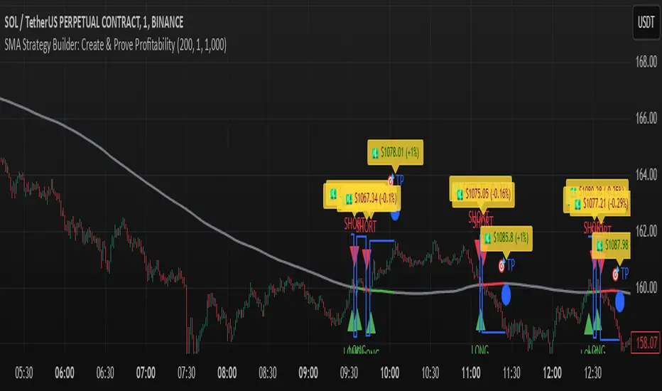
SMA Strategy Builder: Create & Prove Profitability📄 Pine Script Strategy Description (For Publishing on TradingView)
🎯 Strategy Title:
SMA Strategy Builder: Create & Prove Profitability
✨ Description:
This tool is designed for traders who want to build, customize, and prove their own SMA-based trading strategies. The strategy tracks capital growth in real-time, providing clear evidence of profitability after each trade. Users can adjust key parameters such as SMA period, take profit levels, and initial capital, making it a flexible solution for backtesting and strategy validation.
🔍 Key Features:
✅ SMA-Based Logic:
Core trading logic revolves around the Simple Moving Average (SMA).
SMA period is fully adjustable to suit various trading styles.
🎯 Customizable Take Profit (TP):
User-defined TP percentages per position.
TP line displayed as a Step Line with Breaks for clear segmentation.
Visual 🎯TP label for quick identification of profit targets.
💵 Capital Tracking (Proof of Profitability):
Initial capital is user-defined.
Capital balance updates after each closed trade.
Shows both absolute profit/loss and percentage changes for every position.
Darker green profit labels for better readability and dark red for losses.
📈 Capital Curve (Performance Visualization):
Capital growth curve available (hidden by default, can be enabled via settings).
📏 Dynamic Label Positioning:
Label positions adjust dynamically based on the price range.
Ensures consistent visibility across low and high-priced assets.
⚡ How It Works:
Long Entry:
Triggered when the price crosses above the SMA.
TP level is calculated as a user-defined percentage above the entry price.
Short Entry:
Triggered when the price crosses below the SMA.
TP level is calculated as a user-defined percentage below the entry price.
TP Execution:
Positions close immediately once the TP level is reached (no candle close confirmation needed).
🔔 Alerts:
🟩 Long Signal Alert: When the price crosses above the SMA.
🟥 Short Signal Alert: When the price crosses below the SMA.
🎯 TP Alert: When the TP target is reached.
⚙️ Customization Options:
📅 SMA Period: Choose the moving average period that best fits your strategy.
🎯 Take Profit (%): Adjust TP percentages for flexible risk management.
💵 Initial Capital: Set the starting capital for realistic backtesting.
📈 Capital Curve Toggle: Enable or disable the capital curve to track overall performance.
🌟 Why Use This Tool?
🔧 Flexible Strategy Creation: Adjust core parameters and create tailored SMA-based strategies.
📈 Performance Proof: Capital tracking acts as real proof of profitability after each trade.
🎯 Immediate TP Execution: No waiting for candle closures; profits lock in as soon as targets are hit.
💹 Comprehensive Performance Insights: Percentage-based and absolute capital tracking with dynamic visualization.
🏦 Clean Visual Indicators: Strategy insights made clear with dynamic labeling and adjustable visuals.
⚠️ Disclaimer:
This script is provided for educational and informational purposes only. Trading financial instruments carries risk, and past performance does not guarantee future results. Always perform your own due diligence before making any trading decisions.
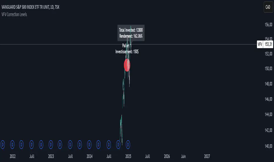
VFV Correction Levels
This Pine Script, "VFV Correction Levels," identifies significant daily price corrections and calculates corresponding investments based on fixed thresholds (paliers). Key features include:
Six predefined correction levels trigger investments between $150 and $600 based on the percentage drop.
Larger corrections correspond to higher investment amounts.
Graphical Indicators:
Visual labels mark correction levels and display investment amounts directly on the chart.
Investment Tracking:
Calculates total invested and tracks performance (yield percentage) relative to the initial correction price.
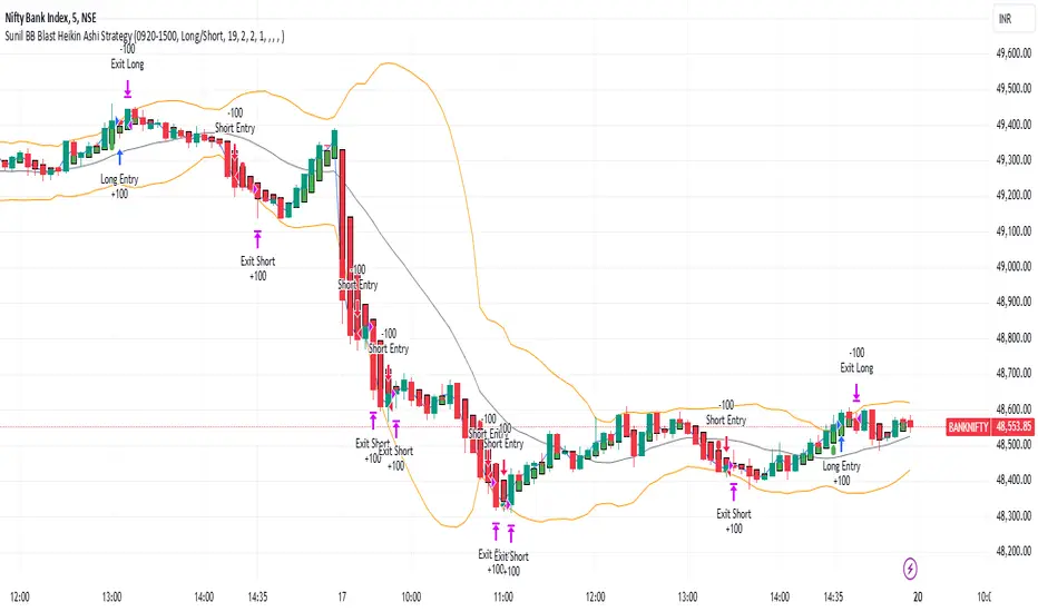
Sunil BB Blast Heikin Ashi StrategySunil BB Blast Heikin Ashi Strategy
The Sunil BB Blast Heikin Ashi Strategy is a trend-following trading strategy that combines Bollinger Bands with Heikin-Ashi candles for precise market entries and exits. It aims to capitalize on price volatility while ensuring controlled risk through dynamic stop-loss and take-profit levels based on a user-defined Risk-to-Reward Ratio (RRR).
Key Features:
Trading Window:
The strategy operates within a user-defined time window (e.g., from 09:20 to 15:00) to align with market hours or other preferred trading sessions.
Trade Direction:
Users can select between Long Only, Short Only, or Long/Short trade directions, allowing flexibility depending on market conditions.
Bollinger Bands:
Bollinger Bands are used to identify potential breakout or breakdown zones. The strategy enters trades when price breaks through the upper or lower Bollinger Band, indicating a possible trend continuation.
Heikin-Ashi Candles:
Heikin-Ashi candles help smooth price action and filter out market noise. The strategy uses these candles to confirm trend direction and improve entry accuracy.
Risk Management (Risk-to-Reward Ratio):
The strategy automatically adjusts the take-profit (TP) level and stop-loss (SL) based on the selected Risk-to-Reward Ratio (RRR). This ensures that trades are risk-managed effectively.
Automated Alerts and Webhooks:
The strategy includes automated alerts for trade entries and exits. Users can set up JSON webhooks for external execution or trading automation.
Active Position Tracking:
The strategy tracks whether there is an active position (long or short) and only exits when price hits the pre-defined SL or TP levels.
Exit Conditions:
The strategy exits positions when either the take-profit (TP) or stop-loss (SL) levels are hit, ensuring risk management is adhered to.
Default Settings:
Trading Window:
09:20-15:00
This setting confines the strategy to the specified hours, ensuring trading only occurs during active market hours.
Strategy Direction:
Default: Long/Short
This allows for both long and short trades depending on market conditions. You can select "Long Only" or "Short Only" if you prefer to trade in one direction.
Bollinger Band Length (bbLength):
Default: 19
Length of the moving average used to calculate the Bollinger Bands.
Bollinger Band Multiplier (bbMultiplier):
Default: 2.0
Multiplier used to calculate the upper and lower bands. A higher multiplier increases the width of the bands, leading to fewer but more significant trades.
Take Profit Multiplier (tpMultiplier):
Default: 2.0
Multiplier used to determine the take-profit level based on the calculated stop-loss. This ensures that the profit target aligns with the selected Risk-to-Reward Ratio.
Risk-to-Reward Ratio (RRR):
Default: 1.0
The ratio used to calculate the take-profit relative to the stop-loss. A higher RRR means larger profit targets.
Trade Automation (JSON Webhooks):
Allows for integration with external systems for automated execution:
Long Entry JSON: Customizable entry condition for long positions.
Long Exit JSON: Customizable exit condition for long positions.
Short Entry JSON: Customizable entry condition for short positions.
Short Exit JSON: Customizable exit condition for short positions.
Entry Logic:
Long Entry:
The strategy enters a long position when:
The Heikin-Ashi candle shows a bullish trend (green close > open).
The price is above the upper Bollinger Band, signaling a breakout.
The previous candle also closed higher than it opened.
Short Entry:
The strategy enters a short position when:
The Heikin-Ashi candle shows a bearish trend (red close < open).
The price is below the lower Bollinger Band, signaling a breakdown.
The previous candle also closed lower than it opened.
Exit Logic:
Take-Profit (TP):
The take-profit level is calculated as a multiple of the distance between the entry price and the stop-loss level, determined by the selected Risk-to-Reward Ratio (RRR).
Stop-Loss (SL):
The stop-loss is placed at the opposite Bollinger Band level (lower for long positions, upper for short positions).
Exit Trigger:
The strategy exits a trade when either the take-profit or stop-loss level is hit.
Plotting and Visuals:
The Heikin-Ashi candles are displayed on the chart, with green candles for uptrends and red candles for downtrends.
Bollinger Bands (upper, lower, and basis) are plotted for visual reference.
Entry points for long and short trades are marked with green and red labels below and above bars, respectively.
Strategy Alerts:
Alerts are triggered when:
A long entry condition is met.
A short entry condition is met.
A trade exits (either via take-profit or stop-loss).
These alerts can be used to trigger notifications or webhook events for automated trading systems.
Notes:
The strategy is designed for use on intraday charts but can be applied to any timeframe.
It is highly customizable, allowing for tailored risk management and trading windows.
The Sunil BB Blast Heikin Ashi Strategy combines two powerful technical analysis tools (Bollinger Bands and Heikin-Ashi candles) with strong risk management, making it suitable for both beginners and experienced traders.
Feebacks are welcome from the users.
BBSS+This Pine Script implements a custom indicator overlaying Bollinger Bands with additional features for trend analysis using Exponential Moving Averages (EMAs). Here's a breakdown of its functionality:
Bollinger Bands:
The script calculates the Bollinger Bands using a 20-period Simple Moving Average (SMA) as the basis and a multiplier of 2 for the standard deviation.
It plots the Upper Band and Lower Band in red.
EMA Calculations:
Three EMAs are calculated for the close price with periods of 5, 10, and 40.
The EMAs are plotted in green (5-period), cyan (10-period), and orange (40-period) to distinguish between them.
Trend Detection:
The script determines bullish or bearish EMA alignments:
Bullish Order: EMA 5 > EMA 10 > EMA 40.
Bearish Order: EMA 5 < EMA 10 < EMA 40.
Entry Signals:
Long Entry: Triggered when:
The close price crosses above the Upper Bollinger Band.
The Upper Band is above its 5-period SMA (indicating momentum).
The EMAs are in a bullish order.
Short Entry: Triggered when:
The close price crosses below the Lower Bollinger Band.
The Lower Band is below its 5-period SMA.
The EMAs are in a bearish order.
Trend State Tracking:
A variable tracks whether the market is in a Long or Short trend based on conditions:
A Long trend continues unless conditions for a Short Entry are met or the Upper Band dips below its average.
A Short trend continues unless conditions for a Long Entry are met or the Lower Band rises above its average.
Visual Aids:
Signal Shapes:
Triangle-up shapes indicate Long Entry points below the bar.
Triangle-down shapes indicate Short Entry points above the bar.
Bar Colors:
Green bars indicate a Long trend.
Red bars indicate a Short trend.
This script combines Bollinger Bands with EMA crossovers to generate entry signals and visualize market trends, making it a versatile tool for identifying momentum and trend reversals.

FT SessionsFT Sessions
Overview
The FT Sessions is a highly customizable and powerful indicator designed for intraday traders who focus on session-based analysis. This script visually highlights global market sessions—Asia, Frankfurt, London, and New York (AM & PM)—on the chart, making it easier to track session ranges and analyze intraday price movements.
Key Features
Customizable Session Times and Colors:
Define your own session times and assign unique colors for better visibility.
Session Range Visualization:
Displays high and low ranges for each session.
Optional transparent range areas with outlines for clarity.
Configurable session range labels for enhanced readability.
Flexible Timezone Settings:
Choose a UTC offset or sync with the exchange's timezone.
User-Friendly Customization:
Compact settings for easier adjustments.
Enable or disable specific sessions to focus on relevant market activity.
How This Script Differs from LuxAlgo
This script draws inspiration from LuxAlgo's session tracking concept but has been developed with significant modifications and unique features:
Built from Scratch in Pine Script v5:
Fully optimized for Pine Script’s latest version, improving performance and functionality.
Expanded Session Range Features:
Five unique sessions (Asia, Frankfurt, London, New York AM, New York PM) with customizable ranges, colors, and labels.
Real-time updating of session ranges for improved intraday analysis.
4H Timeframe Optimization:
Automatically notifies users if applied to an unsupported timeframe, ensuring session accuracy.
Highly Configurable Input Options:
Advanced timezone handling and compact session management settings.
Unique Coding Structure:
Designed to maximize efficiency and minimize resource usage on TradingView.
While LuxAlgo focuses on session concepts, this script brings a fresh, customizable approach specifically tailored for intraday traders seeking precision in tracking session activity.
How It Works
The indicator tracks price movements within each session.
Highlights the high and low range of each session directly on the chart.
Updates session ranges in real-time to reflect evolving market conditions.
Practical Applications
Intraday Trading: Plan trades based on major market session ranges.
Breakout Strategies: Use session high and low levels to identify potential breakouts.
Session-Specific Patterns: Spot consolidations and reversals within session activity.
Important Notes
Optimized for the 4H timeframe. If applied to another timeframe, a notification will appear.
Best used in combination with other tools (e.g., volume or trend indicators) for a complete trading strategy.
Credits
This script draws inspiration from LuxAlgo's open-source session-tracking methodology. However, it introduces substantial improvements and unique features that set it apart. Full credit is given to LuxAlgo for their original open-source concept.
Disclaimer
This script is for informational and educational purposes only. Always test on a demo account before applying to live markets.

TearRepresentative's Rule-Based Dip Buying Strategy Rule-Based Dip Buying Strategy Indicator
This TradingView indicator, inspired by TearRepresentative [ , is a refined tool designed to assist traders in implementing a rule-based dip buying strategy. The indicator automates the identification of optimal buy and sell points, helping traders stay disciplined and minimize emotional biases. It is tailored to index trading, specifically leveraged ETFs like SPXL, to capture opportunities in market pullbacks and recoveries.
Key Features
Dynamic Buy Levels:
Tracks the local high over a customizable lookback period and calculates three buy levels based on percentage drops from the high:
Buy Level 1: First entry point (e.g., 15% drop).
Buy Level 2: Second entry point (e.g., additional 10% drop).
Buy Level 3: Third entry point (e.g., additional 7% drop).
Average Price Tracking:
Dynamically calculates the average price for entered positions when multiple buy levels are triggered.
Sell Level:
Computes a take-profit level (e.g., 20% above the average price) to automate profit-taking when the market rebounds.
Signal Visualization:
Buy Signals: Displayed as green triangles at each buy level.
Sell Signals: Displayed as red triangles at the sell level.
Alerts:
Configurable alerts notify traders when buy or sell signals are triggered, ensuring no opportunity is missed.
Visual Aids:
Semi-transparent and dynamic lines represent buy and sell levels for clear visualization.
Labels provide additional clarity for active levels, helping traders quickly identify actionable signals.
How It Works
The indicator analyzes market movements to identify dips based on predefined thresholds.
Buy signals are triggered when the market price reaches specified levels below the local high.
Once a position is taken, the indicator dynamically adjusts the average entry price and calculates the corresponding sell level.
A sell signal is generated when the market price rises above the calculated take-profit level.
Why Use This Indicator?
Discipline: Automates decision-making, removing emotional factors from trading.
Clarity: Provides clear entry and exit points to simplify complex market dynamics.
Versatility: Suitable for all market conditions, especially during pullbacks and rebounds.
Customization: Allows traders to tailor parameters to their preferred trading style and risk tolerance.
Acknowledgment
This indicator is based on the strategy and insights provided by TearRepresentative, whose expertise in rule-based trading has inspired countless traders. TearRepresentative's approach emphasizes simplicity, reliability, and consistency, offering a robust framework for long-term success.

Quantum ChronoRenko Dynamics Edge - Traditional### **Quantum ChronoRenko Dynamics Edge - Traditional**
**Description:**
The **Quantum ChronoRenko Dynamics Edge - Traditional** is an advanced Renko-based indicator designed for precision trading. It leverages the power of Renko charts to detect price movements, highlight critical trading signals, and dynamically track profit and risk levels. This indicator is built with modern trading strategies in mind, offering robust tools for all traders, from beginners to professionals.
**Key Features:**
1. **Renko-Based Signal Generation**:
- Detects **Buy Signals** when the price closes above the Renko high level.
- Detects **Sell Signals** when the price closes below the Renko low level.
- Ensures signals are non-repainting and confirmed on bar closures.
2. **Take Profit (TP) and Stop Loss (SL) Tracking**:
- Automatically calculates and plots TP and SL levels for every signal.
- Dynamic levels are displayed directly on the chart for better decision-making.
3. **Advanced Signal Management**:
- Prevents duplicate signals within the same Renko range.
- Resets signal conditions when a new Renko range is formed.
4. **Visual Enhancements**:
- Renko high and low levels are plotted with customizable colors and styles.
- TP and SL levels are marked with distinct cross shapes for clarity.
- Optional fill between Renko levels to highlight price ranges.
5. **Real-Time Alerts**:
- Generates alerts for Buy and Sell signals when a candle closes above or below the Renko levels.
- Alerts are designed to help traders react quickly to opportunities.
6. **Comprehensive Statistics**:
- Tracks the number of Buy/Sell signals.
- Calculates the number of TP and SL hits for each signal type.
- Displays detailed percentages and totals in an easy-to-read table.
**Key Benefits**:
- **Non-Repainting Logic**: Ensures stable and reliable signals based on confirmed price movements.
- **Customizability**: Flexible settings for Renko brick size, TP/SL values, and visual enhancements.
- **Professional-Level Insights**: Provides detailed statistics for tracking strategy performance.
**Use Cases**:
- Perfect for intraday and swing traders who rely on Renko charts for clear trend signals.
- Suitable for identifying key breakout opportunities and managing trades with precise TP/SL levels.
Example Usage:
For daily scalping, set the following parameters:
Brick Size: 3
Time Frame: 10 Minutes
This setup provides clean trend signals and dynamic TP/SL tracking for short-term trades.
**Why "Traditional"?**
This version uses the **Traditional Renko method**, ensuring consistent price-based calculations that align with professional trading strategies.
---
**Disclaimer**:
This indicator is a tool to aid trading decisions but does not guarantee profits. Always use proper risk management.
---
Highest High, Lowest Low, Midpoint for Selected Days [kiyarash]Highest High, Lowest Low, and Midpoint for Selected Days Indicator
This custom TradingView indicator allows you to visualize the highest high, lowest low, and the midpoint (average of the highest high and lowest low) over a custom-defined period. You can choose a starting date and specify how many days ahead you want to track the highest and lowest values. This is useful for identifying key levels in a trend and potential support or resistance zones.
How to Use:
Set the Starting Date:
In the settings, input the starting date from which you want to begin tracking the price range. This will be the reference point for your analysis.
Choose the Number of Days to Track:
Specify how many days you want to analyze from the selected starting date. For example, if you want to see the highest high and lowest low over the next 3 days, enter "3" in the settings.
Visualizing the Levels:
The indicator will automatically calculate the highest price and the lowest price over the selected period and draw three lines:
Red Line: Represents the Highest High within the selected period.
Green Line: Represents the Lowest Low within the selected period.
Blue Line: Represents the Midpoint, which is the average of the Highest High and Lowest Low.
Interpretation:
Highest High is a key resistance level, indicating the highest price reached within the specified period.
Lowest Low is a key support level, showing the lowest price during the same period.
Midpoint provides a reference for the average price, often acting as a neutral level between support and resistance.
This tool can help traders to quickly assess potential market ranges, identify breakout or breakdown points, and make informed decisions based on recent price action.
How to Apply:
Add the indicator to your chart.
Adjust the settings to choose your desired starting date and the number of days you want to analyze.
Observe the drawn lines for the Highest High, Lowest Low, and Midpoint levels, and use them to assist in your trading decisions.

Eze Profit - VWAP + MACD Combined SignalThe Eze Profit - VWAP + MACD Combined Signal is an advanced trading tool designed to help traders align price trends with momentum confirmation for better decision-making. By combining Volume-Weighted Average Price (VWAP) and Moving Average Convergence Divergence (MACD), this indicator provides clear entry and exit signals, allowing traders to follow trends and take advantage of momentum shifts.
How It Works:
VWAP:
VWAP represents the average price of an asset, weighted by volume, over a specific period.
It acts as a dynamic support/resistance level and trend filter. Price above VWAP indicates bullish conditions, while price below VWAP suggests bearish conditions.
MACD:
MACD measures momentum through the difference between fast and slow exponential moving averages (EMAs).
Signals are generated when the MACD line crosses its signal line:
Bullish Crossover: Indicates increasing upward momentum.
Bearish Crossunder: Indicates increasing downward momentum.
Combined Logic:
Long Signal: Triggered when price is above VWAP, and MACD exhibits a bullish crossover.
Short Signal: Triggered when price is below VWAP, and MACD exhibits a bearish crossunder.
The script tracks the trader's "in-position" state to prevent redundant signals and ensure clarity.
How to Use:
Use this script to identify potential long and short trading opportunities:
Buy Signal: Enter a long position when the price moves above VWAP and MACD confirms bullish momentum.
Sell Signal: Exit or short when the price drops below VWAP and MACD confirms bearish momentum.
Combine with additional tools like support/resistance, volume analysis, or candlestick patterns for confirmation.
Features:
VWAP Trend Filter: Dynamically adjusts to the trading session to identify overall trend direction.
MACD Momentum Confirmation: Detects key momentum shifts with configurable settings for fast, slow, and signal lengths.
Position State Tracking: Avoids signal redundancy by monitoring open positions.
Buy/Sell Visualizations: Plots Buy/Sell signals directly on the chart for ease of use.
Alerts: Notifies traders in real-time when a long or short signal is triggered.
Customizable Settings:
MACD Fast Length, Slow Length, and Signal Smoothing parameters.
VWAP timeframe resolution to adapt to different trading styles (e.g., intraday or daily).
Credits:
This script is based on standard VWAP and MACD calculations provided by TradingView’s library and has been enhanced with unique logic for combined signal generation.
Notes:
This indicator is intended for educational purposes and should not be considered financial advice. Use it as part of a broader trading strategy alongside other tools for optimal results.

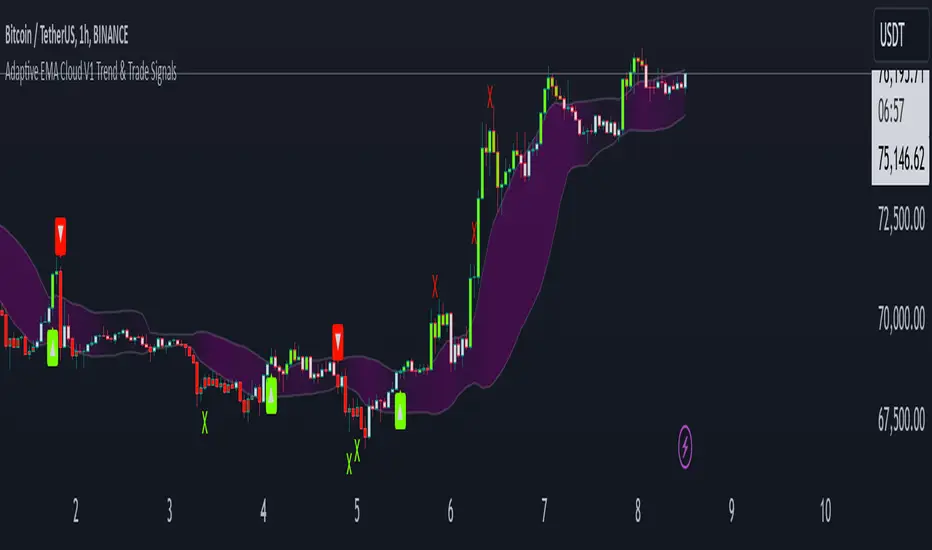
Adaptive ema Cloud v1 Trend & Trade Signals"adaptive ema cloud v1 trend & trade signals" is a comprehensive technical indicator aimed at assisting traders in identifying market trends, trade entry points, and potential take profit (tp) and stop-loss (sl) levels. this indicator combines adaptive exponential moving average (ema) clouds with standard deviation bands to create a visual trend and signal system, enabling users to better analyze price action.
key features:
adaptive ema cloud: calculates a dynamic ema-based cloud using a simple moving average (sma) line, with upper and lower deviation bands based on standard deviations. users can adjust the standard deviation multiplier to modify the cloud's width.
trend direction detection: the indicator determines trend direction by comparing the close price to the ema cloud and signals bullish or bearish trends when the price crosses key levels.
take profit (tp) and stop-loss (sl) points: adaptive tp and sl levels are calculated based on the deviation bands, providing users with suggested exit points when a trade is triggered.
peak and valley detection: detects peaks and valleys in price, aiding traders in spotting potential support and resistance areas.
gradient-based cloud fill: dynamically fills the cloud with a gradient color based on trend strength, helping users visually gauge trend intensity.
trade tracking: tracks recent trades and records them in an internal memory, allowing users to view the last 20 trade outcomes, including whether tp or sl was hit.
how to use:
trend signals: look for green arrows (bullish trend) or red arrows (bearish trend) to identify potential entries based on trend crossovers.
tp/sl management: tp and sl levels are automatically calculated and displayed, with alerts available to notify users when these levels are reached.
adjustable settings: customize period length, standard deviation multiplier, and color preferences to match trading preferences and chart style.
inputs-
period: defines the look-back period for ema calculations.
standard deviation multiplier: adjusts cloud thickness by setting the multiplier for tp and sl bands.
gauge size: scales the gradient intensity for trend cloud visualization.
up/down colors: allows users to set custom colors for bullish and bearish bars.
alert conditions: this script has built-in alerts for trend changes, tp, and sl levels, providing users with automated notifications of important trading signals.
The Pattern-Synced Moving Average System (PSMA)Description:
The Pattern-Synced Moving Average System (PSMA) is a comprehensive trading indicator that combines the reliability of moving averages with automated candlestick pattern detection, real-time alerts, and dynamic risk management to enhance both trend-following and reversal strategies. The PSMA system integrates key elements of trend analysis and pattern recognition to provide users with configurable entry, stop-loss, and take-profit levels. It is designed for all levels of traders who seek to trade in alignment with market context, using signals from trend direction and established candlestick patterns.
Key Functional Components:
Multi-Type Moving Average:
Provides flexibility with multiple moving average options: SMA, EMA, WMA, and SMMA.
The selected moving average helps users determine market trend direction, with price positions relative to the MA acting as a trend confirmation.
Automatic Candlestick Pattern Detection:
Identifies pivotal patterns, including bullish/bearish engulfing and reversal signals.
Helps traders spot potential market turning points and adjust their strategies accordingly.
Configurable Entry, Stop-Loss, and Take-Profit:
Risk management is customizable through risk/reward ratios and risk tolerance settings.
Entry, stop-loss, and take-profit levels are automatically plotted when patterns appear, facilitating rapid trade decision-making with predefined exit points.
Higher Timeframe Trend Confirmation:
Optional feature to verify trend alignment on a higher timeframe (e.g., checking a daily trend on an intraday chart).
This added filter improves signal reliability by focusing on patterns aligned with the broader market trend.
Real-Time Alerts:
Alerts can be set for key pattern detections, allowing traders to respond promptly without constant chart monitoring.
How to Use PSMA:
Set Moving Average Preferences:
Choose the preferred moving average type and length based on your trading strategy. The MA acts as a foundational trend indicator, with price positions indicating potential uptrends (price above MA) or downtrends (price below MA).
Adjust Risk Management Settings:
Set a Risk/Reward Ratio for defining take-profit levels relative to the entry and stop-loss levels.
Modify the Risk Tolerance Percentage to adjust stop-loss placement, adding flexibility in managing trades based on market volatility.
Activate Higher Timeframe Confirmation (Optional):
Enable higher timeframe trend confirmation to filter out counter-trend trades, ensuring that detected patterns are in sync with the larger market trend.
Review Alerts and Trade Levels:
With PSMA’s real-time alerts, traders receive notifications for detected patterns without having to continuously monitor charts.
Visualized entry, stop-loss, and take-profit lines simplify trade execution by highlighting levels directly on the chart.
Execute Based on Entry and Exit Levels:
The entry line suggests the potential entry price once a bullish or bearish pattern is detected.
The stop-loss line is based on your set risk tolerance, establishing a predefined risk level.
The take-profit line is calculated according to your preferred risk/reward ratio, providing a clear profit target.
Example Strategy:
Ensure price is above or below the selected moving average to confirm trend direction.
Await a PSMA signal for a bullish or bearish pattern.
Review the plotted entry, stop-loss, and take-profit lines, and enter the trade if the setup aligns with your risk/reward criteria.
Activate alerts for continuous monitoring, allowing PSMA to notify you of emerging trade opportunities.
Release Notes:
Line Color and Style Customization: Customizable colors and line styles for entry, stop-loss, and take-profit levels.
Dynamic Trade Tracking: Tracks trade statistics, including total trades, win rate, and average P/L, displayed in the data window for comprehensive trade performance analysis.
Summary: The PSMA indicator is a powerful, user-friendly tool that combines trend detection, pattern recognition, and risk management into a cohesive system for improved trade decision-making. Suitable for stocks, forex, and futures, PSMA offers a unique blend of adaptability and precision, making it valuable for day traders and long-term investors alike. Enjoy this tool as it enhances your ability to execute timely, well-informed trades on TradingView.
MultiTimeFrame Trends and Candle Bias (by MC) v1This MultiTimeFrame Trends and Candle Bias provides the trader a quick glance on how each timeframe is trending and what the current candle bias is in each timeframe.
Interpreting Candle Bias : Green points to a bullish bias while red, a bearish bias for a given specific timeframe. For instance, if the current 1 hour candle bias is red, it means that the last hour, the bias has been bearish. If the Daily candle bias is red, it means that the day in question has been a bearish for this selected symbol.
Interpreting MTF Trends: Trends for each time frame follows the simple moving average of the closing prices for the X number of candles you enter in the input section. So for example, if you decide to enter 6 for the 1-hour time frame, the trend for the last 6 hours will be shown and tracked; if on the Daily time frame, you enter 7, the trend for the last 7 days or 1 week will be shown and tracked. I have provided below (as well as on tooltips in the input section of this indicator) recommendations of what numbers to use depending on what kind of trader you are.
What is a best setup for MultiTimeFrame Trends?
Considerations Across All Timeframes:
- Trading Style : Scalpers and very short-term intraday traders may prefer fewer candles (like 12 to 20), which allow them to react quickly to price changes. Swing traders or those holding positions for a few hours to a couple of days might prefer more candles (like 50 to 120) to identify more stable trends.
- Market Conditions : In volatile markets, using more candles helps smooth out price fluctuations and provides a clearer trend signal. In trending markets, fewer candles might be sufficient to capture the trend.
- Session-Based Adjustments : Traders may adjust their settings depending on the time of day or session they are trading. For example, during high-volatility periods like market open or close, using fewer candles can help capture quick moves.
The number of preceding candles to use for estimating the recent trend can depend on various factors, including the type of market, the asset being traded, the timeframe, and the specific goals of your analysis. However, here are some general guidelines to help you decide:
### 1. **Short-Term Trends (Fast Moving Averages):**
- **5 to 20 Candles**: If you want to capture a short-term trend, typically in day trading or scalping strategies, you might use 5 to 20 candles. This is common for fast-moving averages like the 9-period or 15-period moving averages. It reacts quickly to price changes, but it can also give more false signals due to market noise.
### 2. **Medium-Term Trends (Moderate Moving Averages):**
- **20 to 50 Candles**: For a more balanced approach that reduces the impact of short-term volatility while still being responsive to trend changes, 20 to 50 candles are commonly used. This range is popular for swing trading strategies, where the goal is to capture trends that last several days to weeks.
### 3. **Long-Term Trends (Slow Moving Averages):**
- **50 to 200 Candles**: To identify long-term trends, such as those seen in position trading or for confirming major trend directions, you might use 50 to 200 candles. The 50-period and 200-period moving averages are particularly well-known and are often used by traders to identify significant trend reversals or confirmations.
### 4. **Adaptive Approach:**
- **Market Conditions**: In trending markets, fewer candles might be needed to identify a trend, while in choppy or range-bound markets, using more candles can help filter out noise.
- **Volatility**: In highly volatile markets, more candles might be necessary to smooth out price action and avoid false signals.
### **Experiment and Backtesting:**
The optimal number of candles can vary significantly based on the asset and strategy. It's often a good idea to backtest different periods to see which provides the best balance between responsiveness and reliability in identifying trends. You can use tools like the strategy tester in TradingView or other backtesting software to compare the performance of different settings.
### **General Recommendation:**
- **For Shorter Timeframes** (e.g., 5m, 15m): 10-20 candles might be effective.
- **For Medium Timeframes** (e.g., 1h, 4h): 20-50 candles are often a good starting point.
- **For Longer Timeframes** (e.g., Daily, Weekly): 50-200 candles help capture major trends.
If you're unsure, a common starting point for many traders is the 20-period moving average, which provides a balance between sensitivity and reliability.
Guidelines for 1-Minute Timeframe:
For the 1-minute (1M) timeframe, trend analysis typically focuses on very short-term price movements, which is crucial for scalping and ultra-short-term trading strategies. Here’s a breakdown of the number of preceding candles you might use:
1. **Very Short-Term Trend:**
- **10 to 20 Candles (10 to 20 Minutes):** Using 10 to 20 candles captures about 10 to 20 minutes of price action. This range is suitable for scalpers who need to identify very short-term trends and make quick trading decisions.
2. **Short-Term Trend:**
- **30 to 60 Candles (30 to 60 Minutes):** This period covers 30 to 60 minutes of trading, making it useful for traders looking to understand the trend over a full trading hour. It helps capture price movements and trends that develop within a single hour.
3. **Intraday Trend:**
- **120 Candles (2 Hours):** Using 120 candles provides a view of the trend over approximately 2 hours. This is useful for traders who want to see how the market is trending throughout a larger portion of the trading day.
4. **Extended Intraday Trend:**
- **240 to 480 Candles (4 to 8 Hours):** This longer period gives a broader view of the intraday trend, covering 4 to 8 hours. It’s helpful for identifying trends that span a significant portion of the trading day, which can be useful for traders looking to align with the broader intraday movement.
**Considerations:**
- **High Sensitivity:** The 1-minute timeframe is highly sensitive to market movements, so shorter periods (10 to 20 candles) can capture rapid price changes but may also generate noise.
- **Market Volatility:** In highly volatile markets, using more candles (like 30 to 60 or more) helps smooth out the noise and provides a clearer trend signal.
- **Trading Style:** Scalpers will typically use shorter periods to make very quick decisions. Traders holding positions for a bit longer, even within the same day, may use more candles to get a clearer picture of the trend.
**Common Approaches:**
- **5-Period Moving Average:** The 5-period moving average on a 1-minute chart can be used for extremely short-term trend signals, reacting quickly to price changes.
- **20-Period Moving Average:** The 20-period moving average is a good choice for capturing short-term trends and can help filter out some of the noise while still being responsive.
- **50-Period Moving Average:** The 50-period moving average provides a broader view of the trend and can help smooth out price movements over a longer intraday period.
**Recommendation:**
- **Start with 10 to 20 Candles:** For the most immediate and actionable signals, especially useful for scalping or very short-term trading.
- **Use 30 to 60 Candles:** For a clearer view of trends that develop over an hour, suitable for those looking to trade within a single trading hour.
- **Consider 120 Candles:** For observing broader intraday trends over 2 hours, helping align trades with more significant intraday movements.
- **Explore 240 to 480 Candles:** For a longer intraday perspective, covering up to 8 hours, which can be useful for strategies that span a larger portion of the trading day.
**Practical Example:**
- **Scalpers:** If you’re executing trades every few minutes, start with 10 to 20 candles to get rapid trend signals.
- **Short-Term Traders:** For trends that last an hour or so, 30 to 60 candles will provide a better sense of direction while still being responsive.
- **Intraday Traders:** For broader trends that span several hours, 120 candles will help you see the overall intraday movement.
Experimentation and backtesting with these settings on historical data will help you fine-tune your approach to the 1-minute timeframe for your specific trading strategy and asset.
Guidelines for 5, 15 and 30 min Timeframes:
For shorter timeframes like 5, 15, and 30 minutes, the number of preceding candles you use will depend on how quickly you want to react to changes in the trend and the specific trading style you’re employing. Here's a breakdown for each:
**5-Minute Timeframe:**
1. **Very Short-Term (Micro Trend):**
- **12 to 20 Candles (60 to 100 Minutes):** Using 12 to 20 candles on a 5-minute chart captures 1 to 1.5 hours of price action. This is ideal for very short-term trades, such as scalping, where quick entries and exits are key.
2. **Short-Term Trend:**
- **30 to 60 Candles (150 to 300 Minutes):** This period covers 2.5 to 5 hours, making it useful for intraday traders who want to identify the trend within a trading session. It helps capture the direction of the market during the most active parts of the day.
3. **Intra-Day Trend:**
- **120 Candles (10 Hours):** Using 120 candles gives you a broad view of the trend over two trading sessions. This is useful for traders who want to understand the trend throughout the entire trading day.
**15-Minute Timeframe:**
1. **Very Short-Term:**
- **12 to 20 Candles (3 to 5 Hours):** On a 15-minute chart, this period covers 3 to 5 hours, making it useful for capturing the morning or afternoon trend within a trading day. It’s often used by intraday traders who need to make quick decisions.
2. **Short-Term Trend:**
- **30 to 60 Candles (7.5 to 15 Hours):** This covers almost a full trading day to a day and a half. It’s popular among day traders who want to align their trades with the trend of the day or the previous trading session.
3. **Intra-Week Trend:**
- **120 Candles (30 Hours):** This period spans about two trading days and is useful for traders looking to capture trends that may extend beyond a single trading day but not necessarily for an entire week.
**30-Minute Timeframe:**
1. **Short-Term Trend:**
- **12 to 20 Candles (6 to 10 Hours):** This period captures the trend over a single trading session. It's useful for day traders who want to understand the market’s direction throughout the day.
2. **Medium-Term Trend:**
- **30 to 50 Candles (15 to 25 Hours):** This period covers about two trading days and is useful for short-term swing traders or intraday traders who are looking for trends that might last a couple of days.
3. **Intra-Week Trend:**
- **100 to 120 Candles (50 to 60 Hours):** This longer period captures about 4 to 5 trading days, making it useful for traders who want to understand the broader trend over the course of the week.
**Summary Recommendations:**
- **5-Minute Chart:**
- **12 to 20 candles** for very short-term trades.
- **30 to 60 candles** for intraday trends within a single session.
- **120 candles** for a broader view of the day’s trend.
- **15-Minute Chart:**
- **12 to 20 candles** for short-term trades within a few hours.
- **30 to 60 candles** for trends lasting a full day or more.
- **120 candles** for trends extending over a couple of days.
- **30-Minute Chart:**
- **12 to 20 candles** for understanding the daily trend.
- **30 to 50 candles** for trends over a couple of days.
- **100 to 120 candles** for an intra-week trend view.
Experimenting with these settings and backtesting on historical data will help you find the optimal number of candles for your specific trading style and the assets you trade.
Guidelines for 1H Timeframes:
When analyzing trends on a 1-hour (1H) timeframe, you're focusing on short to medium-term trends, often used by day traders and short-term swing traders. Here’s how you can approach selecting the number of preceding candles:
1. **Short-Term Trend:**
- **14 to 21 Candles (14 to 21 Hours):** Using 14 to 21 candles on a 1-hour chart captures roughly half a day to a full day of trading activity. This range is ideal for day traders who want to identify short-term momentum and trend changes within a single trading day.
2. **Medium-Term Trend:**
- **50 Candles (2 Days):** A 50-period moving average on a 1-hour chart covers about two days of trading. This period is popular for identifying trends that may last a couple of days, making it useful for short-term swing traders.
3. **Longer-Term Trend:**
- **100 Candles (4 Days):** Using 100 candles gives you a broader view of the trend over about four days of trading. This is helpful for traders who want to align their trades with a more sustained trend that spans the entire week.
4. **Very Short-Term (Micro Trend):**
- **7 to 10 Candles (7 to 10 Hours):** For traders looking to capture micro trends or very short-term price movements, using 7 to 10 candles can provide a quick look at recent price action. This is often used for scalping or very short-term intraday strategies.
**Considerations:**
- **Market Volatility:** In highly volatile markets, using more candles (like 50 or 100) helps smooth out noise and provides a clearer trend signal. In less volatile conditions, fewer candles may suffice to capture trends.
- **Trading Style:** If you are a day trader looking for quick moves, shorter periods (like 7 to 21 candles) might be more suitable. For those who hold positions for a day or two, longer periods (like 50 or 100 candles) can provide better trend confirmation.
- **Asset Class:** The optimal number of candles can vary depending on the asset
Guidelines for 4H Timeframes:
When analyzing trends on a 4-hour (4H) timeframe, you’re generally looking to capture short to medium-term trends. This timeframe is popular among swing traders and intraday traders who want to balance between catching more significant market moves and not being too sensitive to noise. Here's how you can approach selecting the number of preceding candles:
1. **Short-Term Trend:**
- **14 to 21 Candles (2 to 3 Days):** Using 14 to 21 candles on a 4-hour chart covers roughly 2 to 3 days of trading activity. This range is ideal for traders looking to capture short-term momentum, especially in markets where price action can move quickly within a few days.
2. **Medium-Term Trend:**
- **50 Candles (8 to 10 Days):** A 50-period moving average on a 4-hour chart represents approximately 8 to 10 days of trading (considering 6 trading periods per day). This period is popular among swing traders for identifying trends that develop over the course of one to two weeks.
3. **Longer-Term Trend:**
- **100 Candles (16 to 20 Days):** Using 100 candles gives you a broader view of the trend over about 3 to 4 weeks. This is useful for traders who want to align their trades with the more sustained market direction while still remaining responsive to recent changes.
**Considerations:**
- **Market Conditions:** In a trending market, fewer candles (like 14 or 21) may be enough to identify the trend, allowing for quicker responses to price movements. In a more volatile or range-bound market, using more candles (like 50 or 100) can help smooth out noise and avoid false signals.
- **Trading Style:** If you are an intraday trader, shorter periods (14 to 21 candles) may be preferable, as they allow for quick entries and exits. Swing traders might lean towards the 50 to 100 candle range to capture trends that last several days to a few weeks.
- **Volatility:** The higher the volatility of the asset, the more candles you might want to use to ensure that the trend signal is not too erratic.
**Common Approaches:**
- **20-Period Moving Average:** A 20-period moving average on a 4-hour chart is often used by traders to capture short-term trends that align with momentum over the past few days.
- **50-Period Moving Average:** The 50-period moving average is widely used on the 4-hour chart to track medium-term trends. It provides a good balance between reacting to new trends and avoiding too many whipsaws.
- **100-Period Moving Average:** The 100-period moving average offers insight into the longer-term trend on the 4-hour chart, helping to filter out short-term noise and confirm the overall market direction.
**Recommendation:**
- **Start with 20 Candles for Short-Term Trends:** This period is useful for capturing quick movements and short-term trends over a couple of days.
- **Use 50 Candles for Medium-Term Trends:** This is a standard setting that provides a balanced view of the market over about 1 to 2 weeks.
- **Consider 100 Candles for Longer-Term Trends:** This helps to identify more significant trends that have persisted for a few weeks.
**Practical Example:**
- **Intraday Traders:** If you’re focused on shorter-term trades and need to react quickly, using 14 to 21 candles will help you capture the most recent momentum.
- **Swing Traders:** If you’re looking to hold positions for several days to a few weeks, starting with 50 candles will give you a clearer picture of the trend over that period.
- **Position Traders:** For those holding positions for a longer duration within a month, using 100 candles helps to align with the broader trend while still being responsive enough for 4-hour price movements.
Backtesting these settings on your chosen asset and strategy will help refine the optimal number of candles for your specific needs.
Guidelines for Daily Timeframes:
When analyzing trends on a daily timeframe, you're typically focusing on short to medium-term trends. Here’s how you can determine the optimal number of preceding candles:
1. **Short-Term Trend:**
- **10 to 20 Candles (2 to 4 Weeks):** Using 10 to 20 daily candles captures about 2 to 4 weeks of price action. This is commonly used for identifying short-term trends, ideal for swing traders or those looking for quick entries and exits within a month.
2. **Medium-Term Trend:**
- **50 Candles (2 to 3 Months):** The 50-day moving average is a classic choice for capturing medium-term trends. This period covers about 2 to 3 months of trading days and is often used by swing traders and investors to identify the trend over a quarter or a season.
3. **Long-Term Trend:**
- **100 to 200 Candles (4 to 9 Months):** For longer-term trend analysis, using 100 to 200 daily candles gives you a broader perspective, covering approximately 4 to 9 months of price action. The 200-day moving average, in particular, is widely used by investors to determine the overall long-term trend and to assess market health.
**Considerations:**
- **Market Volatility:** In more volatile markets, using a larger number of candles (e.g., 50 or 200) helps smooth out noise and provides a more reliable trend signal. In less volatile markets, fewer candles might be sufficient to capture trends effectively.
- **Trading Style:** Day traders might prefer shorter periods (like 10 or 20 candles) for quicker signals, while position traders and longer-term swing traders might opt for 50 to 200 candles to focus on more sustained trends.
- **Asset Class:** The optimal number of candles can also depend on the asset class. For example, equities might have different optimal settings compared to forex or cryptocurrencies due to different volatility characteristics.
**Common Approaches:**
- **20-Period Moving Average:** The 20-day moving average is a popular choice for short-term trend analysis. It’s widely used by traders to identify the short-term direction and to make quick trading decisions.
- **50-Period Moving Average:** The 50-day moving average is a staple for medium-term trend analysis, often used as a key indicator for both entry and exit points in swing trading.
- **200-Period Moving Average:** The 200-day moving average is crucial for long-term trend identification. It's commonly used by investors and is often seen as a major support or resistance level. When the price is above the 200-day moving average, the market is generally considered to be in a long-term uptrend, and vice versa.
**Recommendation:**
- **Start with 20 Candles for Short-Term Trends:** This period is commonly used for identifying recent trends within the last few weeks.
- **Use 50 Candles for Medium-Term Trends:** This provides a good balance between responsiveness and stability, making it a good fit for most swing trading strategies.
- **Use 200 Candles for Long-Term Trends:** This period is ideal for long-term analysis and is particularly useful for investors looking at the overall market trend.
**Practical Example:**
- If you’re trading equities and want to catch short-term trends, start with 20 candles to identify trends that have developed over the past month.
- If you’re more focused on medium to long-term trends, consider using 50 or 200 candles to ensure you’re aligned with the broader market direction.
Experimenting with these periods and backtesting on historical data will help you determine the best setting for your particular strategy and the asset you're analyzing.
Guidelines for Weekly Timeframes:
When analyzing trends on a weekly timeframe, you're typically looking at intermediate to long-term trends. Here's how you might approach selecting the number of preceding candles:
1. **Intermediate-Term Trend:**
- **13 to 26 Candles (3 to 6 Months):** Using 13 to 26 weekly candles corresponds to a period of 3 to 6 months. This range is effective for identifying intermediate-term trends, which is suitable for swing traders or those looking to hold positions for several weeks to a few months.
2. **Medium-Term Trend:**
- **26 to 52 Candles (6 Months to 1 Year):** For a broader view, you might use 26 to 52 weekly candles. This represents 6 months to 1 year of price data, which is helpful for understanding the market’s behavior over a medium-term period. This range is commonly used by swing traders and position traders who are interested in capturing trends lasting several months.
3. **Long-Term Trend:**
- **104 Candles (2 Years):** Using 104 weekly candles gives you a 2-year perspective. This can be useful for long-term trend analysis, particularly for investors or those looking to identify major trend reversals or continuations over a more extended period.
**Considerations:**
- **Market Type:** In trending markets, fewer candles (like 13 or 26) may work well, capturing the trend more quickly. In choppier or range-bound markets, using more candles can help reduce noise and avoid false signals.
- **Asset Class:** The optimal number of candles can vary depending on the asset class. For example, equities might benefit from a slightly shorter lookback period compared to more volatile assets like commodities or cryptocurrencies.
- **Volatility:** If the market or asset you're analyzing is highly volatile, using a higher number of candles (like 52 or 104) can help smooth out price fluctuations and provide a more stable trend signal.
**Common Approaches:**
- **20-Period Moving Average:** A 20-week moving average is popular among traders for identifying the intermediate trend. It’s responsive enough to capture significant trend changes while filtering out short-term noise.
- **50-Period Moving Average:** The 50-week moving average is often used to identify longer-term trends and is commonly referenced in both technical analysis and by longer-term traders.
- **200-Period Moving Average:** Although less common on weekly charts compared to daily charts, a 200-week moving average can be used to identify very long-term trends, such as multi-year market cycles.
**Recommendation:**
- **Start with 26 Candles:** This gives you a half-year perspective and is a good starting point for most analyses on a weekly timeframe. It balances sensitivity to recent trends with the ability to capture more significant, sustained movements.
- **Adjust Based on Backtesting:** You can increase the number of candles to 52 if you find that you need more stability in the trend signal, or decrease to 13 if you're looking for a more responsive signal.
Experimenting with different periods and backtesting on historical data can help determine the best setting for your specific strategy and asset class.
Guidelines for Monthly Timeframes:
For analyzing trends on monthly timeframes, you would generally be looking at much longer periods to capture the broader, long-term trend. Here's how you can approach it:
1. **Long-Term Trend (Primary Trend):**
- **12 to 24 Candles (1 to 2 Years):** Using 12 to 24 monthly candles corresponds to a period of 1 to 2 years. This is typically sufficient to identify long-term trends and is commonly used by long-term investors or position traders who are interested in the overall direction of the market or asset over multiple years.
2. **Very Long-Term Trend (Secular Trend):**
- **36 to 60 Candles (3 to 5 Years):** To capture very long-term secular trends, you might use 36 to 60 monthly candles. This would represent a time frame of 3 to 5 years and is often used for understanding macroeconomic trends or very long-term investment strategies.
3. **Ultra Long-Term Trend:**
- **120 Candles (10 Years):** In some cases, especially for assets like indices or commodities that are analyzed over decades, using 120 monthly candles can help in identifying ultra long-term trends. This would be appropriate for strategic investors or those looking at generational market cycles.
**Considerations:**
- **Volatility and Stability:** Monthly timeframes generally smooth out short-term volatility, but they can also be slow to react to changes. Using a larger number of candles (e.g., 24 or more) can help ensure that the trend signal is robust and not prone to frequent whipsaws.
- **Asset Class:** The choice of period might also depend on the asset class. For instance, equities might require fewer candles compared to commodities or currencies, which can exhibit different trend dynamics.
- **Market Phases:** In different market phases (bullish, bearish, or sideways), the number of candles might need to be adjusted. For instance, in a strongly trending market, fewer candles might still provide a reliable trend indication, whereas in a more volatile or ranging market, more candles might be needed to smooth out the data.
**Common Approaches:**
- **50-Period Moving Average:** A 50-month moving average is popular among long-term traders and investors for identifying the primary trend. It offers a balance between capturing the overall trend and being responsive enough to significant changes.
- **200-Period Moving Average:** Although rarely used on a monthly chart due to the long timeframe it represents (over 16 years), it can be useful for identifying very long-term secular trends, especially for broad market indices or in macroeconomic analysis.
**Recommendation:**
- **Start with 24 Candles:** This gives you a 2-year perspective on the trend and is a good starting point for most long-term analyses on monthly charts. Adjust upwards if you need a broader trend view, depending on the stability and nature of the asset you're analyzing.
Experimentation and backtesting with your specific asset and strategy can help fine-tune the exact number of candles that work best for your analysis on a monthly timeframe.

120 GOAT - Simple Moving Average Breakout IndicatorThe 120 GOAT indicator is a powerful tool designed to help traders identify key breakout points relative to the 120-day Simple Moving Average (SMA). This indicator tracks when the price crosses above or below the 120-day SMA, marking these transition points on the chart with dynamic labels that indicate the percentage change in price since the last crossover.
With the 120 GOAT indicator, traders can:
Identify trend reversals when the price crosses the 120-day SMA.
Monitor price momentum and potential support or resistance levels relative to the 120-day SMA.
Receive alerts when a breakout occurs above or below the 120-day SMA, ensuring they never miss an important market move.
Key Features:
120-day SMA: A customizable 120-day Simple Moving Average that serves as a benchmark for price movements.
Dynamic Labels: The indicator provides labels showing the number of days since the last crossover and the percentage change in price from the previous crossover.
Color-coded Breakout Signals: Labels change color based on the nature of the breakout and price movement:
Above SMA: Green for positive price change, blue for negative.
Below SMA: Orange for positive price change, red for negative.
Price Line Tracking: Displays the current price level relative to the SMA.
Custom Alerts: Set alerts for when the price crosses above or below the 120-day SMA to stay updated on significant market events.
How to Use the 120 GOAT Indicator:
Add the Indicator to Your Chart:
Open TradingView and go to the chart where you want to use the 120 GOAT indicator.
Click on the "Indicators" button at the top of the chart.
Search for "120 GOAT" and select it from the list to apply it to your chart.
Customize the Settings:
Show 120 MA: Toggle this option on if you want the 120-day SMA to be displayed on your chart.
MA Color: Choose your preferred color for the 120-day SMA line.
SMA Length: You can adjust the length of the moving average if you prefer a different period. The default is set to 120 days.
Interpret the Signals:
When the price crosses above the 120-day SMA, the indicator will display a label below the price bar showing the number of days since the last crossover and the percentage change in price. If the price change is positive, the label is green; if negative, it is blue.
When the price crosses below the 120-day SMA, a similar label will appear above the price bar. If the price change is positive, the label is orange; if negative, it is red.
Set Alerts for Key Market Movements:
Go to the Alerts panel and create a new alert.
Select 120 GOAT as the condition.
Choose either "Price Crossed Above SMA 120" or "Price Crossed Below SMA 120" as the alert criteria.
Configure the alert frequency and other settings as needed, then click "Create."
Monitor the Indicator for Trading Opportunities:
Use the breakout signals and percentage change information to identify potential trading opportunities.
Combine this indicator with other technical analysis tools to validate trade setups and enhance decision-making.
Disclaimer: The 120 GOAT indicator is designed for educational purposes and should not be considered as financial advice. Always conduct your own research and consult with a professional financial advisor before making trading decisions.

Smooth Trailing Stop
Trading indicator designed to provide traders with a dynamic and responsive stop-loss mechanism, leveraging a combination of Zero Lag Exponential Moving Averages (ZEMA) and the Average True Range (ATR). This indicator is particularly useful for traders looking to capture trends while managing risk effectively. Future notes: will add MTF analysis. First
Key Features:
Zero Lag EMA (ZEMA): This indicator uses a Zero Lag EMA, which helps to reduce the lag traditionally associated with moving averages, providing a more accurate reflection of price action.
ATR-Based Trailing Stop: The stop-loss level is dynamically calculated using a multiplier of the ATR, which adjusts to the volatility of the market, ensuring that the stop-loss distance is neither too tight nor too loose.
Position Tracking: The indicator tracks the position (long or short) based on the relationship between the price and the trailing stop, coloring the stop line green for a long position and red for a short position.
Candle Coloring: Candles are colored green when a buy signal is generated and red otherwise, giving a visual cue to the trader.
Customizable Inputs:
Period: Define the number of periods used for the ZEMA calculation.
ATR Period & Multiplier: Adjust the period and multiplier used for ATR, allowing for customization based on the trader’s risk tolerance and market conditions.
Line Width: Customize the width of the trailing stop line for better visibility on the chart.
This indicator is suitable for traders of all experience levels who are looking for a smooth trailing stop system for their trading strategy.

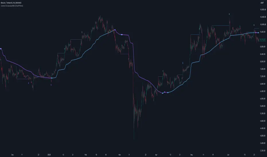
LOWESS (Locally Weighted Scatterplot Smoothing) [ChartPrime]LOWESS (Locally Weighted Scatterplot Smoothing)
⯁ OVERVIEW
The LOWESS (Locally Weighted Scatterplot Smoothing) [ ChartPrime ] indicator is an advanced technical analysis tool that combines LOWESS smoothing with a Modified Adaptive Gaussian Moving Average. This indicator provides traders with a sophisticated method for trend analysis, pivot point identification, and breakout detection.
◆ KEY FEATURES
LOWESS Smoothing: Implements Locally Weighted Scatterplot Smoothing for trend analysis.
Modified Adaptive Gaussian Moving Average: Incorporates a volatility-adapted Gaussian MA for enhanced trend detection.
Pivot Point Identification: Detects and visualizes significant pivot highs and lows.
Breakout Detection: Tracks and optionally displays the count of consecutive breakouts.
Gaussian Scatterplot: Offers a unique visualization of price movements using randomly colored points.
Customizable Parameters: Allows users to adjust calculation length, pivot detection, and visualization options.
◆ FUNCTIONALITY DETAILS
⬥ LOWESS Calculation:
Utilizes a weighted local regression to smooth price data.
Adapts to local trends, reducing noise while preserving important price movements.
⬥ Modified Adaptive Gaussian Moving Average:
Combines Gaussian weighting with volatility adaptation using ATR and standard deviation.
Smooths the Gaussian MA using LOWESS for enhanced trend visualization.
⬥ Pivot Point Detection and Visualization:
Identifies pivot highs and lows using customizable left and right bar counts.
Draws lines and labels to mark broke pivot points on the chart.
⬥ Breakout Tracking:
Monitors price crossovers of pivot lines to detect breakouts.
Optionally displays and updates the count of consecutive breakouts.
◆ USAGE
Trend Analysis: Use the color and direction of the smoothed Gaussian MA line to identify overall trend direction.
Breakout Trading: Monitor breakouts from pivot levels and their persistence using the breakout count feature.
Volatility Assessment: The spread of the Gaussian scatterplot can provide insights into market volatility.
⯁ USER INPUTS
Length: Sets the lookback period for LOWESS and Gaussian MA calculations (default: 30).
Pivot Length: Determines the number of bars to the left for pivot calculation (default: 5).
Count Breaks: Toggle to show the count of consecutive breakouts (default: false).
Gaussian Scatterplot: Toggle to display the Gaussian MA as a scatterplot (default: true).
⯁ TECHNICAL NOTES
Implements a custom LOWESS function for efficient local regression smoothing.
Uses a modified Gaussian MA calculation that adapts to market volatility.
Employs Pine Script's line and label drawing capabilities for clear pivot point visualization.
Utilizes random color generation for the Gaussian scatterplot to enhance visual distinction between different time periods.
The LOWESS (Locally Weighted Scatterplot Smoothing) indicator offers traders a sophisticated tool for trend analysis and breakout detection. By combining advanced smoothing techniques with pivot point analysis, it provides a comprehensive view of market dynamics. The indicator's adaptability to different market conditions and its customizable nature make it suitable for various trading styles and timeframes.
Optimized Bullish and Bearish Structure IndicatorThis Pine Script indicator is designed to identify specific bullish and bearish structures on a price chart based on user-defined conditions. The indicator highlights buy and sell signals and allows customization through input checkboxes to include or exclude additional conditions for generating these signals.
Key Features:
User Input Checkboxes:
Use Additional Buy Condition: Enables or disables an extra condition for buy signals.
Use Additional Sell Condition: Enables or disables an extra condition for sell signals.
Bullish Structure (Case 01):
The closing price of the candle 2 bars ago is greater than the closing price of the candle 1 bar ago.
The current candle's closing price is greater than the opening price of the candle 1 bar ago.
Additional Buy Condition: The closing price of the candle 2 bars ago is less than the closing price of the candle 1 bar ago.
Bearish Structure (Case 01):
The closing price of the candle 1 bar ago is greater than the closing price of the candle 2 bars ago.
The current candle's closing price is less than the opening price of the candle 1 bar ago.
Additional Sell Condition: The closing price of the candle 1 bar ago is less than the closing price of the candle 2 bars ago.
Signal Tracking:
The script tracks whether it is currently in a long (buy) or short (sell) state to avoid consecutive identical signals.
Only one buy signal is allowed until a sell signal is generated, and vice versa.
Plotting Signals:
Buy signals are plotted as green labels below the bar.
Sell signals are plotted as red labels above the bar.
Background colors are used to highlight bars where signals are generated:
Green for buy signals.
Red for sell signals.
Previous Candle Plotting:
Signals are plotted on the previous candle to clearly indicate where the signal conditions were met.
Script Usage:
Overlay:
The indicator is plotted directly on the price chart (overlay=true).
User Inputs:
Users can toggle the additional conditions for buy and sell signals through the checkboxes provided in the input settings.
Customization:
The indicator can be customized further to suit different trading strategies or market conditions by modifying the conditions and input parameters.
Example Usage:
Add the indicator to your TradingView chart.
Use the input checkboxes to include or exclude additional conditions for buy and sell signals.
Observe the plotted signals and background highlights to identify potential buy and sell opportunities based on the defined conditions.
This indicator provides a flexible tool for traders to identify specific bullish and bearish market structures and helps in making informed trading decisions.

Curved Smart Money Concepts Probability (Zeiierman)█ Overview
The Curved Smart Money Concepts Probability indicator, developed by Zeiierman, is a sophisticated trading tool designed to leverage the principles of Smart Money trading. This indicator identifies key market structure points and adapts to changing market conditions, providing traders with actionable insights into market trends and potential reversals. The trading tool stands out due to its unique curved structure and advanced probability features, which enhance its effectiveness and usability for traders.
█ How It Works
The indicator operates by analyzing market data to identify pivotal moments where institutional investors might be influencing price movements. It employs a combination of adaptive trend lengths, multipliers for sensitivity adjustments, and pivot periods to accurately capture market structure shifts. The indicator calculates upper and lower bands based on adaptive sizes and identifies zones of overbought (premium) and oversold (discount) conditions.
Key Features of Probability Calculations
The Curved Smart Money Concepts Probability indicator integrates sophisticated probability calculations to enhance trading decision-making:
Win/Loss Tracking: The indicator tracks the number of successful (win) and unsuccessful (loss) trades based on the identified market structure points (ChoCH, SMS, BMS). This provides a historical context of the indicator's performance.
Probability Percentages: For each market structure point (ChoCH, SMS, BMS), the indicator calculates the probability of the next move being successful or not. This is presented as a percentage, giving traders a quantifiable measure of confidence in the signals.
Dynamic Adaptation: The probability calculations adapt to market conditions by considering the frequency and success rate of the signals, allowing traders to adjust their strategies based on the indicator’s historical accuracy.
Visual Representation: Probabilities are displayed on the chart, helping traders quickly assess the likelihood of future price movements based on past performance.
Key benefits of the Curved Structure
The Curved Smart Money Concepts Probability indicator features a unique curved structure that offers several advantages over traditional linear structures:
Noise Reduction: The curved structure smooths out short-term market fluctuations, reducing the noise often seen in linear structures. This helps traders focus on the true trend direction rather than getting distracted by minor price movements.
Adaptive Sensitivity: The curved structure adjusts its sensitivity based on market conditions. This means it can effectively capture both short-term and long-term trends by dynamically adapting to changes in market volatility, something linear structures struggle with.
Enhanced Trend Detection: By providing a more gradual transition between market phases, the curved structure helps in identifying trends more accurately. This is particularly useful in volatile markets where linear structures might give false signals due to their rigid nature.
Improved Market Structure Analysis: The curved structure's ability to adapt and smooth out irregularities provides a clearer picture of the overall market structure. This clarity is essential for identifying premium and discount zones, as well as mid-range support and resistance levels, which are crucial for effective ICT Smart Money Trading.
█ Terminology
ChoCH (Change of Character): Indicates a potential reversal in market direction. It is identified when the price breaks a significant high or low, suggesting a shift from a bullish to bearish trend or vice versa.
SMS (Smart Money Shift): Represents the transition phase in market structure where smart money begins accumulating or distributing assets. It typically follows a BMS and indicates the start of a new trend.
BMS (Bullish/Bearish Market Structure): Confirms the trend direction. Bullish Market Structure (BMS) confirms an uptrend, while Bearish Market Structure (BMS) confirms a downtrend. It is characterized by a series of higher highs and higher lows (bullish) or lower highs and lower lows (bearish).
Premium: A zone where the price is considered overbought. It is calculated as the upper range of the current market structure and indicates a potential area for selling or shorting.
Mid Range: The midpoint between the high and low of the market structure. It often acts as a support or resistance level, helping traders identify potential reversal or continuation points.
Discount: A zone where the price is considered oversold. It is calculated as the lower range of the current market structure and indicates a potential area for buying or going long.
█ How to Use
Identifying Trends and Reversals: Traders can use the indicator to identify the overall market trend and potential reversal points. By observing the ChoCH, SMS, and BMS signals, traders can gauge whether the market is transitioning into a new trend or continuing the current trend.
Example Strategies
⚪ Trend Following Strategy:
Identify the current market trend using BMS signals.
Enter a trade in the direction of the trend when the price retraces to the mid-range zone.
Set a stop-loss just below the mid-range (for long trades) or above the mid-range (for short trades).
Take profit in the premium/discount zone or when a ChoCH signal indicates a potential reversal.
⚪ Reversal Strategy:
Wait for a ChoCH signal to identify a potential market reversal.
Enter a trade in the direction of the new trend as indicated by the SMS signal.
Set a stop-loss just beyond the recent high (for short trades) or low (for long trades).
Take profit when the price reaches the premium or discount zone opposite to the entry.
█ Settings
Curved Trend Length: Determines the length of the trend used to calculate the adaptive size of the structure. Adjusting this length allows traders to capture either longer-term trends (for smoother curves) or short-term trends (for more reactive curves).
Curved Multiplier: Scales the adjustment factors for the upper and lower bands. Increasing the multiplier widens the bands, reducing sensitivity to price changes. Decreasing it narrows the bands, making the structure more responsive.
Pivot Period: Sets the period for capturing trends. A higher period captures broader trends, while a lower period focuses on short-term trends.
Response Period: Adjusts the structure’s responsiveness. A low value focuses on short-term changes, while a high value smoothens the structure.
Premium/Discount Range: Allows toggling between displaying the active range or previous range to analyze real-time or historical levels.
Structure Candles: Enables the display of curved structure candles on the chart, providing a modified view of price action.
-----------------
Disclaimer
The information contained in my Scripts/Indicators/Ideas/Algos/Systems does not constitute financial advice or a solicitation to buy or sell any securities of any type. I will not accept liability for any loss or damage, including without limitation any loss of profit, which may arise directly or indirectly from the use of or reliance on such information.
All investments involve risk, and the past performance of a security, industry, sector, market, financial product, trading strategy, backtest, or individual's trading does not guarantee future results or returns. Investors are fully responsible for any investment decisions they make. Such decisions should be based solely on an evaluation of their financial circumstances, investment objectives, risk tolerance, and liquidity needs.
My Scripts/Indicators/Ideas/Algos/Systems are only for educational purposes!
Adaptive Bollinger-RSI Trend Signal [CHE]Adaptive Bollinger-RSI Trend Signal
Indicator Overview:
The "Adaptive Bollinger-RSI Trend Signal " (ABRT Signal ) is a sophisticated trading tool designed to provide clear and actionable buy and sell signals by combining the power of Bollinger Bands and the Relative Strength Index (RSI). This indicator aims to help traders identify potential trend reversals and confirm entry and exit points with greater accuracy.
Key Features:
1. Bollinger Bands Integration:
- Utilizes Bollinger Bands to detect price volatility and identify overbought or oversold conditions.
- Configurable parameters: Length, Source, and Multiplier for precise adjustments based on trading preferences.
- Color customization: Change the colors of the basis line, upper band, lower band, and the fill color between bands.
2. RSI Integration:
- Incorporates the Relative Strength Index (RSI) to validate potential buy and sell signals.
- Configurable parameters: Length, Source, Upper Threshold, and Lower Threshold for customized signal generation.
3. Signal Generation:
- Buy Signal: Generated when the price crosses below the lower Bollinger Band and the RSI crosses above the lower threshold, indicating a potential upward trend.
- Sell Signal: Generated when the price crosses above the upper Bollinger Band and the RSI crosses below the upper threshold, indicating a potential downward trend.
- Color customization: Change the colors of the buy and sell signal labels.
4. State Tracking:
- Tracks and records crossover and crossunder states of the price and RSI to ensure signals are only generated under the right conditions.
- Monitors the basis trend (SMA of the Bollinger Bands) to provide context for signal validation.
5. Counters and Labels:
- Labels each buy and sell signal with a counter to indicate the number of consecutive signals.
- Counters reset upon the generation of an opposite signal, ensuring clarity and preventing signal clutter.
6. DCA (Dollar-Cost Averaging) Calculation:
- Stores the close price at each signal and calculates the average entry price (DCA) for both buy and sell signals.
- Displays the number of positions and DCA values in a label on the chart.
7. Customizable Inputs:
- Easily adjustable parameters for Bollinger Bands, RSI, and colors to suit various trading strategies and timeframes.
- Boolean input to show or hide the table label displaying position counts and DCA values.
- Intuitive and user-friendly configuration options for traders of all experience levels.
How to Use:
1. Setup:
- Add the "Adaptive Bollinger-RSI Trend Signal " to your TradingView chart.
- Customize the input parameters to match your trading style and preferred timeframe.
- Adjust the colors of the indicator elements to your preference for better visibility and clarity.
2. Interpreting Signals:
- Buy Signal: Look for a "Buy" label on the chart, indicating a potential entry point when the price is oversold and RSI signals upward momentum.
- Sell Signal: Look for a "Sell" label on the chart, indicating a potential exit point when the price is overbought and RSI signals downward momentum.
3. Trade Execution:
- Use the buy and sell signals to guide your trade entries and exits, aligning them with your overall trading strategy.
- Monitor the counter labels to understand the strength and frequency of signals, helping you make informed decisions.
4. Adjust and Optimize:
- Regularly review and adjust the indicator parameters based on market conditions and backtesting results.
- Combine this indicator with other technical analysis tools to enhance your trading accuracy and performance.
5. Monitor DCA Values:
- Enable the table label to display the number of positions and average entry prices (DCA) for both buy and sell signals.
- Use this information to assess the cost basis of your trades and make strategic adjustments as needed.
Conclusion:
The Adaptive Bollinger-RSI Trend Signal is a powerful and versatile trading tool designed to help traders identify and capitalize on trend reversals with confidence. By combining the strengths of Bollinger Bands and RSI, this indicator provides clear and reliable signals, making it an essential addition to any trader's toolkit. Customize the settings, interpret the signals, and execute your trades with precision using this comprehensive indicator.

MTF Bollinger BandWidth [CryptoSea]The MTF Bollinger BandWidth Indicator is an advanced analytical tool crafted for traders who need to gauge market volatility and trend strength across multiple timeframes. This powerful indicator leverages the Bollinger BandWidth concept to provide a comprehensive view of price movements and volatility changes, making it ideal for those looking to enhance their trading strategies with multi-timeframe analysis.
Key Features
Multi-Timeframe Analysis: Allows users to monitor Bollinger BandWidth across various timeframes, providing a macro and micro perspective on market volatility.
Pivot Point Detection: Identifies crucial high and low pivot points, offering insights into potential support and resistance levels. Pivot points are dynamic and adjust based on the timeframe viewed, reflecting short-term fluctuations or longer-term trends.
Customizable Parameters: Includes options to adjust the length of the moving average, the standard deviation multiplier, and more, enabling traders to tailor the tool to their specific needs.
Dynamic Color Coding: Utilizes color changes to indicate different market conditions, aiding in quick visual assessments.
In the example below, notice how changes in BBW across different timeframes provide early signals for potential volatility increases or decreases.
How it Works
Calculation of BandWidth: Measures the percentage difference between the upper and lower Bollinger Bands, which expands or contracts based on market volatility.
High and Low Pivot Tracking: Automatically calculates and tracks the pivots in BBW values, which are critical for identifying turning points in market behavior. High and low levels will change depending on the timeframe, capturing distinct market behaviors from granular movements to broad trends.
Visual Alerts and Table Display: Highlights significant changes in BBW with visual alerts and provides a detailed table view for comparison across timeframes.
In the example below, BBW identifies a significant contraction followed by an expansion, suggesting a potential breakout.
Application
Strategic Market Entry and Exit: Assists traders in making well-informed decisions about when to enter and exit trades based on volatility cues.
Trend Strength Assessment: Helps in determining the strength of the prevailing market trend through detailed analysis of expansion and contraction periods.
Adaptable to Various Trading Styles: Suitable for day traders, swing traders, and long-term investors due to its customization capabilities and effectiveness across different timeframes.
The MTF Bollinger BandWidth Indicator is a must-have in the arsenal of traders who demand depth, accuracy, and responsiveness in their market analysis tools. Enhance your trading decisions by integrating this sophisticated indicator into your strategy to navigate the complexities of various market conditions effectively.

HC_V2Description:
Detailed Clarity Signal is a sophisticated TradingView indicator designed to provide traders with enhanced trading signals based on Bollinger Bands and the consistency of price actions. This script is particularly useful for identifying high-probability entry points in volatile markets. It combines the power of Bollinger Bands with a unique scoring system that assesses the clarity of buy and sell signals.
Features:
Dynamic Bollinger Bands: Utilizes a standard deviation multiplier to dynamically adjust Bollinger Bands, providing a flexible approach to volatility.
Clarity Scoring System: Each trading signal is scored based on its clarity, which is determined by how significantly the price exceeds the Bollinger Bands and the consistency of similar signals over a short span of time. This helps in distinguishing stronger signals from the weaker ones.
Consecutive Signal Tracking: Tracks consecutive buy or sell signals, allowing for gaps of up to three bars, to enhance the reliability of the trading signals.
Alert Conditions: Includes conditions for setting alerts when signals of high clarity (levels 4 and 5) are detected, making it easier for traders to act promptly on significant trading opportunities.
Visual and Sound Alerts: Designed to integrate seamlessly with TradingView's alert system, providing both visual markers and sound alerts to ensure that traders do not miss important trading signals.
How It Works:
The indicator calculates Bollinger Bands and measures the current close price in relation to these bands. When the price closes significantly beyond the bands coupled with consistent behavior in previous sessions, the signal clarity increases. This clarity is quantified from levels 1 to 5, with higher levels indicating stronger signals. Traders can set alerts to be notified when signals of substantial clarity are detected, aiding in decision-making during fast-moving market conditions.
Usage:
Entry Signal: A high clarity level (4 or 5) suggests a strong buy or sell opportunity, depending on whether the signal is above or below the Bollinger Bands.
Exit Signal: Traders may consider closing positions as the clarity level decreases or as opposing signals begin to form, providing a methodical approach to capturing gains and managing risks.
Conclusion:
The Detailed Clarity Signal indicator is an invaluable tool for traders looking to leverage the volatility of the markets with a higher degree of precision. By focusing on the quality of signals, it provides a robust method to enhance trading strategies, ensuring that traders can make informed decisions backed by a comprehensive analysis of price movements and trend strength.