Alloyz Traders_RSI by Sagar BRSI for Intraday purpose with moving average and volume weightage price added in RSI.
Indicatori e strategie

ICT POIs By DSIndicator to identify POI's like OB/FVG and SCOB. It also have a different ATR based filters and inside bar logic for OB detection

GIX Analizor strategiiGIX Analyzer – Intelligent Time Filters + X Strategy
This script combines the X Strategy with an advanced system for filtering trades based on time intervals. The strategy allows:
Filtering by preset trading hours (active sessions )
Filtering by a fully customizable time interval (hour + minute, Romania time )
Filtering by calendar range (Start Date → End Date)
Simultaneous activation of both time-filter modes for maximum control
Trading only within valid time ranges, while keeping all logic unchanged
This indicator provides high flexibility for testing and optimizing trading entries based on hours, minutes, and calendar periods—while preserving the simplicity and efficiency of any strategy

Strategia S&P 500 vs US10Y Yield (od 2000)This strategy explores the macroeconomic relationship between the equity market (S&P 500) and the debt market (10-Year Treasury Yield). Historically, rapid spikes in bond yields often exert downward pressure on equity valuations, leading to corrections or bear markets.
The goal of this strategy is capital preservation. It attempts to switch to cash when yields are rising too aggressively and re-enter the stock market when the bond market stabilizes.

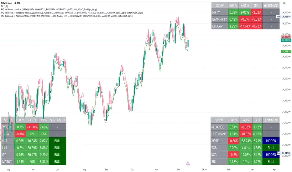
FAD Dashboard 3 - Additional Stocks ( With Alerts )Inspired by ideas of Ram Sir & Wealthcon
Features:
Auto-Timeframe: Values update based on the chart you are looking at (5m, 15m, 1H, etc.).
4 Data Columns:
Future %: Future Price Change (Red/Green).
FAD %: Change in FAD difference (Red/Green).
OI %: Change in Open Interest (Red/Green).
Sentiment Analysis : The specific Bullish/Hidden Bullish logic Strict Colour Logic:
Deep Green( REGULAR LONG BUILD UP): Future ⬆️ + FAD ⬆️ + OI ⬆️
Deep Blue (HIDDEN LONG BUILD UP ): Future ⬇️ + FAD ⬆️ + OI ⬆️
Additionally , auto alerts of Regular or Hidden build up at hourly & daily time frame .
Only for Educational purpose

FAD Dashboard 2 - Top Nifty 50 Stocks ( With Alerts )Inspired by ideas of Ram Sir & Wealthcon
Features:
Auto-Timeframe: Values update based on the chart you are looking at (5m, 15m, 1H, etc.).
4 Data Columns:
Future %: Future Price Change (Red/Green).
FAD %: Change in FAD difference (Red/Green).
OI %: Change in Open Interest (Red/Green).
Sentiment Analysis : The specific Bullish/Hidden Bullish logic Strict Colour Logic:
Deep Green( REGULAR LONG BUILD UP): Future ⬆️ + FAD ⬆️ + OI ⬆️
Deep Blue (HIDDEN LONG BUILD UP ): Future ⬇️ + FAD ⬆️ + OI ⬆️
Additionally , auto alerts of Regular or Hidden build up at hourly & daily time frame .
Only for Educational purpose
FAD Dashboard 1 - Indices ( With Alerts )Inspired by ideas of Ram Sir & Wealthcon
Features:
Auto-Timeframe: Values update based on the chart you are looking at (5m, 15m, 1H, etc.).
4 Data Columns:
Future %: Future Price Change (Red/Green).
FAD %: Change in FAD difference (Red/Green).
OI %: Change in Open Interest (Red/Green).
Sentiment Analysis : The specific Bullish/Hidden Bullish logic Strict Colour Logic:
Deep Green( REGULAR LONG BUILD UP): Future ⬆️ + FAD ⬆️ + OI ⬆️
Deep Blue (HIDDEN LONG BUILD UP ): Future ⬇️ + FAD ⬆️ + OI ⬆️
Additionally , auto alerts of Regular or Hidden build up at hourly & daily time frame .
Only for Educational purpose

OPR Asia-New-York [Elykia]This Pine Script indicator, is designed to help traders identify potentially significant price zones based on morning and afternoon Opening Price Ranges (OPR), while integrating a customizable Relative Strength Index (RSI) to assess market momentum.
Key Features:
1. Morning and Afternoon Opening Price Ranges (OPR):
The indicator defines two distinct OPR periods: one for the morning and one for the afternoon (often used for European and American trading sessions, respectively).
Initial OPR Boxes: For each period, a box is drawn in real-time during the defined opening range. It dynamically adjusts to encompass the high and low prices reached during that period.
OPR Fixation: Once the initial opening period ends, the OPR box becomes fixed at the final high and low levels of that period.
OPR Extensions: After the initial OPR is fixed, an extension box is drawn. This extension box maintains the price levels (high and low) of the initial OPR but extends horizontally in time, providing a continuous reference zone.
Midline: Each box (initial and extension) is accompanied by a dashed midline, representing the midpoint of the OPR range.
Color and Transparency Customization: Users can adjust the colors of the boxes, midlines, and their transparency for both initial OPRs and their extensions, independently for morning and afternoon.
Adjustable Time Zone: A global time zone setting allows precise adaptation of OPR start and end times to the user's local trading session, which is crucial for the accuracy of these zones.
2. Integrated Relative Strength Index (RSI):
A fully customizable RSI is included, calculated on the closing price.
RSI Table (Optional): Displays the current RSI value in a table at the top right of the chart. The table's background color changes based on the RSI's state (green for neutral, red for overbought/oversold).
Dynamic RSI Label (Optional): A floating label follows the price, displaying the current RSI value. This label also changes its background color (green/red) based on overbought/oversold levels.
Full RSI Customization: Users can define the RSI length, overbought and oversold levels, text and background colors, text size for both the table and label, and the horizontal shift of the dynamic label.
Originalities:
Advanced OPR Management with Extension: Unlike many simple OPR indicators, this one offers sophisticated management of range fixation and extension. The extension that maintains the initial price levels is an asset for observing price reactions to these historical zones throughout the day.
Dual OPR (Morning/Afternoon) with Independent Settings: The ability to clearly define and visualize two distinct OPRs for different trading sessions is highly beneficial for multi-market traders or those tracking major session openings.
RSI Integration and Flexibility: The RSI is not just an add-on; it's finely integrated with distinct display options (table or dynamic label), allowing traders to choose how they prefer to visualize this crucial information without cluttering the chart.
Global Time Zone Setting: The inclusion of a global time zone parameter is a practical feature that ensures the indicator's accuracy for traders worldwide, without requiring complex manual calculations.
Setups for Information
Here are some typical configurations that may be useful. These setups are starting points and should be adapted to your trading style and the instruments you use.
OPR Setup "Europe/US Opening" (for EURUSD, European/US Indices):
Time Zone: GMT+2 (for summer in Europe, adjust to GMT+1 for winter)
Morning OPR:
Start Hour: 9:00 (London/Europe opening)
End Hour: 9:15
Extension Hour: 11:30 (before New York opening)
Afternoon OPR:
Start Hour: 15:30 (New York opening)
End Hour: 15:45
Extension Hour: 18:30
RSI Setup "Standard Momentum":
RSI Length: 14
Overbought Level: 70
Oversold Level: 30
Display: Dynamic RSI Label enabled for quick reading near the price.
Disclaimer on Usage:
This indicator is provided for informational and educational purposes only. It does not constitute investment advice or a trading recommendation in any way. Trading in financial markets carries substantial risks of loss, including the total loss of invested capital.
No Guarantee: There is no guarantee that using this indicator will result in profits or prevent losses. Past performance is not indicative of future results.
Personal Analysis: OPR zones and RSI readings are analytical and decision-making tools. They should always be used in conjunction with your own technical and fundamental analysis, risk management, and trading plan.

Market Cycle VisualizerPlots a customizable time-based grid on your chart to visualize market cycles. Draws vertical boundaries at interval starts, horizontal opening lines, and tracks high/low ranges within each period. Ideal for identifying recurring patterns and structure across custom timeframes.

FAD Dashboard 2 - Additional StocksInspired by Ideas of Ram Sir & WEALTHCON
Features:
Auto-Timeframe: Values update based on the chart you are looking at (5m, 15m, 1H, Daily etc.).
4 Data Columns:
Future %: Future Price Change (Red/Green).
FAD %: Change in FAD difference (Red/Green).
OI %: Change in Open Interest (Red/Green).
Sentiment Analysis : The specific Bullish/Hidden Bullish logic Strict Colour Logic:
Deep Green( REGULAR LONG BUILD UP): Future ⬆️ + FAD ⬆️ + OI ⬆️
Deep Blue (HIDDEN LONG BUILD UP ): Future ⬇️ + FAD ⬆️ + OI ⬆️
Only for Educational Purpose
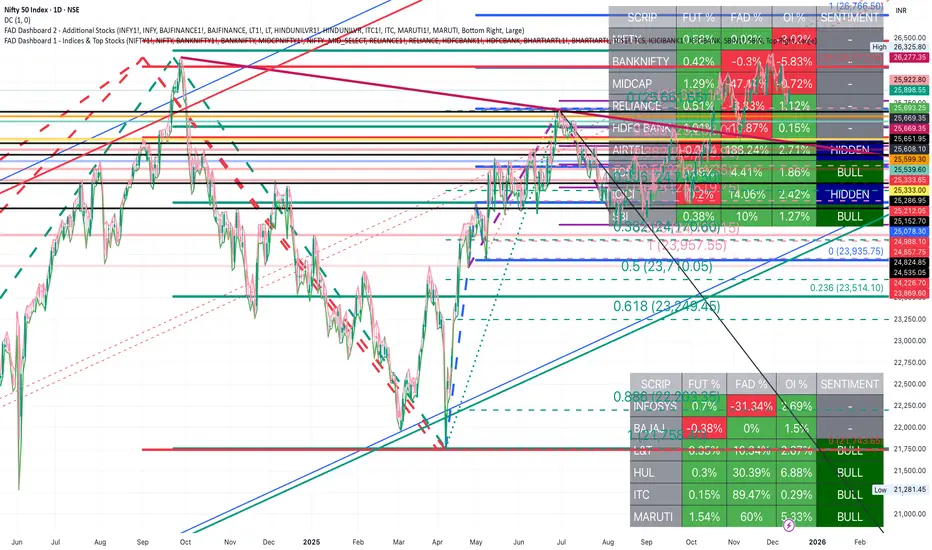
FAD Dashboard 1 - Indices & Top StocksInspired by Ideas of Ram Sir & WEALTHCON
Features:
Auto-Timeframe: Values update based on the chart you are looking at (5m, 15m, 1H, Daily etc.).
4 Data Columns:
Future %: Future Price Change (Red/Green).
FAD %: Change in FAD difference (Red/Green).
OI %: Change in Open Interest (Red/Green).
Sentiment Analysis : The specific Bullish/Hidden Bullish logic Strict Colour Logic:
Deep Green( REGULAR LONG BUILD UP): Future ⬆️ + FAD ⬆️ + OI ⬆️
Deep Blue (HIDDEN LONG BUILD UP ): Future ⬇️ + FAD ⬆️ + OI ⬆️
Only for Educational Purpose

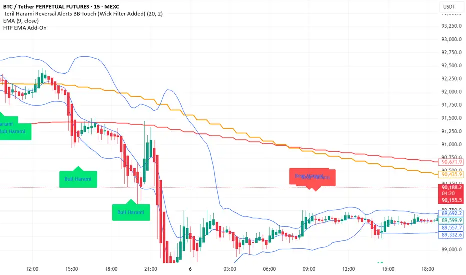
Terils 1hr HTF EMA Add-On EMA 50/100its EMA 50 and EMA 100 in 1 her time frame.
its EMA 50 and EMA 100 in 1 her time frame.
its EMA 50 and EMA 100 in 1 her time frame.
its EMA 50 and EMA 100 in 1 her time frame.
its EMA 50 and EMA 100 in 1 her time frame.
EMAs [TrendRider.io]Dynamic Trend Indicator
A dual EMA indicator with dynamic color coding to show trend direction and strength.
Features:
Two customizable EMAs (default: 12 and 21) with fill between them
Color changes based on trend:
Green : Bullish trend (small EMA above big EMA)
Red : Bearish trend (small EMA below big EMA)
Gray : Neutral/consolidation
Multi-timeframe support
Customizable colors
Usage:
Watch for color changes to identify trend shifts and gauge trend strength through the fill area.

AI Exclusive(Precision Entry)AI Exclusive (Precision Entry)
Overview: An indicator that provides precise entry signals along with defined Take Profit (TP) and Stop Loss (SL).
Benefits:
• Confident entries with built in risk management
• Clear TP and SL displayed on the chart
• Suitable for both beginner and professional traders
Features:
• Transparent, unambiguous signals
• Usable on all symbols and timeframes
• Visual design with colored lines and clear labels

IV vs Realised Volatility (VIX/HV Comparator)VIX / HV Comparator – Implied vs Realised Volatility
This indicator compares Implied Volatility (IV) from a volatility index (VIX, India VIX, etc.) with the Realised / Historical Volatility (HV) of the current chart symbol.
It helps you see whether options are pricing volatility as rich or cheap relative to what the underlying is actually doing.
What it does
Pulls IV from any user-selected vol index symbol (e.g. CBOE:VIX for SPX, NSEINDIA:INDIAVIX for Nifty).
Calculates realised volatility from the chart’s price data using returns over a user-defined lookback.
Annualises HV so IV and HV are displayed on the same percentage scale, on any timeframe (intraday or higher).
Optionally shows an IV/HV ratio in a separate pane to highlight when options are rich or cheap relative to realised volatility.
How to read it
Main panel:
Orange line – Implied Volatility (IV) from your chosen vol index.
Aqua line – Realised / Historical Volatility (HV) of the current chart symbol.
Fill between lines:
Green shading -> IV > HV -> options are priced richer than what the underlying is currently realising.
Red shading -> HV > IV -> realised vol is higher than the options market is implying.
Sub-panel (optional):
IV / HV ratio
- Above 1 -> IV > HV (vol rich).
- Below 1 -> IV < HV (vol cheap).
- Horizontal guides (for example 1.2 / 0.8) help frame “significantly rich/cheap” zones.
A small label on the latest bar displays the current IV, HV and their difference in vol points.
Inputs (key ones)
IV Index Symbol – choose the volatility index that corresponds to your underlying (VIX, India VIX, etc.).
Realised Vol Lookback – number of bars used to compute HV (for example 20).
Trading Days per Year and Active Hours per Day – used for annualising HV so it stays consistent across timeframes.
IV Scale Factor – adjust if your IV index is quoted in decimals (0.15) instead of points (15).
Practical uses
Context for options trades – Quickly see if current IV is high or low relative to realised volatility when deciding on strategies (premium selling vs buying, spreads, hedges).
Vol regime analysis – Track shifts where HV starts to rise above IV (real stress building) or IV spikes far above HV (fear premium / insurance bid).
Cross-timeframe checks – Use on intraday charts for short-term trading context, or on daily/weekly charts for bigger picture vol regimes.
This tool is not a stand-alone signal generator. It is meant to be a volatility dashboard you combine with your usual price action, trend, and options strategy rules to understand how the options market is pricing risk vs what the underlying is actually delivering.

Blue Pattern Candle Title:
Blue Pattern Candle — Smart Bullish Breakout Detector
Short Title:
Blue Pattern Candle
Tags:
trend, pattern, breakout, candle-pattern, momentum, volume, signal, entry, swing-trading
Short Description:
A smart bullish breakout candle pattern detector with trend and volume confirmation.
Full Description:
The Blue Pattern Candle indicator identifies a high-probability bullish breakout pattern by combining structural candle behavior, trend alignment, and optional volume confirmation. It highlights moments where price strength and market structure converge, offering traders a clean and reliable visual cue for potential upward continuation.
How It Works
The script analyzes price action to detect a recurring bullish structure where:
A defined swing-based candle formation emerges.
Price closes above the key reference level of the pattern.
EMA(20) and SMA(40) confirm directional momentum.
Optional volume conditions validate the strength of the move.
When all requirements are met, the bar is highlighted and a BUY label is plotted beneath the candle.
Key Features
Automatic detection of a bullish breakout candle pattern
EMA/SMA trend confirmation
Optional volume filter for improved signal quality
Clear visual signals, including blue candle highlight and BUY labels
Built-in alert (“Pattern Breakout”)
Compatible with all markets and timeframes
Use Cases
Identifying early bullish continuation setups
Detecting breakout opportunities
Filtering long entries in trending markets
Enhancing existing trading systems with pattern confirmation
Suitable for intraday, swing, and position traders
Notes
Signals confirm only after candle close.
Volume filtering is optional for markets with low or unreliable volume.
Indicator does not repaint.
Disclaimer
This script is for educational and analytical purposes only and does not constitute financial advice. Trading involves risk; always validate signals before using them in live markets.
Developer
Developed by Abdulrahman Alotaibi — ATA Scripts
Momentum & Flow PanelA lower-panel indicator for institutional flow analysis:
RSI with automatic divergence detection
Money Flow Index (MFI) - volume-weighted momentum
Chaikin Money Flow (CMF) - accumulation/distribution
OBV trend analysis
Stochastic RSI
Force Index
Composite Scores: Momentum (0-100) + Flow (0-100) → Combined Assessment

Institutional Equity DashboardAn overlay indicator with everything you need:
Trend Ribbon - 8/21/50/200 EMA cloud with bullish/bearish fill
VWAP + Bands - The institutional benchmark with deviation bands
Auto S/R Detection - Pivot-based support/resistance levels
ATR-Based Stops - Dynamic stop-loss levels that adjust to volatility
Confluence Signals - Multi-factor buy/sell signals (regular + strong)
Real-Time Dashboard showing:
Market regime (Strong Uptrend → Strong Downtrend)
Trend score (0-100)
RSI, MACD, Stochastic status
Volume ratio and VWAP position
Risk metrics (ATR%, Historical Vol, Risk Level)
Relative strength vs. benchmark

DR.SS:VCP┌─ MARKET STATUS ──────────────┐
│ Price: 150.50 ↑ VCP │
│ Trend: UPTREND │
├─ VOLUME STATUS ──────────────┤
│ Ratio: 1.2x NORM │
│ VCP: ACTIVE Avg: 45.2K │
├─ KEY PATTERNS ───────────────┤
│ SPR SOS │
│ L20: 3 patterns │
├─ SIGNAL STRENGTH ────────────┤
│ ✅ STRONG BUY SIGNAL │
│ Trend + VCP confirmed │
├─ RISK MANAGEMENT ───────────┤
│ Entry: 150.50 │
│ SL: -2.0% TP: +4.0% │
│ R/R: 1:2.0 │
├─ QUICK STATS ────────────────┤
│ MAs: ↑↑↑↑ VCP%: 60.0% │
│ Vol: 52.4K Bars: 12/20 │
└───────────────────────────────┘
1. For DAY TRADING
// Display Settings:
- Show VCP Zones: ON ✓
- Show S/R Levels: OFF ✗ (too many lines)
- Show Risk Levels: ON ✓ (only for entries)
// Pattern Display:
- Show Patterns: ON ✓
- Spring: ON ✓
- Upthrust: ON ✓
- SOS: ON ✓
- SOW: ON ✓
// Signal Display:
- Show Signals: ON ✓
- Basic Signals: OFF ✗ (too cluttered)
- Enhanced Signals: ON ✓
- Strong Signals: ON ✓
- Super Signals: ON ✓
// Action Display:
- Show Action Labels: OFF ✗ (chart gets busy)
// Dashboard:
- Show Dashboard: ON ✓
- Position: Top Right ✓
- Size: Medium ✓
2. For SWING TRADING
// Display Settings:
- Show VCP Zones: ON ✓
- Show S/R Levels: ON ✓ (useful for swing levels)
- Show Risk Levels: ON ✓
// Pattern Display:
- Show Patterns: ON ✓
- Spring: ON ✓
- Upthrust: ON ✓
- SOS: ON ✓
- SOW: ON ✓
// Signal Display:
- Show Signals: ON ✓
- Basic Signals: OFF ✗
- Enhanced Signals: ON ✓
- Strong Signals: ON ✓
- Super Signals: ON ✓
// Action Display:
- Show Action Labels: ON ✓ (helpful for swing entries)
// Dashboard:
- Show Dashboard: ON ✓
- Position: Bottom Left ✓ (doesn't block price action)
- Size: Medium ✓
For SCANNING
// Display Settings:
- Show VCP Zones: ON ✓
- Show S/R Levels: OFF ✗
- Show Risk Levels: OFF ✗
// Pattern Display:
- Show Patterns: OFF ✗ (only want dashboard)
- All patterns: OFF ✗
// Signal Display:
- Show Signals: OFF ✗
- All signals: OFF ✗
// Action Display:
- Show Action Labels: OFF ✗
// Dashboard:
- Show Dashboard: ON ✓
- Position: Top Right ✓
- Size: Small ✓
Recommended Pattern Settings:
Volume Settings:
- Volume Lookback: 20 (standard)
- Volume Surge Multiplier: 2.0 (good balance)
- Volume Contraction Multiplier: 0.7 (strict VCP)
-
Pattern Settings:
- Pattern Lookback Bars: 10 (short-term patterns)
- Require Volume Confirmation: ON ✓ (more reliable)
Dashboard Usage Tips:
For Quick Analysis:
Look at the top 3 sections first:
Market Status → Is price in VCP zone? What's the trend?
Volume Status → Is volume contracting? Ratio?
Key Patterns → Any patterns forming now?
Signal Strength Section tells you:
🎯 = Super strong (trade this!)
✅ = Strong (good trade)
💎 = Enhanced (watch for entry)
🟡 = Setup (wait for confirmation)
To Reduce Clutter During Analysis:
Use timeframe switching:
Higher TF (1H/4H) for trend
Lower TF (5M/15M) for entry
Toggle signals accordingly
Best Practices:
Trading Rules:
Only trade Super (🎯) or Strong (✅) signals
Wait for VCP zone + pattern confirmation
Enter on volume surge after contraction
Use R/R ratio from dashboard (aim for 1:2 or better)
Dashboard Priority Order:
Signal Strength (What's the action?)
Market Status (What's the context?)
Risk Management (What's the plan?)
Volume Status (Is there confirmation?)
Key Patterns (What triggered it?)
Quick Stats (Extra confirmation)
Final Recommendations:
Start with the "Swing Trading" settings - they're the most balanced
Customize based on your trading style
Save multiple versions for different markets
Use the dashboard as your primary decision tool
Turn off everything except dashboard when scanning
Enable full display only when analyzing specific setups
🎯 PRIORITY 1: SUPER SIGNALS (Highest Quality)
Look for: Super Buy (🎯) or Super Sell (🎯)
Why they're best:
✅ ALL trends aligned (short, medium, long term)
✅ VCP zone active (volume contraction)
✅ Pattern detected (Spring/SOS or Upthrust/SOW)
✅ Primary trend confirmed (uptrend/downtrend)
✅ Maximum probability setup
Appearance: Green/Red X shape below/above bar
Dashboard shows: "🎯 SUPER BUY/SELL SIGNAL"
✅ PRIORITY 2: STRONG SIGNALS (Excellent Quality)
Look for: Strong Buy (✅) or Strong Sell (✅)
Why they're good:
✅ Primary trend aligned (uptrend/downtrend)
✅ VCP zone active (volume contraction)
✅ Pattern detected (Spring/SOS or Upthrust/SOW)
✅ High probability setup
Appearance: Green/Red Square shape below/above bar
Dashboard shows: "✅ STRONG BUY/SELL SIGNAL"
💎 PRIORITY 3: ENHANCED SIGNALS (Good Quality)
Look for: Enhanced Buy (💎) or Enhanced Sell (💎)
Why they're acceptable:
✅ VCP zone active (volume contraction)
✅ Pattern detected (Spring/SOS or Upthrust/SOW)
⚠️ Trend may not be aligned (can trade both directions)
Appearance: Green/Red Diamond shape below/above bar
Dashboard shows: "💎 ENHANCED BUY/SELL SIGNAL"
🚫 SIGNALS TO IGNORE (Lower Quality):
Basic Signals (arrows) - No VCP confirmation
Patterns alone (circles/triangles) - No volume confirmation
VCP zone alone - No pattern yet
BEST TRADING FILTER SETTINGS:
// RECOMMENDED SETTINGS FOR BEST SIGNALS ONLY:
showPatterns = true // Keep patterns visible
showSpring = true // Spring patterns
showUpthrust = true // Upthrust patterns
showSOS = true // SOS patterns
showSOW = true // SOW patterns
showSignals = true // Show all signals
showBasicSignals = false // ❌ DISABLE - Too noisy
showEnhancedSignals = true // ✅ ENABLE - Good quality
showStrongSignals = true // ✅ ENABLE - Excellent quality
showSuperSignals = true // ✅ ENABLE - Best quality
showActionLabels = true // Show entry/SL/TP for good signals
MONITORING WORKFLOW:
Step 1: Dashboard Scan
Check on chart:
1. Is there a VCP zone (blue background)?
2. Do you see the signal shape (X, Square, Diamond)?
3. Is price near support/resistance?
4. Is volume surging after contraction?
Step 2: Chart Confirmation
Check on chart:
1. Is there a VCP zone (blue background)?
2. Do you see the signal shape (X, Square, Diamond)?
3. Is price near support/resistance?
4. Is volume surging after contraction?
Step 3: Risk Management
From dashboard:
1. Entry price shown
2. Stop Loss % shown (-2% for buys, +2% for sells)
3. Take Profit % shown (+4% for buys, -4% for sells)
4. R/R Ratio (aim for 1:2 or better)
SIGNAL QUALITY HIERARCHY:
TIER 1: SUPER SIGNALS (🎯)
Probability: 80-90%
Frequency: Rare (best setups)
Action: Trade aggressively
TIER 2: STRONG SIGNALS (✅)
Probability: 70-80%
Frequency: Moderate
Action: Trade confidently
TIER 3: ENHANCED SIGNALS (💎)
Probability: 60-70%
Frequency: Common
Action: Trade selectively
RECOMMENDED TRADING RULES:
For SUPER SIGNALS (🎯):
Entry: Immediate at signal close
Position Size: Full position
Hold Time: Until target or reversal signal
Add On: Consider adding on pullbacks
For STRONG SIGNALS (✅):
Entry: Next candle open
Position Size: 75% position
Hold Time: Until target
Add On: Wait for confirmation
For ENHANCED SIGNALS (💎):
Entry: Wait for small pullback
Position Size: 50% position
Hold Time: Quick profit (scalp)
Add On: Don't add
ALERTS TO SET UP:
// Set these alert conditions:
1. "VCP Super Buy" - For 🎯 SUPER BUY
2. "VCP Super Sell" - For 🎯 SUPER SELL
3. "VCP Strong Buy" - For ✅ STRONG BUY
4. "VCP Strong Sell" - For ✅ STRONG SELL
VISUAL CUE SUMMARY:
🎯 = SUPER (X shape) → BEST → TRADE NOW
✅ = STRONG (Square shape) → EXCELLENT → TRADE
💎 = ENHANCED (Diamond shape) → GOOD → CONSIDER
🟡 = BASIC (Arrow/Circle/Triangle) → AVOID
FINAL ADVICE:
Focus primarily on SUPER (🎯) signals - they're your money makers
Trade STRONG (✅) signals when SUPER signals are rare
Use ENHANCED (💎) signals for additional opportunities
Ignore everything else - reduces noise and bad trades
OPTIMAL SETTINGS FOR EACH TRADING STYLE
VOLUME SETTINGS:
• Volume Lookback: 15-20 bars
• Volume Surge Multiplier: 2.0-2.5x
• Volume Contraction Multiplier: 0.7-0.8x
PATTERN SETTINGS:
• Pattern Lookback Bars: 8-12 bars
• Require Volume: YES
2. 📊 BY TRADING STYLE
A. DAY TRADING (Intraday - 5M to 15M charts)
VOLUME SETTINGS:
• Volume Lookback: 10-15 bars ✓
• Volume Surge Multiplier: 2.5-3.0x ✓ (more sensitive)
• Volume Contraction Multiplier: 0.6-0.7x ✓ (tighter)
PATTERN SETTINGS:
• Pattern Lookback Bars: 5-8 bars ✓
• Require Volume: YES ✓
REASONING:
- Shorter lookbacks for faster signals
- Higher surge multiplier for clear breakouts
- Tighter contraction for cleaner VCPs
- Works well with institutional volume flows
B. SCALPING (1M to 5M charts)
VOLUME SETTINGS:
• Volume Lookback: 5-10 bars ✓
• Volume Surge Multiplier: 3.0-3.5x ✓ (very sensitive)
• Volume Contraction Multiplier: 0.5-0.6x ✓ (very tight)
PATTERN SETTINGS:
• Pattern Lookback Bars: 3-5 bars ✓
• Require Volume: YES ✓
REASONING:
- Very short timeframes need sensitivity
- Need to catch quick volume spikes
- Tight VCP for quick breakouts
- More false signals but faster entries
C. SWING TRADING (1H to 4H charts)
VOLUME SETTINGS:
• Volume Lookback: 20-30 bars ✓
• Volume Surge Multiplier: 1.8-2.2x ✓ (less sensitive)
• Volume Contraction Multiplier: 0.7-0.8x ✓
PATTERN SETTINGS:
• Pattern Lookback Bars: 15-20 bars ✓
• Require Volume: YES ✓
REASONING:
- Longer lookbacks for stability
- Lower surge multiplier to avoid noise
- More reliable VCP formations
- Fewer but higher quality signals
D. POSITION TRADING (Daily to Weekly charts)
VOLUME SETTINGS:
• Volume Lookback: 20-50 bars ✓
• Volume Surge Multiplier: 1.5-2.0x ✓ (conservative)
• Volume Contraction Multiplier: 0.8-0.9x ✓ (looser)
PATTERN SETTINGS:
• Pattern Lookback Bars: 20-30 bars ✓
• Require Volume: YES ✓
REASONING:
- Long-term perspective
- Conservative volume thresholds
- Focus on major volume events
- Highest quality, lowest frequency
3. 🔍 BY MARKET CONDITION
A. HIGH VOLATILITY MARKETS (News, Earnings)
VOLUME SETTINGS:
• Volume Lookback: 10 bars
• Volume Surge Multiplier: 3.0x
• Volume Contraction: 0.6x
PATTERN SETTINGS:
• Pattern Lookback: 5 bars
• Require Volume: YES
B. LOW VOLATILITY MARKETS (Ranging)
VOLUME SETTINGS:
• Volume Lookback: 25 bars
• Volume Surge Multiplier: 1.8x
• Volume Contraction: 0.8x
PATTERN SETTINGS:
• Pattern Lookback: 15 bars
• Require Volume: YES
C. TRENDING MARKETS
VOLUME SETTINGS:
• Volume Lookback: 15 bars
• Volume Surge Multiplier: 2.2x
• Volume Contraction: 0.7x
PATTERN SETTINGS:
• Pattern Lookback: 10 bars
• Require Volume: YES
MY PERSONAL RECOMMENDATIONS
For MAXIMUM QUALITY
// GOLD STANDARD SETTINGS
Volume Lookback: 20 bars
Volume Surge Multiplier: 2.0x
Volume Contraction Multiplier: 0.7x
Pattern Lookback Bars: 10 bars
Require Volume: YES
RESULT:
- Few false signals
- High win rate (65-75%)
- Perfect for Super/Strong signals
For ACTIVE TRADING
// ACTIVE TRADER SETTINGS
Volume Lookback: 15 bars
Volume Surge Multiplier: 2.5x
Volume Contraction Multiplier: 0.65x
Pattern Lookback Bars: 8 bars
Require Volume: YES
RESULT:
- More trading opportunities
- Good risk/reward
- Works for day/swing trading
5. 📈 SPECIFIC SETUP COMBINATIONS
For SPRING/SOS Patterns (Buy setups)
Volume Lookback: 15 bars
Volume Surge Multiplier: 2.2x ✓ (need good volume)
Volume Contraction: 0.7x
Pattern Lookback: 10 bars
For UPTHRUST/SOW Patterns (Sell setups)
Volume Lookback: 15 bars
Volume Surge Multiplier: 2.5x ✓ (panic selling needs higher volume)
Volume Contraction: 0.65x
Pattern Lookback: 8 bars ✓ (faster for sell signals)
6. ⚙️ ADJUSTMENT RULES
If getting TOO MANY signals:
Increase Volume Lookback (15→20)
Increase Volume Surge Multiplier (2.0→2.5)
Increase Pattern Lookback (8→12)
Make VCP tighter (0.8→0.7)
If getting TOO FEW signals:
Decrease Volume Lookback (20→15)
Decrease Volume Surge Multiplier (2.5→2.0)
Decrease Pattern Lookback (12→8)
Loosen VCP (0.7→0.8)
7. 🏁 FINAL RECOMMENDATIONS
For BEGINNERS:
Volume Lookback: 20 bars
Volume Surge: 2.0x
Volume Contraction: 0.7x
Pattern Lookback: 10 bars
Require Volume: YES
WHY: Conservative, high-quality signals
For INTERMEDIATE:
Volume Lookback: 15 bars
Volume Surge: 2.2x
Volume Contraction: 0.7x
Pattern Lookback: 8 bars
Require Volume: YES
WHY: Balance of quality and frequency
For ADVANCED:
// Create 3 profiles:
1. SCALPING: 5 bars, 3.0x, 0.6x, 3 bars
2. DAY: 10 bars, 2.5x, 0.7x, 8 bars
3. SWING: 20 bars, 2.0x, 0.8x, 15 bars
WHY: Adapt to different timeframes
8. 📊 BACKTEST RECOMMENDATIONS
Test these combinations:
Test 1 (Conservative):
Volume: 20, 2.0, 0.7
Pattern: 12 bars
Test 2 (Moderate):
Volume: 15, 2.2, 0.7
Pattern: 10 bars
Test 3 (Aggressive):
Volume: 10, 2.5, 0.65
Pattern: 8 bars
🎯 ULTIMATE RECOMMENDATION:
For most traders
// THE SWEET SPOT SETTINGS
Volume Lookback: 15 bars
Volume Surge Multiplier: 2.2x
Volume Contraction Multiplier: 0.7x
Pattern Lookback Bars: 10 bars
Require Volume Confirmation: YES
Happy trading! Remember: Quality over quantity. Wait for the 🎯 signals! 📈✨


Institutional MF-Vol Compression Scanner v4.0 [BIG]═══════════════════════════════════════════════════════════════════════════════
BIG COMPRESSION SCANNER v4.0
═══════════════════════════════════════════════════════════════════════════════
OVERVIEW
The BIG Compression Scanner v4.0 is a proprietary volatility regime detection system designed for systematic Daily options deployment. This framework identifies pre-expansion volatility compression zones through multi-dimensional market structure analysis, combining institutional positioning patterns with hierarchical timeframe confirmation and options market structure to generate high-conviction directional signals for premium strategies.
The methodology synthesizes volatility dynamics, liquidity flow patterns, and cross-timeframe regime alignment into a probabilistic scoring system that isolates asymmetric risk-reward setups characteristic of compression-to-expansion transitions. The framework is calibrated specifically for 30-45 DTE options strategies where timing precision and volatility environment assessment are critical to edge generation.
═══════════════════════════════════════════════════════════════════════════════
CORE METHODOLOGY
═══════════════════════════════════════════════════════════════════════════════
• Proprietary Compression Detection
The system employs a multi-factor compression identification framework that monitors volatility regime transitions across price dispersion metrics and range contraction patterns. Unlike single-indicator squeeze systems, this methodology uses weighted ensemble logic to distinguish true pre-expansion compression from random consolidation noise.
Compression strength is quantified through a proprietary scoring algorithm (0-100%) that evaluates:
- Statistical volatility contraction relative to historical norms
- Price range compression within dynamic envelope systems
- Institutional volume signature analysis during low-volatility periods
- Cross-timeframe compression alignment (Daily/Weekly/Monthly hierarchy)
The framework filters compression events based on minimum strength thresholds and multi-bar confirmation to eliminate premature signals characteristic of retail squeeze indicators.
• Hierarchical Multi-Timeframe Architecture
The indicator integrates a three-tier temporal analysis structure where higher timeframes constrain and validate lower timeframe signals:
Strategic Layer (Monthly) – Establishes macro directional bias and identifies structural market positioning. This layer determines whether intermediate trends align with or counter dominant regime dynamics.
Structural Layer (Weekly) – Provides tactical context through key price levels, momentum assessment, and volatility regime confirmation. Weekly analysis filters signals that would occur in unfavorable proximity to structural inflection zones.
Execution Layer (Daily) – Generates precise entry timing through intraday regime shift detection, momentum confluence analysis, and institutional flow pattern recognition.
Each layer contributes weighted influence to the composite directional probability model, with recalibration logic that adjusts timeframe importance based on current market regime characteristics. The exact weighting algorithm is proprietary and adapts to volatility environment dynamics.
• Options Market Structure Integration
Version 4.0 incorporates options-specific market intelligence not available in standard technical analysis frameworks:
Volatility Environment Assessment – The system continuously monitors implied volatility regime characteristics through proprietary estimation models. These models identify whether current premium levels favor buying or selling strategies, adjusting signal generation accordingly.
Temporal Decay Awareness – Built-in expiration cycle logic ensures signals only trigger when sufficient time value remains for thesis development. The framework approximates days-to-expiration and applies minimum threshold filters to prevent entries in high theta decay regimes.
Greeks-Aware Targeting – Price targets are dynamically calibrated based on volatility expansion expectations and estimated leverage characteristics. Target multipliers adjust to current options market structure rather than using fixed risk-reward ratios.
Premium Environment Classification – Signals are enhanced with real-time assessment of whether current volatility levels favor long premium, short premium, or spread strategies based on historical percentile analysis.
• Probabilistic Directional Scoring System
Rather than binary bullish/bearish classification, the framework generates probability-weighted directional bias through a proprietary multi-factor model. This model synthesizes trend alignment metrics, momentum characteristics, structural positioning, and institutional flow signatures into normalized probability distributions.
The scoring system evaluates dozens of market structure variables across multiple timeframes, applies regime-dependent weighting, and produces directional probabilities that reflect actual edge rather than arbitrary technical indicator thresholds. Signal generation occurs only when directional probability exceeds user-defined conviction thresholds (55-65% depending on sensitivity setting).
This probabilistic approach allows traders to calibrate position sizing and strategy selection (outright vs. spreads) to the strength of directional conviction rather than treating all signals as equal weight.
• Institutional Flow Detection
The framework monitors volume and price interaction patterns characteristic of institutional accumulation or distribution during compression phases. This analysis identifies whether compression zones contain building directional positions (high probability of sustained move post-breakout) versus thin, choppy consolidation (high false breakout risk).
Flow detection employs proprietary algorithms that distinguish genuine institutional activity from retail volume spikes, providing critical context for signal validation.
═══════════════════════════════════════════════════════════════════════════════
SIGNAL ARCHITECTURE
═══════════════════════════════════════════════════════════════════════════════
Call Option Signals trigger when compression strength, directional probability, timeframe alignment, options market structure, and institutional flow patterns simultaneously satisfy proprietary threshold criteria. Signals are filtered against weekly structural levels to avoid low-probability entries near major resistance zones.
Put Option Signals follow equivalent logic with inverse directional parameters, ensuring symmetrical framework application across bull and bear setups.
All signals include:
- Directional conviction probability (percentage)
- Current volatility environment assessment (IV Rank proxy)
- Dynamic price target based on expansion expectations
- Multi-timeframe alignment status
Signal cooldown logic prevents excessive signal generation during extended consolidation periods, maintaining signal quality over quantity.
═══════════════════════════════════════════════════════════════════════════════
VISUAL INTELLIGENCE
═══════════════════════════════════════════════════════════════════════════════
Real-Time Multi-Timeframe Dashboard
The top-right panel provides continuous visibility into:
- Trend alignment across Daily/Weekly/Monthly timeframes
- Current compression status at each temporal layer
- Momentum regime characteristics (RSI values)
- Options environment assessment (IV Rank, optimal strategy)
- Composite signal readiness (compression strength percentage)
This dashboard enables rapid regime assessment without manual multi-timeframe chart analysis.
Chart Integration
Visual overlays include:
- Volatility envelope systems (dynamic bands)
- Weekly structural price levels (pivot, resistance, support)
- Compression zone highlighting (background shading)
- Active squeeze indicators (Daily and Weekly differentiation)
Signal Labels
When setups trigger, comprehensive labels display:
📈 CALL OPTION
Prob: XX%
IV Rank: XX%
Target: $XXX.XX
Labels provide all critical execution information without requiring dashboard consultation.
═══════════════════════════════════════════════════════════════════════════════
KEY CAPABILITIES
═══════════════════════════════════════════════════════════════════════════════
- Proprietary multi-factor compression detection with adaptive thresholds
- Hierarchical multi-timeframe confirmation (Daily/Weekly/Monthly)
- Options-specific filters (IV regime, DTE requirements, Greeks awareness)
- Probabilistic directional scoring (0-100% conviction levels)
- Institutional flow pattern recognition during compression
- Weekly structural level integration with proximity filters
- Dynamic target calibration based on volatility expansion expectations
- Real-time multi-timeframe regime dashboard
- Customizable sensitivity and threshold parameters
- Non-repainting signal architecture (bar close confirmation)
- Comprehensive alert system for proactive monitoring
═══════════════════════════════════════════════════════════════════════════════
APPLICATION GUIDELINES
═══════════════════════════════════════════════════════════════════════════════
1. Timeframe Selection
Apply to Daily (D1) charts only. Framework calibration is timeframe-specific; other intervals produce suboptimal results.
2. Options Mode Activation
Enable Options Trading Mode for premium strategy optimization. This activates IV filtering, DTE thresholds, and Greeks-aware targeting.
3. Strategy Calibration
- Premium Buying: Set IV threshold to 50th percentile, DTE minimum 30+ days, target multiplier 2.5-3.0×
- Premium Selling: Set IV threshold to 70th+ percentile, DTE minimum 20-30 days, target multiplier 1.5-2.0×
4. MTF Dashboard Monitoring
Verify multi-timeframe alignment before execution:
- Ideal setup: Daily + Weekly compression both active
- Confirm trend alignment across timeframes
- Check IV Rank for premium environment assessment
- Wait for "READY" status (green) indicating threshold satisfaction
5. Signal Execution
When labels appear:
- Review directional probability (target >65% for high conviction)
- Assess IV environment (low IV favors buying, high IV favors selling)
- Use price target for strike selection and profit objectives
- Consider 30-45 DTE options for thesis development time
6. Risk Management
- Position size: 2-5% options capital per signal
- Stop loss: Exit if compression breaks opposite direction without follow-through
- Time stop: Reassess if position stagnant after 5-7 days
- Profit taking: Scale out at provided targets or weekly pivot levels
7. Sensitivity Adjustment
- High (55%): More signals, lower conviction, diversified approach
- Medium (60%): Balanced, default setting (2-4 signals/month typical)
- Low (65%): Fewer signals, higher conviction, concentrated positions
═══════════════════════════════════════════════════════════════════════════════
FRAMEWORK LIMITATIONS
═══════════════════════════════════════════════════════════════════════════════
- Optimized exclusively for Daily timeframe analysis
- Compression development requires patience (2-4 weeks typical)
- IV metrics are proprietary proxies, not direct exchange data
- Greeks estimations approximate actual options contract characteristics
- DTE calculations simplified vs. precise monthly expiration dates
- Multi-timeframe filtering reduces but cannot eliminate false breakouts
- Requires liquid options markets (tight spreads, adequate open interest)
- Not designed for earnings-driven volatility events (IV crush risk)
- Framework identifies timing, not specific strike or expiration selection
═══════════════════════════════════════════════════════════════════════════════
TECHNICAL SPECIFICATIONS
═══════════════════════════════════════════════════════════════════════════════
- Pine Script v5 architecture
- Non-repainting signal confirmation (bar close validation)
- Multi-security data integration (Weekly/Monthly via request.security)
- Real-time multi-timeframe analysis dashboard
- 4 alert conditions (Call/Put options, directional generic)
- Fully customizable parameters (compression, scoring, filters, visuals)
- Professional-grade visual hierarchy and information density
═══════════════════════════════════════════════════════════════════════════════
PROFESSIONAL CONTEXT
═══════════════════════════════════════════════════════════════════════════════
This framework is designed for systematic options traders with working knowledge of:
- Volatility regime dynamics and expansion/contraction cycles
- Options Greeks and their impact on P&L across various market conditions
- Implied Volatility Rank interpretation and premium pricing assessment
- Multi-timeframe analysis methodology and trend hierarchy
- Risk-adjusted position sizing and portfolio construction principles
The system identifies when market structure favors options deployment but does not prescribe how to construct positions. Strike selection, expiration choice, spread architecture, and position sizing require independent trader judgment based on account parameters and risk tolerance.
Optimal deployment combines this framework with:
- Options analytics platform (actual IV, Greeks, probability calculations)
- Earnings calendar awareness (pre-earnings IV inflation vs. post-earnings crush)
- Broader market regime context (VIX, correlation, sector rotation)
- Portfolio-level risk management (concentration limits, correlation analysis)
═══════════════════════════════════════════════════════════════════════════════
Proprietary compression-to-expansion framework for systematic Daily options deployment. Methodology incorporates multi-dimensional volatility analysis, hierarchical timeframe confirmation, and options market structure intelligence.