Institutional Trend & Liquidity Nexus [Pro]Concept & Methodology
The core philosophy of this script is "Confluence Filtering." It does not simply overlay indicators; it forces them to work together. A signal is only valid if it aligns with the macro trend and liquidity structure.
Key Components:
Trend Engine: Uses a combination of EMA (7/21) for fast entries and SMA (200) for macro trend direction. The script includes a logical filter that invalidates Buy signals below the SMA 200 to prevent counter-trend trading.
Liquidity Imbalance (FVG): Automatically detects Fair Value Gaps to identify areas where price is likely to react. Unlike standalone FVG scripts, this module is visually optimized to show support/resistance zones without obscuring price action.
Smart Confluence Zones (Originality):
The script calculates a background "State" based on multiple factors.
Bullish Zone (Green Background): Triggers ONLY when Price > SMA 200 AND RSI > 50 AND Price > Baseline EMA.
Bearish Zone (Red Background): Triggers ONLY when Price < SMA 200 AND RSI < 50 AND Price < Baseline EMA.
This visual aid helps traders stay out of choppy markets and only focus when momentum and trend are aligned.
█ How to Use
Entry: Wait for a "Triangle" signal (Buy/Sell).
Validation: Check the Background Color. Is it highlighting a Confluence Zone?
Example: A Buy Signal inside a Green Confluence Zone is a high-probability setup.
Example: A Buy Signal with no background color suggests weak momentum and should be taken with caution.
Targets: Use the plotted FVG boxes as potential take-profit targets or re-entry zones.
Indicatori e strategie

BTC vs Russell2000Description
The BTC vs Russell2000 – Weekly Cycle Map compares Bitcoin’s performance against the Russell 2000 (IWM) to identify long-term risk-on and risk-off market regimes.
The indicator calculates the BTC/RUT ratio on a weekly timeframe and applies a moving average filter to highlight macro momentum shifts.
White line: BTC/RUT ratio (Bitcoin relative strength vs small-cap equities)
Yellow line: Weekly SMA of the ratio (trend filter)
Green background: BTC outperforming → macro bull regime
Red background: Russell 2000 outperforming → macro bear regime
Halving markers: Visual reference points for Bitcoin market cycles
This tool is designed to help traders understand capital rotation between crypto and traditional markets, improve timing of macro entries, and visualize where Bitcoin stands within its broader cycle.

4HR JRSX Algo4HR JRSX Algo
The 4HR JRSX Algo is built for users who monitor swing conditions on the four hour chart. It uses a JRSX-based structure combined with candle confirmation rules to highlight moments where momentum rotation and exhaustion patterns align. This tool is designed exclusively for GBPUSD and EURUSD on the 4-hour timeframe.
Intended Usage
• Timeframe: 4-hour
• Pairs: GBPUSD and EURUSD
• Style: Swing trading
• Frequency: Roughly 10 to 15 setups per year per pair
• Alerts: Available for all potential signals
• Not intended for use during Asia session
Technical Methodology
JRSX Strength and Rotation
The script evaluates JRSX behavior to identify shifts in directional strength. It marks conditions where rotation or exhaustion aligns with predefined parameters. It does not forecast future outcomes and is not optimized for any other instruments.
Candle Confirmation Requirements
Signals only confirm after the bar closes, ensuring no intrabar repainting.
• Buy Conditions: Bullish close or a pinbar showing clear rejection from the downside
• Sell Conditions: Bearish close or a pinbar showing rejection from the upside
Only fully closed candles can confirm a setup.
Stop Loss and 4R Target Plotting
For each valid setup, the algo automatically plots:
• A suggested stop reference below (for buys) or above (for sells) the signal candle zone
• A corresponding projected target level based on a 4R multiple
These levels are provided as visual planning tools. They are not performance projections and should be used within each user’s own risk framework.
Session Guidance
The tool is not intended for Asia session trading. Signals forming in low-liquidity hours may not reflect the conditions the algorithm is built around. Users should focus on sessions with higher participation such as London and New York.
Swing-Focused Structure
Because this tool evaluates higher-timeframe momentum and exhaustion conditions, setups are selective. Users can expect around 10–15 signals per year per pair.
Alerts
Alerts can be enabled for buy conditions, sell conditions, and rotation events so users can monitor the pairs without remaining at their screens.
Important Notes
This script analyzes historical price and JRSX behavior. It does not predict future price movement or guarantee results. All trading carries risk. Users should test and review the tool on the intended pairs and ensure the approach suits their strategy before using it in live conditions.

SMC Pro: Real-Time Final**Description:**
This comprehensive SMC indicator is designed to automatically visualize major **Trading Sessions** and **Killzones**, alongside Fair Value Gaps (FVG). It helps traders identify high-probability setups by correlating time and price, specifically during key market hours (London, New York, Asia).
**Key Features:**
1. **Trading Sessions & Killzones:** The indicator clearly highlights the open and duration of major sessions (Asia, London, New York), allowing traders to spot volatility injections and "Judas Swings."
2. **Automated FVG Detection:** Scans price action to locate valid Fair Value Gaps and Imbalances within these sessions.
3. **Entry Logic:** Marks potential entry zones at the 50% retracement level of the identified FVG.
4. **Risk Management:** Projects a fixed Risk-to-Reward ratio (e.g., 1:3) with automatic Stop Loss and Take Profit levels.
5. **Clean Visualization:** Color-coded boxes for sessions and gaps keep the chart organized.
**How to Use:**
* **Time Analysis:** Watch for price action as the London or NY session opens (highlighted by the indicator).
* **Signal:** Wait for an Imbalance/FVG to form during these high-volume times.
* **Entry:** Set a limit order at the 50% mark of the gap.
* **Exit:** Use the projected TP levels.
**Disclaimer:**
This tool is for educational purposes and technical analysis assistance only. Past performance does not guarantee future results.

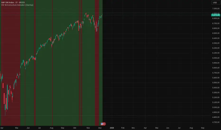
VIX Termstructure Indicator (Overlay)This indicator visualizes the VIX futures term structure directly on your chart background and highlights three key volatility regimes using color coding. It helps identify when the volatility curve is in normal contango, inverted (backwardation), or undergoing a curve flip between the front-month VIX futures.
What the indicator does
The script pulls and compares:
VIX spot index: VIX
Front-month VIX futures: VX1!
Second-month VIX futures: VX2!
All data is requested on the daily timeframe and used to classify the current volatility environment. The indicator then colors the background of your chart according to the detected VIX term structure:
Green background – Contango:
VIX spot is below the front-month futures (VIX < VX1!).
This is typically associated with more “normal” market conditions and lower perceived short-term stress.
Red background – Inverted curve (Backwardation):
VIX spot is above the front-month futures (VIX > VX1!).
This often signals elevated fear, stress, or risk-off conditions in the market.
Yellow background – Curve flip between VX1! and VX2!:
The front-month futures are trading above the second-month futures (VX1! > VX2!).
This can indicate a transition phase in the volatility term structure and may precede or accompany shifts in market sentiment.
How it works
The script fetches the daily close values of VIX, VX1!, and VX2!. It checks whether the front-month futures are above the second-month futures to detect a curve flip. It compares VIX with VX1! to determine if the curve is contango or inverted. Based on these conditions, the chart background is colored with a semi-transparent overlay:
Red has priority when VIX is above VX1! (inverted curve).
If not inverted, yellow is shown when a curve flip VX1! > VX2! is detected.
Otherwise, the background is green (normal contango).
Use cases
This overlay is designed as a context tool for indices, ETFs, Options, or individual stocks that are sensitive to volatility and risk sentiment. Typical applications include:
Identifying periods of heightened risk (red / inverted curve) to adjust position sizing or risk exposure.
Confirming risk-on environments (green / contango) where volatility is more contained.
Monitoring yellow curve-flip phases as potential early warnings of changing volatility regimes.
The indicator does not generate buy/sell signals on its own, but it can be a valuable regime filter or confirmation layer alongside other technical tools.
Notes
This is an overlay indicator: it colors the background of your active chart.
All VIX-related data is evaluated on the daily timeframe, regardless of the chart timeframe.
Make sure that the symbols VIX, VX1!, and VX2! are available on your broker/data feed in TradingView.
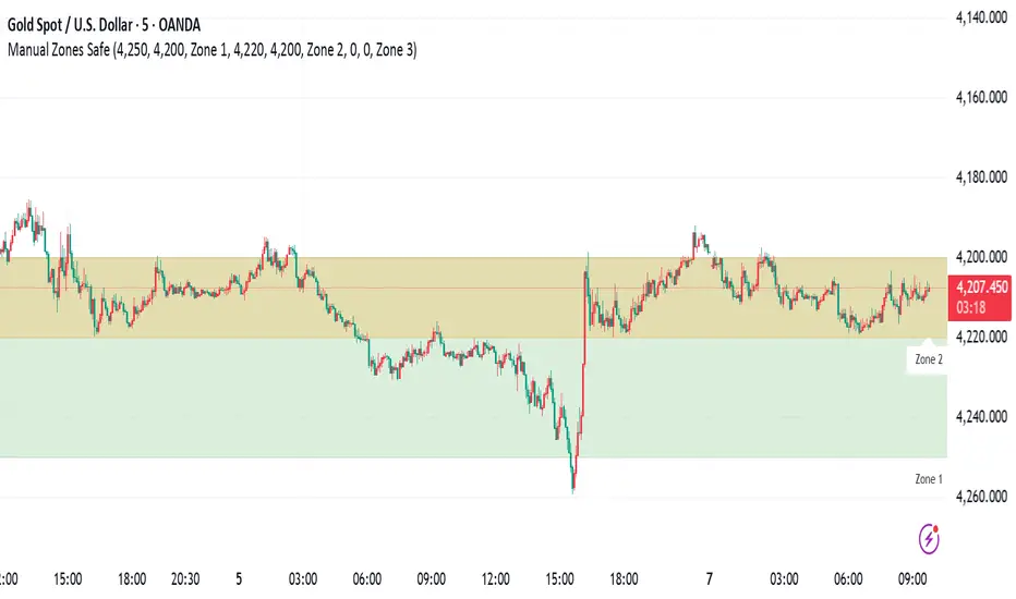
Manual Zones SafeUse cases:
Support and resistance levels
Supply and demand zones
Price action areas for manual trading strategies
OHLC ProjectionsOHLC Projections is an advanced analytical tool designed to forecast potential price ranges for the current session (Daily or Weekly) based on historical data. The indicator utilizes a statistical analysis of price behavior relative to the Open, calculating average values for "Manipulation" (movement against the closing direction) and "Distribution" (the main expansion in the closing direction).
Unlike standard moving averages, this tool creates a "roadmap" for the developing candle, helping traders identify potential session highs and lows before they form.
How It Works
The algorithm analyzes a user-defined lookback period (e.g., 60 candles) and calculates:
Manipulation (M): The average length of the wick formed opposite to the candle's closing direction (e.g., the bottom wick of a bullish candle).
Distribution (D): The average distance from the Open to the extreme point in the direction of the close.
Based on these metrics, the following levels are projected:
Open Line: The opening price of the period (Always Solid).
Manipulation Levels (+M / -M): The statistical range where price often "traps" traders before the true move begins. These are often ideal reversal points (Smart Money Reversal).
Distribution Levels (+D / -D): The statistical target (Take Profit) that price tends to reach after the manipulation phase is complete.
Key Features
Anchored Levels (Non-Repainting): Levels are calculated once at the start of a new session (e.g., at Midnight) and remain fixed throughout the day. They do not "float" or repaint with current price action.
History Management: A unique "Limit history to current day" feature keeps your chart clean. When enabled, the indicator automatically removes lines from previous days, leaving only the projections relevant to the current active session.
NY Midnight Support: Option to anchor daily calculations specifically to the New York Midnight Open (essential for ICT/SMC traders).
Dual Timeframe: Ability to display projections for two timeframes simultaneously (e.g., Daily and Weekly) on lower timeframe charts.
"Areas" Mode: Option to display zones (Boxes) instead of lines, based on two different lookback periods (short and long), allowing for the visualization of statistical confluence.
Premium/Discount Zones: Optional shading of zones above and below the opening price to easily identify expensive (Premium) and cheap (Discount) price areas.
Configuration & Visuals
The indicator is fully customizable:
Lookback Period: Adjust the number of historical candles used for the average calculation.
Visual Style: Full control over line colors and styles. The Open Line is always forced to Solid for easy distinction, while other levels can be set to dotted or dashed.
Statistics Table: An optional dashboard displaying the specific price values for all calculated levels.
Strategy Application
This tool is highly effective for Smart Money Concepts (SMC) and Inner Circle Trader (ICT) strategies.
Look for Short opportunities when price extends above the Open and hits the -M or +D levels.
Look for Long opportunities when price drops below the Open and tests the +M or -D levels.
Alerts
Built-in alerts allow you to be notified immediately when price crosses key Manipulation or Distribution levels, ensuring you never miss a reaction point.

Crypto Market Pulse: Dom vs Vol AnalyzerConcept & Methodology
The core logic of this indicator is based on the "Money Flow" theory. It aggregates data from multiple sources (CRYPTOCAP:TOTAL, BTC.D, BINANCE:BTCUSDT) to provide a comprehensive market overview in a single panel.
Key Calculations:
Total Market Cap & Volume: Fetches real-time data to determine the overall health of the market.
Inverse Dominance Logic: Unlike standard indicators, this script applies inverse color coding to Bitcoin Dominance (BTC.D).
When BTC Dominance drops, it is colored Green (indicating liquidity flowing into Altcoins).
When BTC Dominance rises, it is colored Red (indicating risk for Altcoins).
Volume Delta: Compares the current timeframe's volume against the previous candle to calculate the percentage change, highlighting sudden liquidity injections.
█ Features
Real-time Dashboard: Displays Cap, Volume, BTC Price, and BTC Dominance.
Altcoin-Focus Coloring: Automatically interprets data to favor Altcoin traders (Green Signals = Good for Alts).
Dynamic Alerts:
Volume Surge Alert: Triggers when volume exceeds a user-defined threshold (default +50%), signaling potential breakout activity.
Dominance Drop Alert: Triggers when BTC Dominance falls significantly, signaling the start of potential Altcoin movement.
█ How to Use
Look for Confluence: The ideal "Altseason" signal is when the Total Cap is Green (Market up) AND BTC Dominance is Green (Dominance down). This indicates money is moving from BTC to Alts.
Volume Confirmation: Use the Volume row to confirm the strength of the move. A price rise without volume is often a fakeout.
Customization: You can adjust the table position and text size from the settings menu to fit your screen setup.

HTF Frequency Zone [BigBeluga]🔵 OVERVIEW
HTF Frequency Zone highlights the dominant price level (Point of Control) and the full high–low expansion of any higher timeframe — Daily, Weekly, or Monthly. It captures the frequency of closes inside each HTF candle and plots the most traded “frequency zone”, allowing traders to easily see where price spent the most time and where buy/sell pressure accumulated.
This tool transforms each higher-timeframe bar into a fully visualized structure:
• Top = HTF high
• Bottom = HTF low
• Midline = HTF Frequency POC
• Color-coded zones = bullish or bearish bias
• Labels = counts of bullish and bearish candles inside the HTF range
It is designed to give traders an immediate understanding of high-timeframe balance, imbalance, and price attraction zones.
🔵 CONCEPTS
HTF Partitioning — Each Weekly/Daily/Monthly candle is converted into a dedicated zone with its own High, Low, and Frequency Point of Control.
Frequency POC (Most Touched Price) — The indicator divides the HTF range into 100 bins and counts how many times price closed near each level.
Dominant Zone — The level with the highest frequency becomes the HTF “Value Zone,” plotted as a bold central line.
Directional Bias —
• Bullish HTF zone
• Bearish HTF zone
Internal Candle Counting — Within each HTF period the indicator counts:
• Buy candles (close > open)
• Sell candles (close < open)
This reveals whether intraperiod flow was bullish or bearish.
HTF Structure Blocks — High, Low, and POC are connected across the entire higher-timeframe duration, showing the real shape of HTF balance.
🔵 FEATURES
Automatic HTF Zone Construction — Generates a complete price zone every time the selected timeframe flips (Daily / Weekly / Monthly).
Dynamic High & Low Extraction — The indicator scans every bar inside the HTF window to find true extremes of the range.
100-Level Frequency Scan — Each close within the period is assigned to a bin, creating a detailed distribution of price interaction.
HTF POC Highlighting — The most frequent price level is plotted with a bold red line for immediate visual clarity.
Bull/Bear Coloring —
• Green → Bullish HTF zone.
• Orange → Bearish HTF zone.
Zone Shading — High–Low range is filled with a semi-transparent color matching trend direction.
Buy/Sell Candle Counters — Printed at the top and bottom of each HTF block, showing how many internal candles were bullish or bearish.
POC Label — Displays frequency count (how many touches) at the POC level.
Adaptive Threshold Warning — If bars inside the HTF window are too few (<10), the indicator warns the trader to switch timeframe.
🔵 HOW TO USE
Higher-Timeframe Biasing — Read the zone color to determine if the HTF candle leaned bullish or bearish.
Value Zone Reactions — Price often reacts to the Frequency POC; use it as support/resistance or liquidity magnet.
Range Context — Identify when price is trading near HTF highs (breakout potential) or lows (reversal potential).
Momentum Evaluation — More bullish internal candles = internal buying pressure; more bearish = internal selling pressure.
Swing Trading — Use HTF zones as the “macro map,” then execute trades on lower timeframes aligned with the zone structure.
Liquidity Awareness — The HTF POC often aligns with algorithmic liquidity levels, making it a strong reaction point.
🔵 CONCLUSION
HTF Frequency Zone transforms raw higher-timeframe candles into detailed distribution zones that reveal true market behavior inside the HTF structure. By showing highs, lows, buying/selling activity, and the most interacted price level (Frequency POC), this tool becomes invaluable for traders who want to align executions with powerful HTF levels, liquidity magnets, and structural zones.

OXE MTF Support/Resistance+Demand/Supply Zone ArsenalOXE MTF Support/Resistance + Demand/Supply Zones Indicator
Your Complete Multi-Timeframe Zone Arsenal
This professional-grade indicator transforms your chart into a zone confluence powerhouse, simultaneously tracking high-probability price reaction areas across 5 timeframes (Daily, H4, H1, M15, M5) – giving you the institutional edge you need to dominate the markets.
🎯 What It Is
A sophisticated dual-system zone detector that identifies both:
Classic Support/Resistance levels using pivot point detection
Smart Money Demand/Supply zones triggered by Break-of-Structure (BOS) confirmations
Unlike basic S/R indicators, this tool employs institutional methodology – capturing order blocks and imbalance zones where smart money is positioned, not just where price bounced.
⚡ Core Capabilities
Multi-Timeframe Mastery
Track up to 5 timeframes simultaneously without switching charts
Identify confluence zones where multiple timeframe levels align
Customize which timeframes to display for clean, focused analysis
Intelligent Zone Management
Automatic zone validation – tracks when zones flip from resistance→support or supply→demand
Invalid zone filtering – hide broken/invalidated zones to focus only on active opportunities
Configurable zone limits – control the number of zones per timeframe (up to 8 each)
Smart Money Detection
BOS-confirmed zones – only marks demand/supply after break-of-structure confirmation
Precise zone timing – captures the exact candle that created the imbalance
Visual differentiation – dashed borders distinguish demand/supply from traditional S/R
Professional Dashboard
Real-time zone counter – shows active zones per timeframe at a glance
Filter status indicators – tracks which validation filters are enabled
Color-coded timeframe labels – instant visual organization
💰 How This Transforms Your Trading
1. Find High-Probability Entries
Enter trades at zones where multiple timeframes converge – when H4 demand aligns with Daily support, you've found institutional backing.
2. Stay on the Right Side of the Market
The zone flipping system shows you when market structure changes – a supply zone that flips to demand tells you the narrative has shifted bullish.
3. Eliminate Guesswork
No more wondering "is this level still valid?" The automatic invalidation tracking removes subjectivity – zones are either active (tradeable) or broken (ignored).
4. Scale Your Timeframe Analysis
Whether you're scalping M5 or swing trading Daily, access all relevant zones without the mental overhead of switching between charts and manually tracking levels.
5. Trade Like Institutions
By combining pivot-based S/R with BOS-confirmed order blocks, you're seeing where retail AND institutional money is positioned – giving you the complete picture.
🔥 Perfect For
Day traders seeking M15/H1 confluence for precise entries
Scalpers needing M5 zones with higher-timeframe confirmation
Swing traders looking for Daily/H4 zone alignment for position trades
ICT/SMC practitioners combining order blocks with traditional analysis
Any trader who values clean, validated, multi-timeframe zones over cluttered charts

Magic Moving AveragesThis indicator plots up to three adaptive “Magic MAs” plus a weighted combo line, with optional traditional SMAs for comparison.
Instead of averaging only closes, each Magic MA:
looks at the midpoints of highs/lows and opens/closes
decides whether recent behaviour favours the highs or the lows
builds a series of either highs or lows, then smooths it over your chosen length
You can run:
Short / Medium / Long Magic MAs
A weighted combo line (using 1–10 weights)
Optional traditional short/long SMAs on close
How I use it:
Price above the combo line → bullish bias
Price below the combo line → bearish bias
Short/medium/long Magic MAs together → dynamic support/resistance and trend structure
Traditional SMAs on for comparison with “classic” moving average behaviour
Inputs:
Magic MA lengths control how reactive vs smooth each regime is
Weights (1–10) let you emphasise short, medium or long regimes in the combo
This is a free / educational version of the Magic MAs.
It’s not financial advice – always manage your own risk.

ADX with Customisable LevelsADX with Customisable Levels.
25 for strong trend
50 for Very strong trend
75 for unsustainable strong trend.

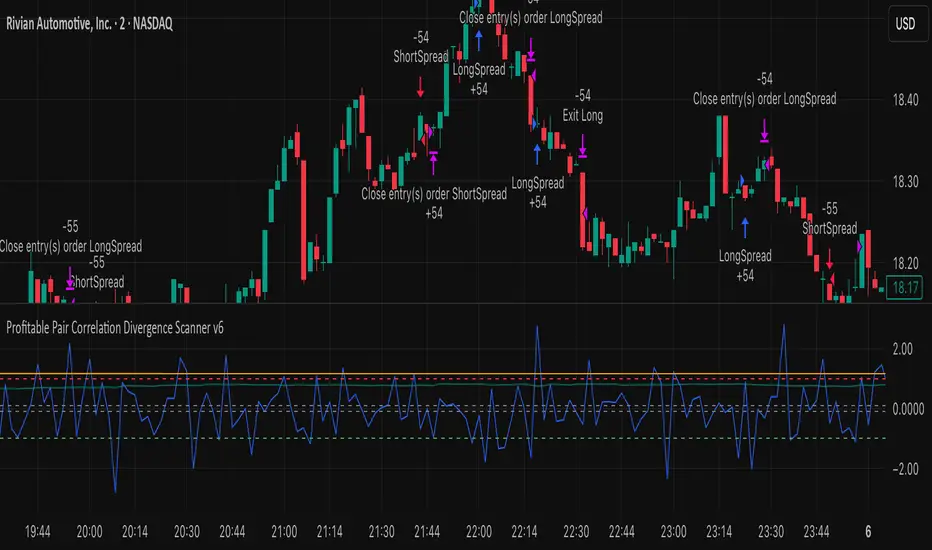
Profitable Pair Correlation Divergence Scanner v6This strategy identifies divergence opportunities between two correlated assets using a combination of Z-Score spread analysis, trend confirmation, RSI & MACD momentum checks, correlation filters, and ATR-based stop-loss/take-profit management. It’s optimized for positive P&L and realistic trade execution.
Key Features:
Pair Divergence Detection:
Measures deviation between returns of two assets and identifies overbought/oversold spread conditions using Z-Score.
Trend Alignment:
Trades only in the direction of the primary asset’s trend using a fast EMA vs slow EMA filter.
Momentum Confirmation:
Confirms trades with RSI and MACD to reduce false signals.
Correlation Filter:
Ensures the pair is strongly correlated before taking trades, avoiding noisy signals.
Risk Management:
Dynamic ATR-based stop-loss and take-profit ensures proper reward-to-risk ratio.
Exit Conditions:
Automatically closes positions when Z-Score normalizes, or ATR-based exits are hit.
How It Works:
Calculate Returns:
Computes returns for both assets over the selected timeframe.
Z-Score Spread:
Calculates the spread between returns and normalizes it using moving average and standard deviation.
Trend Filter:
Only takes long trades if the fast EMA is above the slow EMA, and short trades if the fast EMA is below the slow EMA.
Momentum Confirmation:
Confirms trade direction with RSI (>50 for longs, <50 for shorts) and MACD alignment.
Correlation Check:
Ensures the pair’s recent correlation is strong enough to validate divergence signals.
Trade Execution:
Opens positions when Z-Score crosses thresholds and all conditions align. Positions close when Z-Score normalizes or ATR-based SL/TP is hit.
Plot Explanation:
Z-Score: Blue line shows divergence magnitude.
Entry Levels: Red/Green lines mark long/short thresholds.
Exit Zone: Gray lines show normalization zone.
EMA Trend Lines: Purple (fast), Orange (slow) for trend alignment.
Correlation: Teal overlay shows current correlation strength.
Usage Tips:
Use highly correlated pairs for best results (e.g., EURUSD/GBPUSD).
Run on higher timeframe charts (1h or 4h) to reduce noise.
Adjust ATR multiplier based on volatility to avoid premature stops.
Combine with alerts for automated notifications or webhook execution.
Conclusion:
The Profitable Pair Correlation Divergence Scanner v6 is designed for traders who want systematic, low-risk, positive P&L trading opportunities with minimal manual monitoring. By combining trend alignment, momentum confirmation, correlation filters, and dynamic exits, it reduces false signals and improves execution reliability.
Run it on TradingView and watch how it captures divergence opportunities while maintaining positive P&L across trades.
specific breakout FiFTOStrategy Description: 10:14 Breakout Only
Overview This is a time-based intraday trading strategy designed to capture momentum bursts that occur specifically after the 10:14 AM candle closes. It operates on the logic that if price breaks the high of this specific candle within a short window, a trend continuation is likely.
Core Logic & Rules
The Setup Candle (10:14 AM)
The strategy waits specifically for the minute candle at 10:14 to complete.
Once this candle closes, the strategy records its High price.
Defining the Entry Level
It calculates a trigger price by taking the 10:14 High and adding a user-defined Buffer (e.g., +1 point).
Formula: Entry Level = 10:14 High + Buffer
The "Active Window" (Expiry)
The trade setup does not remain open all day. It has a strict time limit.
By default, the setup is valid from 10:15 to 10:20.
If the price does not break the Entry Level by the expiry time (default 10:20), the setup is cancelled and no trade is taken for the day.
Entry Trigger
If a candle closes above the Entry Level while the window is open, a Long (Buy) position is opened immediately.
Exits (Risk Management)
Stop Loss: A fixed number of points below the entry price.
Target: A fixed number of points above the entry price.
Visual & Automation Features
Visual Boxes: Upon entry, the strategy draws a "Long Position" style visual on the chart. A green box highlights the profit zone, and a red box highlights the loss zone. These boxes extend automatically until the trade closes.
JSON Alerts: The strategy is pre-configured to send data-rich alerts for automation (e.g., Telegram bots).
Entry Alert: Includes Symbol, Entry Price, SL, and TP.
Exit Alerts: Specific messages for "Target Hit" or "SL Hit".
Summary of User Inputs
Entry Buffer: Extra points added to the high to filter false breaks.
Fixed Stop Loss: Risk per trade in points.
Fixed Target: Reward per trade in points.
Expiry Minute: The minute (10:xx) at which the setup becomes invalid if not triggered.

6B1! Manipulation/Distribution Projections (OHLC Stats)Overview
The Manipulation/Distribution Projections (OHLC Stats) indicator is a powerful tool designed to forecast potential price levels for various timeframes on British Pound futures (6B1!). It operates on a simple yet profound principle: price action within a single candle can be broken down into “manipulation” and “distribution” phases.
By analyzing over 17 years of 6B (6B1!) historical OHLC data externally in Python, this script calculates the average (mean) and typical (median) extent of these movements. These statistical insights are then used to project key levels on your chart based on the current period’s opening price—providing a statistically-grounded framework for potential support, resistance, and price targets.
________________________________________
Key Concepts Explained
The indicator’s logic is based on how price wicks and bodies form relative to the opening price.
• Manipulation: This refers to the initial move that goes against the candle’s eventual direction.
o For a bullish candle, it’s the lower wick (the move from the open down to the low before reversing higher).
o For a bearish candle, it’s the upper wick (the move from the open up to the high before selling off).
It represents a “fake out” or a stop hunt.
• Distribution: This is the primary, directional move of the candle from the opening price.
o For a bullish candle, it’s the distance from the open to the high.
o For a bearish candle, it’s the distance from the open to the low.
It represents the “real” intended direction of price for that period.
________________________________________
How It Works
This indicator does not calculate these ratios in real-time. Instead, it leverages a comprehensive statistical analysis performed externally in Python on over 17 years of 6B (6B1!) OHLC data. This analysis determined the mean and median ratios for both Manipulation and Distribution movements across different timeframes and, for intraday periods, different times of day.
These pre-computed, static ratios are embedded directly into the script. When a new period begins (e.g., a new day on the Daily timeframe), the indicator:
1. Takes the opening price for that period.
2. Retrieves the corresponding pre-calculated Manipulation and Distribution ratios.
3. Applies these ratios to the opening price to project eight potential price levels:
o
/ - Mean Distribution
o
/ - Median Distribution
o
/ - Mean Manipulation
o
/ - Median Manipulation
This approach provides a stable, forward-looking set of levels for the entire duration of the trading period.
________________________________________
Features
• Statistically-Derived Projections: Plots eight key price levels based on historical tendencies, providing clear potential zones for entries, exits, and stop placement.
• Selectable Timeframe: Choose to view projections for the 1H, 4H, 1D, or 1W periods directly from the settings.
• Dynamic Stats Table: A powerful, on-chart dashboard that provides real-time context. For all four timeframes (1H, 4H, 1D, 1W), it shows:
o Position: Where the current price is relative to the projected zones (e.g., “In +Manip Zone,” “Below -Dist”).
o Range Completed: The percentage of the historical average range that the current period has already covered.
o Current & Average Range: The current high-to-low range in points vs. the historical average.
• Historical Context: You can display levels for previous periods to see how price has interacted with them in the past.
• Full Customization: Control the color, style, and visibility of every line, label, and fill to match your chart’s theme.
________________________________________
How to Use
This indicator is versatile and can be integrated into various trading strategies.
• Identifying Targets & Reversal Zones: The Distribution levels (especially the zone between the median and mean) can serve as logical take-profit targets, as they represent a historical point of extension. Conversely, Manipulation levels can indicate areas where price might form a wick and reverse.
• Gauging Volatility: Use the Stats Table’s “Range Completed” column to assess market conditions. If the 1D range is only 30% complete by mid-day, there may be room for significant expansion. If it’s already at 150%, the market might be overextended and due for consolidation.
• Multi-Timeframe Confluence: Use the Stats Table to quickly check if the price on a lower timeframe (e.g., 1H) is approaching a significant level on a higher timeframe (e.g., 1D), adding more weight to that level.
• Defining Bias: If the price opens and holds above the Manipulation zones, it can signal a strong directional bias for the rest of the period.
________________________________________
Settings
• Projection Timeframe: The primary timeframe for which to calculate and display the levels.
• Historical Periods to Show: Set to 1 for only the current period, or increase to see how levels from past periods held up.
• Timezone: Set the timezone for accurate hourly calculations (defaults to America/New_York).
• Visuals: Customize the appearance of the projection lines, labels, and the shaded zones between mean and median levels.
• Stats Table: Enable/disable the table and configure its position, size, and colors.
________________________________________
Disclaimer
This indicator is for informational and educational purposes only. It does not constitute financial advice or a recommendation to buy or sell any asset. All trading involves risk, and past performance is not indicative of future results. Please do your own research and risk management.
Enjoy!

52 Week High LowPurpose
This indicator plots the rolling **52-week high and low price levels** to highlight long-term breakout zones, major support/resistance bands, and trend structure used by position and swing traders.
## How It Works
The script dynamically calculates:
- The highest high over the last ~260 trading sessions (52-week high)
- The lowest low over the last ~260 trading sessions (52-week low)
- Visual bands that update in real time as price evolves
## Best Timeframe
Optimized for **daily charts** to reflect true yearly price ranges.
Can be adapted to other timeframes using the bar-count inputs.
## Trading Applications
✅ Breakout confirmation tool
✅ Long-term trend validation
✅ Relative strength filter alignment
✅ RRG and momentum cross-checks
✅ Swing trade zone identification
## How To Use
1. Apply to daily charts.
2. Track price interaction with the 52-week bands.
3. Look for:
- Breakouts above the high band for trend continuation
- Pullbacks toward the high band for retest entries
- Rejections at the low band as breakdown confirmation
⚠️ This indicator maps key price structure — it does **not predict directional outcomes**.
Always combine with volume or momentum confirmation.
---
## Mathematical Basis
Rolling extreme calculations based on:
- **Highest high over N bars**
- **Lowest low over N bars**
N defaults to **52 weeks × 5 sessions = 260 bars** for daily charts.
---
Developed for professional retail traders seeking institutional-grade structural tools.
