StrategyScript77 Is a rule-based strategy built on top of an Ichimoku based engine.
Ichimoku concepts are used as the backbone for trend and momentum filtering, so the strategy tends to stay on the side of the dominant move instead of fighting it.
The name “Super77” comes from the behavior I consistently observed in testing because the win rate tends to hover around the 70–80% range, often clustering around ~77% when used as intended.
It’s not a promise or guarantee, but it reflects the core design philosophy: frequent, relatively small but steady wins, with controlled and manageable losses.
Trading Style – Built for Conservative Traders
Super77 is intentionally designed for traders who prefer a conservative and calm approach:
Entries only at bar close
The strategy waits for bar close confirmation before entering a position. No intrabar guessing, no chasing half-formed signals. If the signal is still valid at close, only then will it enter.
Exits automated on bar close
Exits are also managed on bar close, which makes the logic transparent, easy to review on the chart, and more robust in backtesting compared to tick-based or intrabar hacks.
Semi-auto friendly
If you like to keep some discretion, you can treat it as semi-automatic:
Let the strategy generate entry signals
Manually cancel or skip certain trades if market context changes (news, extreme volatility, etc.)
This combination makes Super77 suitable for traders who don’t want to stare at the screen all day but still want structure and automation.
How to Use
Works best with bar-close execution (avoid trying to simulate intrabar fills if you want consistent behavior).
Designed for conservative, trend-aligned trading, not for hyper-scalping or news gambling.
Can be used as:
Fully automated (let all entries/exits trigger on bar close), or
Semi-automated (use alerts/signals but manually cancel some entries).
Step-by-Step: Automation with Cornix (Webhook Setup)
You can automate Super77 using Cornix by connecting TradingView alerts to your Cornix group via webhook.
Note: Exact button names may differ slightly depending on Cornix / TradingView updates, but the flow is always the same:
Cornix group → get webhook URL & mapping → TradingView alerts → signals sent to Cornix.
(Optional) Map specific pairs / directions
If you use UUID / signal mapping per symbol and per side (long/short), set them up in Cornix according to your own template.
Super77 can be used either:
On a single pair (simple setup), or
On multiple pairs if your alert / webhook structure supports that. So you can pick many pairs with 1 script.
Final Notes & Disclaimer
Super77 is an educational and experimental trading tool, not financial advice.
Past performance in back tests does not guarantee future results.
Always:
Test on demo or paper first
Adjust risk to match your own profile
Accept that losses and drawdowns are a natural part of any strategy
If you’re looking for a strategy that reflects a conservative, confirmation-based trading style with a focus on steady win rate and smoother equity behavior, Super77 was built exactly with that mindset in mind.
Indicatori e strategie


Bollinger-Yanovskyy bands of perpendicular volatilityDifferent mathematical approach to volatility - measured in square root from a product of price distance by time distance (geometrically 90 degrees to a projected MA basis).
With MA length as a factor of this volatility STDEV, creating a self-tuning feedback loop basically.

Alloyz Traders_RSI by Sagar BRSI for Intraday purpose with moving average and volume weightage price added in RSI.

ICT POIs By DSIndicator to identify POI's like OB/FVG and SCOB. It also have a different ATR based filters and inside bar logic for OB detection

GIX Analizor strategiiGIX Analyzer – Intelligent Time Filters + X Strategy
This script combines the X Strategy with an advanced system for filtering trades based on time intervals. The strategy allows:
Filtering by preset trading hours (active sessions )
Filtering by a fully customizable time interval (hour + minute, Romania time )
Filtering by calendar range (Start Date → End Date)
Simultaneous activation of both time-filter modes for maximum control
Trading only within valid time ranges, while keeping all logic unchanged
This indicator provides high flexibility for testing and optimizing trading entries based on hours, minutes, and calendar periods—while preserving the simplicity and efficiency of any strategy

RSI Pivot Breaks█ OVERVIEW
RSI Pivot Breaks is an RSI-based indicator that detects breakout events on oscillator-based pivot levels (RSI or MA RSI).
The tool automatically plots pivot levels, tracks their breakouts, highlights momentum shifts, and generates alerts for key events (pivot breaks and OB/OS crosses).
The indicator is designed primarily for momentum strategies — pivot breakouts often precede directional price moves, making RSI Pivot Breaks a powerful tool for identifying accelerations and changes in strength.
█ CONCEPTS
The indicator analyzes local RSI extremes and transforms them into dynamic support/resistance levels.
When RSI or MA RSI breaks the last pivot, it signals a shift in momentum balance, often leading to an impulse move.
Key concepts:
- pivot highs/lows detected on RSI or MA RSI,
- pivot lines extend forward until broken,
- pivot filters restrict pivot detection to specific RSI zones,
- OB/OS levels provide contextual momentum thresholds.
█ FEATURES
Pivot Detection & Breakouts
- Detection of pivot highs and lows on RSI or MA RSI.
- Pivot filters allow you to limit pivot detection to specific RSI ranges (e.g., only bullish pivots below 50 or bearish pivots above 50).
- Pivot lines update automatically after breakout.
Background highlights:
- green on pivot-high breakouts,
- red on pivot-low breakouts.
RSI & MA RSI
- Dynamic RSI colors based on momentum direction.
- Optional MA RSI line (SMA/EMA/RMA/WMA) usable as a smoother pivot source.
OB / OS Zones
- Fully adjustable overbought/oversold levels.
- Dedicated OB/OS colors.
- Optional gradient backgrounds.
Highlights
- Instant identification of moments when RSI breaks a key pivot level.
Alerts:
- pivot high breakouts.
- pivot low breakouts.
- OB crosses.
- OS crosses.
█ HOW TO USE
Add the indicator:
Indicators → RSI Pivot Breaks.
RSI Settings
- RSI Length – core RSI period.
- RSI MA Length & Type – MA RSI smoothing parameters.
Pivot Settings
- Pivot Left / Pivot Right – number of bars required to form a pivot and also the number of bars of delay before the pivot becomes confirmed.
(Higher values produce more reliable but slower pivots.)
Pivot Filters
- Minimum/maximum allowed RSI levels for pivot Highs and Lows.
- Examples:
- detect only pivot Highs at low RSI values.
- ignore pivots during extreme momentum.
- allow only mid-range pivot detection depending on strategy.
Visualization
- Toggles for RSI and MA RSI visibility.
- Optional gradients.
- Full color and transparency customization.
OB/OS Levels
- Adjustable thresholds depending on instrument volatility and strategy style.
█ SIGNAL INTERPRETATION
BUY
- RSI breaks the latest pivot high.
- RSI crosses upward out of OS.
- Context example: pivot lows forming a rising sequence.
SELL
- RSI breaks the latest pivot low.
- RSI drops downward from OB.
- Context example: pivot highs forming a declining sequence.
Trend / Momentum
- Pivot breakouts indicate acceleration or continuation of momentum.
- MA-based pivots provide smoother and more stable momentum structure.
█ APPLICATIONS
- Momentum Trading – pivot breaks as early acceleration signals.
- Scalping & Intraday – fast RSI pivots react quickly to short-term shifts.
- Swing Trading – smoother pivots using MA RSI for higher-timeframe structure.
- Divergence Detection – pivot behavior helps reveal divergence patterns, e.g.:
- RSI pivots rising while price is falling → potential early momentum reversal.
- Custom Filtering – pivot filters allow, for example:
- blocking bullish signals near OB.
- blocking bearish signals near OS.
- detecting pivots only above/below mid-range during strong trends,
depending entirely on strategy design.
█ NOTES
- Pivot detection includes natural delay equal to the Left/Right parameters.
- Pivot filters significantly change the character of signals, allowing fine-tuning of aggressiveness for any strategy.

Strategia S&P 500 vs US10Y Yield (od 2000)This strategy explores the macroeconomic relationship between the equity market (S&P 500) and the debt market (10-Year Treasury Yield). Historically, rapid spikes in bond yields often exert downward pressure on equity valuations, leading to corrections or bear markets.
The goal of this strategy is capital preservation. It attempts to switch to cash when yields are rising too aggressively and re-enter the stock market when the bond market stabilizes.

Strategia S&P 500 vs US10Y YieldThis strategy explores the macroeconomic relationship between the equity market (S&P 500) and the debt market (10-Year Treasury Yield). Historically, rapid spikes in bond yields often exert downward pressure on equity valuations, leading to corrections or bear markets.
The goal of this strategy is capital preservation. It attempts to switch to cash when yields are rising too aggressively and re-enter the stock market when the bond market stabilizes.

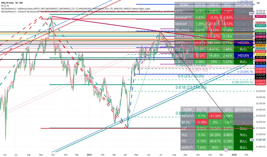
FAD Dashboard 3 - Additional Stocks ( With Alerts )Inspired by ideas of Ram Sir & Wealthcon
Features:
Auto-Timeframe: Values update based on the chart you are looking at (5m, 15m, 1H, etc.).
4 Data Columns:
Future %: Future Price Change (Red/Green).
FAD %: Change in FAD difference (Red/Green).
OI %: Change in Open Interest (Red/Green).
Sentiment Analysis : The specific Bullish/Hidden Bullish logic Strict Colour Logic:
Deep Green( REGULAR LONG BUILD UP): Future ⬆️ + FAD ⬆️ + OI ⬆️
Deep Blue (HIDDEN LONG BUILD UP ): Future ⬇️ + FAD ⬆️ + OI ⬆️
Additionally , auto alerts of Regular or Hidden build up at hourly & daily time frame .
Only for Educational purpose

FAD Dashboard 2 - Top Nifty 50 Stocks ( With Alerts )Inspired by ideas of Ram Sir & Wealthcon
Features:
Auto-Timeframe: Values update based on the chart you are looking at (5m, 15m, 1H, etc.).
4 Data Columns:
Future %: Future Price Change (Red/Green).
FAD %: Change in FAD difference (Red/Green).
OI %: Change in Open Interest (Red/Green).
Sentiment Analysis : The specific Bullish/Hidden Bullish logic Strict Colour Logic:
Deep Green( REGULAR LONG BUILD UP): Future ⬆️ + FAD ⬆️ + OI ⬆️
Deep Blue (HIDDEN LONG BUILD UP ): Future ⬇️ + FAD ⬆️ + OI ⬆️
Additionally , auto alerts of Regular or Hidden build up at hourly & daily time frame .
Only for Educational purpose
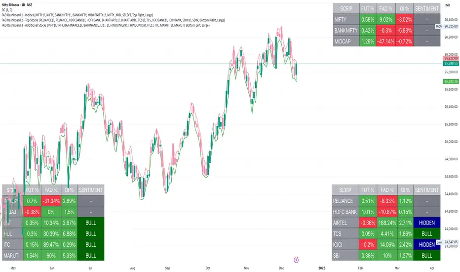
FAD Dashboard 1 - Indices ( With Alerts )Inspired by ideas of Ram Sir & Wealthcon
Features:
Auto-Timeframe: Values update based on the chart you are looking at (5m, 15m, 1H, etc.).
4 Data Columns:
Future %: Future Price Change (Red/Green).
FAD %: Change in FAD difference (Red/Green).
OI %: Change in Open Interest (Red/Green).
Sentiment Analysis : The specific Bullish/Hidden Bullish logic Strict Colour Logic:
Deep Green( REGULAR LONG BUILD UP): Future ⬆️ + FAD ⬆️ + OI ⬆️
Deep Blue (HIDDEN LONG BUILD UP ): Future ⬇️ + FAD ⬆️ + OI ⬆️
Additionally , auto alerts of Regular or Hidden build up at hourly & daily time frame .
Only for Educational purpose

OPR Asia-New-York [Elykia]This Pine Script indicator, is designed to help traders identify potentially significant price zones based on morning and afternoon Opening Price Ranges (OPR), while integrating a customizable Relative Strength Index (RSI) to assess market momentum.
Key Features:
1. Morning and Afternoon Opening Price Ranges (OPR):
The indicator defines two distinct OPR periods: one for the morning and one for the afternoon (often used for European and American trading sessions, respectively).
Initial OPR Boxes: For each period, a box is drawn in real-time during the defined opening range. It dynamically adjusts to encompass the high and low prices reached during that period.
OPR Fixation: Once the initial opening period ends, the OPR box becomes fixed at the final high and low levels of that period.
OPR Extensions: After the initial OPR is fixed, an extension box is drawn. This extension box maintains the price levels (high and low) of the initial OPR but extends horizontally in time, providing a continuous reference zone.
Midline: Each box (initial and extension) is accompanied by a dashed midline, representing the midpoint of the OPR range.
Color and Transparency Customization: Users can adjust the colors of the boxes, midlines, and their transparency for both initial OPRs and their extensions, independently for morning and afternoon.
Adjustable Time Zone: A global time zone setting allows precise adaptation of OPR start and end times to the user's local trading session, which is crucial for the accuracy of these zones.
2. Integrated Relative Strength Index (RSI):
A fully customizable RSI is included, calculated on the closing price.
RSI Table (Optional): Displays the current RSI value in a table at the top right of the chart. The table's background color changes based on the RSI's state (green for neutral, red for overbought/oversold).
Dynamic RSI Label (Optional): A floating label follows the price, displaying the current RSI value. This label also changes its background color (green/red) based on overbought/oversold levels.
Full RSI Customization: Users can define the RSI length, overbought and oversold levels, text and background colors, text size for both the table and label, and the horizontal shift of the dynamic label.
Originalities:
Advanced OPR Management with Extension: Unlike many simple OPR indicators, this one offers sophisticated management of range fixation and extension. The extension that maintains the initial price levels is an asset for observing price reactions to these historical zones throughout the day.
Dual OPR (Morning/Afternoon) with Independent Settings: The ability to clearly define and visualize two distinct OPRs for different trading sessions is highly beneficial for multi-market traders or those tracking major session openings.
RSI Integration and Flexibility: The RSI is not just an add-on; it's finely integrated with distinct display options (table or dynamic label), allowing traders to choose how they prefer to visualize this crucial information without cluttering the chart.
Global Time Zone Setting: The inclusion of a global time zone parameter is a practical feature that ensures the indicator's accuracy for traders worldwide, without requiring complex manual calculations.
Setups for Information
Here are some typical configurations that may be useful. These setups are starting points and should be adapted to your trading style and the instruments you use.
OPR Setup "Europe/US Opening" (for EURUSD, European/US Indices):
Time Zone: GMT+2 (for summer in Europe, adjust to GMT+1 for winter)
Morning OPR:
Start Hour: 9:00 (London/Europe opening)
End Hour: 9:15
Extension Hour: 11:30 (before New York opening)
Afternoon OPR:
Start Hour: 15:30 (New York opening)
End Hour: 15:45
Extension Hour: 18:30
RSI Setup "Standard Momentum":
RSI Length: 14
Overbought Level: 70
Oversold Level: 30
Display: Dynamic RSI Label enabled for quick reading near the price.
Disclaimer on Usage:
This indicator is provided for informational and educational purposes only. It does not constitute investment advice or a trading recommendation in any way. Trading in financial markets carries substantial risks of loss, including the total loss of invested capital.
No Guarantee: There is no guarantee that using this indicator will result in profits or prevent losses. Past performance is not indicative of future results.
Personal Analysis: OPR zones and RSI readings are analytical and decision-making tools. They should always be used in conjunction with your own technical and fundamental analysis, risk management, and trading plan.

Market Cycle VisualizerPlots a customizable time-based grid on your chart to visualize market cycles. Draws vertical boundaries at interval starts, horizontal opening lines, and tracks high/low ranges within each period. Ideal for identifying recurring patterns and structure across custom timeframes.


FAD Dashboard 2 - Additional StocksInspired by Ideas of Ram Sir & WEALTHCON
Features:
Auto-Timeframe: Values update based on the chart you are looking at (5m, 15m, 1H, Daily etc.).
4 Data Columns:
Future %: Future Price Change (Red/Green).
FAD %: Change in FAD difference (Red/Green).
OI %: Change in Open Interest (Red/Green).
Sentiment Analysis : The specific Bullish/Hidden Bullish logic Strict Colour Logic:
Deep Green( REGULAR LONG BUILD UP): Future ⬆️ + FAD ⬆️ + OI ⬆️
Deep Blue (HIDDEN LONG BUILD UP ): Future ⬇️ + FAD ⬆️ + OI ⬆️
Only for Educational Purpose
FAD Dashboard 1 - Indices & Top StocksInspired by Ideas of Ram Sir & WEALTHCON
Features:
Auto-Timeframe: Values update based on the chart you are looking at (5m, 15m, 1H, Daily etc.).
4 Data Columns:
Future %: Future Price Change (Red/Green).
FAD %: Change in FAD difference (Red/Green).
OI %: Change in Open Interest (Red/Green).
Sentiment Analysis : The specific Bullish/Hidden Bullish logic Strict Colour Logic:
Deep Green( REGULAR LONG BUILD UP): Future ⬆️ + FAD ⬆️ + OI ⬆️
Deep Blue (HIDDEN LONG BUILD UP ): Future ⬇️ + FAD ⬆️ + OI ⬆️
Only for Educational Purpose

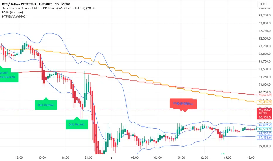
teril 1H EMA50 Harami Reversal Alerts BB Touch teril Harami Reversal Alerts BB Touch (Wick Filter Added + 1H EMA50)
teril Harami Reversal Alerts BB Touch (Wick Filter Added + 1H EMA50)
teril Harami Reversal Alerts BB Touch (Wick Filter Added + 1H EMA50)
teril Harami Reversal Alerts BB Touch (Wick Filter Added + 1H EMA50)


Terils 1hr HTF EMA Add-On EMA 50/100its EMA 50 and EMA 100 in 1 her time frame.
its EMA 50 and EMA 100 in 1 her time frame.
its EMA 50 and EMA 100 in 1 her time frame.
its EMA 50 and EMA 100 in 1 her time frame.
its EMA 50 and EMA 100 in 1 her time frame.
EMAs [TrendRider.io]Dynamic Trend Indicator
A dual EMA indicator with dynamic color coding to show trend direction and strength.
Features:
Two customizable EMAs (default: 12 and 21) with fill between them
Color changes based on trend:
Green : Bullish trend (small EMA above big EMA)
Red : Bearish trend (small EMA below big EMA)
Gray : Neutral/consolidation
Multi-timeframe support
Customizable colors
Usage:
Watch for color changes to identify trend shifts and gauge trend strength through the fill area.

Volatility Value BandsThis indicator is a modern adaptation of Mark Helweg's original Value Charts concept, focused on visually displaying volatility zones and "extreme value" areas directly on the price chart. It does not replicate the original work but draws inspiration from the logic of normalizing price by volatility to highlight statistically stretched regions.
1. Introduction
This study displays three lines directly on the chart:
- a central reference line (base),
- an upper overvaluation band,
- and a lower undervaluation band.
The bands are calculated from the relationship between price, moving average, and volatility (via true range/ATR), following Mark Helweg's Value Charts concept but with a custom implementation and adjustable parameters for different assets and timeframes. This allows objectively visualizing when price is in a statistically extended region relative to its recent behavior.
2. Key Features
- Volatility-normalized base
The indicator converts price deviation into "value units" using a combination of moving average and smoothed volatility (true range/ATR), making levels comparable across different assets and time horizons.
- Auto-adjusting limits (optional)
An automatic mode can calculate upper and lower limits from recent value unit extremes, using a configurable sampling window and percentile, allowing bands to adapt to the current volatility regime without manual recalibration.
- Direct plot on price chart
The three lines (central, upper, and lower) are drawn directly on the main asset chart (`overlay`), making it easy to read context: it's clear when price "touches" or breaks the volatility bands without switching to a separate pane.
- Flexible parameters
Users can control:
- base moving average period (length)
- volatility factor (manual or automatic)
- independent windows for volatility and limits calculation
- limits mode (auto or manual) and percentile used
This allows adapting behavior to different markets (stocks, indices, forex, crypto).
3. How to Use
- Basic interpretation
- When price approaches or exceeds the upper band, it indicates a statistically overvalued zone where the asset is stretched upward relative to recent volatility.
- When price approaches or exceeds the lower band, it indicates a statistically undervalued zone.
- The central line serves as a reference for recent "average value," derived from the base moving average.
- Recommended initial setup
- Choose the Value Chart period (e.g., 144 bars) for the base.
- Enable automatic limits mode for coherent bands matching the asset's volatility.
- Adjust the limits window and percentile for tighter bands (more signals) or wider bands (fewer but more extreme).
- Best practices
- Use bands as context filters, not standalone buy/sell signals. Combine with trend, market structure, or other confirmation indicators.
- Avoid decisions solely because price touched a band; in strong trends, price can "walk the edge" for extended periods.
- Always follow TradingView community rules when publishing: clearly state in the description that the study is "inspired by Mark Helweg's Value Charts concept," without claiming official status, reproducing proprietary code, or violating copyrights.
