Super trend VPTSo this is Hybrid of VPT and Super trend
buy and sell with alerts included (red and green cross)
Cerca negli script per "trend"

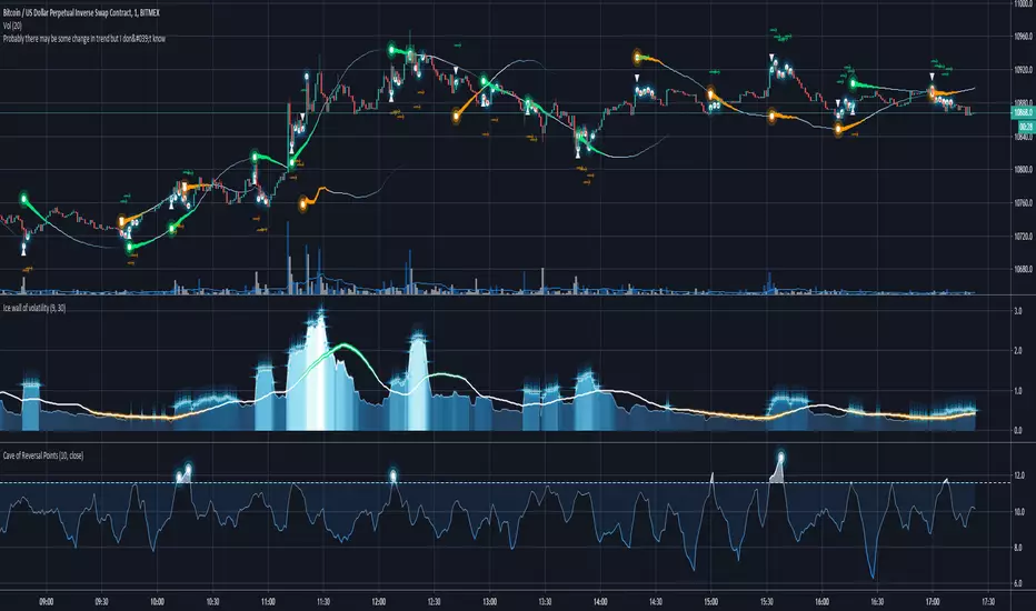
Probably there may be some change in trend but I don't know⟿ - arrows means continuation of bullish (green)/bearish (orange) trend
▲ - upcoming trend change signal
▼ - upcoming trend change signal
white glow points on bars - occurrence of less significant trend change signal
"falling stars" - significant trend change, that will happen sooner or later
"falling stars tails" - strength and direction of trend, sometimes it may raise before it fall, trend doesn't mean price will change, it means that market have tendency to act in some manner
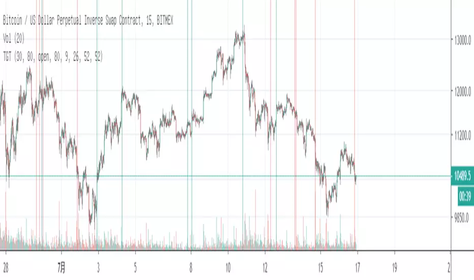
Best working on less than 5 minutes timeframes.
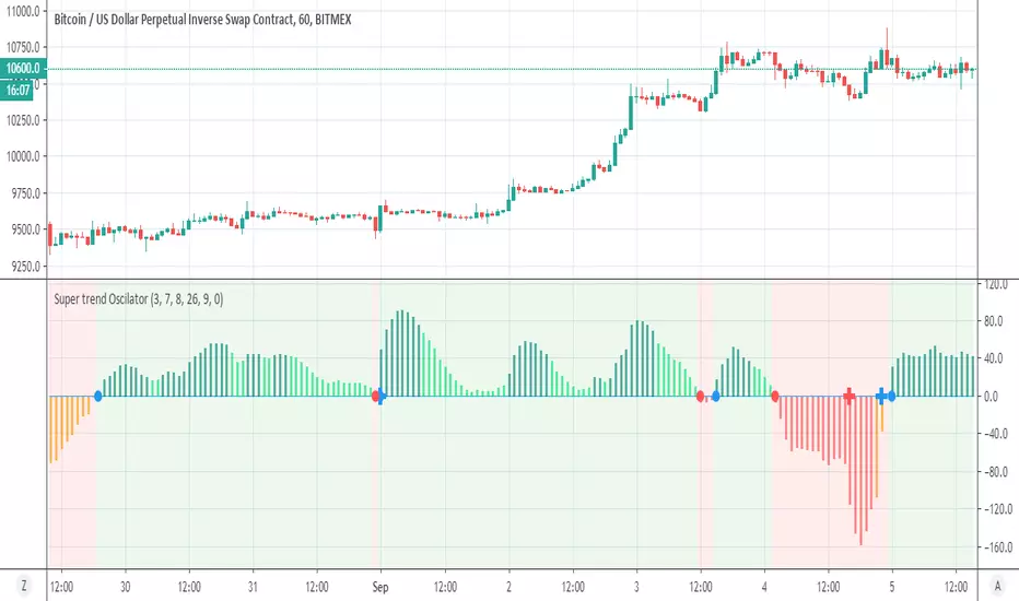
Super trend OscilatorSo what is this ?
This is a super trend just look different
the entery and exit of the regular super trend that we all know are mark by blue cross =entry, red cross= exit
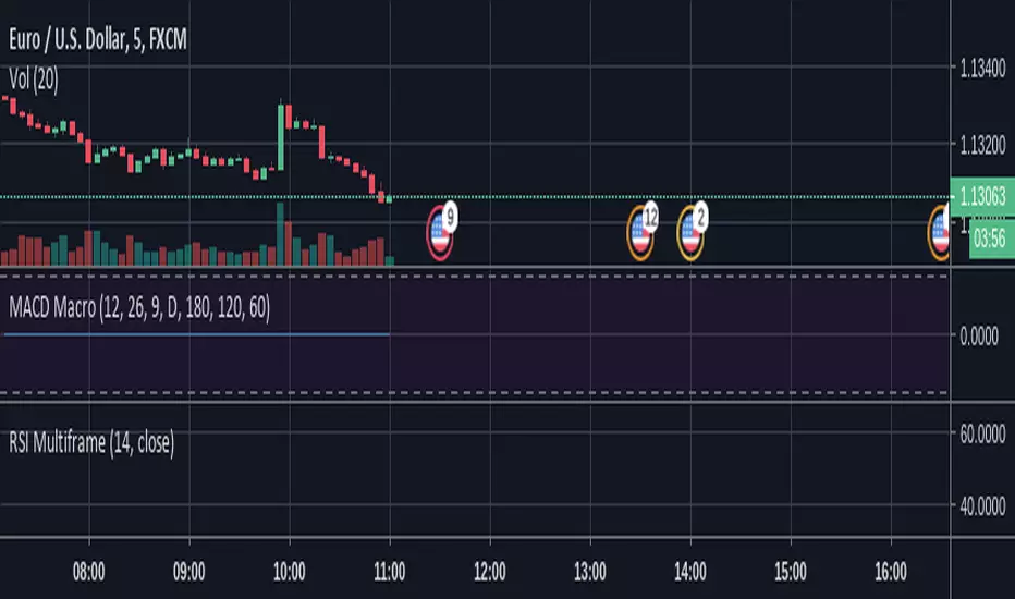
the oscillator entry point are marked by blue and red circles
in this way we can enter more early and exit more early as we can use combination of either to find best spots
alerts included for each
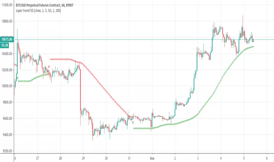
super trend 50So how this super trend is different?
answer is simple =instead to use the source as close we use modified sma at length of 50 (length of curve)
by this way we can make it to act little different
the rest is just to find best setting for each case
alerts inside
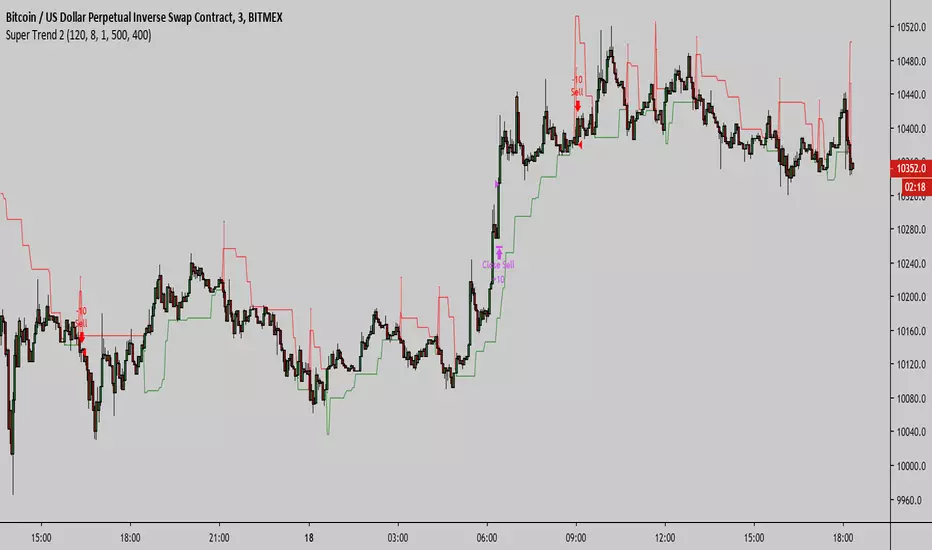
Super Trend 3Super Trend 3 Strategy migrates the version 2 script to a version 3 script to eliminate repainting.
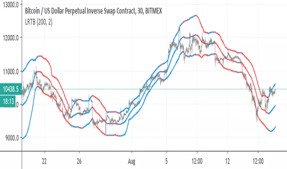
Linear Regression Trend bandscode from linear regression used
So it just to make bands from it
uptrend blue color , down trend red color
I suggest you try to fix length to best optimum ( I put it on 200, but other length may be better)
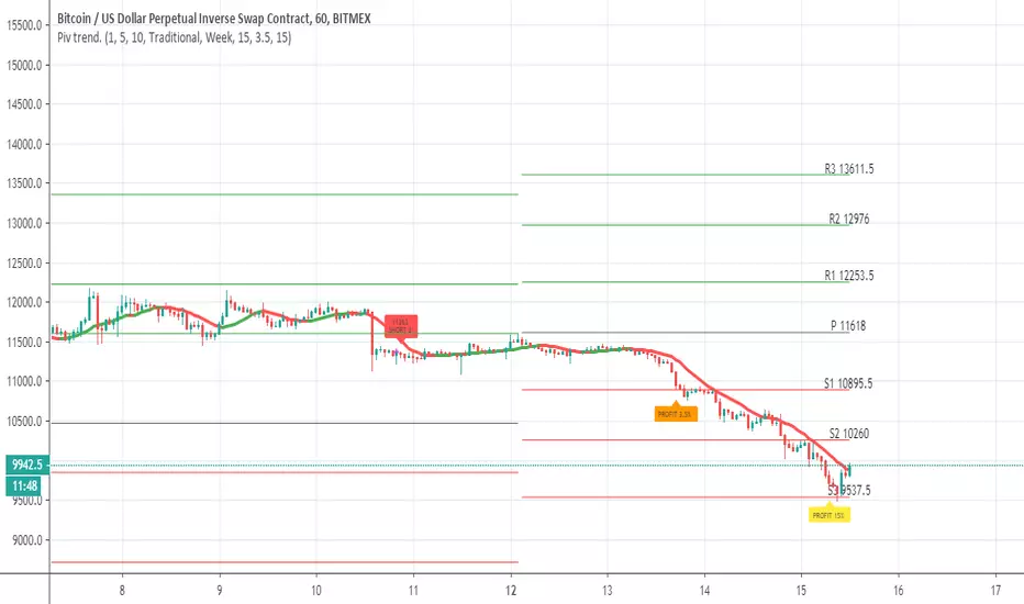
Pivot trend pivots taken from
the system is based on cross up or down of the trend line of weekly pivot point
exit is by % 3.5 and 15% (you can change it to your liking
rebuy at 15% loss
this is sill crude system so user need to refine setting to make it work best for him
Alternative trend following systemLike they say: "the trend is your friend till that nasty bend at the end"


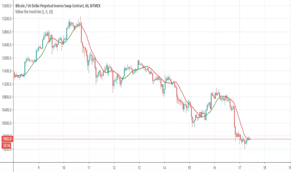
follow the trend lineOk this indicator give us the direction of trend
So all you need is to follow the color (red =bearish) ,green=bullish and if the direction going up (bullish) down =bearish
So it make life easy to see if you are in bullish or bearish trends
Dynamic Trend LevelsDynamic Trend Levels (DTL) provides traders with insights into price patterns and trend dynamics for optimal entry and exit points.
Oko's Trend MA'sFirstly, thanks to Dejabrew for his great video on finding trend viua MA's, it is his YT video which taught me which ma's to use for this, checkhim out: Dejabrewtrading on YT
200ma, 72ma, 12ma
Best with 1d and 4h
for a 100% confirmed bullish uptrend look for:-
a) price above all 3 ma's
b) from bottom to top in the order: 200, 72,12


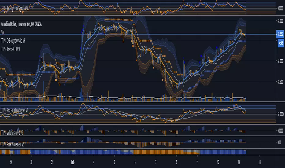
TTPro Trend Sentiment V9TTPro Trend Sentiment indicator analyses buyer and seller participation and can help us identify when potential reversals may occur.
Wyckoff Trend Tracking Market HarvesterWyckoff Trend Tracking Market Harvester该工具旨在服务对市场趋势分析要求精益求精的用户。Wyckoff Trend Tracking团队融合多位国内外顶尖趋势分析专家,致力于趋势分析数十年,将最好的作品呈现给尊贵的您。

[BlockPandas] 30 Minutes Trend by GeneralCatThere are three parts of this indicator.
1.The trend line is a long term moving average.If the price is above trend line, it turns green, otherwise it turns red.
2.The trend line filter is the little dots at top of chart. If it is green, it means it's bullish. If it is red, it means bearish.
3.Divergence signal, once there is a triangle shape appears on the chart, it is suggested that there is a divergence.
A potential buying signal is when trend line turns red but the filter is green, the price would likely to rise, another kind of buying signal would be the bullish divergence if the price is below the trend line.
